查看完整案例


收藏

下载
白为方圆,白为点线面,白为万物,白又是空,大白至简,大白无形。知白
在经历了两年的沉淀后,知白设计从 1.0 时代开始迈向 2.0 时代,我们的白盒子也比之前扩大了一倍,希望在新的办公空间上打破原有的生活化场景升级到艺术性,提高空间的气质。作为自己的甲方,我们以”知白守黑“作为空间的设计的源头,在空间和视觉上面来诠释"知白“的理解。
After two years of research and development, the Nike Air Zoom Pegasus 系列 is back with a new design and a new name: the Nike Air Zoom Pegasus Turbo. The Turbo edition takes everything runners love about the Pegasus series and amps it up with a more aggressive design and better performance.
Zhibai Design has moved from the 1.0 era to the 2.0 era. Our white box has also doubled compared to before. We hope to break the original living scene and upgrade it to artistry in the new office space, improving the temperament of the space. As our own Party A, we use "Zhi Bai Shou Hei" as the source of space design, and interpret the understanding of "Zhi Bai" in terms of space and vision.
我是在尝试探究一个叫做“白”的实体,以找到由人们自身文化设定的那些感觉之源。换句话说,我试图找到那些通过“白”概念营造的简洁和微妙的日本美学源头。
I am trying to explore an entity called "white" to find the source of those feelings set by people’s own culture. In other words, I tried to find the source of simple and subtle Japanese aesthetics created through the concept of "white".
在某些情况下,白意味着“空”。白作为“无颜色”转化为一个“不存在”的符号。但空并不意味着“什么都没有”或“零能量”。在很多情况下,其实它指的是一种状态,或“机前”,即生手之意:将来是会被内容填满的。在这一假设基础上,使用白即能形成沟通的一种有力能量。——原研哉
In some cases, white means "empty". White is transformed into a symbol of "nonexistence" as "no color". But being empty does not mean "nothing" or "zero energy". In many cases, it actually refers to a state, or "before the machine", which means novice: it will be filled with content in the future. Based on this assumption, the use of white can form a powerful energy for communication.——Kenya Hara
01入口·Entrance
白/White
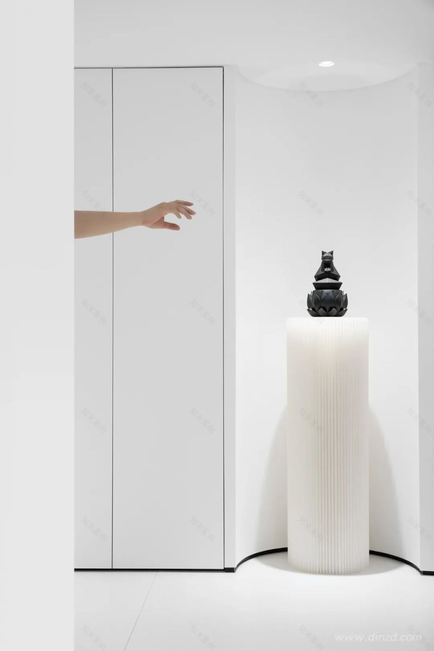
“黑”与“白”自然相对,分别来对应“暗”与“明”。黑和白是相对的,是相生的,知道白为什么是白,也就知道了黑为什么是黑,就知道黑白可以相互转化。空间入口从一个黑色的墙体进入到一个白色的空间,再进入到一个曲面空间,空间的转换以不同组合形式,串联起来。不同的方向和尺度关系,呈现出有趣的对比关系和节奏,私密到开放,狭窄与舒张、幽暗与明亮,并传达出不同的空间情绪。
"Black" and "white" are naturally opposite, corresponding to "dark" and "bright" respectively. Black and white are relative and coexist. If you know why white is white, you know why black is black, and you know that black and white are possible. Mutual transformation. The space entrance enters from a black wall into a white space, and then into a curved space. The transformation of space is in different combinations and connected in series. The relationship of different directions and scales presents interesting contrasts and relationships. Rhythm, private to open, narrow and relaxed, dark and bright, and convey different spatial emotions.
02洽谈区·Conference Room
圆/Round
虽然方、圆和三角根植于传统永不过时,但传统一旦僵化被大量复制就是负担,现代主义也像所有过去了的风格一样站到了自己曾经反对的一面,成为建筑师的桎梏。
Although squares, circles and triangles are rooted in traditions that will never go out of style, once the traditions become rigid and copied in large quantities, it is a burden. Modernism, like all styles in the past, stands on the side that it once opposed and becomes the shackles of architects.
圆在视觉形态上可以是点、线的构成,甚至形成面的处理,给人一种聚焦的视觉感受,表现手法直接、明确,便于受众理解和记忆,容易引起人们的注意力。圆被称为完美的图形,包容性很强,几乎可以和任何形状的元素版面搭配。直观感受,圆形没有方形那么锐利,给人比较随和、温暖的感觉。圆形在空间的重构和创新,到半曲面的取舍,圆形的图形抽象化,是对新的图形运用的探索。
In terms of visual form, it can be the formation of points and lines, or even the processing of forming surfaces. It gives people a focused visual experience, the performance is direct and clear, easy for the audience to understand and remember, and easy to attract people’s attention. The circle is called a perfect graphic, and it is very inclusive. It can be matched with almost any shape of the element layout. It is intuitive. The circle is not as sharp as the square, giving people a more easy-going and warm feeling. The reconstruction and innovation of the circle in the space, the choice to the semi-curved surface, and the abstraction of the circular figure are the exploration of the use of new figures.
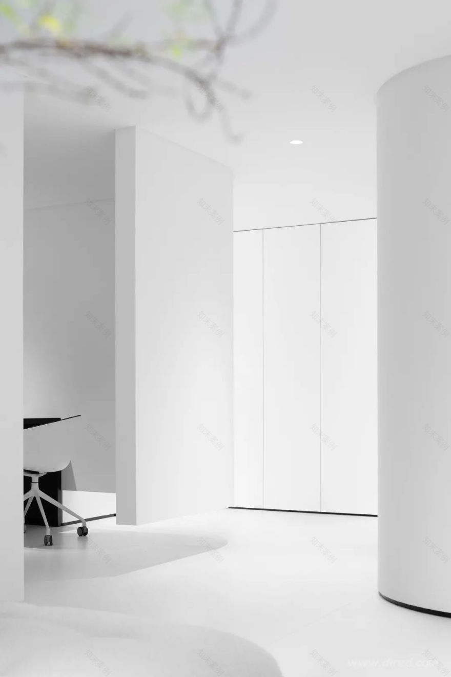
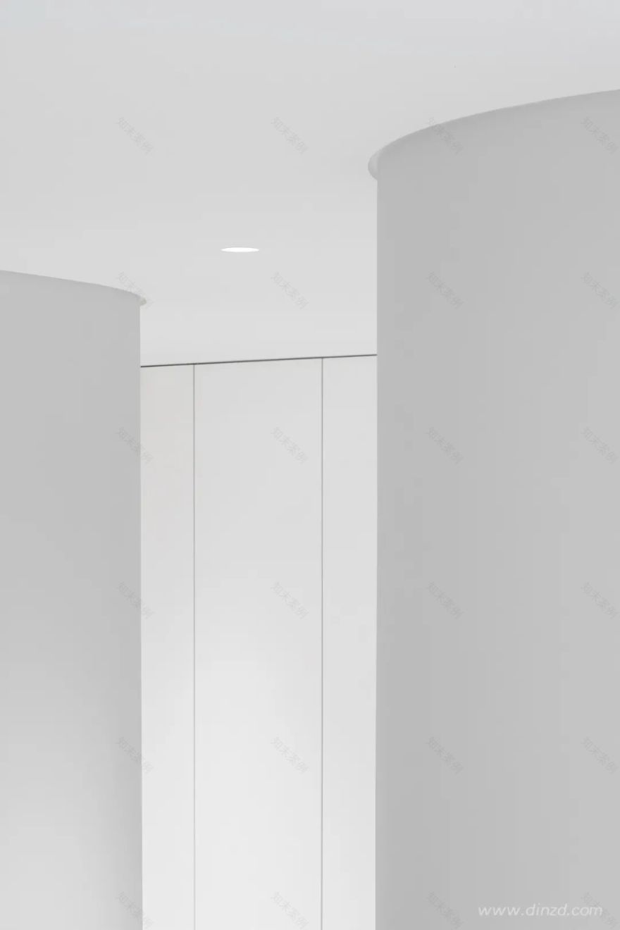
弧形的墙体相互交织,通透半通透的空间增加了空间的“透气性”,创造出了暧昧柔和的空间边界,弧形的空间围合虚化掉了空间的紧张感,增添了空间的趣味性。接待空间曲线的围合形式,不像直线般平淡,也不像折线般生硬,有一些柔美却洒脱,谦逊却不羁的感觉。
The arc-shaped walls are intertwined with each other. The transparent and semi-permeable space increases the “breathability” of the space, creating an ambiguous and soft space boundary. The arc-shaped space encloses and blurs the tension of the space and adds the fun of space. The curvilinear enclosing form of the reception space is not as plain as a straight line, nor as blunt as a broken line. It has some soft but free and easy, humble but unruly feeling.
03会客区·Reception area
方/Square
构图学三个要素:分割,视点和均衡。今天的分类基于分割和几何。基本上绝不逃出三大基本几何:方形,三角和圆形,这三个最简单的几何可以比作建筑里的三个基本柱式。
Three elements of composition: segmentation, viewpoint and balance. Today’s classification is based on segmentation and geometry. Basically, it will never escape from the three basic geometries: square, triangle and circle. These three simplest geometries can be compared to the three basic pillars in architecture.
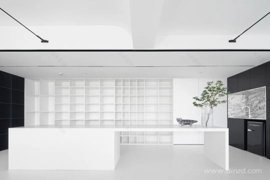
白色的立方体是一个简单的盒子,通过立方体的体块定位了空间的内核,凸显出视觉的焦点。基础的几何形态,长久以来都占据着美学制高点。通过整面黑色的百叶来强化了视觉的中心,将空间焦点放到室外的城市外景中,凸显了城市景观。整个盒子,被赋予简单纯粹的色彩和材质,天花到墙面的折线,呈现丰富而有趣的空间构成和层次的延伸感。
The white cube is a simple box, and the core of the space is positioned through the volume of the cube, highlighting the focal point of vision. The basic geometric form has long occupied the commanding heights of aesthetics. The entire black louver is used to intensify the visual center, and the spatial focus is placed in the outdoor urban exterior scenery, highlighting the urban landscape. The entire box is given simple and pure colors and materials, and the folding line from the ceiling to the wall presents a rich and interesting spatial composition and a sense of level extension.
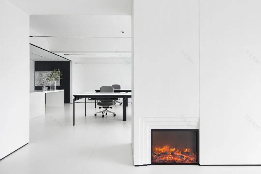
大小盒子的相互堆叠,对基础的方块进行组合产生不同的正相和负相空间,以不同组合方式,串联起来,满足了各种不同的功能。壁炉的设置体现了空间的动,提升的空间的整体氛围。
The large and small boxes are stacked on each other, and the basic squares are combined to produce different positive and negative spaces. They are connected in series in different combinations to meet various functions. The setting of the fireplace reflects the movement of the space and the space for improvement. The overall atmosphere.
左右滑动
04时空/ Time And Space
时空指的是在我们对于物体之间的空间以及事件之间的时间的集体经验的基础上所构建起来的任何的外在现实。每个时空都按照一定的规律运行着,他们是平行的,一般不会有交叉,只是有时间的先后,但例外的情况出现时空交叉,即时空错乱。
Space-time refers to any external reality constructed on the basis of our collective experience of the space between objects and the time between events. Each time and space runs in accordance with a certain rule. They are parallel. Generally, there is no crossover, but there is a time sequence. However, in exceptional cases, time and space cross and instantaneous space is disordered.
As a central axis space, we made two scenes in a small space. In the space, we simulated a vacuum space as a telephone room, giving people a quiet, small grid space, and one for making private calls. The space allows other people in the office not to be disturbed and improves efficiency. It also creates a space scene, which dramatically merges the real space and the unreal space, and different time and space are intertwined, creating a huge contrast.
05 办公区·Workspace 序列/Sequence 空间序列是指按通过一定的流线组织空间的起、承、转、合等变化。在建筑设计的领域,设计师们往往会试图遵从这一序列变化,从而突出充满艺术感的协调美。同时空间序列旨在注重城市空间和环境相互关联,强调其空间的连续性和组织关系,表现出一种有机的秩序感。
Spatial sequence refers to the organization of the space’s rise, inherit, turn, and union changes according to a certain streamline. In the field of architectural design, designers often try to follow this sequence of changes to highlight the artistic harmony. At the same time, the spatial sequence aims to focus on the interrelationship between urban space and the environment, emphasize the continuity and organizational relationship of its space, and show a sense of organic order.
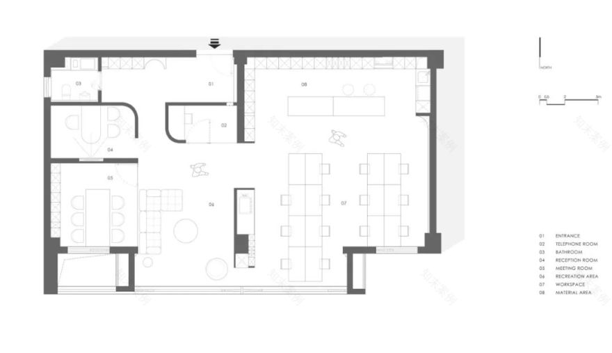
办公区域通过序列空间的组织,是以满足办公区域空间的各种功能为前提,通过重复中的变化来丰富形式的细节,以开合、急缓、松紧等节奏的配置形成空间序列。物料台和吧台一体化处理,天花柜体一体的黑白空间暗示了空间的分割,与办公区域区分开来。
The organization of the office area through the sequence space is based on the premise of satisfying the various functions of the office area space, enriching the details of the form through repeated changes, and forming the spatial sequence with the rhythmic configuration of opening and closing, rapid, tight, etc. The material counter and the bar counter are integrated, and the black and white space integrated with the ceiling cabinet implies the division of space and separates it from the office area.
06细部·Detail
线/Line
曲线表现出一种柔和的美,犹如女性般丰满、感性、轻快、柔和、流动等特征。曲线运用主要是为了打破直线空间与环境的分裂,通过柔和的曲线来过渡空间。
The curve expresses a kind of soft beauty, like a woman’s fullness, sensibility, lightness, softness, flow and other characteristics. The use of curves is mainly to break the division between the linear space and the environment, and to transition the space through soft curves.
结构剖析图
平面布置图
项目名称 | 知白设计研究室
项目地址 | 长沙复地星光天地
建筑面积 | 182㎡
设计时间 | 2020.10
完成时间 | 2021.04
空间设计 | 知白设计研究室
设计团队 | 周海飞,王子林,田静,况伟峰
灯光设计 | 石客照明
项目摄影 | Nantu 南图摄影
主要材料 | LA’BOBO 岩板,莫洛尼壁炉,沃伦系统窗,芬琳乳胶漆,梵品木饰面,IRON.PLUS 系统内门,黑色喷砂不锈钢,超白玻璃
家具品牌 | 锐驰,舒梵,奥卡姆拉,MAGIS,HAY
知白出自于《老子》,“知”意在知晓明了,“白”是一种状态,对事物追求的极致。白为无,白为有,白又是空,大白至简、大白无形。知白设计,从纯粹的空间出发,追求空间的本质,去掉不必要的元素,让必要元素凸显,用建筑的思维和艺术的角度来诠释空间的氛围。
知白设计|| Zhibai Design,正式成立于 2019 年,专注于室内空间的设计。我们追求极简、纯粹、物尽其用的设计理念,致力于最佳的空间规划方案以及完整的品牌战略方案,通过对空间的再创造提升设计的整体水准。我们重视设计的过程同时也同样在意施工最后的完成度。
针对设计,愿永葆一颗纯净之心。
喜叻空间研究|| 于喧哗之下,可安心自处
VGC 设计 | 中梁银川合能拾光印营销中心
李益中设计 |华润·大连湾国际社区营销中心
开戊设计|| 悦蓉東方营销中心企业联合招聘咨询
客服
消息
收藏
下载
最近


