查看完整案例


收藏

下载
源自五六十年代的「珊瑚色」,平衡了鲜明色彩的亮度与中性色的沉稳,以更感性的特质,带来舒适愉悦的视觉观感。当「珊瑚色」一跃出现在室内设计的语言中,可营造出温馨柔软的环境,赋予整个空间更具流动性的生命力。
The colour coral became popular in the 1950s and 60s, for its perfect representation of both vibrant and neutral qualities. With a more emotional touch, the colour coral brings visual comfort, and when used in the language of interior decoration, it creates a warm and soft environment, pouring streams of life into the whole space.
现象设计在为家具集合店 EatenByTigers 设计店铺空间时,就运用了这种色彩。
以家具空间为切入点,立足设计对每个人都非常重要的隐秘的「私人空间」,如何让人在进入店铺的瞬间就产生温暖放松的感受,同时激发好奇心和探索欲,是这次设计的重点。
XianXiang Design used coral for the curated furniture shop EatenByTigers, with the purpose to create a sense of private space which relaxes visitors as they set foot into the shop while letting out their curiosity towards the space.
愉悦人心的明亮
-Bright and cheerful-
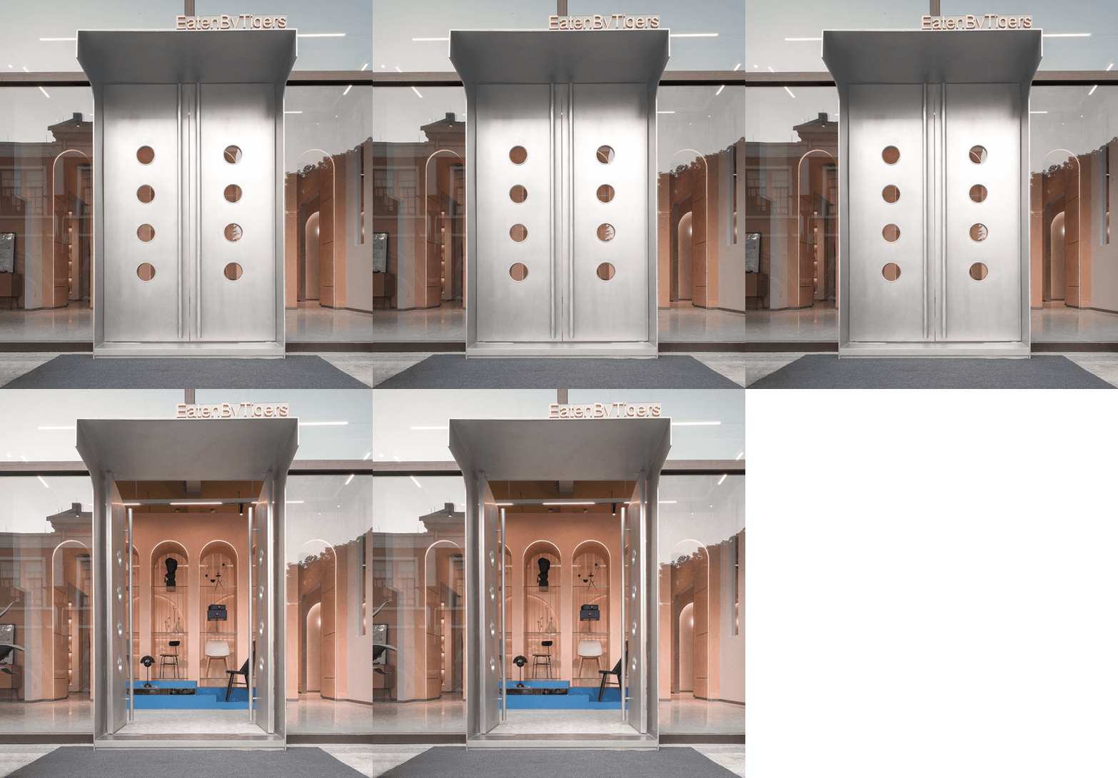
推开EatenByTigers的金属大门,入眼便是明亮的色块碰撞。整体空间设计上,采用了饱和度偏低的「珊瑚色」为主色调,让客人即刻被温柔的氛围包裹。
Behind the metal doors of EatenByTigers, one is welcomed by blocks of bright colours. Coral set the tone of the space, breathing softness and warmth towards the visitors.
现象设计将整体环境与产品色彩的协调配比考虑其中,使用少量蓝、绿色块,与设置其中的家具产品相互呼应,充满活力与美学上的趣味。
Colours of the products are orchestrated together with the overall space, as patches of blue and green echo with the products, putting together an aesthetics which is energetic and fun.
在不同层次「珊瑚色」手刮漆的映衬下,空间其他墙面应用了更简约的米色墙面漆,地面采用浅灰色大理石碎块水磨石。暖色与冷色互相中和,不同材质发生对话,丰富了空间的层次感。
Layers of hand scraped corals are decorated with beige walls and grey toned terrazzo floors. The warm and cold colours blends together with the different material qualities that enrich the space.
在严谨、丰富色彩配比中,加入了乱纹不锈钢金属带来平衡感。呈现中性、现代的设计风格。
The rigorously colour palette is given a final touch of wild grain stainless steel to balance out a modern, eclectic design style.
引人探索的空间动线
-A journey of discovery-
对商业店铺来说,引导顾客参观的空间动线往往是最重要的。EatenByTigers 对称的平面布局,分割为六个相对独立的空间,以拱门互相连接作为呼应形式。通过视角的变换以及不同产品的陈列,强调空间的「变化性」和「探索欲」。
For a business space, a well designed journey is vital. The symmetrical layout of the EatenByTigers space is divided into 6 independent modules, connected by arched gateways. Through shifted perspectives and displays of different product collections, the space is full of surprises for the curious minds.
追溯历史的多元风格
-After diverse historical styles-
无论是店铺的门面,还是空间中的连接点与陈列道具,现象设计在EatenByTigers的案例中都在不断强化「拱卷」这个代表欧洲古典建筑的元素。
From the shopfront, to connecting spaces and display props, XianXiang Design emphasized the arch element, a representative of classical European architecture.
流畅的圆弧线条与利落的空间划分,同样是元素对立又互补的体现。
「拱卷」是欧洲古典建筑的标志,恰好与店铺所售家具产品气质相符。
The clean lines that cut the spaces is yet another embodiment of the juxtaposition of opposite elements which complement each other. The choice of arch element speaks to the temperament of the furniture collections at the shop.
项目名称 |
Eaten By Tigers 家具集合店
项目位置 |
杭州520新天地
项目面积 |
约170㎡
主创设计 |
元立俊
设计团队 |
朱科润
施 工 方 |
杭州名淙装饰工程有限公司 许卫明
主要材料 |
手刮漆、水磨石、不锈钢、玻璃
摄 影 |
汪敏杰
Eaten By Tigers 家具集合店
图纸呈现
分析图
平面图
供稿 /
现象设计
Gooobrand
品牌设计
客服
消息
收藏
下载
最近


