查看完整案例


收藏

下载
叛逆在这不是一种否定,而是对周围环境的一种回应。
AD ARCHITECTURE designed an office for a Chinese clothing brand called JYC, which is located in Dalang Town, Dongguan, China. The design team defined the space as a “Rebel”, which doesn’t mean the negation of something but is a response to the surrounding environment.
空间是物质的光与影反推出来的虚幻结构,它不追随,而更在意自身的创造性与精神性,我们将其定义为「叛逆者」。
设计的开始,我们从空间自身的角度思考,借以形而上学在空间层面上,营造有意错乱的深景透视几何图式空间,由此衍伸办公空间的创造性与精神性。
The space is an “illusory structure” deduced from physical light and shadows. Rather than following conventions, the project emphasizes creative and spiritual attributes of the space. At the beginning of design phase, the designers tried to think from the perspective of the space itself and apply metaphysics to the interior design. In this way, they created a geometric space which seems to be disorderly and features a deep and perspective view, aiming to inject creativity and spirit into it.
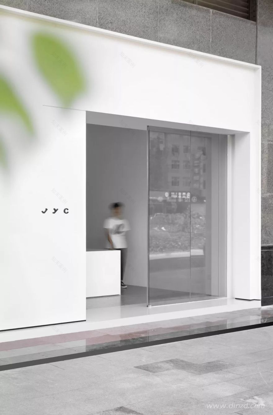
周边环境基地周边为喧闹杂乱的城市商业街区,位于东莞大朗镇的羊毛服装批发集散地。项目空间主要做为服装设计和销售办公使用。入口处白色立方体嵌入一个杂乱无序的建筑环境中,我们试图去重新建立秩序,引导出一种商业街区新形象。
The project is situated at a woolen clothes wholesale center, surrounded by a noisy and chaotic commercial block. The space serves for garments design, working and sales activities. At the entrance, a white cube was inserted into the disorderly architectural space, through which AD ARCHITECTURE hoped to rebuild spatial order and bring a new image to the commercial block.
总图区位
区位凸显
外立面
将功能空间以几何的形式组合在一起,一层为接待区,二层和三层为办公与会议及发布的功能性空间,通过虚实的楼梯将其串联。
Functional spaces are combined in a geometric manner and connected by the staircase. 1F is used for reception, while 2F and 3F serve for working, meetings and new products release.
形体分析
面对矩形狭长的平面,单跨结构的多层空间,我们将一个毫无装饰的巨大几何体量嵌入单一通高的门厅空间中,使空间张力得到重构。
The original space has a long and narrow rectangular plan as well as a single-span framework. AD ARCHITECTURE embedded a large unadorned geometric volume into the full-height foyer, which adds a sense of tension to the interior.
顶部灰色体块实则为办公室提供了额外的储藏空间,门厅与接待空间被无形划分,接待台后面灰色混凝土柱子得以保留,强调了空间的结构的同时丰富了空间的质感。
The gray block on the top provides additional storage space. The foyer and reception area are separated in a subtle way, and the gray concrete column that already existed is retained, which highlights the interior structure whilst enriching spatial textures.
一层空间
横向的白色体块兼顾前台接待台及水吧台,将门厅视线指向空间尽端的楼梯位置,相互交错,楼梯空间不再是单一的垂直交通,而变成空间中的焦点舞台,结构解放及齿形洞口让使用者与空间产生了有趣的对话。
The white block functions as a reception desk and a bar counter, and leads the sight line to move from the foyer to the rear staircase area. The staircase area provides a twisting circulation route and becomes a visual highlight in the space, with its flexible structures and openings allowing playful interaction between people and the space.
楼梯空间
空间细节
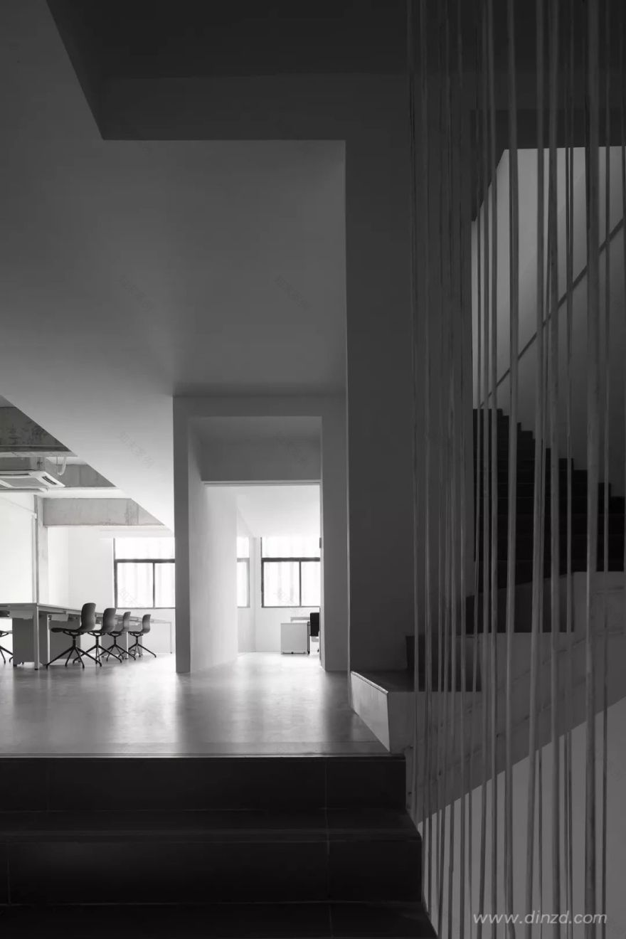
空间整体强调体量与尺度,在楼梯的处理上我们反推常理,黑白相间,让原本厚重的楼梯轻量化,有如一张折纸。
The overall spatial design emphasizes volume and scale. And the staircase alternates between black and white, which appears more lightweight, just like a piece of paper.
楼梯空间
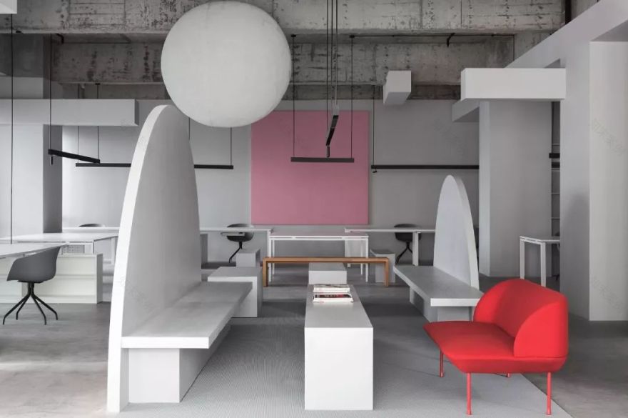
在办公区顶部通过天花形体虚实变化界定出休息区域,员工可以在此沟通交流及休息。
原始空间混凝土结构被有意解放,在紧凑的办公区域里营造一个舒适干净的环境。
In the working area, the ceiling presents varying shapes, either void or solid, which demarcates the resting space where the staff can communicate and have a break. The original concrete interior structure was “liberated”, so that a clean and comfortable environment was created in the compact workplace.
楼梯空间
二层办公空间
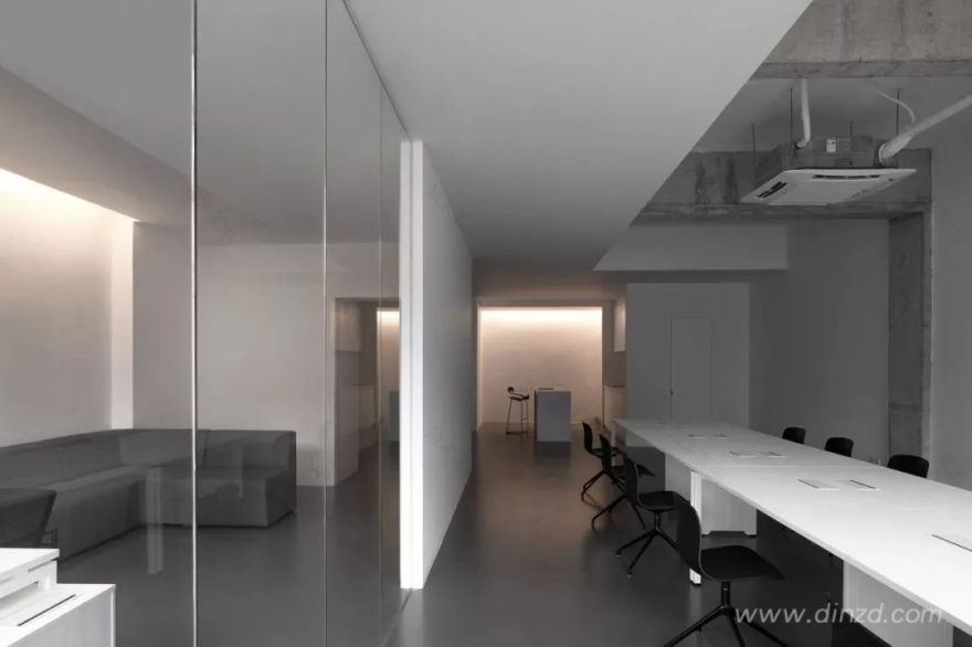
经理办公室只是透明玻璃隔断,空间中并不介入实体划分,意在营造开放、轻松的空间体验。
Apart from the manager’s office which is partitioned by transparent glass, there is no massive physical partitions within the space, which ensures an open and relaxing spatial atmosphere.
二层办公空间
水吧区是连接一二楼空间的重要角色,也是起到了引导人的行为的一个物体,整体氛围轻松舒适,软化了整体办公室的冰冷空气。
The bar area plays an important role in connecting 1F and 2F and is capable of guiding physical behaviors. With a cozy ambience, it softens and balances with the cool tone of the overall space.
空间细节
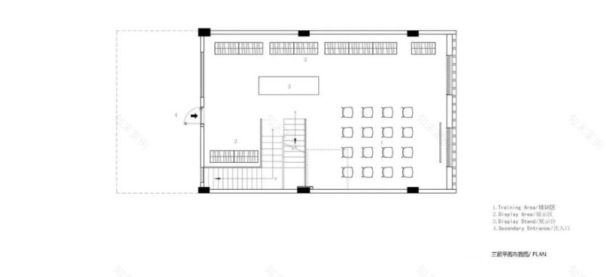
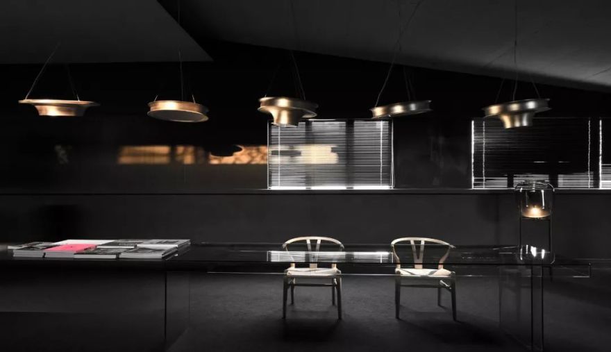
三层作为办公空间的发布主题展厅,留空让空间形式与可能产生最大的可能性,兼顾会议、产品发布、产品展示三大功能。
设计轻量化,强调功能与产品。
3F functions as a place for meetings as well as product release and display. The interior structure is open and lightweight, so as to provide more possibilities and highlight functionality and products.
三层多功能空间
实质上,空间功能与形体视觉呈现为交错的,混乱的。
通过对空间形体、设施和结构的重新整合,让空间实现自我演化,进而呈现有趣且富有张力的几何空间美学。
In fact, functions and visual impressions of the space are intermingled. Through recombining spatial forms, facilities and structures, AD ARCHITECTURE realized self-transformation of the space and further endowed it with a playful geometric aesthetic, which is full of tension.
空间细节
项目名称 | 叛逆者 JYC 服饰办公空间
Projectname | JYC Office
设计机构
Design firm |
总设计师 | 谢培河
Chiefdesigner | Xie Peihe
设计团队 | 艾克建筑
Design team | ADARCHITECTURE
项目地点 | 广东东莞
Projectlocation | Dongguan, Guangdong, China
建筑面积 | 400
Projectarea |400
主要材料 | 灰色砖、灰色地漆、白色乳胶漆、灰色乳胶漆、白色人造石
Mainmaterials | gray brick, gray floor paint, white/gray latex paint, white artificialstone
设计时间 | 2019 年 1 月
Starttime | January 2019
竣工时间 | 2019 年 08 月
Completiontime | August 2019
摄影师 | 欧阳云
Photography | OuyangYun
叛逆者 JYC 服饰办公空间图纸呈现
1F 平面图
2F 平面图
3F 平面图
叛逆者 JYC 服饰办公空间
公司介绍
谢培河,高级室内建筑师,AD ARCHITECTURE 创始人及总设计师,致力于室内建筑空间的创造及空间体验性的营造。设计从生活中来,提取感性的设计灵感与理性的设计手法,让每一个设计都从零开始,打破惯性的设计思维,让人感受每一个空间不同的体验与乐趣。AD ARCHITECTURE,成立于 2015 年,以共赢、共存、共识为理念。意在聚集有共同理念的设计人。组成一个富有协作精神的设计团队,发展本土设计事业。主要业务内容包含建筑设计、室内设计、软装设计。专注于豪宅、售楼处、办公、会所、公共空间。以专业的立场、创新的设计理念,致力为市场提供高水平的建筑及室内设计专业作品 AD ARCHITECTURE,力图让自己创造出更多富有创造力以及关心到人的作品。
AD ARCHITECTURE
案例推荐
X 游戏 形色界办公室
AD 艾克建筑办公室
供稿/AD ARCHITECTURE 艾克建筑设计
Gooobrand
品牌设计


