查看完整案例


收藏

下载
▲ 点击蓝字“
知行Design
知.鉴赏
【
新作-极简艺术 时尚大气|办公室
】
|知停.而行|
作为深圳万科首个定位汇聚“高端金融+科技企业总部”的超甲级写字楼产品,滨海云中心位于深圳福田CBD核心商务区,荣集大空港、口岸、地铁、高速路、汽车、高铁交通枢纽等多维路网于一体,坐拥一线海景资源。
As the first super grade office product positioned by shenzhen vanke to gather "high-end finance + technology enterprise headquarters", binhai cloud center is located in the core business district of futian CBD, shenzhen. It integrates the multi-dimensional road networks such as airport, port, subway, highway, automobile and high-speed rail transportation hub, and boasts first-line sea view resources.
AG汇创设计团队接受委托对其招商办公展厅进行空间设计,故从项目起始到落成,设计师一直在试图回答两个问题:一是如何平衡企业展厅招商展示与专业办公空间使用的双重需求;二是如何帮助企业实现产品高溢价的同时成为具备“城市办公标志新名片”的潜力。
AG huichuang design team accepted the commission to design the space of its investment office exhibition hall, so from the beginning to the completion of the project, the designer has been trying to answer two questions: one is how to balance the dual needs of investment exhibition exhibition of the enterprise exhibition hall and the use of professional office space; Second, how to help enterprises achieve high product premium while becoming a "new business card of urban office signs" potential.
故在空间布局与动线设计的考量上,为平衡办公与展厅双重需求,满足商务接待、智能办公及休闲洽谈功能,设计师将整个场地视为一个可游走的空间系统,不管是服务台、沙盘区,多功能办公区、还是休闲洽谈区,会议区等都具有一定的平面构成感,既相互独立而又互相连贯,满足在有限空间中实现功能复合的概念。同时秉持环保生态设计理念,尊重环境的本真馈赠,通过实体墙柱和透明的玻璃围合设计,以最大尺度对湾区进行场景化定格,将绝美风光引入室内。
So on spatial layout and line design considerations, to balance the dual needs, office and showroom to meet business reception, intelligent office and leisure functions, designers will be the site as a system of space, whether it's the front desk, sand area, multi-functional office, or leisure area, meeting area and so on all have a certain sense, planar is both independent and coherent with each other, meet in a limited space to achieve the concept of functional composite. At the same time, adhering to the concept of environmental protection and ecological design, respecting the real gift of the environment, through the solid wall column and transparent glass enclosure design, the scene of the bay area is frozen at the maximum scale, and the most beautiful scenery is introduced into the interior.
进入空间,随动线而行,服务台背景墙上宛若银河点点射灯的铺散,在空间与游动的白色天花造型形成点线面呼应。
Into the space, with the line line, the service desk background wall like the Milky Way little lights spread, in the space and swimming white ceiling form a point line surface echo.
左侧沙盘区特设项目区域背景墙及品牌广告联播演示,在侧重客户体验互动的同时彰显着企业品牌实力。
The special project background wall and brand advertising joint broadcast demonstration in the left sand table area highlight the brand strength of the enterprise while focusing on customer experience and interaction.
右侧办公功能展示区前端的Tiffany蓝艺术玻璃屏风则为空间做了一个视觉聚焦及引导着动线行进。
Tiffany blue art glass screen at the front of the office function exhibition area on the right side provides a visual focus for the space and guides the moving line.
多功能办公及休闲洽谈区将45°角呈现云端湾景的极佳视野尽收眼底,再一次营造了空间的连续与景观互动上的协调连贯。
Multifunction office and leisure discussion area will be 45 ° Angle presents the cloud bay scenery panoramic view of excellent vision, once again, build the space of continuous landscape interactive coordination and coherence.
水吧台设于空间90°转角处是设计师的巧思之一,它极大的减弱了转角对空间的影响,增加了空间尺度感与自由度,成功解决了原建筑空间进深较小的问题;而随着光影尽呈波光粼粼之态的浅色不锈钢水吧背景墙,使空间界面互为穿插与延伸,形成丰富而递进的空间场景。
Water in space 90 ° corner is one of the designers think of opportunely, it greatly weakens the influence of the Angle of space, increase the sense of space scale and the degree of freedom, successfully solved the problem of the original architectural space depth smaller; The light color stainless steel water bar background wall with sparkling light and shadow makes the space interface interpenetration and extension to each other, forming a rich and progressive space scene.
会议区固有立柱顶加纤细灯带,则很好的打破其厚重的体量感,将空间整体关系消化缓和到一个舒适的体验中。
Meeting area inherent column top adds fine lamp belt, break its massiness volume feeling very well, will dimensional whole relation is digested moderate in a comfortable experience.
随着公区向董事办公区域的延伸,空间用色及家具也渐趋沉稳,自然而然的区分了空间性质,使整个空间无论从色彩还是功能性质上,都层次分明。
Along with the extension of the public area to the director's office area, the space color and furniture also gradually become calm, naturally distinguish the space nature, make the whole space no matter from the color or functional nature, are distinct.
在设计选材上,设计师则力求物尽其用,用统一而纯粹的材料把“用”发挥到极致。当极简的白色亚克力天花在波澜起伏的造型下,透过玻璃捕捉光的温度;当高级灰不再作为奢华的唯一表达,而是尝试以丰富肌理感来呈现;当以绢丝绸带为意向镶嵌的Tiffany蓝艺术玻璃屏风如灵动的宝石游走于空间,平衡空间未来感中的一抹“温暖”;当几何面料的沙发,灰色的地毯和镜面不锈钢的茶几,形成有趣又充满现代酷感的软式搭配组合的围合。一切浮现的简约未来、轻盈灵动与温润质感,正是这个空间打动人心的所在。
On design select material, stylist makes every effort to make the best use of everything, with unified and dinkum material "with" develop acme. When the minimalist white acrylic ceiling in the ups and downs of the shape, through the glass to capture the temperature of light; When the advanced grey is no longer the only expression of luxury, but to try to enrich the texture of the presentation; When the Tiffany blue art glass screen set with silk ribbon as the intention moves in the space like a smart gem, it balances the "warmth" in the future sense of space. When the sofa of geometrical fabrics, gray carpet and tea table of lens face stainless steel, form interesting the circle that the soft type tie-in combination that is full of contemporary and cool feeling again closes. The concise future that all emerge, lightsome and clever with wen run simple sense, it is this space moves the place of popular feeling.
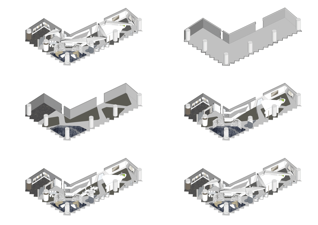
△ 分析图
△
平面图
项目地址|中国·深圳
开 发 商|万科集团
建成时间|2019年
项目面积|400㎡
项目类型|办公展厅
主要选材| GRG、白色乳胶漆、白色铝条、深色铝板、浅色不锈钢、银色镜面不锈钢
设计单位| 香港汇创国际建筑设计有限公司
(Atelier Global)
设计主创| 吕达文
设计团队| 蔡超、潘兆峰、蓝伟良、钟英豪
【
知停.而行
】
不断探索|不断进步
原我们的分享可以帮助您
知行编辑|版权归原作者


