查看完整案例


收藏

下载

翻译
Architects :Wand Works Architecture
Area :85 m²
Year :2022
Photographs :Egemen Karakaya
Manufacturers : Ikea, VitrAIkea
Architectural Design :Ayse Aybuke Samast, Damla Pınar Çelik
City : Bursa
Country : Turkey
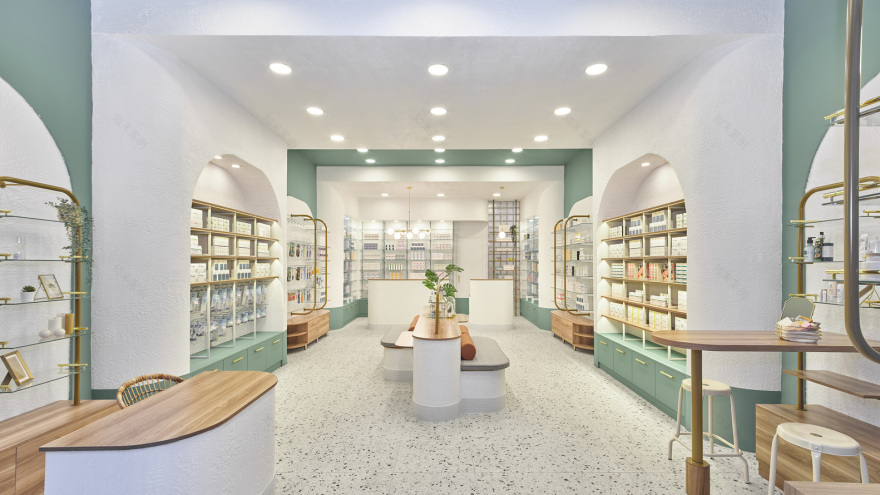
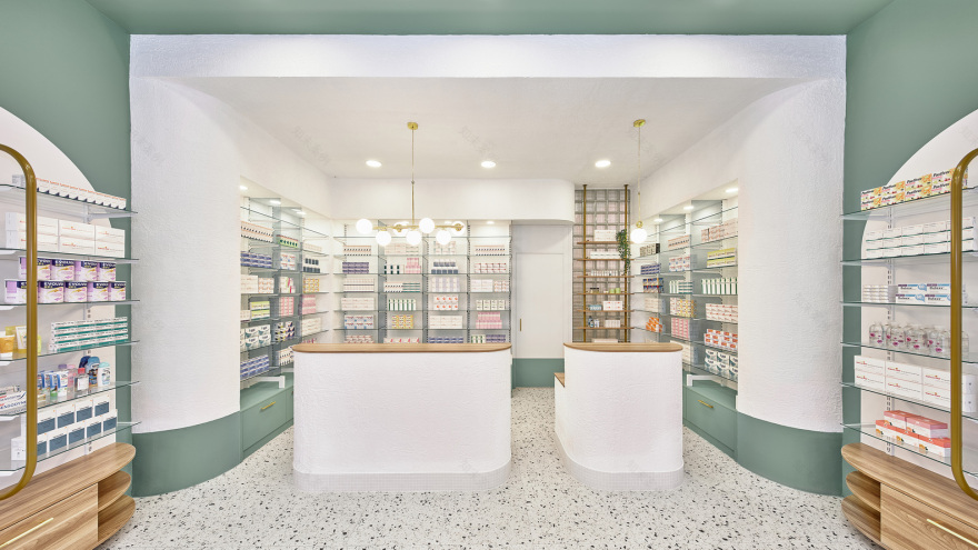
A feeling beyond the hygienic whiteness of medical spaces was targeted in the design of the K Pharmacy. The design process is built upon a concept of wellness. Design guided by the motivation of being well, feeling well, and investing in your own wellness is composed of cozy, soft, and natural forms and materials. The holistic approach to health, including physical, psychological, and sociological health, becomes widespread in public during pandemics. Total space of 85 m2 is divided into two parts display space (65 m2) and service spaces (20 m2).
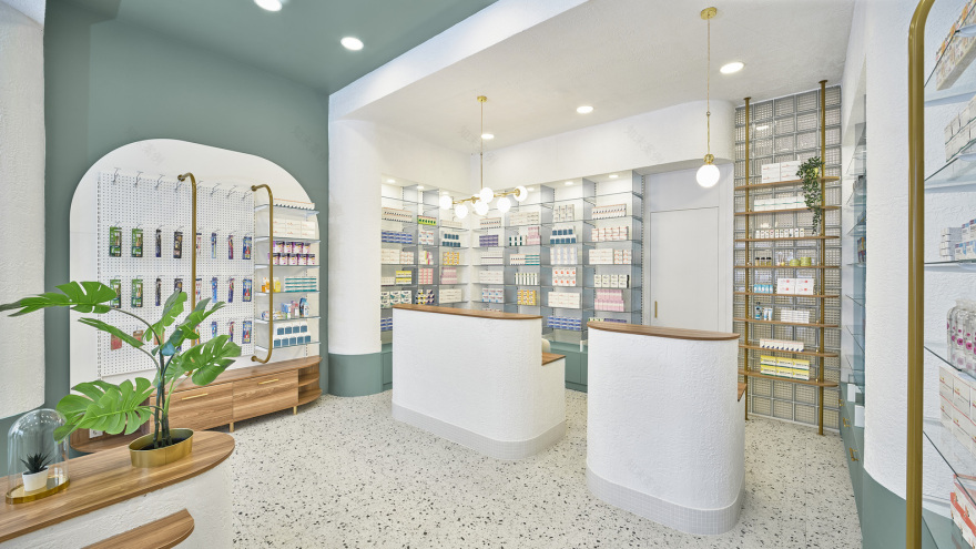
The display area is designed to be spacious to let the customers comfortably examine products and encounter locals socializing while waiting. To serve this purpose a central module which is consisted of low-height display surfaces and seating units is placed at the very heart of the space. Volume within the module is utilized as storage space. Strips created through the usage of niches and alternating colors provide categorization of the products as well as develop the aesthetics.
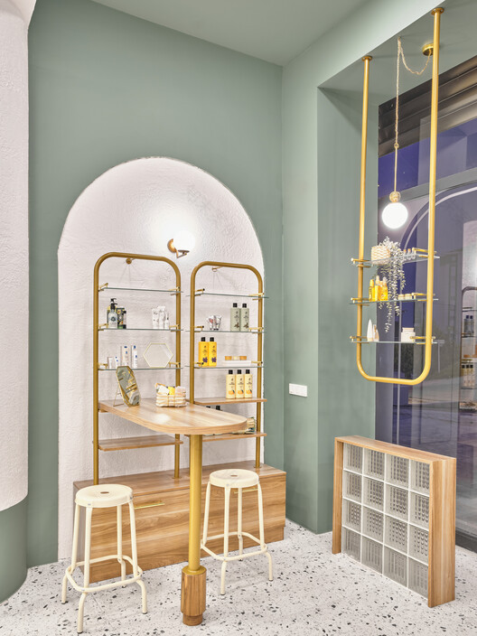
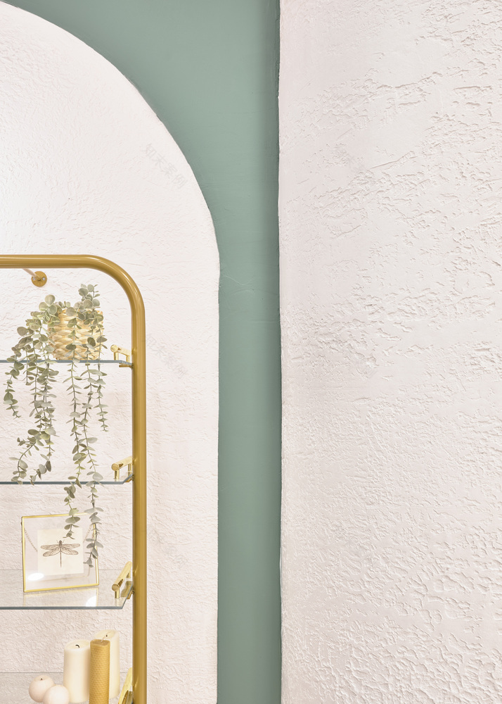
With the inspiration gained from the client, the Pharmacist, a space that makes someone feel welcomed and warm as in some herbal tea and ginger-lemon honey is freshly made for you not like you are in an anonymous futuristic lab environment of white lights, shiny surfaces, sharp angles. Design goals are reached through nature-attributing colors, textures, and forms. Through a balanced combination of pastel green used next to white, textured surfaces neighboring smooth ones, shiny elements as metal and glass over dominant opaque wood and gypsum surfaces desired concept is reached.
▼项目更多图片
客服
消息
收藏
下载
最近


