查看完整案例

收藏

下载

翻译
The owners had begun this project’s story, a
In this context, we received the first inquiry asking “what do you think about the design?” and so our joint journey began in 2017, when the clients finally gathered their courage and were willing to entrust us with the design of the entire apartment, except for bathrooms, which they did not want to change.
We have to honestly admit that the first round of designs, although stylish, did not meet their expectations. But thanks to our joint dialogue and willingness, we finally understood each other better, and thanks to being given another chance, we prepared an interior design for the second round, which they liked and which fulfilled their visions.
However, we did not have an easy task, we had to stick to a certain budget and we literally thought about each item. In addition, the interior matched the clients, as their style and vision were very sensitive to detail. As part of a joint process, we worked together as we went along to solve various alternatives, variants and changes.
Due to certain reasons, the project was dormant for several months and we returned to it in 2019, when we started a physical reconstruction in September, which lasted an active 7 months and of which 4 months were spent on “construction work”.
It was necessary to structurally clean and replace the basic surfaces and materials that were used in the interior, which pertained to the floor, stairs, layout and radiator type in the kitchen. We also structurally modified the appearance of plasterboard ceilings, a partition in the space above the kitchen, and thanks to the extended partition in the living space, we further separated the TV wall from the kitchen and dining area. We then applied brick cladding to this wall.
For the floor, we chose vinyl flooring with a hard underlay and used the glue-down installation method. At the end of the living room and the “chill zone”, we levelled the step, which was originally divided into several segments. We completely unified the entire floor of the apartment, except for the bathrooms, where the original tiles remained.
We didn't want to change the existing non-rebated door, but the door had American walnut veneer, which did not fit with the design concept at all. In addition, we were looking for an atypical brick colour for the door from the living room to the bedroom, so that the shade matched the adjacent brick cladding. However, at the same time, we wanted the same door in the bedroom to be white, so we decided to cover the door with a special foil, thanks to which we were able to have different colors on the door and use our original colors. We also replaced the door fittings.
From the beginning, the clients loved the colors and wanted to have a colorful and cheerful interior. Therefore, we were not afraid to also use colors on switches and sockets, and the Katy-Paty company was a great help with these.
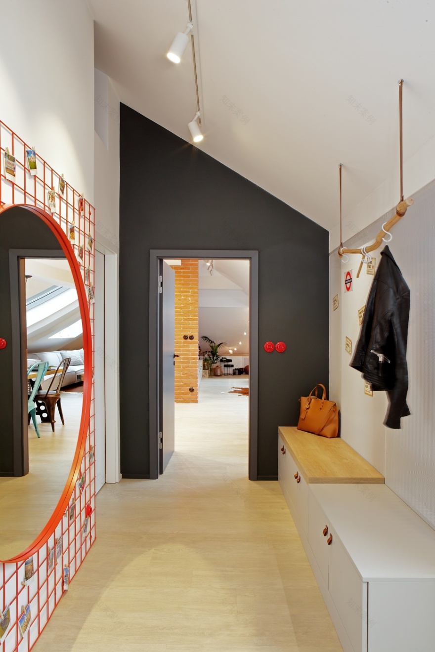
The clients are passionate travelers and cyclists; they like natural materials and the already mentioned colors. They like a playful approach to the interior, various accessories and decorations. That's why we placed a big red mirror on a welded wire mesh in the hallway and hung polaroid photos from their travels there using pegs. This is also why various blocks of wood, branches and natural leather are used in the apartment.
The approach to the layout of the hallway was quite revolutionary for the clients as we created a partition in the original entrance room. In front of the partition there is enough space for the arrival, handling and storage of ordinary things, behind it there is an ample storage space with wardrobes and also space for bicycles.
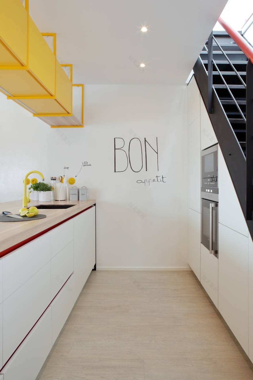
The layout of the kitchen meant another significant change for the clients, as we changed an L-shaped kitchen with a free-standing island into two parallel blocks. One tall block is under the stairs with a washing machine and an island. The island includes the washing and cooking part and we extended it into a length similar to the staircase behind it.
We feel the cover for the boiler created a great aesthetic effect, originally it was bare and the clients could see it and didn’t know how to cover it neatly. We placed it in a hidden niche in the wall, which is covered with vinyl so that the vinyl continues onto the floor.
We renovated the staircase by varnishing most of the original steps black, underlaid the staircase with a blackboard, which covers the kitchen under it and painted the handrail on the railing with red according to the clients' wishes. The same red colour was used in the recessed profiles in the kitchen.
Another major change was made in the bedroom, which previously had problems with storage space. Originally, the clients had free-standing wardrobes around the bed. Instead of these, we created a compact storage space along the walls that optically “calmed” the entire room.
For us, this project is a nice example that even though this interior is not in the primary style of our studio, we were able to find a solution and understand the clients. At the same time, we feel deep gratitude that, despite a stumble at the beginning, we were able to reach a very positive ending;).
客服
消息
收藏
下载
最近


