查看完整案例


收藏

下载
建筑事务所GROUP A近日完成了对阿姆斯特丹Oostlijn(东线)地铁站的更新改造项目。该项目包括5座地下地铁站和11座地上地铁站。Oostlijn地铁线从中央火车站(Central Station)发车,一路开往阿姆斯特丹的东南自治区(Amsterdam Zuidoost),沿线的路程部分位于地下,部分位于地面之上。该铁路沿线的地铁站建于70年代,是标志性的粗野主义风格的建筑。
Architectural studio GROUP A has recently completed renovating the Oostlijn (East bound Line) of the Amsterdam Metro. The project includes 5 underground and 11 above ground stations. The Oostlijn runs from the Central Station to Amsterdam Zuidoost, partially underground and partially elevated above ground. It was built in the seventies in a signature brutalist style.
▼地铁站外观,the exterior view of the metro station
自建成以来,经过多年的使用,原建筑的架构逐渐变得混乱。由于后续的改造,这条地铁线的特性渐渐消失了。乘客开始抱怨在地铁上缺乏安全感和舒适感,同时,脏乱差的地铁环境也使人感到不适。因此,地铁运营商迫切地需要一个新的发展战略,从而为寻路、广告、售票和各种商业标语提供全新的空间。此外,目前的逃生通道太过于狭窄,且缺乏适当的排烟系统。简而言之,这些站台已经不再具备服务于未来生活的能力了。建筑事务所GROUP A立足于增强社会安全性、舒适性和特性的目标,进行本次设计。他们的目标是创建一个现代化的地铁系统,该系统应当具备完备的功能、清晰的空间结构组织和舒适愉悦的空间氛围。建筑师希望能够在现有地铁系统的基础上实现这个目标,而不是全盘否认现在的粗野主义建筑、甚至是强硬地将其拆除。
Over the years, the clarity of the original architecture had become muddled. The line’s identity faded because of subsequent modifications. Passengers complained of a lack of safety, comfort and overall smudginess. The metro operator was in desperate need of a clear strategy regarding wayfinding, advertisement, ticket vending and commercial signage. Escape routes were too narrow and a proper smoke exhaust was lacking. In short, the stations were no longer equipped to face the future. GROUP A developed a design vision, based on enhancing social security, comfort and identity. Their aim was to create a modern metro system which functions adequately, is comprehensibly organised, and pleasant to use. The architects proposed to achieve this without denying the brutalist DNA of the metro line or even demolish it. But instead build upon it.
▼地铁站入口,采用大面积的玻璃,使用釉面砖拼贴出站名,the entrance of the metro station with the large glass, using the wall tiles to indicate the name of the station
所有的16座地铁站点都各不相同,因此,建筑事务所GROUP A首先将设计目标转变为了一个常规设计,这包括了一系列通用的非特定性干预措施,其中最为重要的是以下几点:
All 16 stations are different, so GROUP A first evolved the design vision into a Generic Design. This consisted of a set of general site unspecific design interventions, of which the most important are:
通透性 | Transparency
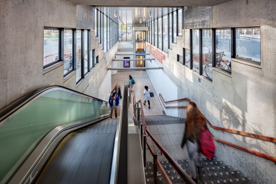
建筑事务所GROUP A通过在地铁站的入口附近创造一系列大规模的虚空间来增加其通透性。这种处理方式不仅能够使人们可以对整个空间的层次有一个比较概括性的认识和印象,同时还增强了乘客们的安全感。此外,这些虚空间还使得阳光能够照进车站大厅的深处,使室内空间与外部环境更好地结合。
GROUP A added transparency to the stations by creating large voids near the entrances. This creates overview between different levels and enlarges the passengers’ feeling of safety. It also brings daylight deeper into the station halls which allows for natural orientation.
▼地铁站入口,创造大规模的虚空间来增加其通透性,the entrance of the metro station, adding the transparency to the stations by creating large voids near the entrances
特性 | Identity
建筑师将图案和站名融进了墙砖的模块化系统中,从而创建出Oostlijn地铁线所特有的“字母表”。这个生动的图案化表面赋予了Oostlijn地铁线一种特性,同时也加强了其整体感。
Patterns and stations names were designed in the modular system of the wall tiles to create an Oostlijn specific “alphabet”. This graphical layer binds and strengthens the Oostlijn’s overall identity.
▼地铁站入口,将站名融进了墙砖的模块化系统中,the entrance of the metro station, stations names are designed in the modular system of the wall tiles
▼地铁站入口,通过釉面砖在墙壁上拼贴出特有的图案,the entrance of the metro station, using the glaze tiles to form the specific pattern on the wall
集群 | Clusters
所有的寻路、广告和自动售票系统都集中在车站的中心位置,这里光线充足且易于辨认和到达。这些集群都是在模块化设计的基础上发展出来的,从而便于维护和适应未来的变化。
All wayfinding, advertisement and ticket vending elements are clustered on central locations, well lit and instantly visible. The clusters are based on a modular design – easy to maintain and accommodate future changes.
▼地铁站入口,设有广告设施,the entrance of the metro station with the advertisement
干净的地面系统 | Clean Floor
建筑师将所有的集群元素都整合在墙壁中,不惜一切代价来保持地面系统的干净整洁。
The clusters are integrated into the walls, to keep the floors clean at all cost.
▼地铁站入口,地面系统干净整洁,the entrance of the metro station with clean floors
间接照明 | Indirect Lighting
墙体和天花板上的定点照明系统突出了原始站台的空间质量。对于那些位于地面之上、具有非常高的混凝土天花板的地铁站,建筑师设计了一个由点状照明灯、摄像头和扬声器组成的光带。
Wall and ceiling directed spots emphasize the spatial qualities of the original stations. For the above ground stations, with very high concrete ceilings, the architects designed a lightline with light spots, cameras and speakers integrated.
▼地铁站入口,设置由天窗和点状照明灯组成的光带,the entrance of the metro station with a lightline with skylights and light spots
▼地铁站入口,设置由天窗、摄像头和扬声器组成的光带,the entrance of the metro station with a lightline with skylights, cameras and speakers integrated
颜色 | Colour
地铁站空间以单色调为基础,战略性地使用颜色。除了寻路系统外,颜色仅用于强调某些需要乘客特殊注意的空间点,如入口、自助售票处、信息问询处和垂直交通点等。
Starting from a monochromatic basis, the colour was used strategically. Apart from the wayfinding, colour is used solely to emphasize points in space that require the passengers’ attention: entrances, ticket vending, information and vertical connections.
▼地铁进站口,使用彩色玻璃砖进行强调,the passenger entrance with the colorful glass blocks as an emphasis
▼自助售票处,使用颜色进行强调,using colors to emphasize the ticket vending
新材料 | New materials
为了与原始的混凝土表面形成对比,建筑事务所GROUP A在设计中使用了一系列新材料,如玻璃、硬木和釉面砖等。这些材料易于清洁,不仅丰富了空间,更为乘客们提供了一种舒适感。
In contrast to the original concrete surfaces, GROUP A added new materials like glass, hardwood and glazed tiles. Rich materials that are easy to clean and appeal to a sense of comfort.
▼地铁站站台,使用带图案的釉面砖,与原有的混凝土表面形成对比,the platform, using the glazed tiles to form patterns, in contrast to the original concrete surfaces
▼地铁站站台,使用混凝土作为两个方向的地铁站台的分隔,the platform in the metro station, using the concrete block as the separation of the metro platforms ahead for opposite directions
▼地铁站站台局部,白色釉面砖搭配着木色的休息座椅,partial platform view in the station with white glazed tiles and wood seatings
▼地铁站站台墙面细节,details of the wall of the platform
▼地铁站站台局部,围绕混凝土柱子设置木质座椅,partial platform view in the station, wood seatings are organized around the concrete column
该项目在预算有限且不中断每日通勤交通的情况下有条不紊地进行。经过近十年的努力,如今,Oostlijn地铁线已经再次成为了阿姆斯特丹境内一个充满特色的公共空间,它功能齐全,空间条理清晰,为乘客们提供了一种轻松愉悦的空间体验。此外,它还为该地铁线未来30年的发展奠定了良好的基础。
The project was carried out with limited budget and without interrupting daily commuter traffic. After almost ten years of hard work, the Oostlijn has now once more become a functional, comprehensible, and pleasant addition to public space in Amsterdam. A good basis for the next 30 years.
客服
消息
收藏
下载
最近


