查看完整案例


收藏

下载
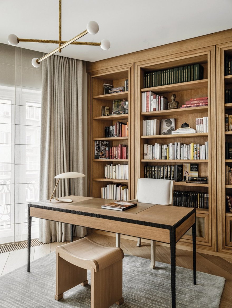
当设计师Natalia Abdurazakova和客户立即达成共识时,这是很好的:客户清楚地说出他想要的东西,设计师就立即拟定了这一个项目。然而,简单的方法并不总是正确的。Natalia认真听取客户的意见,但她也明白,有时客户可能也不知道自己还想要什么。这就是创意元素的作用,最终令人钦佩,因为客户得到的东西甚至超过了他们的预期。
It's great when designer Natalia Abdurazakova and the client are on the same page immediately: the client clearly states what he wants, and the designer immediately sketches out a project. However, the easy way is not always the right way. Natalia listens to her clients carefully, but she also understands that sometimes they may not know what else they want. That's where the creative element comes in, and ultimately it's admirable, because the client gets even more than they bargained for.
Natalia Abdurazakova的新作作品Moscow Apartment内的空间设计,结果是完全不同的,主要是因为她为公寓带来了惊喜。除了最初的装修,Natalia在这个公寓内没有看到任何问题。有一个圆形的墙和一个有角度的入口,是可以利用一点。而当设计团队开始清除所有的装饰物时,他们发现有两扇窗户已经被封死了。
The results of Natalia Abdurazakova's new Moscow Apartment are completely different, mainly because of the surprises she brings to the Apartment. Aside from the initial renovations, Natalia didn't see any problems in the apartment. There is a rounded wall and an angled entrance that can be utilized a bit. When the design team started removing all the decorations, they found that two of the Windows had been boarded up.
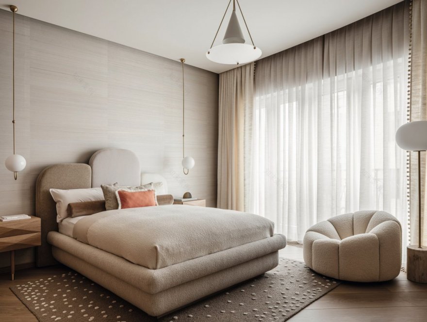
于是,他们把这两扇窗户都打开了:一个现在属于厨房,另一个已经成为主卧室里的一个可爱的落地窗。经过进一步检查,他们发现还有许多令人不快的地方。其中最大的问题是缺乏轴线:其余两根柱子不在隔板的轴线上,也不在窗户的轴线上。
So they opened both Windows: one is now in the kitchen, and the other is a lovely floor-to-ceiling window in the master bedroom. On further inspection, they found many unpalatable points. The biggest problem was the lack of axis: the remaining two columns were not on the axis of the partition, nor were they on the axis of the window.
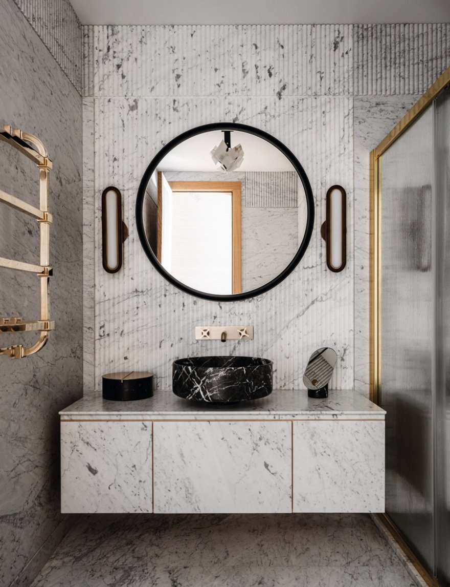
为了找到逻辑性、对称性和人体工程学,Natalia总共做了18种布局选择。当然,他们并不是完全独立的,但在私人和公共区域内有很多被重新安排。当十字形的走廊形成后,一切都齐了,这也激发了Natalia对大理石的折叠式布局:从一开始就采用的浅色墙面,但在灰色的莫斯科,真的想要的是温暖。所以她建议引入黄色,这与走廊地板上的金色玛瑙产生了无缝衔接。
In all, Natalia made 18 layout choices to find logic, symmetry and ergonomics. Of course, they are not completely independent, but many are rearranged in private and public areas. When the cross-shaped corridor was formed, it all came together, which inspired Natalia's fold-down marble layout: light colored walls from the beginning, but in gray Moscow, really wanted warmth. So she suggested the introduction of yellow, which works seamlessly with the golden agate on the corridor floor.
Interiors:NataliaAbdurazakova
Photos:MikhailLoskutov
Words:小鹿
客服
消息
收藏
下载
最近


