查看完整案例


收藏

下载

翻译
Deftly switching genres between residential, commercial and hospitality interiors, Sydney studio Alexander &CO have unveiled their refurbishment of Manly Wharf Bar (MWB) — the reimagining of the eponymous venue that’s resided in the Eastern corner of the jetty for the past 15 years. Developing upon the old sports bar and bistro, the project offers an entirely new feel to the venue via a replanned bar and kitchen experiences.
Inspired by its sister venue The Burleigh Pavilion on the Gold Coast of Queensland, MWB has decluttered the iconic Manly location in an effort to de-theme the wharf at large and its many tenancies which have become a themed pastiche over the years. It is a renovation and brand re-positioning of the old Manly Wharf Bar and Bistro within the same tenancy envelope, but with all new doors and windows, as well as exterior finishes and signage.
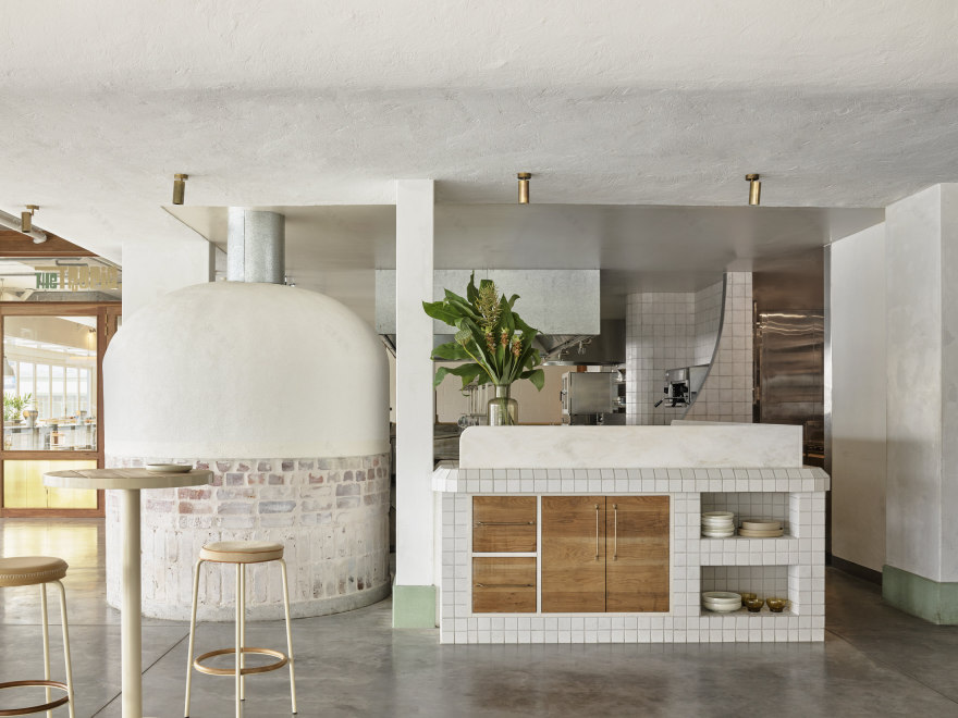
The project spans from the Eastern Sports bar to the Southern Tropic Restaurant with a private dining room and orientates around the central bars and open kitchen with a pizza oven.
“MWB is a worn back, worn away, and reclaimed coastal rumpus room—the venue feels part urban loft story, part sexy surfer,” explains the design team. “A mid-century warehouse above water, an integration of the Manly CBD with the slightest touch of residential DNA.”
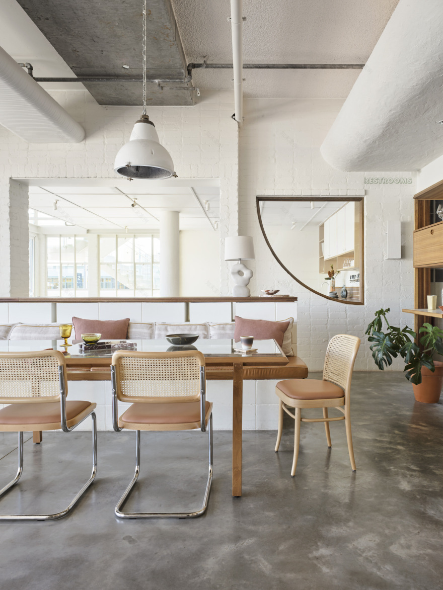
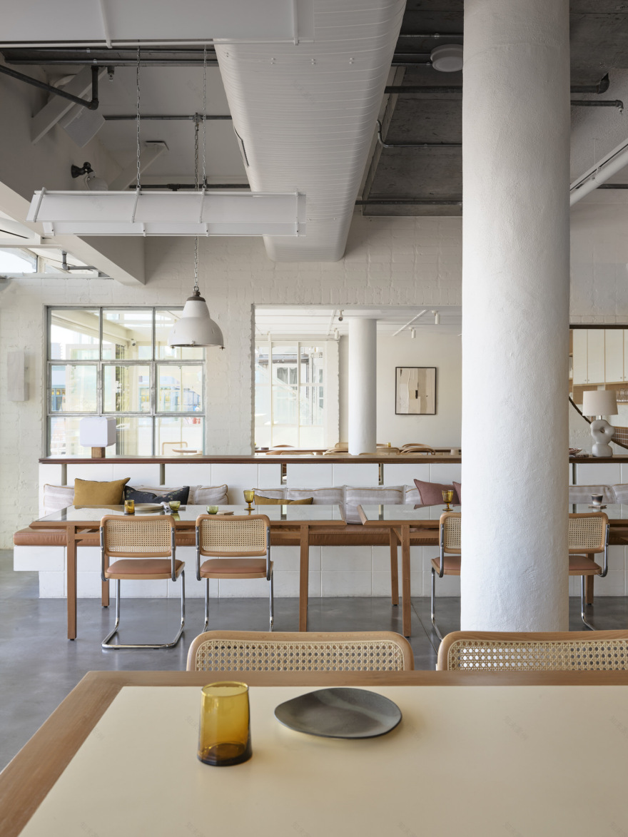
Danish furniture classics with bent chrome, timber and rattan sit against custom timber tabletops resting atop pink rammed-earth table bases. The private dining room loft feels part apartment, part private dining room and features a peach coloured Laminex kitchenette.
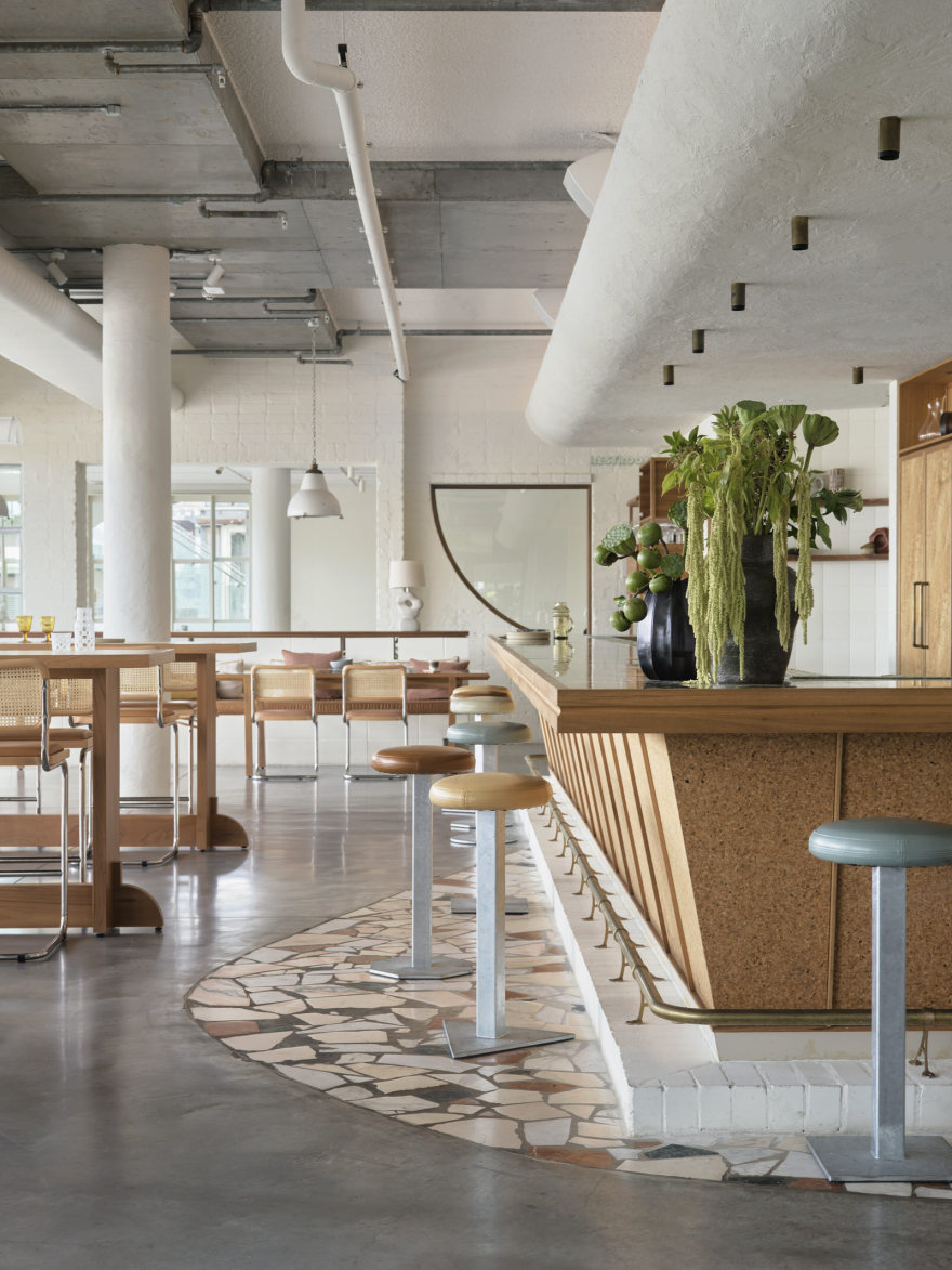
The restaurant and bar feature exposed and painted brickwork, glass blocks and textured render, open breeze block with a central glowing cork and brass bar. The interior offers a freshness, an easy sandy-feet vibe with enough detail and layers of materials to ensure the experience avoids ambivalence. It touches upon the mid-century—a theme of interest for the owner Ben May—while avoiding decoration in lieu of a more architectural slant.
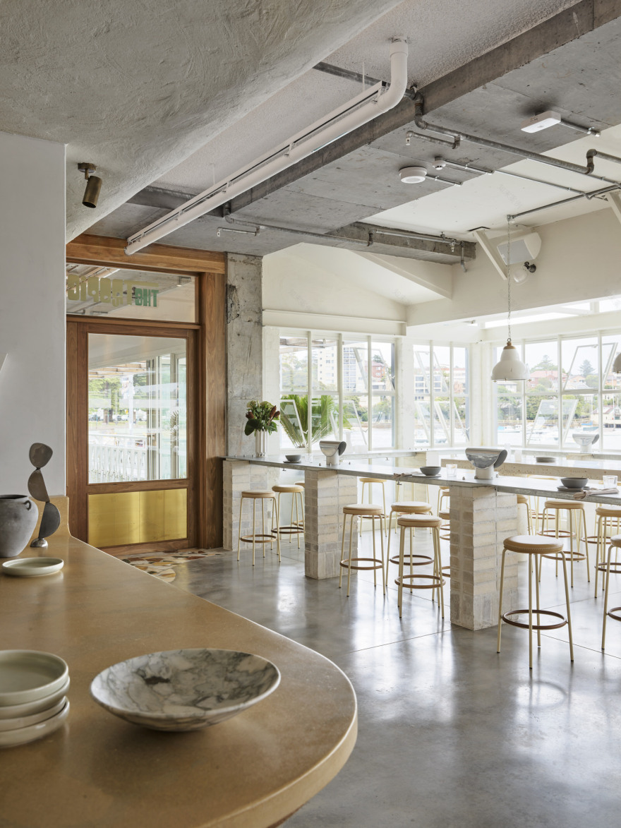
Curious and unexpected details like broken moments of terrazzo, galvanised steel tables and communal benches made from masonry waste find timelessness in the grain of the many imperfections from their handmade materiality.
“Like all our projects, less is more,” says the design team. “The purposeful decluttering of the tenancy fit-out is both an aim to return more experience for less work, but as much to reduce or remove the churn of fit-out work and position the business for its next 20 years with only the necessary new furniture and paint required to get it there.”
“Reduction is the cornerstone theme of our sustainable pillar, but the venue goes on to re-use various harvested masonry elements for its wall material, and reconstitutes masonry waste into bricks, table legs and bench surfaces,” concludes the team.
[Images courtesy of Alexander &CO. Editorial styling by Claire Delmar. Photography by Anson Smart.]
▼项目更多图片
客服
消息
收藏
下载
最近


