查看完整案例

收藏

下载
Biasol是一家提供全方位服务的创意设计咨询公司,专门为我们的客户制作室内装饰、建筑和产品。我们专注于交付良好的设计和质量保证,支持强大的技术知识在整个项目生命周期。
Biasol is a full-service creative design consultancy, specialising in crafting interiors, buildings and products for our clients. We focus on the delivery of sound design and quality assurance, supported by strong technical knowledge throughout a projects lifespan.
导演韦斯·安德森(Wes Anderson)独特的视觉风格让人一眼就能认出他的电影世界。这种独特的美学启发了我们在墨尔本卡尔顿的布达佩斯Café的设计,它遵循了布达佩斯Café在中国成都的成功和流行。受到安德森的布景设计方法的启发,墨尔本café是一个充满想象力和唤起回忆的空间,使用了非常规的元素和自然、大地的色彩,反映了当地的设计敏感性。
Filmmaker Wes Anderson’s cinematic world is instantly recognisable for his idiosyncratic visual style. This unique aesthetic inspired our design of The Budapest Café in Carlton, Melbourne, which follows the success and popularity of The Budapest Café in Chengdu, China. Inspired by Anderson’s approach to set design, the Melbourne café is an imaginative and evocative space with offbeat elements and a natural, earthy colour palette reflecting the local design sensibility.
安德森的电影令人难忘,充满魔力。他以对称、细节和一点透视而闻名,他通过异想天开的场景、生动的色彩和怀旧的情感创造了他的神话世界。在成都的布达佩斯酒店Café学习了他的风格后,我们为墨尔本酒店café发展了设计经验。利用我们对现代抽象艺术、设计和酒店服务的兴趣,我们通过对形式、功能和色彩的探索,创造了一种沉浸式的画廊式体验。
Anderson’s films are memorable and magical. He is renowned for symmetry, detail and one-point perspectives, and he creates his mythical worlds through whimsical sets, vivid colours and nostalgic sentiment. Having studied his style for The Budapest Café in Chengdu, we evolved the design experience for the Melbourne café. Drawing on our appetite for modern abstract art, design and hospitality, we created an immersive gallery-like experience through an exploration of form, function and colour.
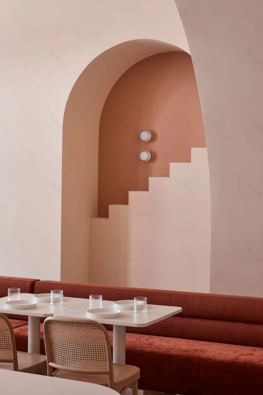
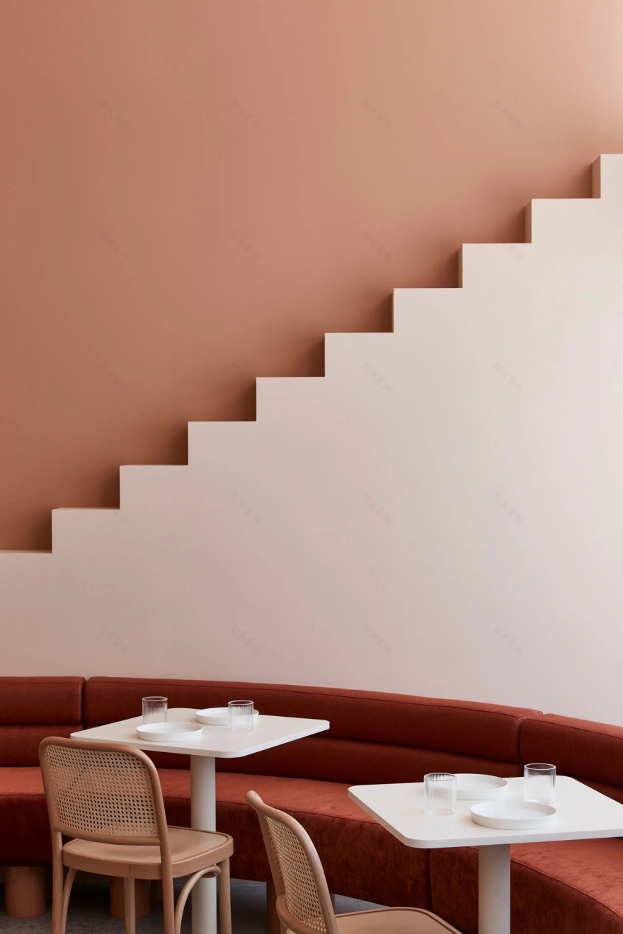
在设计元素上有一个更大胆的方法,同时仍然优化空间的最大容量。拱形的长凳环绕着两层高的空间,公共吧台穿过中心。一个隧道拱引导顾客深入café,并在末端设置了销售点柜台。后墙装饰着一条狭窄的楼梯,没有通向哪里的路。另一个楼梯同样在一个拱形的凹槽中,鼓励顾客参与设计,捕捉和分享古怪的、有风格的图像。
There is a bolder approach to the design elements, while still optimising the space to its fullest capacity. Arched-shaped banquette seating wraps around the front beneath a double-height space, with a communal bar table through the centre. A tunnelled arch leads patrons deeper into the café and frames the point-of-sale counter at the end. The back wall is adorned with a narrow stair leading nowhere. Another staircase is likewise framed in an arched recess, encouraging patrons to engage with the design and capture and share the quirky, stylised images.
最小化建筑形式使我们能够最大化色彩的影响。自然的泥土色调散发出温暖、纹理和个性,同时仍然与安德森的布达佩斯大饭店的粉色冰façade保持一致。使用调色板,我们发挥颜色的深度,以突出想象力的元素,并创造一个独特的二维感。较亮的色调,如沙色和米色,在前景上,而较暗的色调,如赤陶色和浅橙色,在背景上。铁锈红色的软垫增加了更多的颜色深度,而沿着柜台前面的油管有纹理和对比。
Minimising the built form allowed us to maximise the impact of colour. The natural earthy palette exudes warmth, texture and character, while still in keeping with the pink-iced façade of Anderson’s Grand Budapest Hotel. Using a tonal palette, we played with depths of colour to highlight fanciful elements and create a unique sense of two-dimensionality. Lighter hues, such as sand and beige, are on the foregrounds, and darker hues, such as terracotta and pale orange, are on the backgrounds. The banquettes upholstered in rust-red add even more depth of colour, while tubing along the front of the counter has texture and contrast.
成都的布达佩斯Cafés和墨尔本的布达佩斯Cafés是相同的作品,最新的场馆是一个成熟和复杂的演变。通过更丰富的色调和大胆的设计,新的café是永恒的和当代的墨尔本顾客,同时仍然提供轻松和放纵的氛围和好客的体验。
The Budapest Cafés in Chengdu and Melbourne are of the same oeuvre, with the latest venue being a mature and sophisticated evolution. With a richer palette and bolder design, the new café is timeless and contemporary for its Melbourne patrons, while still offering a relaxed and indulgent atmosphere and hospitality experience.
客服
消息
收藏
下载
最近


