查看完整案例


收藏

下载

翻译
Architects:Khosla Associates
Area :20000 ft²
Year :2019
Photographs :Shamanth Patil J
Manufacturers : Louis Poulsen, Grohe, Bharat Floorings, Living elements, Monier, WoodvilleLouis Poulsen
Architect In Charge : Sandeep Khosla, Amaresh Anand
Design Team Leader : Oommen Thomas
Architecture And Interior Design : Khosla Associates
Contractor : Clients In-House
Consultants : Clients In-House
Landscape Consultants : Prakrti Living Environment
Architecture : Khosla Associates
Interior Design : Khosla Associates
Country : India
Our client was the owner of one of South India’s largest printing and publishing houses and also a family of 2nd generation politicians. Along with his wife and three children they were a family of 5, but the requirement was to have close extended family visit often.
The site was on a serene hillock nestled in a clearing within 150 acres of dense coffee plantations. Our first impression was that of lush vertical trees with pepper vines growing on them and coffee plants beneath. There was an existing ancestral home on the site halfway through renovation, that needed to be re-imagined. There was also an existing temple built by the family 3 decades ago, a regular place of worship for the neighboring villagers. Both the ancestral home and the temple had an emotive connect for the village community as our clients had over generations cultivated a special bond with them. It was common-place for the home to feed a hundred villagers in a day and the temple to be their daily place of worship, so there was no boundary walls between the house and neighbors and the site was permeable.
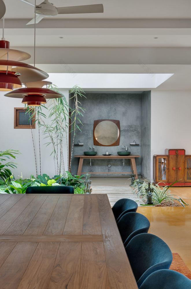
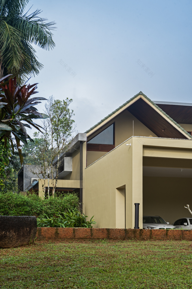
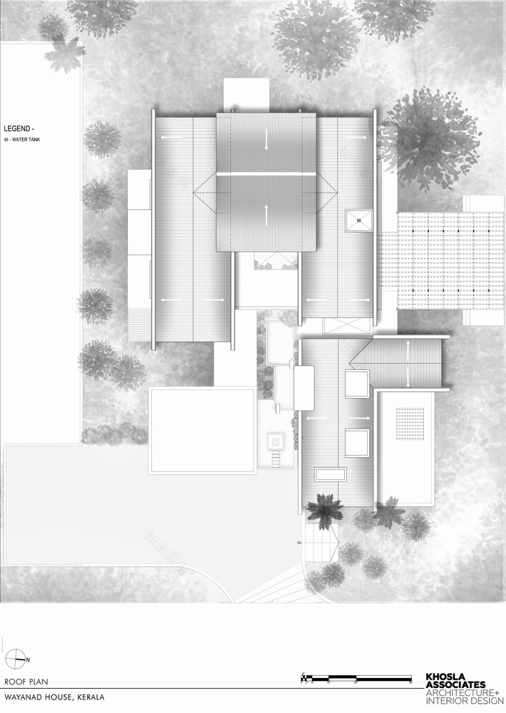
Our first impression was of a stunningly beautiful estate, the existing building however was far too bulky and the interior spaces were dark and inward looking. We inherited the basic form of two linear gabled roofs and decided to work and modify the same rather that demolishing it. Our interventions architecturally were largely in punctuating the house with skylights in strategic locations, changing the functions of certain spaces and opening the house more to the views. A crucial move was to introduce a large skylight-covered courtyard at the center of the house, allowing natural light and lush tropical planting to flow into the interior. This move transformed the interior experience, brightening up and bringing sunlight into a dark and humid space, while protecting it from rain.
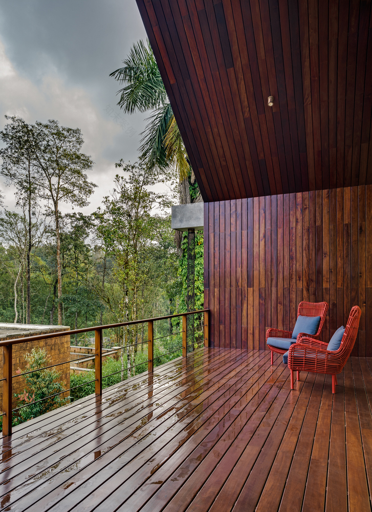
Wayanad is a hilly region and receives moderate to heavy rainfall for most of the year. We used several devices to protect the building from the rains and harsh summer sun. Wrap-around verandas on the lower floor, balconies on the first floor and ample overhangs on the roof, were all useful in this regard. The large sliding doors and windows were strategically placed so as to allow for the estate breezes to flow through every room in the house naturally ventilating it specially in humid conditions.
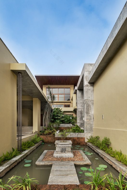
The living room towards north was expanded and opened up where there had previously been a bedroom. And we added a voluminous informal breakfast/dining space overlooking the estate where they had previously been staff quarters. An attic room was also added on the 2nd floor. The spatial layout of the ground floor consists largely of public areas. It includes an ample verandah at the entrance overlooking a cascading water feature and courtyards and verandas in the foyer to meet people visiting from the surrounding villages. It also includes the master bedroom as well as guest
bedrooms for the extended family when they visit. The upper floor has private spaces for the immediate family. It has 4 bedrooms, a lounge, a library and a Puja room. The clients father was a scholar and writer so the library houses an extensive collection of old and new books. The Pujari from the local temple performs a daily ritual in the Puja room at dusk.
The house is Indian in its soul and we intentionally chose an earthy color palette for the shell of the building. Yellow Jaiselmer stone, timber, kota stone, polished cement and local laterite complement the verdant surroundings. On the interior furniture, accessories and artwork we intentionally chose a more vibrant palette of blues, reds and fuchsias. A majority of the furniture was custom designed by us along with sourcing some accent refurbished Art Deco pieces. The main area rugs are all hand knotted in Sari Silk while other antique carpets act as accents. Contemporary Indian paintings and folk art adorn the walls and the living spaces house pieces sourced from antique markets in Old Kochi.
The landscape design played a crucial role in establishing a soft connection between the house and the existing forested landscape. It was designed to feel natural and unmanicured. Hardy and local species of planting were used, and the flow of rainwater through the site was preserved.
▼项目更多图片
客服
消息
收藏
下载
最近


