查看完整案例


收藏

下载

翻译
Architects:Taillandier Architectes Associés
Year :2019
Photographs :Luc Boegly
Manufacturers : AutoDesk, Terreal, Kawneer, Conjugaison, Gaggenau, Grantis & Matériau, Griesser, Martinelli Luce, SEAC, Turbo FonteAutoDesk
Lead Architects :Aurélie Guinel
Clients : Private client
City : Toulouse
Country : France
The project is located in the centre of Toulouse, in the Montplaisir neighbourhood, between the Canal du Midi and the botanical gardens of the Jardin des Plantes. Its proximity to the Radoub Basin, created in the 19th century between the canal and the railroad for the maintenance and repair of barges, puts the project in a protected historical monument zone.
The existing house, two stories plus an attic, was divided into 4 units that had fallen into a dilapidated state. It is characteristic of the regional typology: cornice, brick façade, double-pitched roof running parallel to the street, framed windows and doors, decorative roses above the openings. The aim of the project is to create an entirely new family home while preserving only the existing historic façade of this house type called the “Toulousaine”.
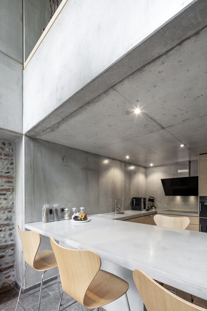
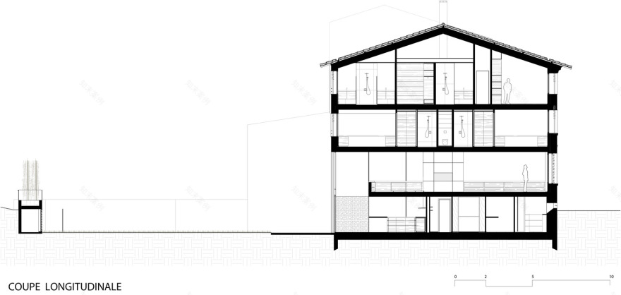
The new house is divided in two zones. The sleeping areas occupy the upper two floors, while the living and dining areas link the street level in the front to the lower garden level in the back. These zones function like two superposed duplexes, the “day duplex” and the “night duplex”. The “day duplex” is organized at garden level around a kitchen that opens onto a double-height space. Behind a door integrated in the kitchen cabinets, one finds service areas including the boiler room, dressing room, pantry, laundry room and cellar. The upper level of the “day duplex” consists of a single space functioning as living and dining room with a fireplace as a focal point. A balcony looks out over the double height space towards the kitchen and garden.
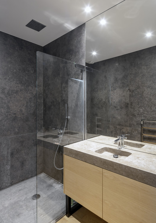
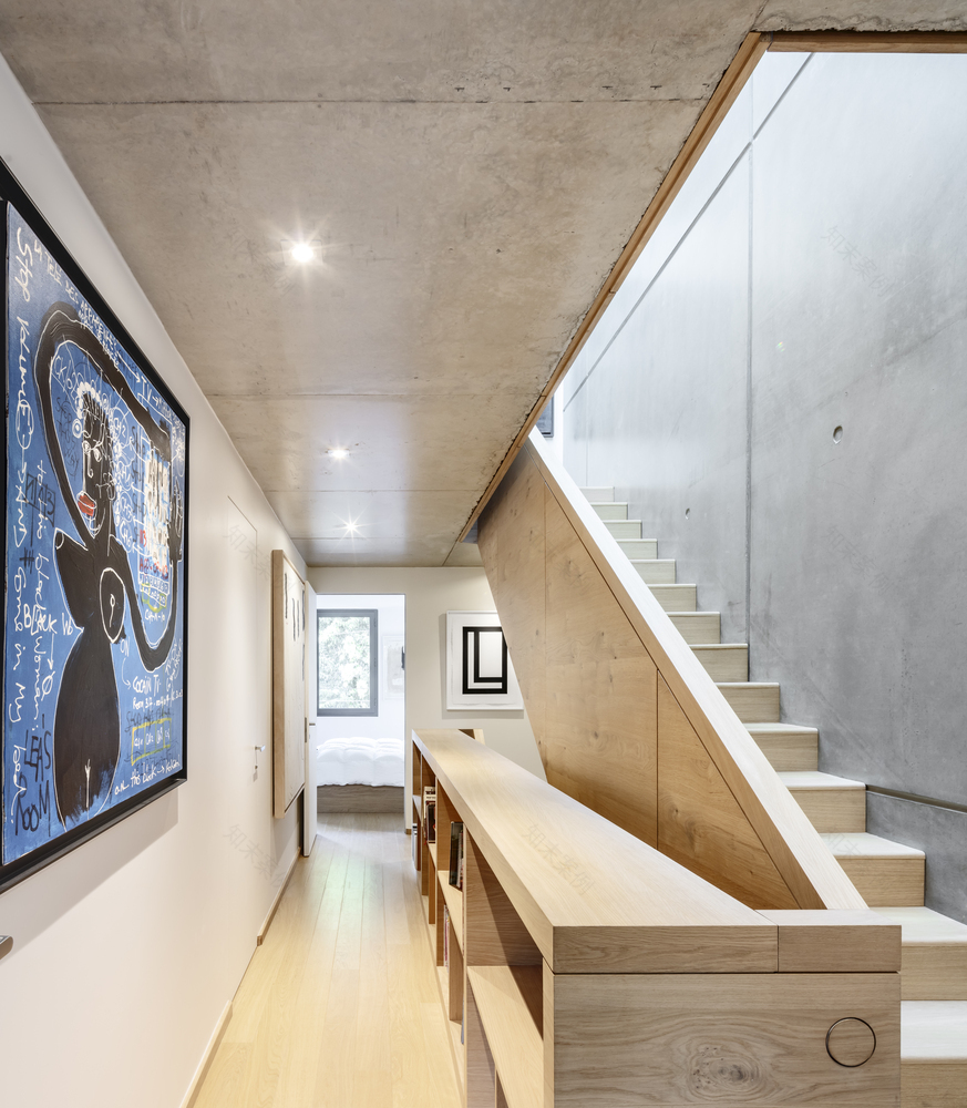
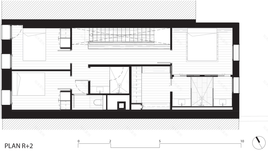
The “night duplex” consists of two children’s suites on its lower level, articulated around a library-hallway and a bathroom, and a master suite, guest room, and office on the upper level, tucked under the sloping roof. On the street side, the architectural intention is to establish a façade in harmony and continuity with the urban sequence of the rue du Japon. The roof and cornice heights are calibrated with those of the neighbouring houses. The existing cornice was even separated and raised to match the height of the neighbouring house to the right, which has a strong heritage character, unlike the house to the left.
The street façade is composed of straw-coloured brick. Its rich detailing is characteristic of the “Toulousaine” house typology. The existing moulding was renovated and rid of various parasites, like exposed electrical equipment that had appeared over time. The area of façade created between the preserved ground floor façade and the raised existing cornice is treated with sobriety and neutrality. It is clad in a straw-coloured brick identical to the existing façade. The vertical proportions of the new window openings closely follow the proportions and alignment of the existing condition. In reference to the neighbouring building, number 28bis, careful attention is paid to the metalwork: handrails, mobile brise-soleils, and air vents.
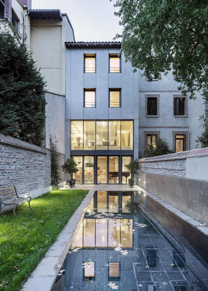
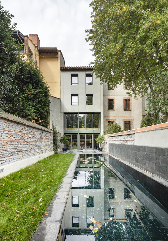
The garden side has a different, more intimate environment, with no neighbours overlooking it. The façade is treated contemporaneously. The lower levels open expansively to the outside thanks to a double-height curtain wall, which brings generous amounts of light into the “day duplex”. The stained concrete underside of the upper floor reflects the light further into the interior spaces. The upper part of the garden façade, in prefabricated concrete, retains the same rhythm of openings as the street façade.
On the inside of the house, the party walls are also built in prefabricated concrete, while the floors and stair are cast-in-place. Thanks to this thermal mass, the house does not need to be air conditioned. The skylights positioned above the stairwell can be opened during hot weather to create a “free cooling” effect. All of the windows are equipped with adjustable sun shades, allowing the house to be naturally kept cool.
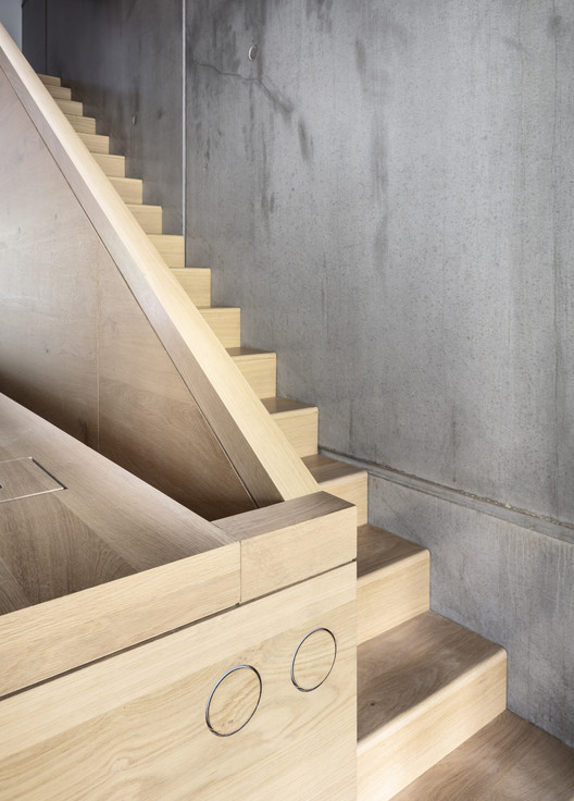
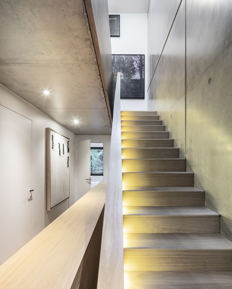
The layout of the prefabricated concrete panels and the boards used to form the poured concrete were carefully studied to align with interior millwork, including the fitted kitchen, the built-in bookshelf around the stairwell, the hearth, and the furnished walk-in closets. The joints are aligned between elements, whatever their material. The contrast between stained concrete and light oak emphasizes the dual nature of the house, between historic and contemporary expression, intimate and gallery-like spaces, public areas for living and socializing and intimate areas for sleeping. As a rule, the concrete walls are kept pure, without any added elements such as switches, light fixtures, or artwork.
The design refers to several classic threads of the architectural imagination, with its built-in library wrapping around the stair like the tower of knowledge of ancient Babylon, a 15-centimeter (6-inch) vertical reveal connecting all four levels. This stair creates a link between the sky, with its four skylights, and the ground, at garden level, while connecting and unifying all of the spaces and levels of the house. The stair also enables natural ventilation between the gardens all the way to the uppermost floor. A ramp linking the street-level entrance to the lower garden level is in part purely functional – it allows for bicycles and trash cans to be easily transported to and from the cellar – and in part a reference to the ramp of the Guggenheim in New York, with the railing serving as a picture rail to hang paintings by Raymond Espinasse. The vertical circulation, as it winds upward, thus serves as both gallery space and library.
The garden is an open area composed of an area of grass lawn and an in ground lap pool, a long and narrow basin that aligns with the foot of the ramp and creates an extended perspective as seen from the front door. This arrangement reinforces the simplicity and abstraction of the floor plan, resulting in a stripped-down intimacy. The rear wall of the garden is another servant space, with one half dedicated to the pool equipment room and the other to a chicken coop. A fence in Xtend metal mesh separates the chickens from the rest of the garden. A raised planter holds a stand of bamboo that screens the view out towards the railway embankment.
At six meters wide at the street (not quite 20 feet), the design makes the most of the interior volumes. There is a voluntary play on ceiling heights, generous in the living room, lower in the food preparation area of the kitchen, double-height in the dining area, intimate in the children’s bedrooms, sloping in the master suite. The design also uses custom built-in furniture in the same way as a boat interior, to optimize storage space while maintaining openness and views throughout the house.
▼项目更多图片
客服
消息
收藏
下载
最近


