查看完整案例


收藏

下载

翻译
Architects:Coordination Asia
Area :2320 m²
Year :2021
Design Team : Tilman Thürmer Francesca Inchingolo David Keohane María Fernanda González Prendes Yichun Chen Bon Wen
The Client : Shanghai G+ Culture Creative Developing Co.,Ltd
City : Shanghai
Country : China
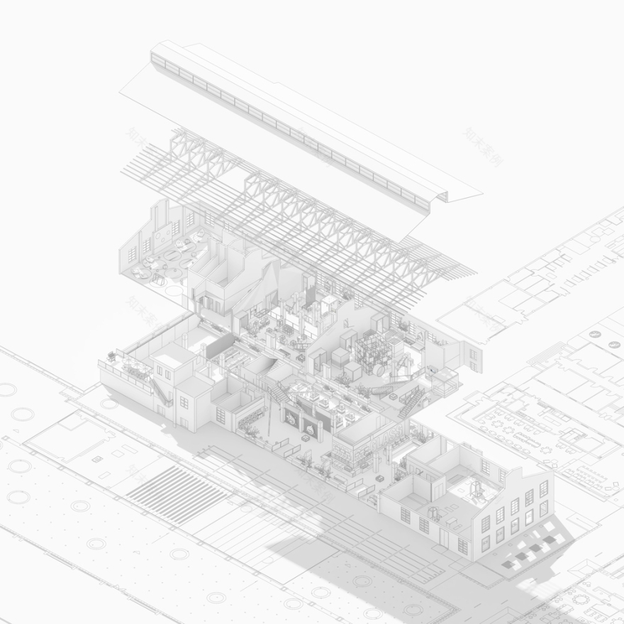
The Kids Museum of Glass 2.0 is a 2,320 m2 contemporary art and design museum created for young visitors in a converted former glass-making workshop. Aiming to encourage independent learning, COORDINATION ASIA integrates kids-driven content into an explorative visiting experience.
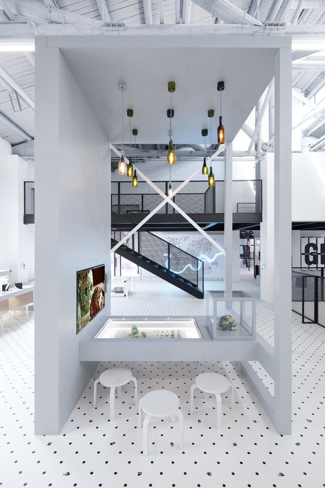
The exhibition is designed to engage visitors on multiple levels. All the exhibits are connected through a scavenger hunt which invites them to look for clues in the space. The hands-on installations empower children to take control and explore further what interests them and to actively learn about glass as a material and its role in the environment, science, technology, art, design, and human civilization. Multimedia and digital contents play a significant part in the exhibition design, including a mirror maze, sound installations, an interactive motion-tracking exhibit, and short films about glass in different fields.
“When it comes to designing a museum for children, the challenge often lies in finding the balance between what children and their parents desire during the visit. In our Kids Museum of Glass 2.0, we managed to create a satisfying learning experience that creates a common ground between both sides.” Says Tilman Thürmer, Founder of COORDINATION ASIA and Curator, Design Director, and Vice President of the Shanghai Museum of Glass.
The new museum also provides large workshop spaces with fully functioning glass-making kilns and state-of-the-art flameworking stations. The flexible space allows opportunities for temporary exhibitions and events and can accommodate several school groups.
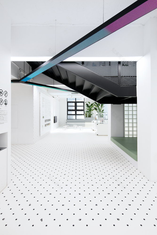
The original wooden structures of the roof and exposed brick walls are kept to preserve the authenticity of the former workshop. Black metal platforms and staircases are inserted into the clean, open-plan space to create layers under the original roof with an impressive height of 12 meters. Translucent walls made of customized glass bricks let the space flooded with natural light. The patterns on the glass bricks imitate the steel mesh used in the former factory. These subtle details are intended to be reminders of the building’s industrial heritage, creating an intriguing dialogue between ‘old and new’.
The whole space is dominated by the strong contrast of a monochromatic palette which highlights the vibrant colors used on exhibits, dynamic surfaces, and installations. Animated light lines run through the whole museum, elevating the space with an energetic and active vibe. Distinctive environmental graphic treatments play a central role. The bold graphics on the wall and the museum’s own mascot patterns on the custom-made soft floors encapsulate visitors in a uniquely immersive environment. The kid’s behaviors are taken into consideration while choosing materials. Tempered glass is used on all the showcases that allow young visitors to stand, walk and even jump on the surface.
Tilman describes the aesthetic direction he took for this project: “Sometimes one may underestimate how much potential young children have to appreciate culture and art. We often assume that contemporary art is only for grownups, but in this museum, we want to show that a kids museum can be cool, artistic, and kid-friendly at the same time.”
The Kids Museum of Glass 2.0 offers an environment that creates a common ground where parents’ objectives for children to learn and kids’ wishes to play are met. The design demonstrates the vision of creating a contemporary cultural and educational destination. The museum presents young urbanites and their families a platform for lifestyle-centered activities and the appreciation of art and culture.
▼项目更多图片
客服
消息
收藏
下载
最近


