查看完整案例

收藏

下载

翻译
Architects:Wim Heylen
Area :80 m²
Year :2021
Photographs :Wim Heylen
Manufacturers : Reynaers Aluminium, RENSON, Gyproc, WoodstoxxReynaers Aluminium
Stability Engineer :Lime engineering
Energy Consultants :EMS
City : Lochristi
Country : Belgium
The project concerns a bungalow from the 1950s located on a spacious plot with a green character. In the 00s, the house was extended at the rear facade with a ground floor volume in dark gray brick. The main volume also received a new cladding in white plaster with gray aluminum window frames. The characteristic canopy around the gently sloping roof was retained as a visible reminder of the original post-war villa that was concealed in the stucco. A house with two faces was formed: a white abstraction of the past on the front facade stands in stark contrast with the dark stone no-nonsense architecture on the rear facade.
In 2019 we were approached by the client with the request to further expand the house with a night area; a bedroom with sanitary facilities, as well as some additional functions such as a laundry room and a secondary entrance. A third volume had to reconcile the two elements already present. It became a search for an appropriate transition from front to back facade. Thus the new volume, despite a uniform appearance, developed like a chameleon.
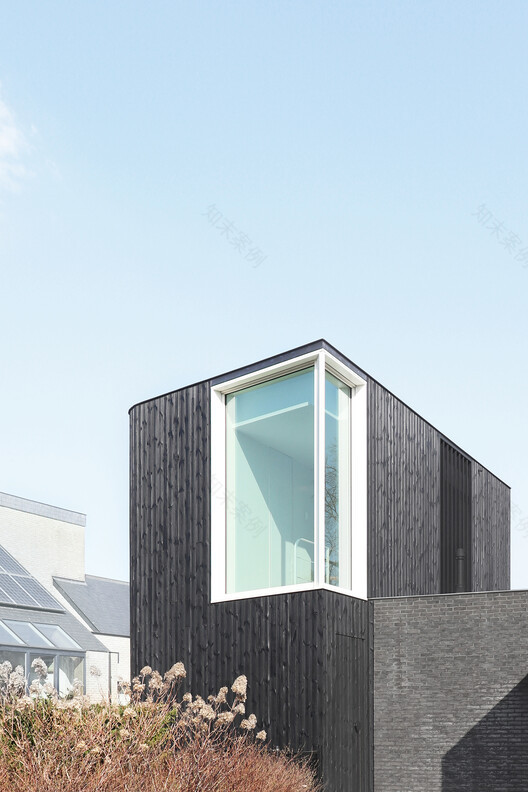
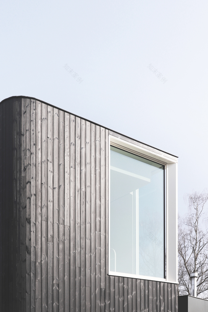
On the front side, the existing canopy plays a major role. Its strong lines create a horizontal separation between old and new. This gave the new element the appearance of a black mystery box on top of the existing roof. The black wood contrasts with the stucco and brings texture to the palette of the facade.
On the rear facade, it blends tone on tone with the existing context. The wood texture breaks with the horizontality of the half-brick bond. In contrast to the front facade, here the visual separation is achieved vertically. The new section was given the appearance of a slender lookout tower in response to the low expanse of the bungalow. Old and new coexist comfortably.
On the side elevation, the connection is made by a new window. This junction makes the transition by extending the existing canopy as a sunscreen above the opening. The natural stone plinth is in turn extended as a base for the new extension.
The extension was inserted as a cornerstone that completes the existing plan. The new side façade bends towards the rear façade, giving way to the driveway of the existing carport deeper in the plot. The sloping line of this echoes the original front facade. The curvature also refers to a remnant of the curved fireplace volume in the heart of the original house.
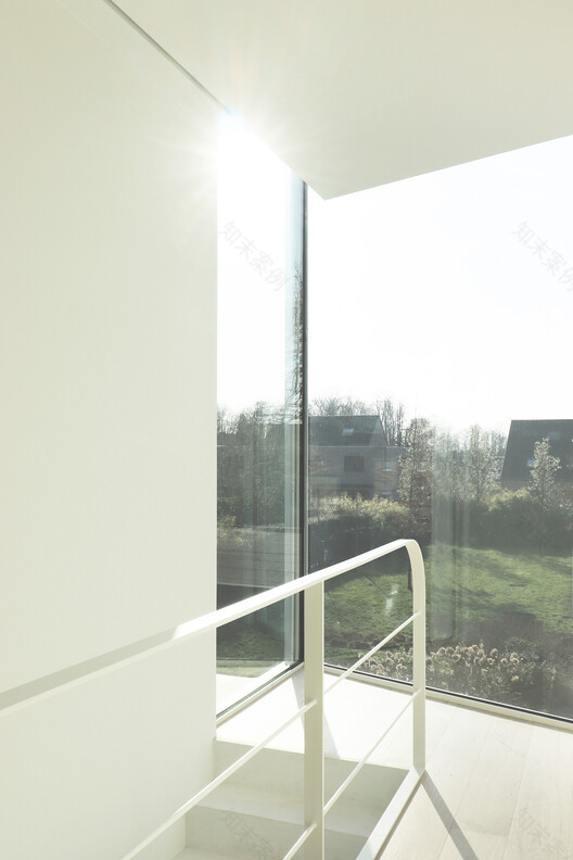
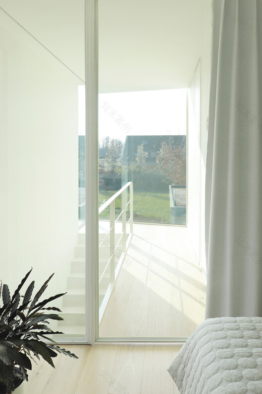
A view of the green surroundings was an indispensable feature of the bedroom. On the sidewall, aluminum louvers provide the necessary shade and privacy from the street side. A glazed steel interior door creates a deep view through the night hall to the backyard. This corner window allows natural light to penetrate deep into the home through the stairwell. It also provides a continuous visual connection with the environment through circulation.
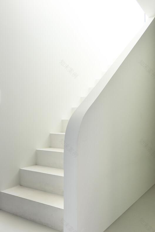
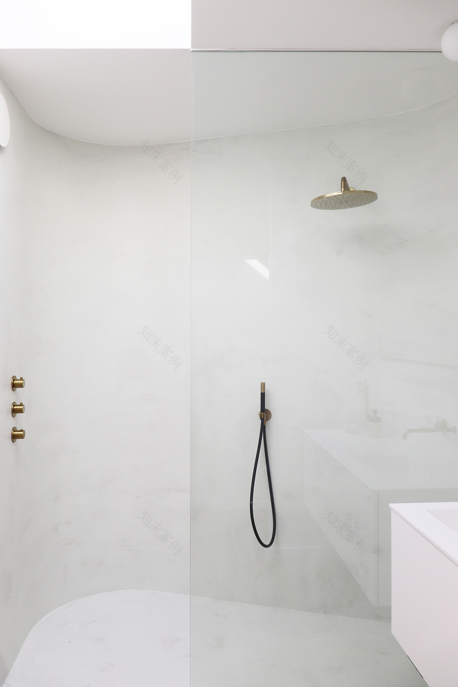
The bathroom forms an intimate cocoon. Here the walls embrace the shower area. A skylight provides abundant daylight while maintaining privacy. On the ground floor, only the staircase and a wall of cupboards serve as space-separating elements. The staircase volume conceals a toilet area, while the wall of cupboards doubles as a wardrobe closet at the back door and as a linen cupboard in the laundry room.
▼项目更多图片
客服
消息
收藏
下载
最近


