查看完整案例

收藏

下载

翻译
Architects:CuldeSac
Area :100 m²
Year :2020
Photographs :David Zarzoso
Manufacturers : AutoDesk, Simon, Fustera Soyca, Frmica, Metalinox, TRISON, TopcimentAutoDesk
Lead Architect :CuldeSac
Design Team : CuldeSac
City : Madrid
Country : Spain
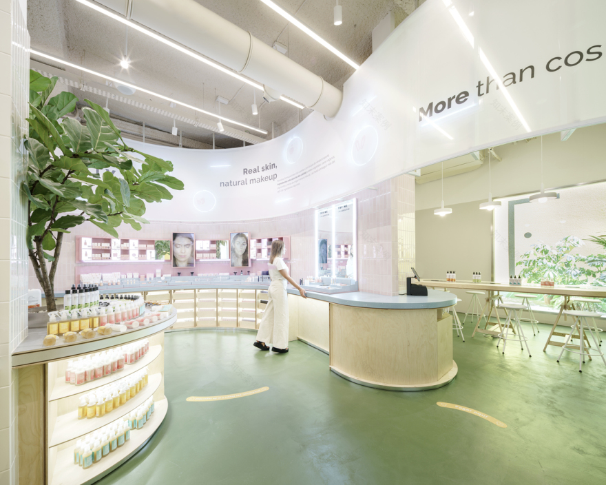
The second Freshly Store has already opened its doors in the heart of Madrid; a 100m2 space at 46 Fuencarral. After the success of the first space in Barcelona, the Freshly Cosmetics team has once again joined forces with the Valencian studio CuldeSacTM for this new challenge.
A space that is the evolution of the previous one. Freshly's iconic curve reflects the brand's personality: it makes things easier, speeds up routes, takes risks, and breaks new paths. A brave and cornerless brand. In addition to these attributes, there is also the DNA of Identy Beauty, the new make-up line with which the company has broken into the market. An in-store journey in parallel through the duality within the same brand. The more conventional face of Freshly in front of the spontaneity of Identy.
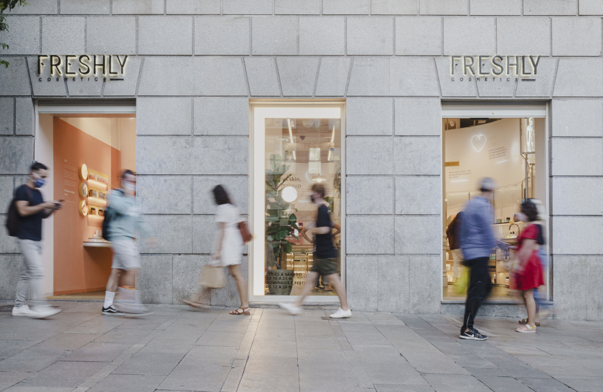
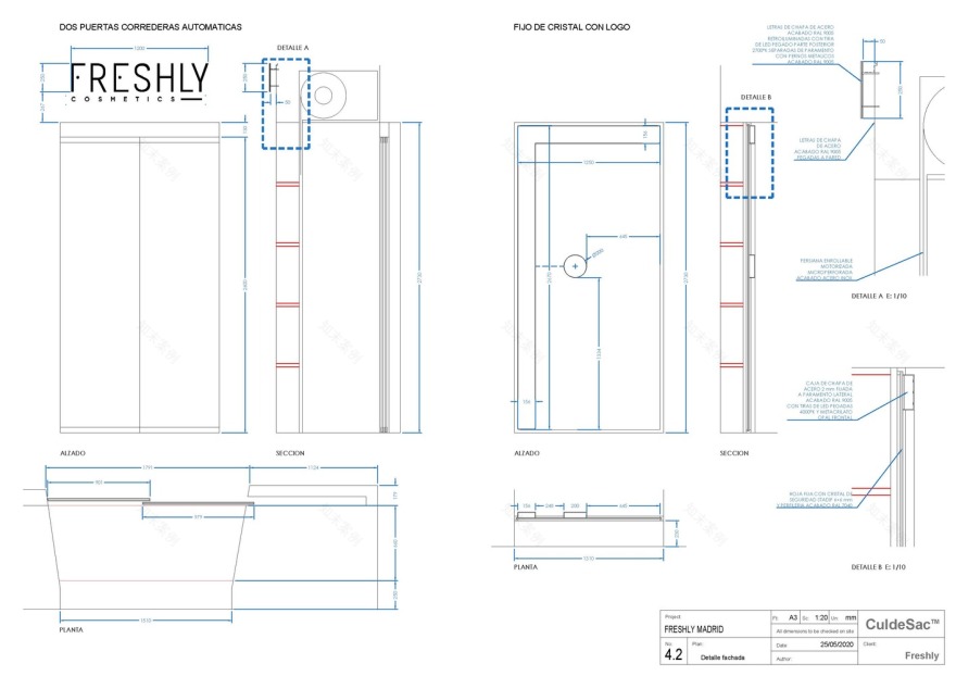
The store's façade is divided into three sections. The central showcase works as a call to action and, in it, stands the icon of the F so recognisable on the façade of the Barcelona shop. On each side are the two entrances. On the right, the user enters through the Freshly products, turning the curve to interact with them. On the left, the user will meet the most social part of Identy. A huge canvas hanging from the ceiling welcomes the user, who will find tiers that work as an extension of the street, which is used as a meeting point inside the store, where the user can be, sit down to charge the phone or watch the rear video wall projections with the brand's new products.
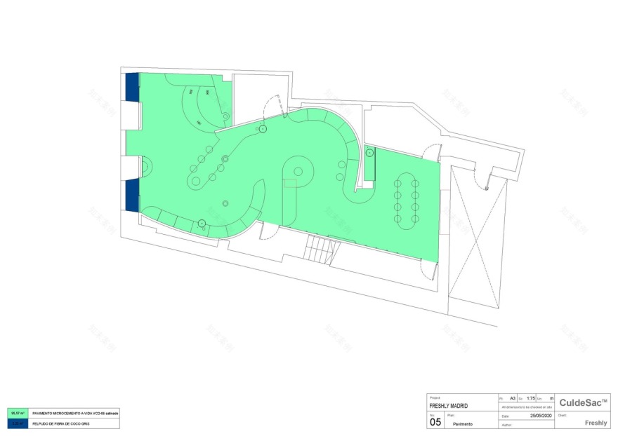
Thus, an octagonal space appears before the visitor, preserving the original structure, in which the elements designed ad hoc cohabitate and interact with the existing ones. During their journey in the shop, the user is surrounded by a canvas from both brands. Freshly's, which is more rational and ordered, transmits the brand's values; Identy's with inspiring messages and in larger formats.
Between the two entrances to the shop, the concept of a square is generated to walk through space, through the duality of its identity, the organic route through the curves of Freshly and the social dimension of Identy. This parallel journey opens up two squares in the shop, both surmounted by vegetation, in allusion to the eco character of the firm. At the exhibition level, these squares are separated by a full-length mirror that delimits the areas and completes the curves, creating a sensation of openness in the space.
▼项目更多图片
客服
消息
收藏
下载
最近


