查看完整案例

收藏

下载

翻译
Architects:DUA Desarrollos Urbanos y Arquitectónicos
Area :690 m²
Year :2018
Photographs :Enrique Portillo Delfoz
Lead Architect :Gastón René Fourzán Fierro
Collaborators (Interior Design) : Elizabeth Gómez Coello
City : Chihuahua
Country : Mexico
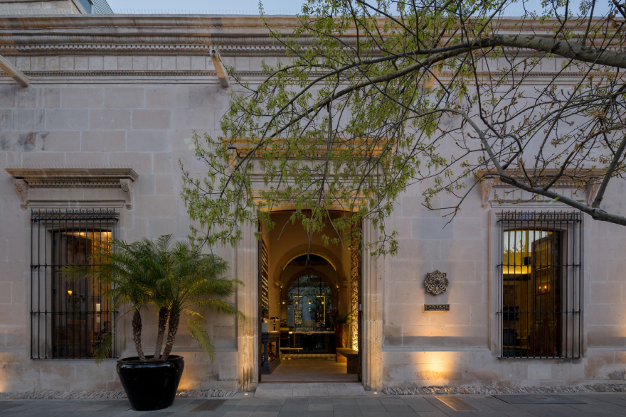
La Casa Tría, built around 1860 with neoclassical details and subsequent Art Deco interventions, remained underutilized for 50 years. During this time the house suffered considerable damage. Finally, its strategic location and its quality of assets were decided to be harnessed. The establishing of a boutique hotel was determined, with the dream of rescuing some history of the city and the house as such.
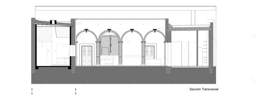
Installations in historic buildings must be done carefully so as not to destroy the original building. Edicules, that were inserted in the old structure, were built for the kitchen and bathrooms that require a lot of installations. Having their own foundation, walls and roof they can be demolished and removed without having to touch the original structure, in the case of wanting to return the building to its original state.
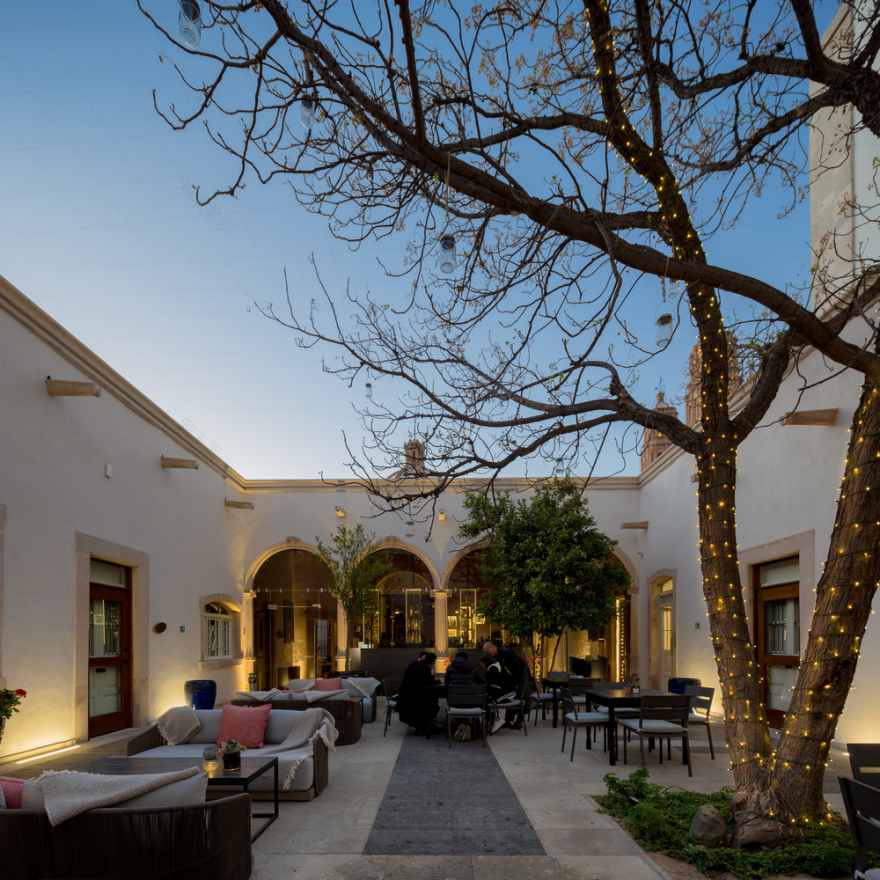
The program has 690 m2 indoors, and 254 m2 outdoors. The house, with a typology with a central patio with rooms around it, defines the concept of the project with this characteristic layout. The patio becomes a versatile core hosting circulation, the dining room and the bar. All rooms face directly outside as in the original layout of the building.
The reception services are located at the front, accessible from the street, while the rooms are situated around the patio and the backyard, with greater privacy. The service areas are at the back of the building. The hallway and the courtyards function as the main circulations.
The program requires several services when used for this type of hotel industry. The available space could not house the entire program and in order to resolve this, an additional pavilion was built in the back.
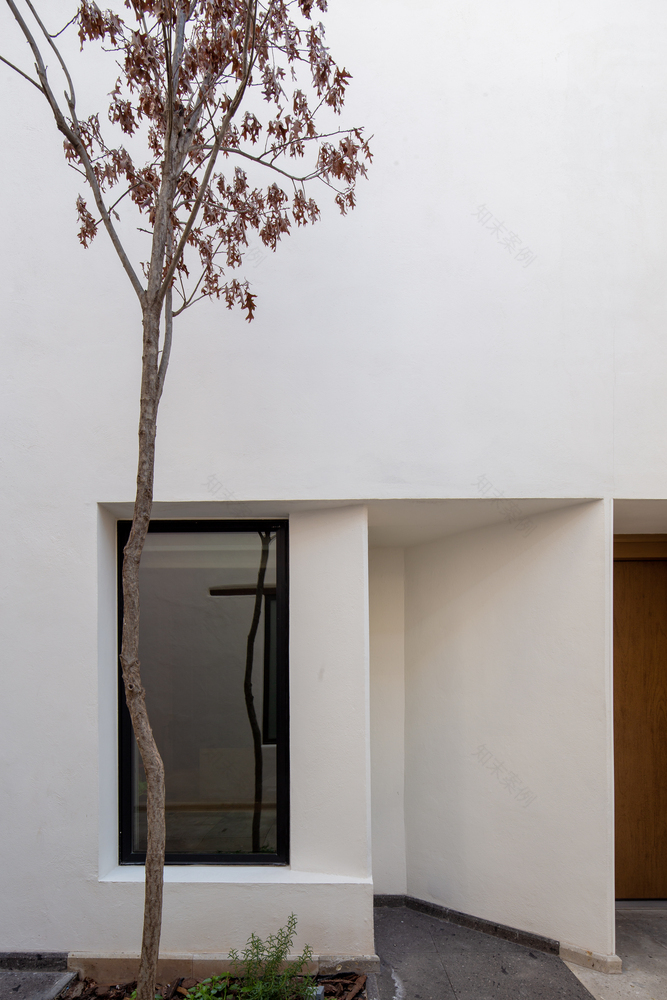
The additional pavilion has been built under three design principles: Preserving the original massive environment; Keeping the volume of the scale; Using the contrast of apertures in the wall, but giving them an uneven rhythm.
A contemporary language is achieved in the approach of complexity by using asymmetry, playing with alternating apertures and visible construction materials and the blurring the harshness of geometric shapes. The intervention is evident, but without subordinating the old building.
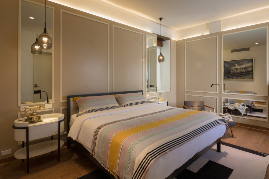
The interior design proposal is based on traces of decorative interventions found in the building that, even tho they were newer than the original construction, were part of the history of the place. Neoclassical accents with a touch of decorative arts using a palette of neutral tones were key in integrating the interior with the project.
The concept seeks to find a contrast between the old and the new, highlighting the historical aspect of the building. Original materials and finishes were respected while revealing the beams of the ceilings and the whitewashed walls. These elements alternate with overlaying interventions in neutral but bright tones, allowing each element to gain the necessary importance based on measured contrasts.
The neutral palette in grayscale and ochre is accentuated by polished brass metallic surfaces, natural textures and exposed materials from the original house that become the protagonists of the space, showing the history fo the building to the visitor.
The floors were covered with tiles, reproducing the original style using local stone and wood that was used during the time of the building of the house.
▼项目更多图片
客服
消息
收藏
下载
最近


