

创作上传
VIP
收藏下载
登录 | 注册有礼
查看完整案例

收藏

下载

分享
翻译
The existing building, built in 1986 at the height of the "bubble economy" period in Japan, is a typical example of so-called "bubble architecture".
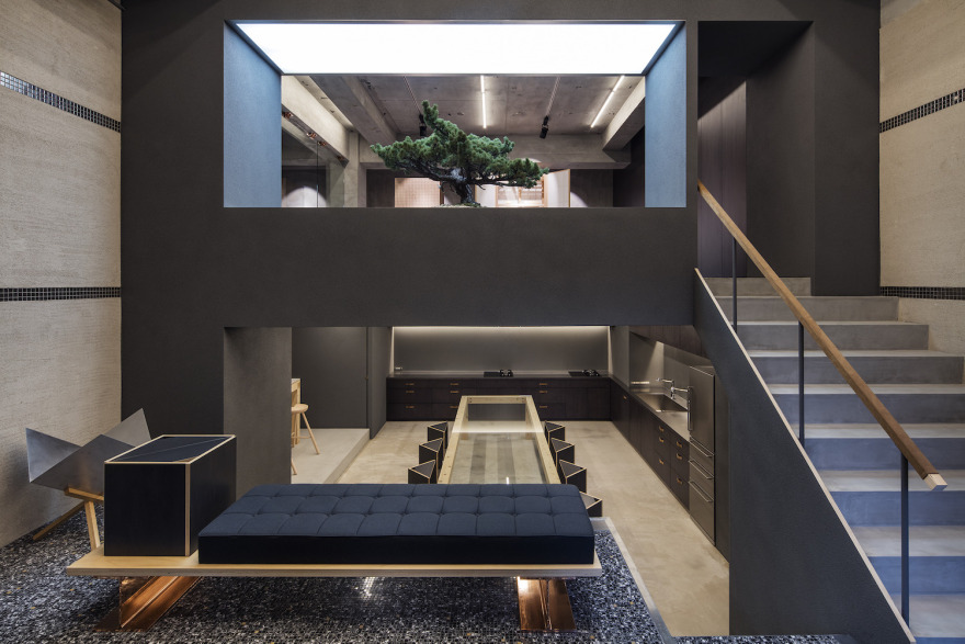
The first floor with the floor area of approximately 100 m² has grand entry features including a revolving door like a hotel and the double-height entrance hall occupying one third of the entire floor. The entrance hall floor is finished with flashy mosaic tiles, which effects are intensified by vivid gold lines on both side walls. Despite the tackiness, I kind of felt envious of such hyper-excitement of the time. It seemed to me that they spent full energy and really enjoyed making this building, and somehow these grand and flashy features felt extremely rich because they were not decided simply based on appropriateness, reasonability or cost-efficiency.
People would ridicule this building as a "bubble kind of thing". At first, I thought of painting the entire hall white and dismantling the revolving door, but we thought it would be a mistake to just ignore this unique design in front of us. How can we enjoy the entrance hall once more, which people used to enjoy before? Our answer was to think about the way to change the visual impression by placing new things next to it, without changing the hall itself.
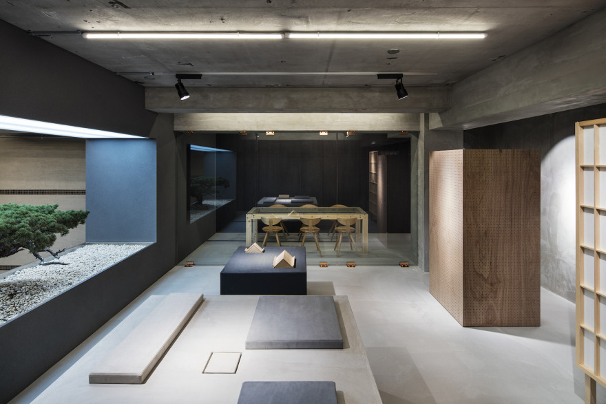
We decided to keep the flashy mosaic tile floor, the Italian-style plaster walls, and the revolving door as they are.
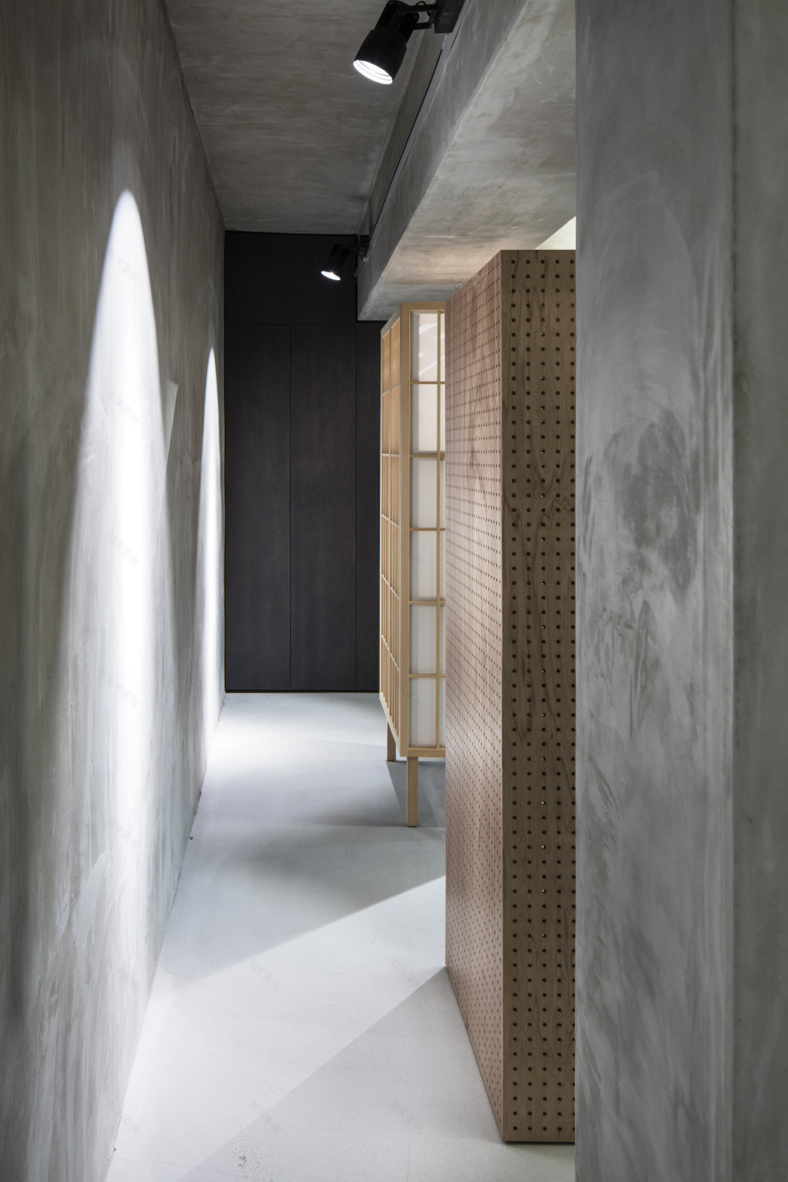
In order to alleviate the contrasting effect, a subdued grey color was selected, instead of white, for the wall facing the entrance hall. Regarding the texture of the grey wall, we wanted to have a rough texture like the existing exterior wall, so we selected textured acrylic spray finish containing fine aggregates, a typical material often used in conventional wood houses.
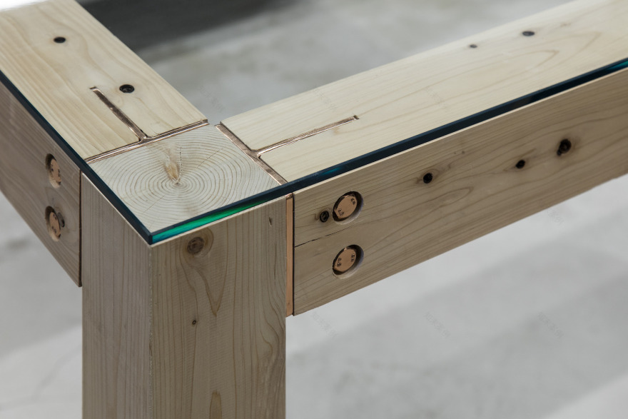
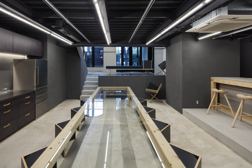
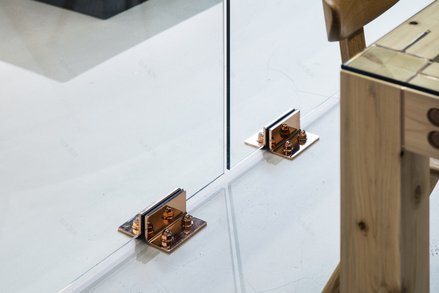
From the entrance hall, you can see below a kitchen/meeting area with a large table placed in the center. Upon designing the table, we wanted to make it as long as possible and emphasize the sense of depth in the perspective view. Calculating from the number of people gathering at the table, we needed to make it 4-meter long. Since the 4-meter span would be too long for a piece of furniture, we decided to select building materials of conventional wood houses again. Though it would be too big for furniture, it is not so big for architecture. Conventional and economical bolts and fittings are used for the joints, copper-plated in advance to change the appearance. In addition, the conventional wood floor construction method was adopted to build the kitchen counter. Lastly, we placed a splendid old pine bonsai tree opposite to the ridiculous revolving door, with an intension to counterbalance a joke with a joke.
A visual impression of the same color changes in relation to what is placed next to it. Although it is a typical approach in graphic design, we think it is also an effective approach in architectural design, to utilize and enjoy the existing building as much as possible without negating it.


南京喵熊网络科技有限公司 苏ICP备18050492号-4知末 © 2018—2020 . All photos and trademark graphics are copyrighted by their owners.增值电信业务经营许可证(ICP)苏B2-20201444 苏公网安备 32011302321234号
苏公网安备 32011302321234号客服
消息
收藏
下载
最近