查看完整案例


收藏

下载
在中国有一座古镇,大大小小的灯具生产商遍地都是,灯饰业总产值甚至占到全国市场份额的60%以上,光灯饰铺位就有3600多家。它就是有着“中国灯饰之都”的中山古镇。CUN寸DESIGN与绿豹灯具品牌的相遇也是从这里开始。
In China, there is an ancient town features numerous lighting manufacturer of all kinds of size. The total output value of its lighting industry accounts for sixty percent of Chinese market, and it has more than 3600 lighting stores. It is Zhongshan, known as the “Lighting City in China”. The cooperation between CUN DESIGN and LUPARD LIGHTING also starts from here.
▼商店外观,exterior view of the store
拆解 · 绿豹文化
Disassembly · Lupard Culture
对于每一个灯具企业,展厅的需求与期望值是非常高的。展厅设计不光对产品的营销有很大的助益,更是对企业文化的传播与品牌的打造都有着非凡的作用。设计展厅的初始,我们着手了解绿豹灯具品牌文化并拆解。
▼绿豹灯具品牌形象在空间中的呈现与延展应用,the space embodiment of the brand culture of Lupard Lighting
Almost every lighting enterprise has high demand and expectation on exhibition hall. Because exhibition hall plays an important role in product marketing as well as in corporate culture promotion and brand building. The design starts from understanding the brand culture of Lupard Lighting and the next step is disassembly.
▼商店外观,exterior view of the store
当下的消费习惯中,驱动消费者在展览中进行的所有行动的往往是消费者个人兴趣,而不是设计师在展厅空间中设定的”情节”。站到行业角度讲,当我们抵达中山看到形形色色的灯具展厅时,它们都有着共同的特性,就是将灯饰都放置在空间公共展厅中,这些灯具间的相互影响是极大的。
在传统形式的展厅中,大家为了卖掉一盏灯而去虚拟设计出一些场景,比如客厅、卧室等,这些都是为了灯具产品而去营造的虚拟场景,然而这样的操作存在着一定的问题,首先是场景化的设置无法长期使用,其次这样的操作并不符合每位消费者内心的真实购买诉求。在我们面对灯具展厅初始的设置中,每位设计师应该思考的是“光到底该在什么样的环境中展示?”
After research and analysis on the current consumption habits, the designer conclude that what drives consumers’ actions in exhibition hall is often their personal interests, instead of the “plot” set by designer in space. When it comes to the lighting industry, after visiting all kinds of lighting halls in Zhongshan, the designer found that they have a common characteristic, that is, all the lighting products is placed in public exhibition hall, and the products have great effects on each other.
In traditional exhibition hall, in order to sell a lamp, some scenes are designed accordingly, such as living room, bedroom, etc. These are simulated scenes created for lighting products. However, this method has certain problems. First, the scene cannot be used for a long time; and secondly, such operation cannot meet the true purchase demands of each consumer. So, before designing a lighting hall, every designer should think about a question: “In what kind of environment should the light be displayed?”
▼商店外观局部,采用大面积的玻璃墙体,partial exterior view of the store with glass walls
▼商店雨篷细节,details of the awning of the store
我们不是在设计灯的环境,而是在做光的环境
We don’t design lighting scene, but we build lighting environment
原有空间是建筑的两个底商,我们为了达成符合商业的环形动线,将两个体块建筑进行解构,拆除阻隔墙体,使动线更为合理。为满足不同的商业需求,我们设置了3个出入口,在展厅的A主入口,然后沿街拥有展示面的B入口,以及最重要的通往内部商场的C入口,形成内部商业的引流。
The original space was two commercial areas in the ground floor of the building. In order to achieve a commercial circular line, we deconstructed the two blocks of architecture and removed the barrier wall to make the dynamic line more reasonable. Meanwhile, in order to meet different business needs, three entrances have been set up: entrance A in the main exhibition hall, entrance B with exhibition facing the street, and the most important entrance C leading to the mall, forming the internal business flow.
▼商店室内,interior view of the store
▼商店室内,灰色的墙体和天花板与绿色的地板相辅相成,interior view of the store, the gray walls and ceilings complement the green floors
绿豹力量 · POWER
Lupard · Power
A入口的目的是展示品牌形象气质,也是来宾的主服务功能区,我们打破传统的前台布置手法,将前台与服务区域结合,根据主入口的视角处理,设置斜拉式的前台区域,并在端头制作了绿豹品牌的Logo墙。Logo的造型是金属与体块相组合形式,力量与动态张力的立体效果代表着绿豹品牌“冲”的精神。街道往来的人群可以从A入口直观的看到品牌Logo。
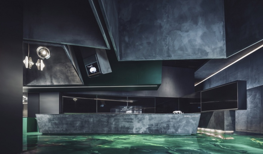
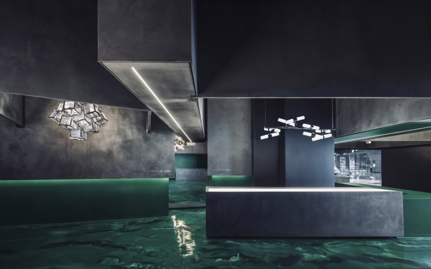
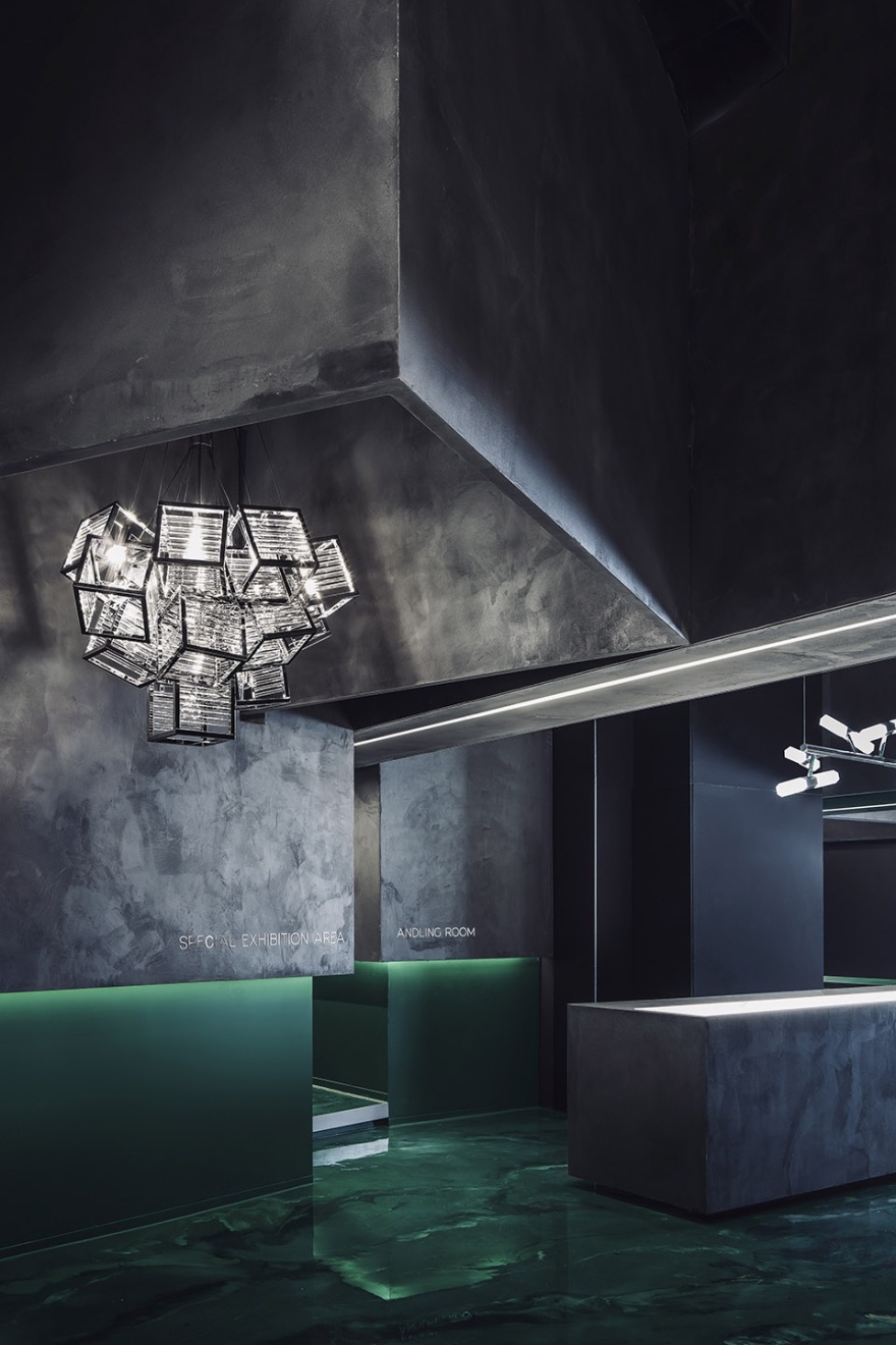
顶部的造型是由绿豹Logo中豹子的肌肉感上拆解下来的。我们做了一些下放的盒子,这样每个灯都在盒子中,首先解决了光与光之间形成影响的问题。灰色材质的区域内灯具产品的独特性发挥的淋漓尽致,使消费者更加关注产品单独本身的造型,这样我们去掉了虚拟环境,也伴随着与消费者的成长关系。因为当下的消费群体,他们对产品的选择,其实更加清晰明了,他们脑中是拥有画面的,不需要场景去佐证。下放盒子中也有小面积的体块延伸,并设置了灯具产品信息交互屏,消费者可以自行站在这里了解每款产品的特性与实际案例资料。
▼品牌Logo在空间中的应用,the Logo used in the space
As a way of displaying brand image, entrance A is also the main service function area. Breaking the traditional method, this front desk integrates with service area. A slanted front desk area was built according to the perspective of main entrance. And a logo wall of Lupard was made in the end. The shape of Logo is a combination of metal and blocks, in which the three-dimensional effect of strength and dynamic tension represents the spirit of Lupard. The logo can be seen directly by passerby on the street.
The shape of ceiling is disassembled by the leopard’s muscle in logo. Some lowered boxes are made to contain lamps, so that the problem of the influence between lights has been solved. The uniqueness of lighting products in gray material area makes consumers pay more attention to the shape of product itself. In this way, we have eliminated the scenes. It is also a result from the growth of consumers. Because the current consumer groups have a clear image in their minds, they do not need scenes to prove their choices. There is also a small extension area in box, and an interactive screen is set to display product information. Consumers can stand here to understand the characteristics of each product and actual application data.
▼商店局部,顶部的造型是由绿豹Logo中豹子的肌肉感上拆解下来的,partial interior view, the shape of ceiling is disassembled by the leopard’s muscle in logo
▼商店局部,灰色材质的区域内灯具产品的独特性发挥的淋漓尽致,partial interior view, the uniqueness of lighting products in gray material area makes consumers pay more attention to the shape of product itself
绿动极光 · AURORA
AURORA
整体空间我们沿用了Logo色的植入,水鬼绿的水墨艺术树脂地坪漆让地面仿佛盒子投影下的绿色极光。展厅中核心管理服务功能布置在空间中心位置,并设置了两块品牌展示屏幕,便于向四周发散销售和服务,缩短管理流线,降低管理成本。
The color in logo has been implanted and extended in the overall space. The low-key green ink art resin floor paint makes the ground look like a green aurora projected by a box. The core management service function is arranged at the center of space, and two brand display screens are set up to facilitate the distribution of sales and services, so as to shorten the management flow and reduce management cost.
▼商店局部,采用水鬼绿的水墨艺术树脂地坪漆,partial interior view with the low-key green ink art resin floor paint
洽谈区域的摆放,根据空间面积平均分配,在互不打扰的前提下便于使用,平均约15米会有一个洽谈区,并将其设置在靠近橱窗位置,人流在这个位置洽谈,会让窗外人流看到店内的消费状况。家具与产品的搭配形成很好的视觉效果,可以通过橱窗对外展示,达成吸引人流的目的。
展厅中心区域,我们设置了工艺模块展示区。模块化组合表现形式使置装平台的展示面积为20平米,如果按照平均每个工艺模块所需0.7平米计算,共可以展示绿豹品牌文化的28个工艺模块。
▼材料工艺,the material techniques
The layout of negotiating area is evenly distributed based on the premise of being easy to use without disturbing each other. On average, there is a negotiating area at about 15 meters. Set near the display window, people on the street can see the consumption status in the store. The combination of furniture and products forms a good visual effect, which can be displayed through window to attract more customers.
In the central area of exhibition hall, we have set up a display area for process modules. The modular combination method makes a 20 square meters’ display area. If one module needs 0.7 square meters, a total of 28 process modules can be displayed to show the Lupard brand culture.
▼商店局部,设置自发光台面,partial interior view of the store with self-luminous counters
▼商店局部,partial interior view
空间尽头墙面的处理,我们将绿豹品牌的壁灯设置在这里。为了能让每款壁灯所展示的光影不会交错,基于墙面我们做了统一的斜处理,这样每一盏壁灯都拥有自己的底板进行单一产品的展示。解决最重要的功能后,壁灯展示的数量从原先的符合墙面尺寸的10个延伸到15~17个。
Wall lamp products are set at the end of space. In order to avoid intersection and overlapping between light and shadow of wall lamps, the walls have a unified oblique treatment. In this way, each wall lamp has its own bottom plate to display solely. After solving the most important function issues, the number of wall lamp displayed has been raised from 10 to 15 to 17.
▼设置着壁灯的空间尽头墙面,为了能让每款壁灯所展示的光影不会交错,对墙面进行统一的斜处理,wall lamp products are set at the end of space, and in order to avoid intersection and overlapping between light and shadow of wall lamps, the walls have a unified oblique treatment
自己说 · 他人说
Space Speaks · People Speak
90后、00后的消费崛起,使得市场正在变得日趋年轻化。面对这群口味清奇的一代人,传统品牌倚老卖老的时代已经过去。在过去,通过一个出色的Logo、一句动人的Slogan、一个动听的故事,传统品牌就可以让几代人趋之若鹜,而与先天带着诸多顾忌的70后、80后相比,95后、00后更没有包袱,更有个性,更有主张。他们消费的不只是一件具有功能性的商品,而是更看重这件商品背后所蕴含的自我认同感和归属感。
The rise of customers born in 1990’s and 2000’s has been making the market increasingly younger. Facing the new tastes of this generation, the era of traditional brands taking advantage of seniority has passed. In the past, just an outstanding logo, an attractive slogan, or a good story can make a traditional brand popular. Compared to people born in 1970’s and 1980’s, the new generation has a more distinctive personality and more new ideas. What they consume is not just a functional product, but they value more the self-identity and belonging underlying a product.
▼商店局部,partial interior view of the store
展厅的设计赋予企业的是:
– 品牌价值的传递和变现:让消费者快速建立品牌联想和品牌识别;
– 创造可供多维度展示内容和产品:提升消费者获得产品信息的到达率和接受度;
– 创造拥有新商业空间的产品组合:为品牌创新提供辅助力量,实现品牌差异化;
The design of the exhibition hall can provide:
-Promotion and realization of brand value: make consumers quickly establish brand association and brand identity;
-Create multi-dimensional contents and products for display: increase effective reach and acceptance of product information for consumers;
-Create product mix with new business space: provide auxiliary forces for brand innovation and achieve brand diversification.
▼商店局部,partial interior view of the store
在纷繁的物质世界里,我们想找到某种特质来表达一种诚实的态度去面对生活或某些事物。设计不光是对产品的营销有很大的助益,更应该是用设计思维做品牌附加值。与大众沟通,影响行业走向,带动消费者的购买力,而不再拘泥于某种形式,让品牌进入大众舆论,让空间自己说与别人说。
In the complicated material world, we suppose to find a certain trait to express an honest attitude to face life or other things. Design is not only a great help to the marketing of product, but also a brand added value in design thinking. In this project design, the designer hope that the exhibition hall can communicate with the public and affect the trend of industry, thus, drive the purchasing of consumers. The design is no longer adhere to a certain form, and it makes brand close to the public opinion. Let space speak by itself and let space speak with people.
▼商店局部,partial interior view of the store
▼商店空间细节,space details
▼平面图,plan
▼吊灯产品选型点位布置索引,index of chandelier product selection point and placement
项目名称:中山市绿豹灯饰品牌旗舰店空间设计
项目地点:广东省中山市
项目面积:600m²
设计公司:CUN寸DESIGN
业主:绿豹灯饰有限公司
主创设计师:崔树、王继周
辅助设计师:叶英东
材料品牌名称:铝板、混凝土艺术墙漆、水墨艺术树脂地坪漆
摄影师:王厅
Project Name: Zhongshan Lupard Lighting Flagship Store
Project Location: Zhongshan, China
Project area: 600m²
Design company: CUN DESIGN
Proprietor :Lupard Lighting Co., Ltd.
Chief Designer: Cui Shu, Wang Jizhou
Assistant Designer: Ye Yingdong
Material: Aluminum plate, concrete art wall paint, ink art resin floor paint
Photographer: Wang Ting
客服
消息
收藏
下载
最近


