查看完整案例


收藏

下载
它 | IT
积家作为木作美学的‘创造者’,为客户探索更多生活可存在美好的同时,也将每一个细小的产品做到更好。因频率的相近,所以相遇。设计师打破常规木作展厅产品的堆叠,以 ‘放’ 的姿态给予空间生命力,使空间更加的灵活且具有艺术性。
As the creator of wood aesthetics, Jaeger-LeCoultre is good for customers to explore more life, and also to make every small product better. Because of the similar frequency, they met. Designers break the stack of conventional woodwork showroom products, giving space vitality in a ‘release’ posture, making the space more flexible and artistic.
▼装置区域总览,Device area overview
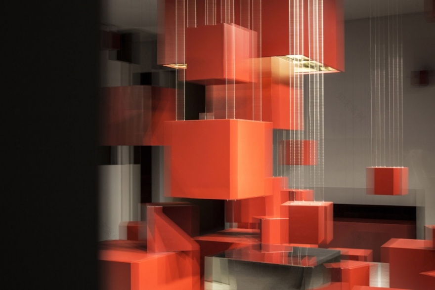
我们以利落的线条度刻出体积,自上而落,迸发而出的力量,收纳后再吐露,使空间拥有高低错落的层次感。再由‘它’将其余的红盒在空间抖落开来,恣意的散落在各个角落,第二只贮藏着第三只,第三只含纳着第四只…
‘存在’的意想不到,时而也变成了惊喜。方体滑落的轨迹直接而坦荡的暴露,让他和空间摩擦、互相包容,之后再消散开,形成特有的‘场’。
▼入口区域,Entrance area
We use the neat lines to engrave the volume, from the top to the bottom, the strength that comes out of the hair, and then confide after storage, so that the space has a high and low layered sense. Then the ‘there’ will shake the rest of the red box in the space, and it will be scattered in every corner. The second one will store the third one, and the third one will contain the fourth one…
The unexpectedness of ‘existence’ has sometimes become a surprise. The slid of the square body is directly and openly exposed, allowing him to rub with the space, tolerate each other, and then dissipate it to form a unique ‘field’.
▼红盒在空间抖落开来,the red boxes are scattered in the space
红色创造出空间独特而富有张力的情绪。入口处的红色体块,有着小小的惊异,如果尚能被惊异击中,可以向里深入。中心区域的开放性提供了多元化的体验感,它们在每一个可能性的裂隙中形成自己的语言,也为空间塑造了丰富的‘凹凸’。
Red creates a unique and tensioning mood. The red body at the entrance has a small surprise. If you can still be shocked, you can go deep inside. The openness of the central area provides a diverse sense of experience, they form their own language in the cracks of each possibility, and also create a rich ‘bump’ for the space.
▼装置细节,Device details
蜷曲,再舒展、延伸,再缩小。这些体块被不规则的墙体半围合式的包裹,墙体在不经意间的转向,和每一个空间都产生对话。镜面与空间的虚实交融让空间的体验感更加的立体。每一块区域:洽谈区、办公区、休息区都可以看到中心的装置,不同的视角产生不同的感知。在当下碎片化的体验中,我们想给予空间更多的可能性和一些新的思考,让走进空间中的人形成自己的想象世界。
Distort, stretch, stretch, and shrink. These blocks are wrapped in a semi-enclosed wall of irregular walls, the walls are inadvertently turned, and each space creates a dialogue. The combination of mirror and space makes the experience of space more three-dimensional. Each area: the center, the office area, the rest area can see the center of the device, different perspectives produce different perceptions. In the current fragmentation experience, we want to give space more possibilities and some new thinking, let people who walk into space form their own imaginary world.
▼为空间塑造丰富的‘凹凸’ ,creating a rich ‘bump’ for the space
▼办公区域看向装置区域,Office area looking at the device area
▼解构分析图,Deconstruction analysis
▼平面图,Floor plan
项目名称:它
设计方:观至空间设计
项目设计 & 完成年份:2019
主创及设计团队:关聪&黄永贵
项目地址:江苏南京
建筑面积:200m²
摄影版权:ingallery
客户:积家木作美学
客服
消息
收藏
下载
最近


