查看完整案例

收藏

下载
随着大众的审美升级,证件照这件事已经不像往常一样“凑合”了,也应运而生了一个为用户专门拍摄证件照的品牌——小象馆, 我们也为小象馆做了最新的空间设计。
With the aesthetic upgrade of the public, the document photo has not been as ID function as it used to be. It also gave birth to a brand that specially photographed the ID photo for the user – the elefoto. We have just finished the project for elefoto space.
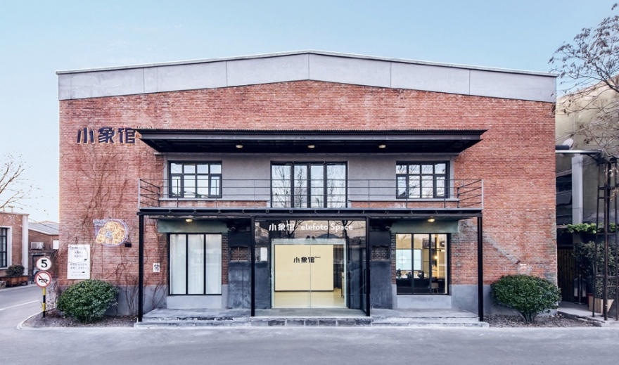
▼小象馆外观,exterior view
在“寸土寸金”中“闪转腾挪” | CIRCULATION
这种全新的业态和服务方式也带来全新的设计挑战,照相馆的流程比传统的餐饮,零售要复杂好多倍,预约客人、路过访客、化妆、试衣、拍摄、等候,每个区域都有顾客,造型师和摄影师等内部员工的动线,往往是几十个人在200平米的区域内穿梭, 一个巧妙互不干扰的动线,能直接提升所有人的行为体验。
▼动线示意,circulation diagram
This brand new service format brings completely new design challenge. The process of taking photos in such store is much more complicated than traditional F&B or retails. Customers, visitors, makeups, photographers and other employees all squeeze and move in such small area. A good circulation that does not interfere with each other, could directly enhance everybody’s experience.
▼一层室内概览,1F interior view
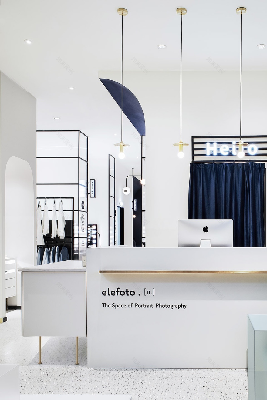
▼接待台和休息区,reception and seating area
▼收银台细部,detailed view
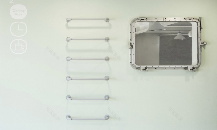
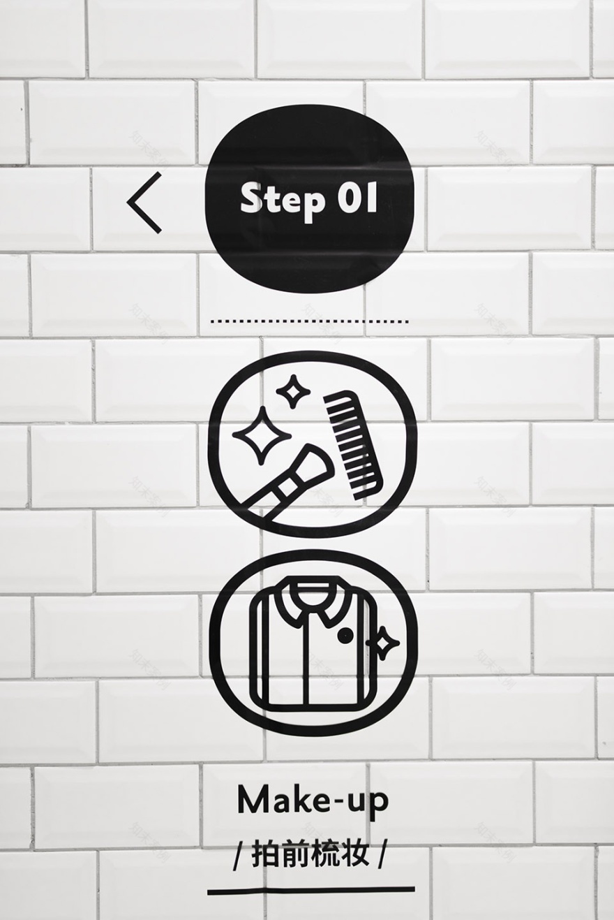
随处可见的不张扬但有具有很强功能性和装饰感的导视信息,对首次来店的顾客很友好。这样,以最低的成本可以让顾客迅速的了解接下来需要干什么,从而使他们有了较为主动的体验感。同时在空间中配合每一个需要等候的步骤,在等候空间配置相应的帮助顾客打发时间的小设计,提升顾客的整体体验。比如在摄影之前的等待中,一个小圆镜可以帮助顾客练习怎么样笑从而打发时间并获得更好的体验。
▼走廊,corridor
The less obtrusive while strong functional guide information placed everywhere in the space. It is very friendly to customers who come to the store for the first time. In this way, customers can quickly understand what they need to do at the lowest cost, so that they have a more active experience. At the same time, we set up a series of little design to help customer kill time when they need to wait for the next step in the certain area to enhance the general experience. For example, a simple mirror in the right place could allow customer to practice how to smile before photo shooting.
▼兼具功能性和装饰感的导视系统,the guide system combines function with an
aesthetic feeling
未来轻复古主义 | MILD FUTURE-RETROISM
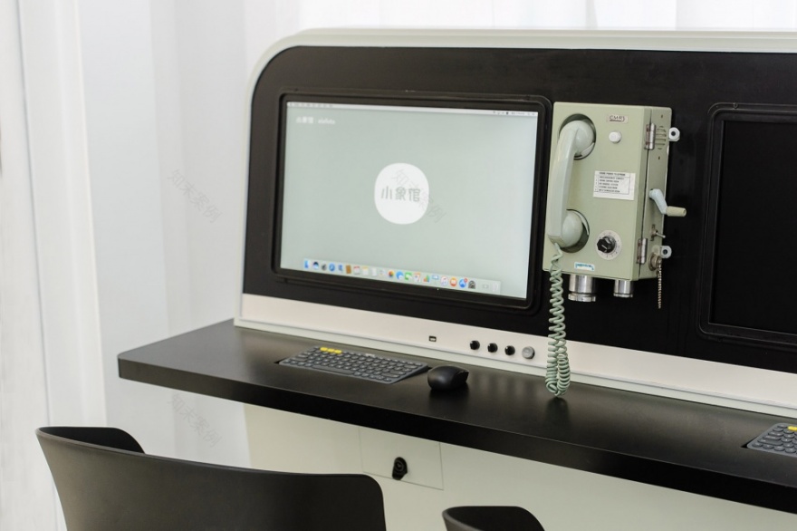
小象馆有一个“宇航员”IP,我们也借此扩展出了一个风格理念——未来轻复古主义。因此在空间的各个角落,都有一些复古的小装置,但经过设计的二次重构之后,又焕发出未来感,有些像时光机,有些像太空舱。
The elefoto has an IP of “astronaut”, so we proposed a new style – mild future-retroism. Therefore, in every corner of the space, there are some retro small devices, but after the secondary reconstruction of the design, it has a sense of futuristic, some like a time machine, and some like a space capsule.
▼复古又焕发未来感的装置,installations with a style of mild future-retroism
用设计为用户创造小惊喜 | SURPRISE
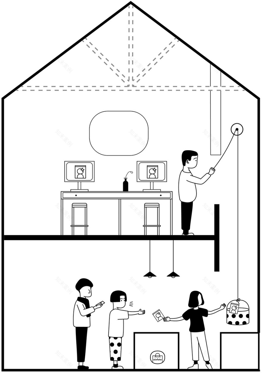
对于小象馆这类业态的整体升级设计中,我们也尽可能的对具体项目提出有趣的细节设计。比如小象馆SPACE北京半壁旗舰店,有不少设计细节带来了非凡的体验惊喜。建筑体原本存有一个类烟井的中空的多余空间,因为某种设计的巧合,二楼靠近中空的位置是修片区,而一楼是收银台,我们顺势利用这个中空,做了简易的传送装置,这样一来修片结束后,可以直接经滑轮装置传送至一楼的收银台,代替了原本人工跑到楼下送片的行为。
During the whole Store Identity upgrading process, we try to propose more and more interesting details in every single store. Like the SPACE flagship store in Beijing, a few details brought extraordinary surprise of experience. The existing building originally contained a hollow
chimney
. Because of a certain design coincidence, both the reception counter on the first floor and photo producing space on the second floor are next to this hollow well.
▼二层修片区,2F interior view
▼中空空间被设计为简易的传送装置,a simple conveyer system is installed in the existed
chimney
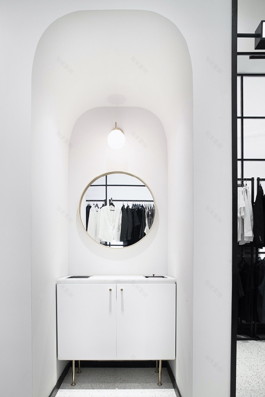
我们也为顾客卸妆环节做了非常细致入微的设计,卸妆液的摆放,垃圾的丢弃位置,顾客使用时能很轻易的保持区域的整洁,给后续顾客很好的体验。顺便说一句,由于美感和功能兼具,据说让很多店员心动想在家里也做一个呢:P。
We have made a nuanced table for customers’ makeup removing process. The display of the makeup removers, the place to dispose the garbage and other details were well-designed to help the customers easily maintain the whole area tidy and clean, giving the following customer a nice and fresh impression. By the way, because it is nice and also functional, many shop assistants would like to have one at home.
▼化妆区,make-up area
▼等候区,waiting area
▼摄影棚设计细部,
photo studio design diagram
品牌更需要通过设计传递专业 | PROFESSIONAL
虽然是消费升级时代下的“网红”照相馆,但从始至终小象馆都是以专业能力立足,因此在设计的风格上,斗西团队更注重帮品牌传递专业性,传递品味,而不是做一些让女顾客“眼花缭乱”网红元素。
Although it is the “web influencer ” photo studio under the consumption upgrading era, the elefoto is based on its outstanding professional ability since it’s open, which is why, the daylab studio was paying more attention, in the style of design, on delivering the message of its profession and the taste, rather than piling up dazzling “popular elements” to cater to female consumers.
▼更衣区和修片区,cabinet and
retouching area
▼准备区和墙面标识细部,preparation area and guidance detail
小象馆的拥趸是国内率先注重审美的群体,传统设计中大量的装饰材料,抢眼的颜色,装修纹样的堆砌所营造出的高级感并不能提升品牌价值,也是斗西团队所不推崇的设计方式,对此,美学方面我们遵循“克制的品味”原则,用低饱和度的品牌主色,和精心的细节设计来打动顾客,这种“润物无声”的方式很受用户欣赏。
The fans of the elefoto are the first group in the country to have good sense of aesthetics. The large amount of decorative materials in the traditional design, the eye-catching colors, and the high-quality sense of the decoration patterns cannot enhance the brand value, which is also not accepted by the Daylab team. In terms of design, we believe the principle of “introverted taste”, using low-saturation brand color and meticulous detail to impress customers, which is very popular among this group of users.
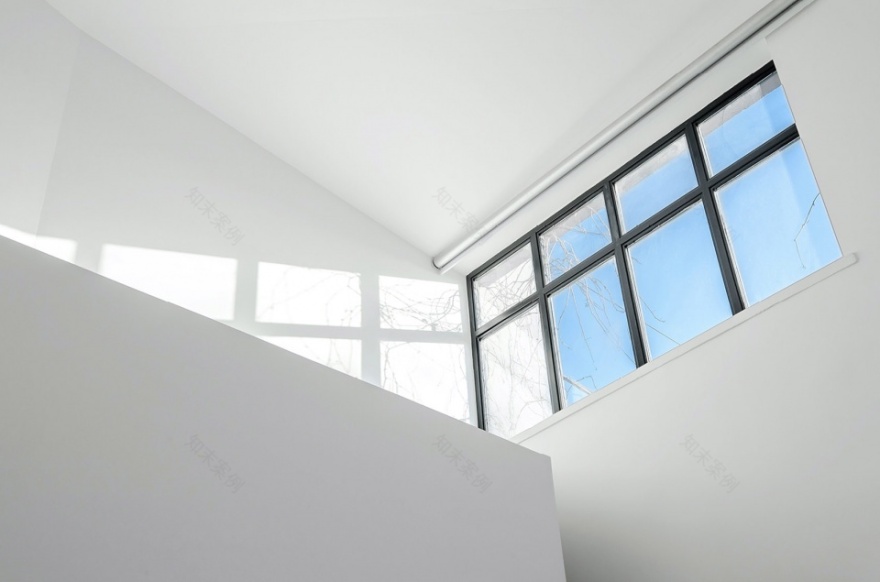
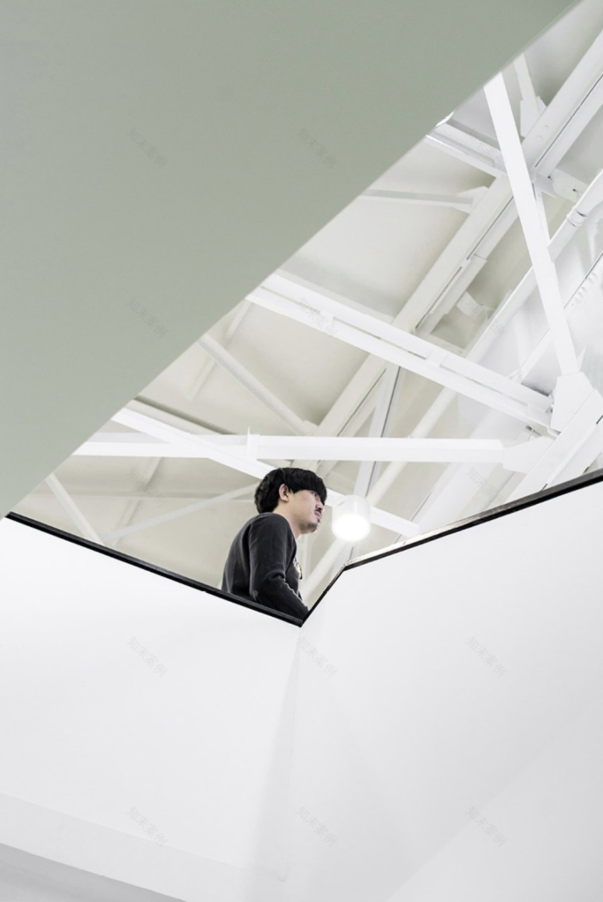
▼楼梯间窗景,window scenery
▼楼梯间,stair
▼平面图,floor plans
▼剖面示意图,sectional diagram
品牌:小象馆
类型:摄影空间设计
地点:北京颐堤港
面积:250 sqm.
状态:设计完成、施工完成
时间:2018
主创:斗西、Aimee、小花、阿翔
Client:ELE-FOTO
Category:Photo Studio design
Location:Beijing
Area: 250 sqm.
Status:Design Completed and Constructed
Timeframe:2018
客服
消息
收藏
下载
最近


