查看完整案例

收藏

下载

翻译
Plywood covers almost every surface in this store that creative studio Mythology has designed for beauty retailer Shen in Brooklyn, New York. Shen’s new retail space is nestled in Brooklyn’s Cobble Hill neighbourhood and measures 1,550 square feet. The former store of the beauty retailer – which is known for selling a roster of independent makeup and skincare brands – had been located in the nearby area of Carroll Gardens and featured a mix of white and lavender-pink walls.
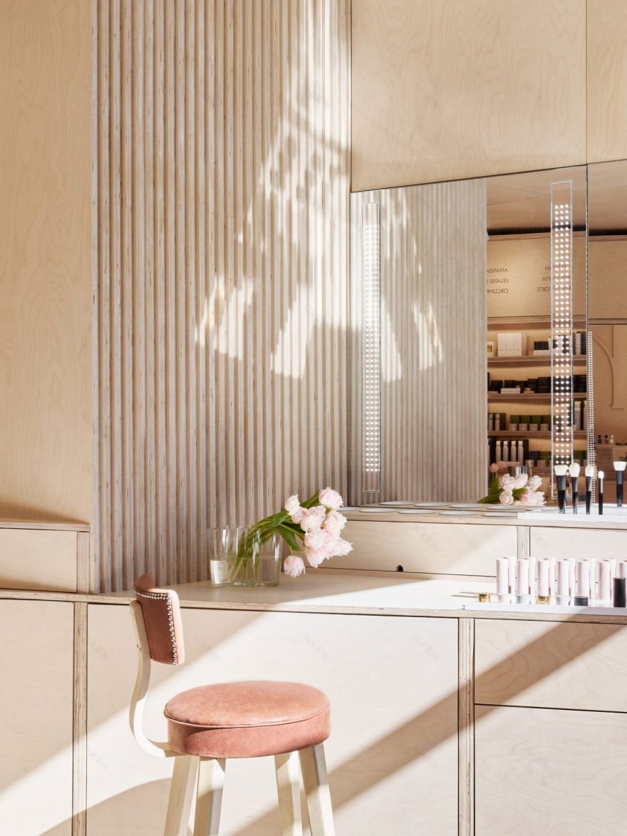
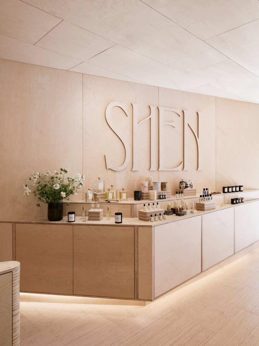
Manhattan-based Mythology has fashioned a warmer fit-out for this location, opting to line every surface in Baltic birch plywood. “We challenged ourselves to use a singular material because we wanted to juxtapose a humble utilitarian material like plywood with the high-end products featured in Shen’s product offering,” Ted Galperin, a partner and director of retail at Mythology, told Dezeen. “Using both the face and end-grain of the plywood allowed us to create a multitude of custom applications, and add visual variety to the space.”
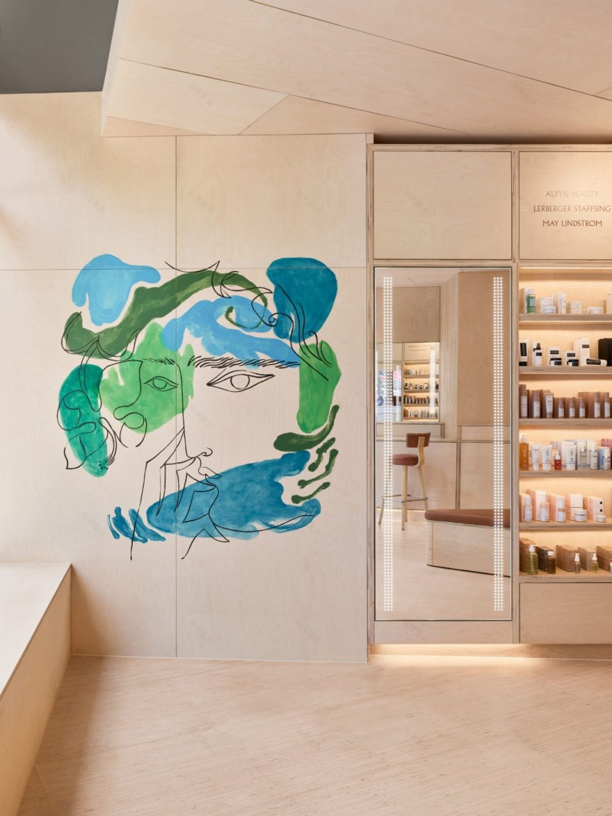
Inside, Shen has been loosely divided into three sections. The first section is dedicated to customer browsing and lies towards the left of the store. Plywood has been used here to make a sequence of storage units that fan outwards from the wall, each one complete with vanity mirror and shelving where products are openly displayed. Names of different brands that are on offer have been carved into plywood panels set directly above the units.
The second section comprises a couple of triangular plywood islands in the middle of the store, where Shen staff can spotlight certain products and talk through them in detail with customers or demonstrate how they’re used. On the right-hand side of the store is the third section, which is used for services like makeup tutorials. There’s also an angled plywood counter here that showcases candles and scents for the home, running beneath a three-dimensional plywood sign of Shen’s company logo.
Excluding a handful of restored 1950s stools from Thonet, furnishings and decorative elements in the store have been kept to a minimum. A splash of colour is added by a bespoke mural created by New York artist Petra Börner, which features a black-line illustration of a person’s face surrounded by wobbly blotches of green and turquoise paint.
Another mural by Börner using pink and orange tones appears in the treatment area at the rear of the store, where customers can come for treatments like facials, waxing, and microblading. Walls here have also been painted a pinkish hue, but exposed plywood can still be seen on the floor, built-in sofas and beauticians’ cupboards.
Designed by Mythology
Photography is by Brooke Holm
客服
消息
收藏
下载
最近


