查看完整案例


收藏

下载

翻译
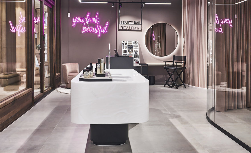
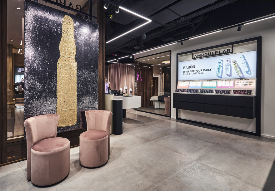
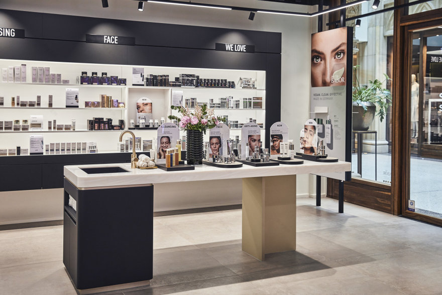
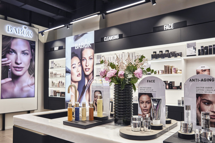
The new shop design for Babor Cosmetics, which is more modern and younger but also has timeless glamour, was created by Engels Architektur.
The store is devided into various zones. In the entrance area, the costumers are being welcomed with a modern functional look. The product placement is clearly arranged and the colour code is black and white with details in brass.
The second zone has an even more cosy athmosphere The colour code is black, rose and a warm shade of grey with again details in brass.
In the back zone, four treatment areas embrace the costumer with smooth textures and warm colours. Velvet curtains in rose compensate the black functional wall. An indirect light concept is completing the comfort zone.
engels architektur
客服
消息
收藏
下载
最近


