查看完整案例

收藏

下载

翻译
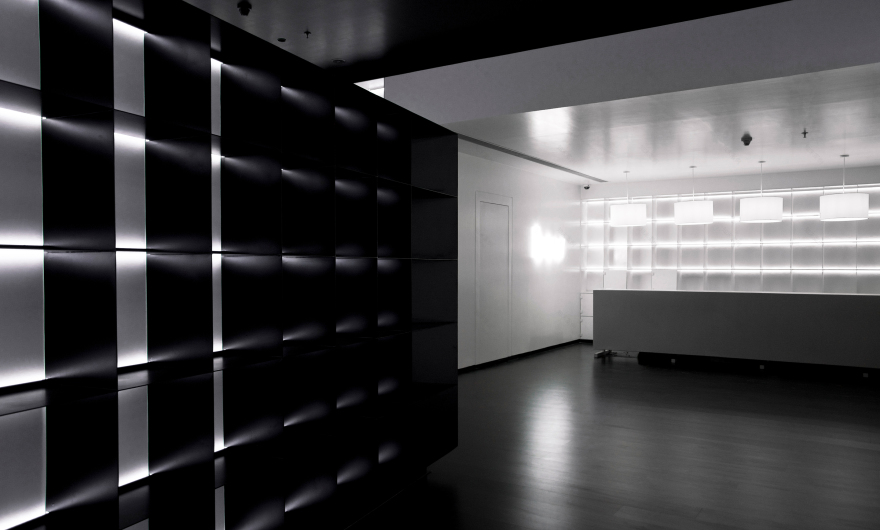
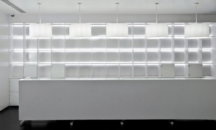
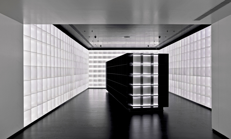
The design of B & W exaggerates the irony of alcohol in a ‘dry state’ by allowing the space to be occupied by tall display stacks for liquor bottles – almost as an analogy for valuable manuscripts in an archive. Each bottle on the wall is designated generous space while celebrating it as a venerable object. It is the monochromatic character of the space which gives rise to a sublime shopping experience.
The stacks along the wall are created by simple repetition of a single module. They are prefabricated sheet-metal elements assembled on site. The design strives to minimize the number of spatial elements and avoids creating a visual chaos in order to celebrate liquor.
Photographer
: Vishal Mehta
Design Team :
Dhawal Mistry, Virginia Garcia, Chandni Shah, Rakhi Nagpal
客服
消息
收藏
下载
最近


