查看完整案例

收藏

下载

翻译
The 1st Myeongjidae HwananTteo-bbokki Stand located before a university town of youth consists of a trendy, youthful space away from the existing general snack stand. The relevant design team has created the brand identity in the perception of a brand, which forms relations with customers by delivering its external, internal contents other than settling for a taste simply for discrimination, as important.
The same design team expressed the concept which the brand intends to express in a totally different way from the existing style / with a completely new & a lot more definite brand image, and intuitively by throwing away a red-color expression, or the elements used in general snack stand without hesitation.
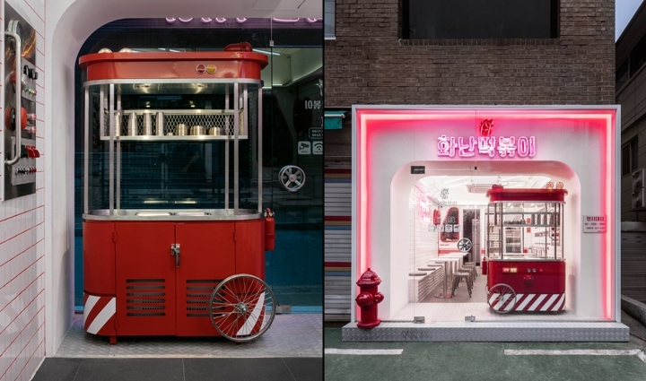
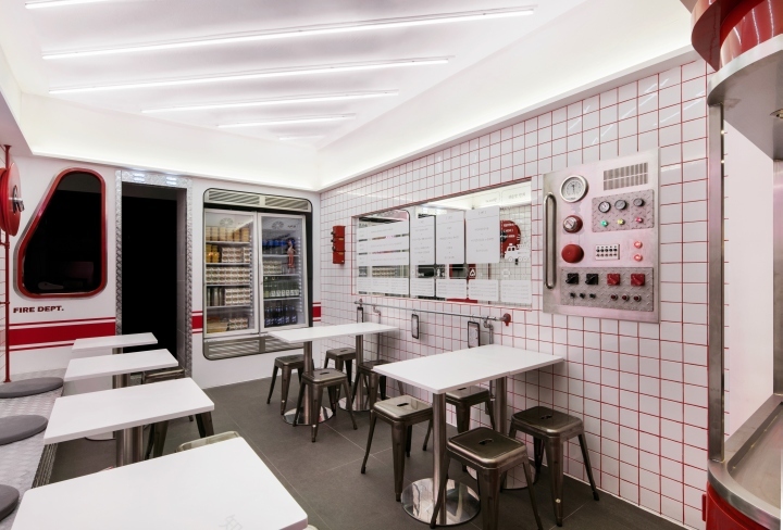
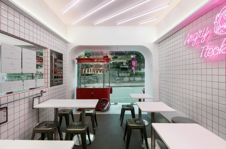
In addition, the same design team applied the concept of a Fire Truck with the addition of a wit and colors of the brand’s own that can be felt even in the name of the brand. As a method of expressing red color, this design team put emphasis on indirect lighting of the brand identity color for a façade, and the intense red color of tiles on walls.
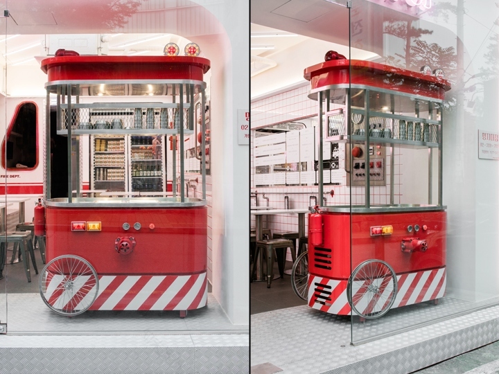
In addition, this design team made a design of a cart (purchase of a refrigeration system/self-bar) named ‘Hwanan Cart (Angry Cart)’ by borrowing the elements of a fire truck (side marker light, mesh net, hose reel, safety display pattern, fire extinguisher, and side mirrors) rather than a form in the light of a fire truck concept which could become somewhat childish.
Generally, this design team put priority on how to deliver a totally different, completely new, a lot more definite brand image to a consumer, and expressed a casual image that is coming near intuitively for the major target customer of Myeongjidae branch store- young customer base. To sum up, the 1st Myeongjidae Hwanan Tteok-bbokki store assumes a new brand image of a new Tteok-bbokki stand by breaking from the existing general Tteok-bbokki stand.
Design: Flymingo Design
Photography: Yongjoon Choi
客服
消息
收藏
下载
最近


