查看完整案例


收藏

下载
空间的一半依赖于设计,另一半则源自于存在与精神。
Half of space depends on design the other half is derived from presence and spirit.
——安藤忠雄(Tadao Ando)
设计构思 DESIGN CONCEPT 触目所及之处皆臻品,强化空间品质。
The quality of the space is improved wherever you can see it.
这套项目位于深圳,原本的四居改成大三居,公区区域尽可能的全部打通,包括阳台推拉门尽量极简显空间,开阔又高级。微水泥的米色宁静基调,不锈钢的时尚精致点缀,利落的极简硬装,艺术感的家具。纯净而自然,宁静而治愈。整个设计我们充分遵循简洁与留白的设计思想,为屋主尽可能营造出自然又舒适的居住感受......
This project is located in Shenzhen. The original four-bedroom was changed to Da Sanju, and all the public district area was opened as possible, including the balcony sliding door as much as possible to show the space as simple as possible, open and advanced. Micro cement beige is quiet tone, stainless steels fashion and exquisite embellishment, neat minimalist hard fit, artistic furniture. Pure and natural, quiet and healing. The entire design we fully follow the design ideas of concise and white, and create a natural and comfortable living experience for the homeowner as much as possible......
玄关,进门处满足了正常收纳的同时,还能看到满是生活希望向上而上天际线一线灯。
At the time of the entrance to the door, the normal storage can also be seen, and you can also see the hopes of life and the upper line of the sky line.
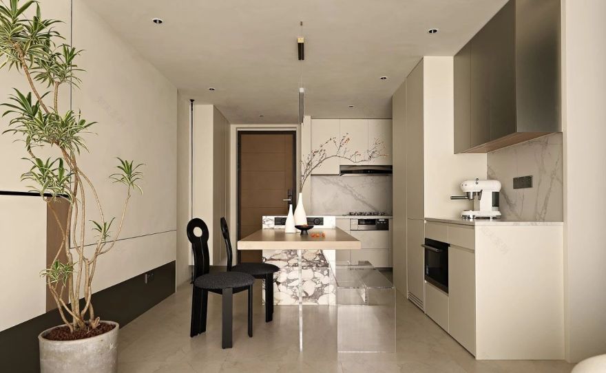
L 型的厨柜收纳空间充足,又让动线更为流畅,兼具功能与美观,很符合年轻人的需求喜好。
The L-shaped kitchen cabinet has sufficient storage space, which makes the moving line smoother, with both functions and beauty, in line with the needs of young people.
开放式 LDK 餐厨区域,连冰箱也隐藏在美学空间里,餐厅吊柜延用餐厅背景墙的不锈钢装饰板,岛台点缀了时下流行的宝格丽大理石,即前卫又时尚,为空间提升格调,与典雅的家具结合相得益彰,丰富又独特。开放式的餐厨客厅,亦能轻松自如的来回切换不同场景模式,又大大增加了屋主家人之间的互动性。
The open LDK kitchen area, even the refrigerator is hidden in aesthetic space. The restaurant hanging cabinet extends the stainless steel decorative board of the restaurant background wall. The combination of elegant furniture complements, rich and unique, open-style kitchen living room, can also easily switch different scene models back and forth, which greatly increases the interaction between the homeowners family.
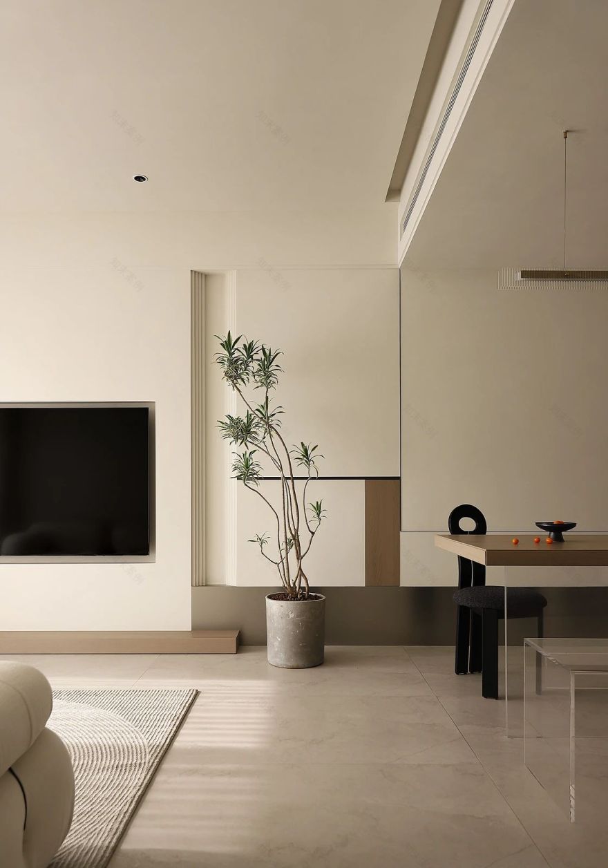
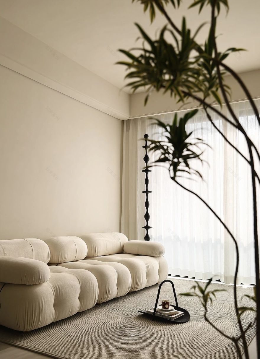
客厅区域,墙面微水泥背景延用餐厅背景序列式的排列设计手法,也称斯卡帕似的设计手法,宛如生活一切有序却惊喜的进行,沙发背景也设计了线性灯脱离墙面与天花之间的硬收口。我们希望用简洁温暖的设计语言,为屋主创造出理性实用和自然美学的相融空间。
In the living room area, the background of the background sequence of the restaurants background sequence -like arrangement design technique, also known as Ska Papas design techniques, like all orderly but surprise in life. Hard storage between smallpox. We hope to use simple and warm design languages to create a space for homeowners with rational, practical and natural aesthetics.
整个过道,利用公卫二次分离的卫生间外置洗手台,尽显空间尺度感,各私有空间的房门无框隐形到顶,将极简利落到更极致。
Throughout the aisle, the outside toilet washed by the secondary toilet of the public health showed the sense of space scale. The door of the private spaces of the private space was not invisible to the top, and the minimalist was extremely extreme.
灰常治愈的衣帽间,高颜值的大面积无框镀膜玻璃门,使用镜面原理尽显空间大通透和折射光线作用,简直就是空间的放大镜。定制烤漆色的梳妆台与衣柜形成穿插结构的设计,让空间更加灵动起来。
The cloakroom that is often cured, a large-scale frameless coating glass door, using the principle of mirror surface to show the spatial throughout and refraction light, it is simply a magnifying glass. The custom-made painting dresser and wardrobe form a design of interspersed structures to make the space more agile.
主卧天花弧形顺势而下至背景墙,犹如一幅卷轴画卷徐徐展开,散发着缕缕温柔,艺术审美张力也就此拉满。
The main bedrooms ceiling is going down to the background wall, as if a scroll scroll is open slowly, exuding a strand of gentleness, and the artistic aesthetic tension is full.
主卫整面电子雾化玻璃(调光玻璃),可使玻璃在瞬间转换透明与不透明的效果,模糊了主卧空间边界,既能兼具审美与功能,解决大大的采光问题,又能保护隐私,也给屋主日常生活使用增添一些趣味和仪式感。
The main guards entire electronic atomizing glass (lighting glass) can make the glass transparent and opaque effect in an instant, blurring the boundaries of the master bedroom space. Protecting privacy also adds some interesting and rituals to the daily use of the homeowner.
客房牛油果绿的床头软包给生活增添一丝绿意盎然,让整体呈现出干净清新的气质,带来素雅细腻的感官体验。定制悬浮的榻榻米床,这样的设计不仅看起来轻盈通透,没有丝毫厚重感,简洁高级,而且能够很好的提升空间通透感。
The soft bag of the green bedside of the rooms adds a hint of green to life, allowing the overall to show a clean and fresh temperament, bringing an elegant and delicate sensory experience. Customized suspended tatami beds, this design not only looks light and transparent, does not have a strong sense of heavyness, simple and advanced, but also can improve the sense of space transparency.
粉嫩及趣味性的高低床,属于自己的小天地,干净治愈的高级感,童真的回忆,延伸客餐厅的序列设计,一切又自然而有变化,也让视觉上有了一定的延伸感。软呼呼的儿童房,等你慢慢长大......
Pink tender and interesting beds belong to their own small world, clean and cure, innocent memories, extended the sequence design of the guest restaurant, everything is naturally changed, and it has a certain sense of visual extension. Soft children’s room, wait for you to grow up slowly......
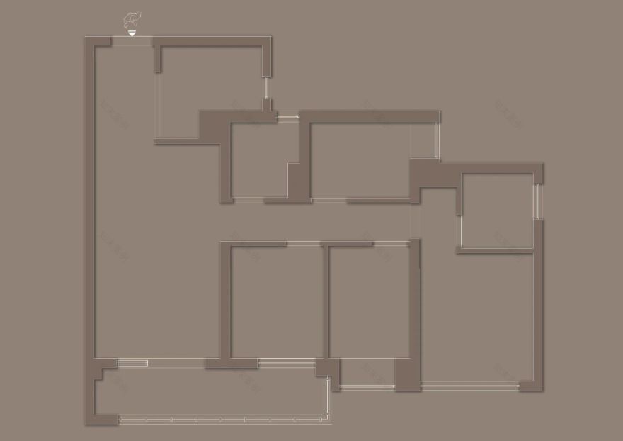
FLOOR PLAN
平面方案/DESIGN FLAT PLAN
改造后亮点:
① LDK 厨餐厅,满足西厨的同时还兼顾收纳;
② 公卫二次分离,洗手台外置;
③ 多功能房空间的灵活性,有客人时可就住;
④ 小孩房墙体移位,可增多一排收纳面积给到公卫及过道;
⑤ 主卧增加一个衣帽间功能区域;
⑥ 主卫满足 4 件套,洗手台外置,另设计了电子雾化玻璃,增加空间通透感及趣味性。
INFO
项目名称:返璞 • BACK TO NATURE
项目地点:深圳 招商臻府
设计机构:FX 风向设计
建筑面积:122m²
室内材料:微水泥、岩板、金属板、全屋智能
AGENCY FOUNDER
曹智红
FX INTERIORS DESIGN 创始人 / 设计总监
FX 风向设计(成立於 2022 年)----传播更有生活态度的 HOUSE 整个设计过程是由风向设计团队共同协作完成,及项目总设计、前期深化、执行设计、软装设计。
FX Design(established in 2022)---- The whole design process of spreading more life oriented HOUSE is jointly completed by the wind direction design team, as well as the general design, preliminary deepening, implementation design and soft decoration design of the project.
……
内容策划 / PRESENT
策划 Producer:Mei Ji File
撰文 Writer:MATILIAN
排版 Editor:W/fei
图片版权 Copyright:风向设计
纵享全球之美学
开拓设计之思维
INDULGE IN GLOBAL AESTHETICS AND DEVELOP DESIGN THINKING
客服
消息
收藏
下载
最近


