查看完整案例

收藏

下载

翻译
We continue our series on deconstructivism by looking at Zaha Hadid's first major built work, the Vitra Fire Station in Weil am Rhein, Germany.
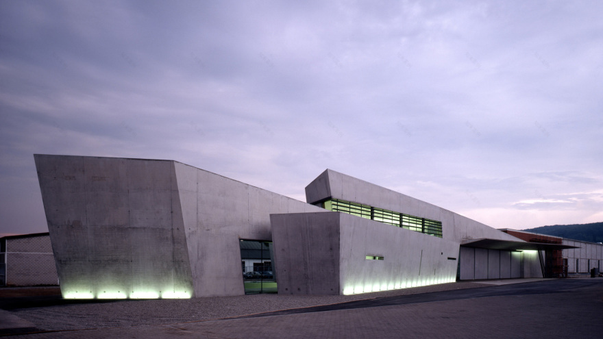
Designed by Zaha Hadid Architects in 1993, the building was a key work in establishing the style of deconstructivism and now serves as an exhibitions and events space.
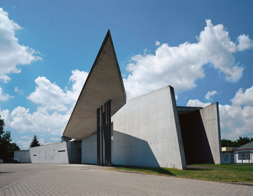
Top and above: Zaha Hadid designed the Vitra Fire Station. Photos by Christian Richters
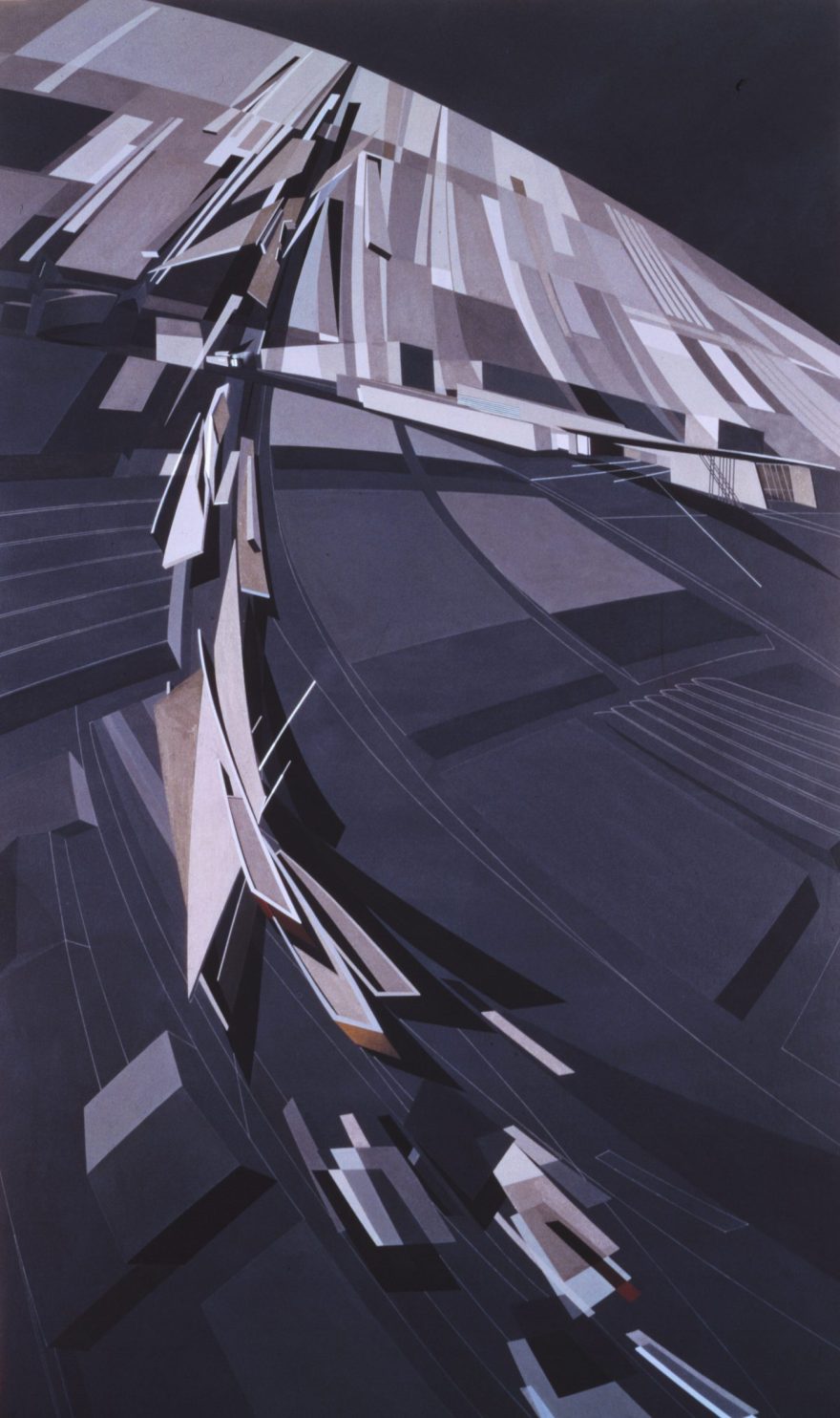
The station's dynamic form was the built translation of Hadid's early, visionary paintings, which portrayed disordered, dynamic forms "exploding into little pieces" with a sense of movement that would become characteristic of the deconstructivist style.
At Vitra Fire Station, this feeling of motion is captured in sweeping planes of exposed concrete that cut across the site along paths informed by the surroundings, demonstrated in a short animation produced by the practice.
It has a dynamic form. Photo by Thomas Dix, courtesy of Vitra
The unusually narrow, sloping spaces created where these planes crash together are intended to create a sense of "tension", anticipating the sudden rush of activity that could occur at any time should the station's alarm ring.
"This building is 'movement frozen' – a vivid, lucid expression of the tensions necessary to remain 'alert', to explode into action as required," said Zaha Hadid Architects.
Vitra director Rolf Fehlbaum commissioned the station in 1990, following a fire in 1981 that tore through over half of the Vitra Campus, necessitating a new masterplan that would include space for a dedicated fire service.
This redevelopment saw the campus become home to a series of early works by some of the most high profile architects in the world, including another proponent of deconstructivism, Frank Gehry, who designed the nearby Vitra Design Museum.
The building is on the Vitra campus. Photo by Christian Richters
The fire station sits at the southwestern edge of the campus, where it follows a curve in the road with two parallelogram-shaped forms that are organised according to "linear patterns in adjacent fields and landscapes."
"Conceived as the end-note to existing factory buildings… it is designed as a connecting unit rather than an isolated object, defining rather than occupying space," explained the studio.
It was originally used as a fire station. Photo by Christian Richters
To the east is a cavernous garage space featuring an entirely glazed, steel frame wall.
A large section of sliding wall forms of the exit from this garage, beneath a sharp, geometric concrete canopy supported by a cluster of thin metal columns that soars upwards to reference the movement of fire engines rushing out of the building.
"The walls appear to slide past each other, while the large sliding doors literally form a moving wall," said the studio.
To the west, a two-storey volume contains an entrance corridor with a large ribbon window, behind which are the changing areas for the firefighters.
The space is now a gallery. Photo by Mark Niedermann, courtesy of Vitra
Above, a break room with a kitchenette features an angular countertop and shelving that follows the geometry of the walls, looking back towards the campus through another ribbon window shaded by brise-soleil.Instead of being treated as separate rooms enclosed by doors, the interior is conceived as a flowing network of spaces, with the changing areas originally separated by curving metal lockers and thresholds suggested by the narrowing of spaces rather than doors.
"The fire station - long, linear, narrow - emerges as a layered series of tilted and breaking walls," said the practice.
"The programme inhabits the spaces between these walls, which puncture, tilt and break according to functional requirements," it continued.
Internal walls are exposed concrete. Photo is by Andreas Schwarzkopf
To maintain the clarity of this formal composition, details in the station have been kept to an absolute minimum, avoiding light fittings, door and window frames, floor finishes, and roof edgings.
While certain spaces have been given a lining of insulation and white plaster to retain heat, many of the internal walls have been left as exposed concrete.
Strips of fluorescent light embedded along the ceilings or floors again reference the concept of lines cutting across the site, and give the concrete planes the appearance of glowing.
Even the balustrade of the staircase, which is positioned in a void where two forms intersect, is designed as four parallel handrails at different heights that ensure its upwards, angled trajectory is not broken by the landing areas.
It has many angular spaces. Photo is by Pjt56
"Any attachments like roof edgings or claddings were avoided as they distract from the simplicity of the prismatic form and the abstract quality of the architectural concept." said the practice
Lines inscribed onto the pavement surrounding the building suggest the "linear patterns" that informed the design, and are intended to "choreograph" the various positions and routes of the fire engines.
"As one passes across the spaces of the fire station, one catches glimpses of the large red fire engines," said the practice.
"Their lines of movement are inscribed into the asphalt. Similarly, the ritualised exercises of the firemen will be inscribed into the ground' a series of choreographic notations," it continued.
The station opened to great acclaim, praised for its ability to translate what many had merely considered "paper architecture" in Hadid's paintings into built form.
Vitra Fire Station was a built translation of Hadid's early paintings
In a 2016 interview filmed for Dezeen's Remembering Zaha Hadid series, the Danish architect Bjarke Ingels reflected on the impact seeing the Vitra Fire Station for the first time had on him.
"She had somehow found a way to manifest in physical form the seemingly impossible perspectives of floating elements and skewed angles that she had captured in her fantasy [paintings]," said Ingels.
Just a few years after the station opened, however, Vitra decided to disband its dedicated fire service, with the responsibility for protecting the campus transferred to the Weil and Basel Fire Services.
Hadid's paintings show angular forms
To critics of deconstructivism, reports that firefighters had allegedly found the building difficult to use served as proof that the style prioritised form over function. Today, the Vitra Design Museum continues to use the spaces for events and small exhibitions.
The use of exposed concrete to create angular, sloping walls and jagged edges would become a hallmark of Zaha Hadid's early projects, including the MAXXI Museum in Rome and the Phaeno Science Centre in Wolfsburg.
Illustration by Jack Bedford
Deconstructivism is one of the 20th century's most influential architecture movements. Our series profiles the buildings and work of its leading proponents – Eisenman, Koolhaas, Gehry, Hadid, Libeskind, Tschumi and Prix.
Read our deconstructivism series ›
客服
消息
收藏
下载
最近


