查看完整案例


收藏

下载

翻译
Chinese architecture Studio PIG Design has created a showroom for the Memphis Milano furniture brand in Hangzhou, China, with interiors designed to make customers "feel the atmosphere of Memphis".
Named Ya Space!, the two-storey building was designed to be an exhibition space and furniture showroom for Memphis Milano, which owns the rights to pieces created by the Memphis Group.
PIG Design created the Ya Space! furniture showroom in Hangzhou
The showroom's name, exterior form and interiors were all created to reference the Italian design and architecture group, as well as the city of Memphis.
Its name is a play on the city's nickname Bluff city, which refers to several nearby bluffs – or cliffs – on the Mississippi River, as cliff is pronounced as Ya in Cantonese.
"Ya Space! not only echoes the nickname of Memphis in China – Cliff City, but also conveys a surprising feeling that indicates the unexpected sensory experiences Memphis furniture brings to people," PIG Design said.
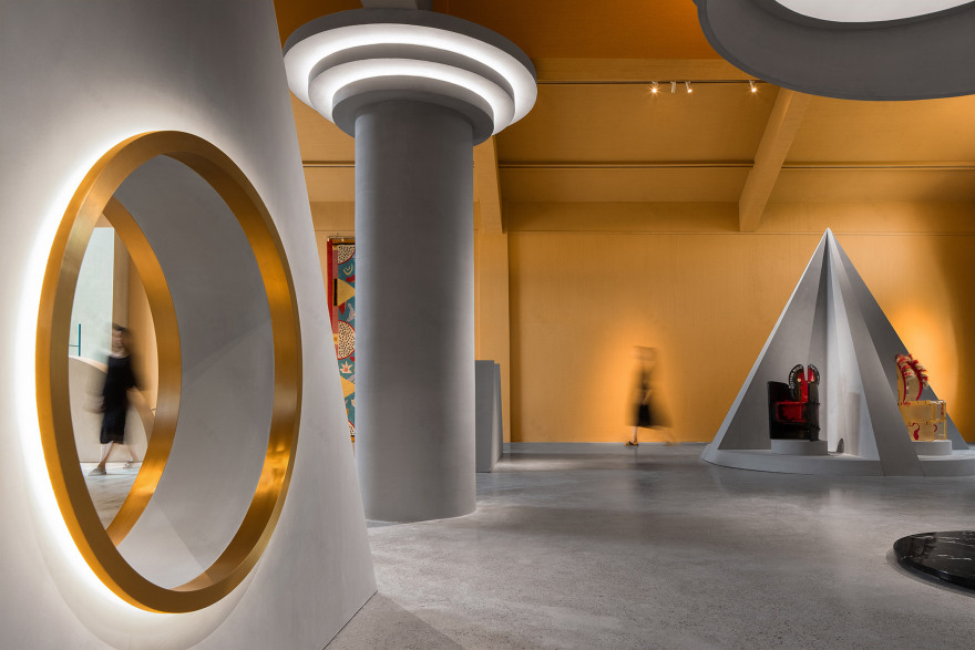
The showroom has Memphis Group-informed interiors
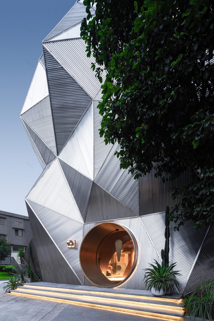
The idea of a cliff also informed the two-storey building's facades, which are covered in angular, corrugated stainless steel sheets.
A circular doorway cut into the stainless steel facade leads into the showroom, which was created to evoke the style of the Memphis Group.
"We hope that what customers feel in the space is not the ordinary white box exhibition hall but a totally different perception, one that makes the customers feel the atmosphere of Memphis," PIG Design founder Li Wenqiang told Dezeen.
The interiors are almost entirely grey and yellow
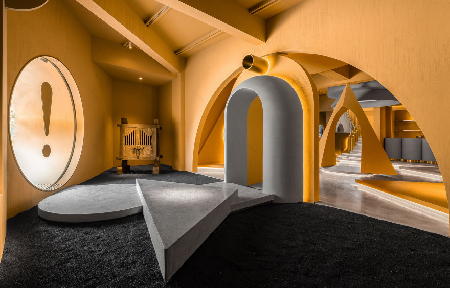
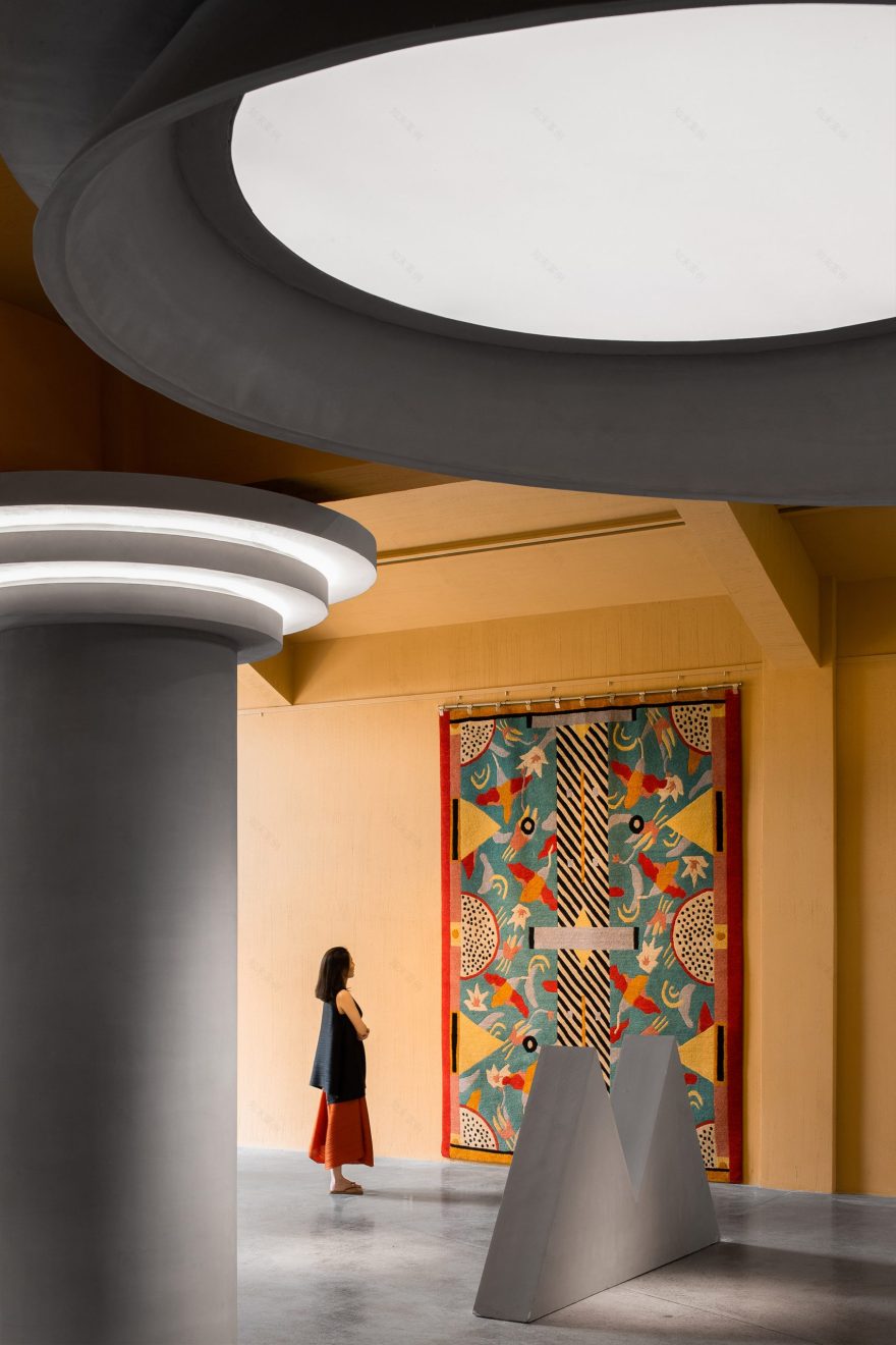
Within the showroom, PIG Design created a series of spaces divided by archways and geometric forms and united by a colour scheme that only utilised yellow, grey and black.
Customers enter into a foyer space with a black-stone floor, where a pathway formed by three grey geometric blocks leads into the main exhibition area.
A triangular arch stands at the centre of the showroom
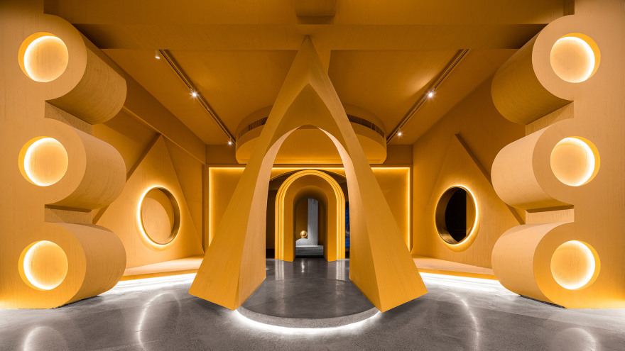
Entered through a grey archway, this main space is arranged around a triangular archway that stands at the centre of the room.
Related story Five designers who show that maximalism is back in fashion
Four raised triangular platforms protrude from the walls to display items of furniture on, with matching triangular forms extending up the walls.
Arches break up the ground floor space
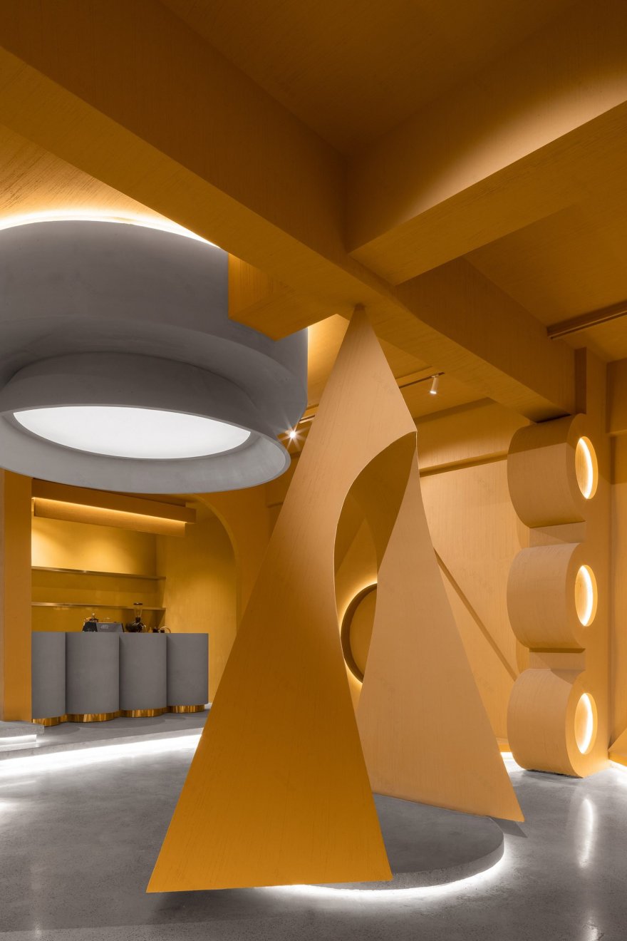
At the rear of the main exhibition space is a counter for a small coffee shop fronted by four stubby grey columns.
Alongside this, a grey staircase with a golden bannister leads up to the first-floor exhibition space.
Much like the lower showroom, this upper space is broken up by a series of geometric forms, although on the upper floor these are all grey.
The display space is arranged around a grey central column with triangular, curved and pyramid forms used to divide the room.
The upper gallery is divided by geometric forms
Designed as a homage to the Memphis Group, Wenqiang hopes that Ya Space! will be an interesting alternative to numerous minimal exhibition spaces that have been built in recent years.
"In my opinion, we have been surrounded by the Nordic frigid style, neutral style and minimalist style for a long time," he said.
"In a way, we have visual fatigue and the Memphis style creates a strong visual impact on us."
Ya Space! will be used for displaying furniture that will be for sale
In recent years there has been a re-emergence of designers and architects refocusing on the Memphis Group and maximalism.
Claire Bingham, author of More is More: Memphis, Maximalism, and New Wave Design picked out five contemporary designers currently reinterpreting the style.
Photography is by Shao Feng.
Project credits:
Design firm: PIG Design
Chief designer: Li Wenqiang
Design firm: Tan Shijie, Cheng Liang, Zhu Yiyun, Chen Yunyun, Liu Ruonan, Wang Keke
Construction firm: Hangzhou Dianchang Decoration Engineering
Lighting design: Hangzhou Licheng Lighting Engineering / Young Lighting Design
Furniture brand: Memphis
Lighting fixture design: Li Wenqiang
客服
消息
收藏
下载
最近


