查看完整案例


收藏

下载

翻译
Firm: Cristiana Vannini | arc
Type: Commercial › Exhibition Center
STATUS: Built
YEAR: 2011
what: fair booth
where: made expo 011, milan
client: PUCCI SAORO
project: vc-a _cristiana vannini + paolo cesaretti
project team: alessandra spaltini + steven risiott
photo: saverio lombardi vallauri
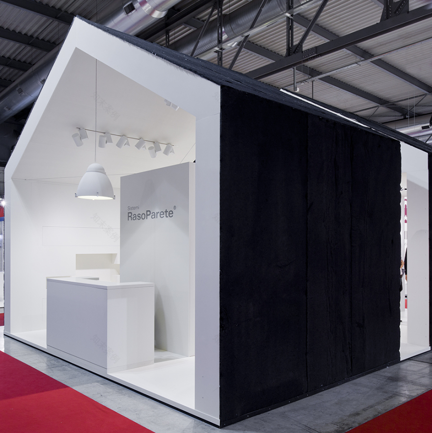
Sistemi RasoParete takes part to Made Expo 2011 - emerging European fair for architecture and construction - with a stand totally renovated. The concept designed by Milan-based studio vc a | vannini+cesaretti, emphasizes the company’s vocation for a production of the highest architectural quality. The company’s tailor-made products are problem solving in interior architecture: windows, doors and containers concealed in the walls and perfectly engineered
A theme of the exhibit project is therefore architecture, interiors, features of which the house is the synthesis and archetypal symbol. As a second theme is the interstitial space between the building structure and the inner skin that draws the interior environment. Sistemi RasoParete allows in fact, with its products, to exploit this interstitial space.
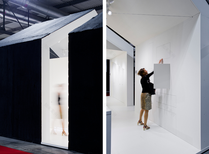
The project is an abstraction of the house, with its interior and its “walls”, a small white architecture with a gabled roof, “cut” on front and center to show its thickness. The exhibition space looks like a small building covered outside by a thin sheet of dark felt, rough textured surface, a bit ‘primitive, in stark contrast to the purity of the inner surfaces. The front of the setup is outlined by a reception desk and a large chandelier, both white.
The small area available is best used through a looping path, thus maximizing the exhibition surfaces. A total whiteness expands the perception of space dimensions. The interior is divided along a solid volume and a clear glass one both accommodating some of the company’s products, meanwhile the inner perimeter houses the concealed systems that strongly characterize Sistemi RasoParete’s production.
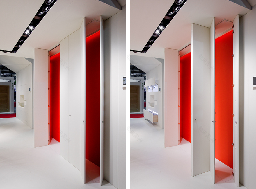
Doors, cabinets and drawers, when opened, reveal the inner portions of the perimeter that – contrasting with the general all white atmosphere – are painted bright red. The dynamic interplay to open and close, on and off, makes the visitor interact with the space, changing colors and configurations.
The iconic shape of the whole installation reveals three distinct perceptive elements: the dark outer skin, the inner white, and the red symbolizing the space enclosed between the former two.
客服
消息
收藏
下载
最近


