查看完整案例


收藏

下载

翻译
Architect:MLA+;CAPOL
Location:Shenzhen, Guangdong Province, China; | ;
Project Year:2020
Category:Apartments
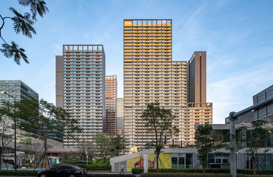
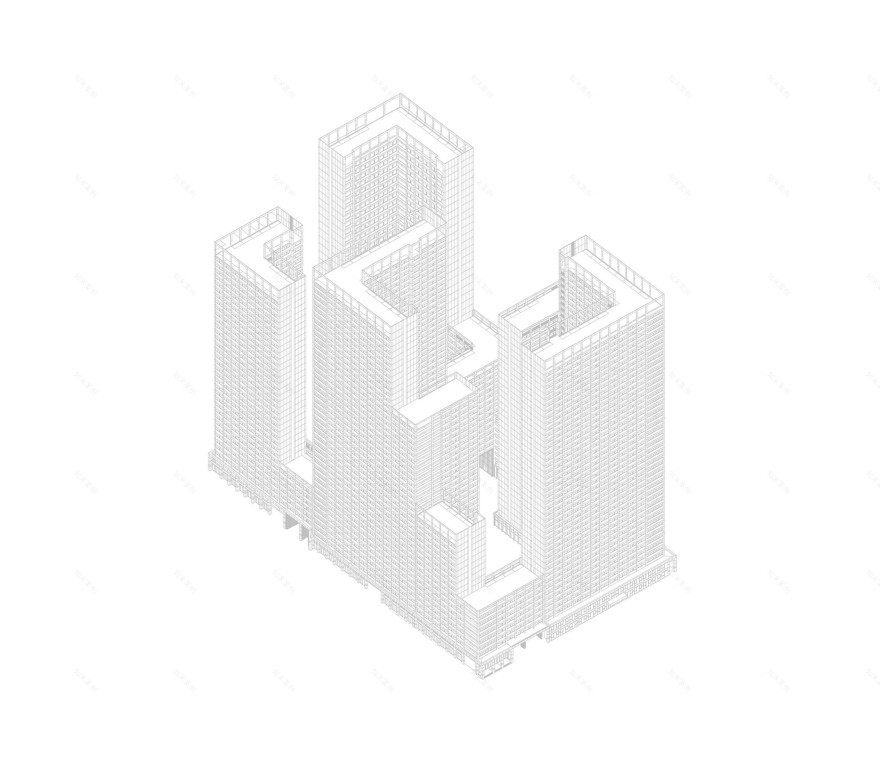
Located within Liu Xian Dong High-Tech district, this housing project provides home for some of Shenzhen’s booming talents. The 150.000m2 small-scale apartments and 20.000m2 hotel are complemented with 15.000m2 amenity spaces and 5.000m2 commercial space surrounding courtyard and towards the street.
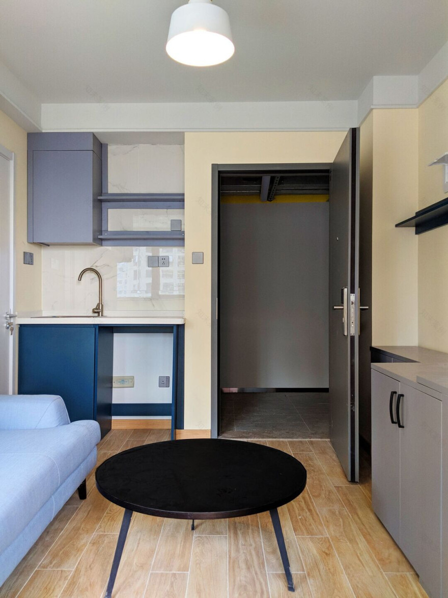
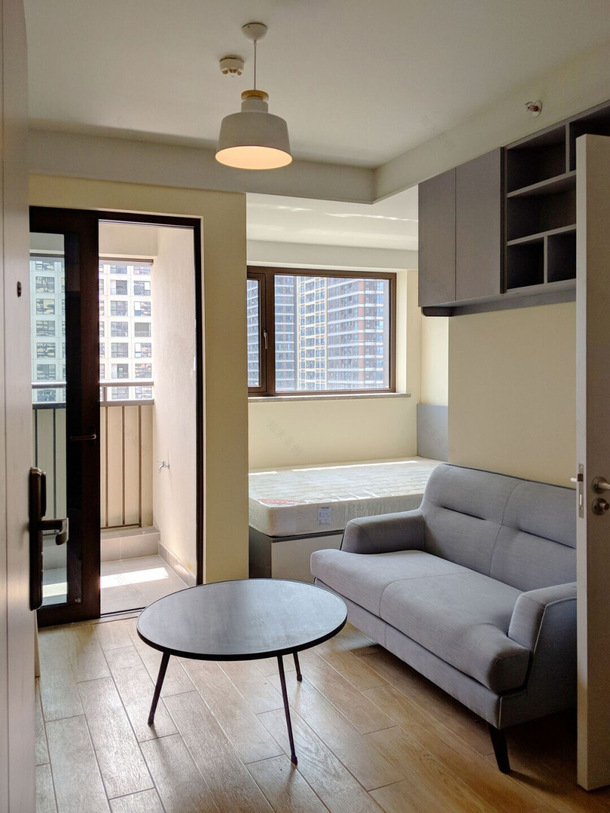
While we had experience with small residential units, the scale of the Tropical Metropolis was a new challenge. Organizational principles typically used for studio apartments became even more important in this building where every square meter saved immediately had an effect multiplied hundreds of times. Optimizing did not stop at finding the most efficient floor plan. Structure, installations, facades, fit-out all bear potential for optimization – knowledge we were able to evolve during this project.
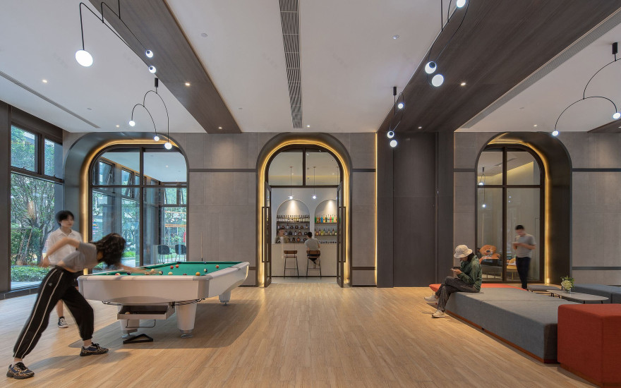
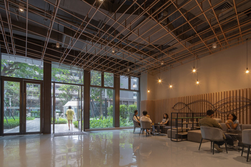
Micro living’s qualities not only lie in the residential units. More than in other residential projects, the quality and usability of the shared spaces and shared facilities are important. We, therefore, put extra emphasis on allocating them in the best places in the building within an environment that helps them thrive.
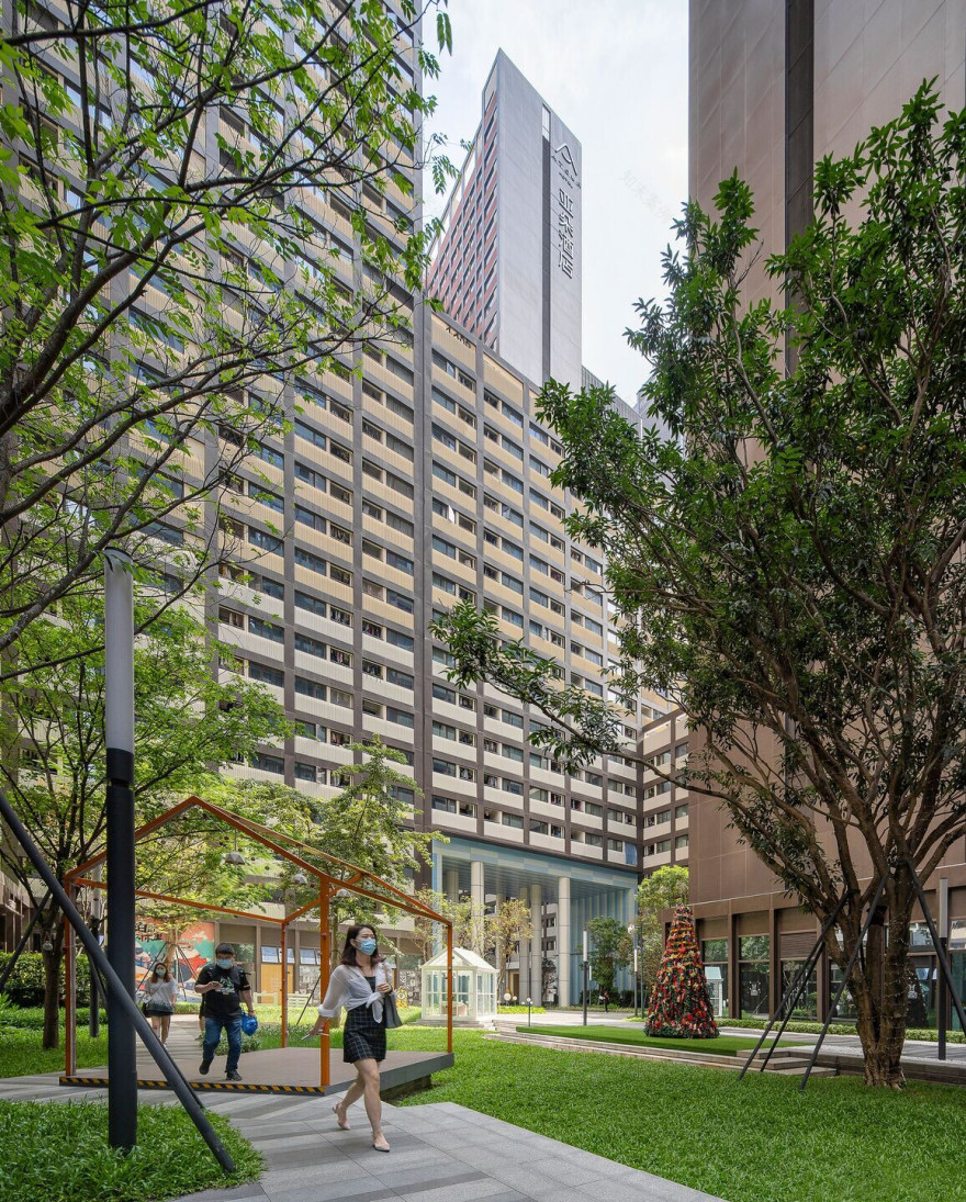
We make buildings that land in the city in an integrated way and enhance the urban environment. This applies even more so to this complex. The plinth of the building is designed as a continuous colonnade which varies in height and depth. It unifies all the functions that can be found on the ground floor: retail on all sides, the hotel entrance to the north, and a regional post office to the south.
The communal entrances to the courtyards as well as the parking entrances are fully integrated into this system. This covered space provides shadow in the heat of Shenzhen summers and protection against the subtropical thunderstorms that hit the city frequently. The colonnade is finished in a white local granite which is polished at street level to 1,8m in height.
The infill (doors, windows, grilles) are executed in dark bronze metal just like the main façade grid of the upper levels. All this combined gives the building an urban and civic character while providing a clear sense of place.
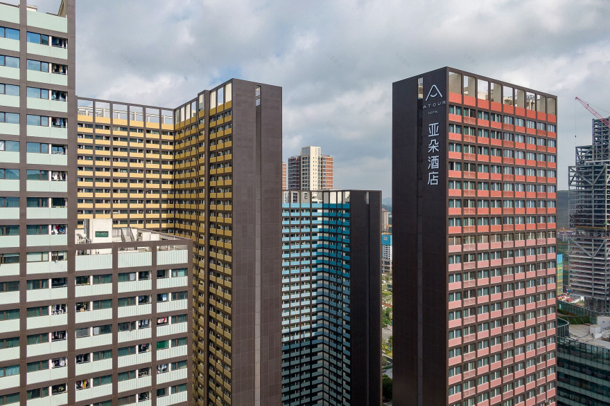
To create more visual depth, each of the 4 towers is given a color that gradually darkens as you go up the building. From far away this gives each tower a distinct character, while on street level and up to 24m, they share the same unified grey base.
The strength of the project is its repetition of residential units that together form a sculptural building. We felt, that the units should remain visible by treating the structural concrete frame as a uniform grid which is clad in dark bronze metal. Each unit is individually expressed by a metal infill panel in a dedicated color, that also serves as a balustrade to the balcony. In order to create depth and shadow, the metal panel is faced with vertical strips that give the facade a 3-dimensional quality. The windows and balcony doors have the same uniform dark bronze finish as the mega grid. The overall shape, grid, and color combined create a ‘happy’ building that sets itself apart from the mostly grey complexes that characterize the closer and wider areas.
1. Facade cladding: Oxidized copper (similar to TECU® Oxid)
2. Balcony railings Powercoated steel railings
3. Windows: Aluminium (similar to Schüco Jansen aluminium systems windows)
4. Doors: Aluminium (similar to Schüco Jansen aluminium systems windows)
5. Roofing: Gravel flat roof
Structure: In situ concrete frame
Main frame: Aluminium cladding in dark bronze
Window frames, doors, metalwork: Aluminium dark bronze
Balustrades: Powder coated aluminium in 4 colour ranges (red, blue, green and yellow)
Plinth streetside: Natural stone cladding in local white granite
Plinth courtyard plinth: Aluminium cladding in dark bronze
Interior completed by third parties, brands chosen by executive architect
▼项目更多图片
客服
消息
收藏
下载
最近


