查看完整案例


收藏

下载

翻译
Firm: DP Architects
Type: Commercial › Office Retail Shopping Mall
Photos: Wellington Kuswant (2), Marc Tey Ge Wai (1), Rory Daniel (1), SHAPS - Shu He Architectural photography Studio (1)
Designing the Retail Space: Case Studies
Ti has been involved in a series of successful retail projects around the world, including several malls that transformed Singapore’s famed Orchard Road and The Dubai Mall, one of the world’s largest malls. This essay discusses three key aspects of Ti’s retail design.
As dedicated public spaces are increasingly being subsumed into private developments, retail space plays an increasingly important role in upholding the public domain. Retail developments open up new spaces that serve as points of congregation, and make a positive contribution to the urban context by activating spaces beyond office hours.
Ti has been instrumental in reshaping the shopping landscape and urban experience in Singapore and overseas. His retail portfolio includes the revitalisation of Paragon and Mandarin Gallery on the renowned Orchard Road shopping strip, and the design of The Dubai Mall, arguably the world’s most successful mall.
In his retail projects, Ti takes a fresh approach by challenging the conventional design process without compromising functionality. The three key aspects in his thinking are clearly reflected in his designs: visual connectivity, purposefulness and spatial quality.
Visual Connectivity
An important element of any retail development is visual connectivity. Visitors should have clear sightlines to the retailers, both for retail viability and ease of wayfinding. The atrium space, which DPA introduced decades ago at People’s Park Complex, serves not only as a social collection space, but also as a visual core allowing sightlines to multiple levels and locations from a single vantage point. On the outside, visual connectivity is often manifested in the treatment of shopfronts to allow interaction between interior and exterior spaces.
At Novena Square, completed in 2000, a five-storey glass rotunda located at the retail entrance has become a focal point for the complex, and continues the tradition of congregation space within retail. A series of five barrel-vaulted skylights allow full penetration of natural light into the retail atrium below.
Seven years later, Ti not only explored ways of knitting together the existing building and the new addition, branded as Velocity, but also increased visibility between different levels. Two new atriums carved through the structure create more opportunities for social interactions. Light streams from the skylight and illuminate the interior, creating a unique light-filled spatial experience for entering and moving through the retail space.
Paragon shopping centre is a compelling example of visual connectivity. The design responds to the demands of the mall's upmarket tenants for grand street displays on Orchard Road. The interior space is naturally illuminated by sunlight filtering through the exterior skin.
Paragon’s openness and internal visibility is further enhanced by the unique configuration of its façade. The frontage exhibits full glazing up to the fifth level, and three glazed blocks project four metres beyond the original elevation line. Its unique façade articulations create more shopfront opportunities than most other malls along Orchard Road. The signature façade creates a strong presence of retail display within its urban context.
Purposefulness
While aesthetic trends are increasingly short-lived to respond to an evolving clientele, functionality and purposefulness remain evergreen hallmarks of good design. While the shopping public may focus on the dazzling displays, the continued success of any good shopping mall depends on clear circulation for both shoppers and retailers alike. This manifests in clear wayfinding that allows a level of instant familiarity for the shopper, along with an ease of service and loading routes for the retailers. Coupled with easy ingress and egress, parking access and facilities, thoughtful and considerate design remains the backbone of Ti’s design strategy.
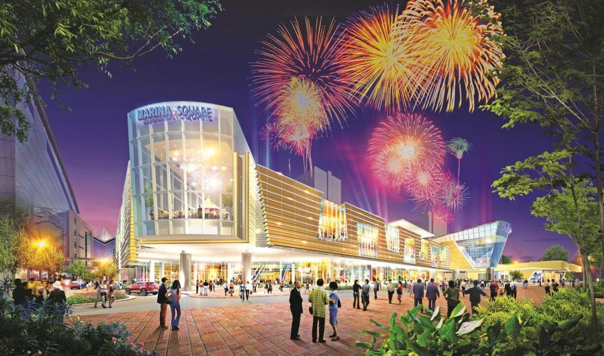
The current addition-and-alteration of Marina Square demonstrates a clear circulation system. As the focus of the area has shifted to the adjacent Marina Bay in recent years, Ti reorganised the layout of Marina Square to emphasise this orientation change, and inserted a two-storey prismatic volume with two new main entrances.
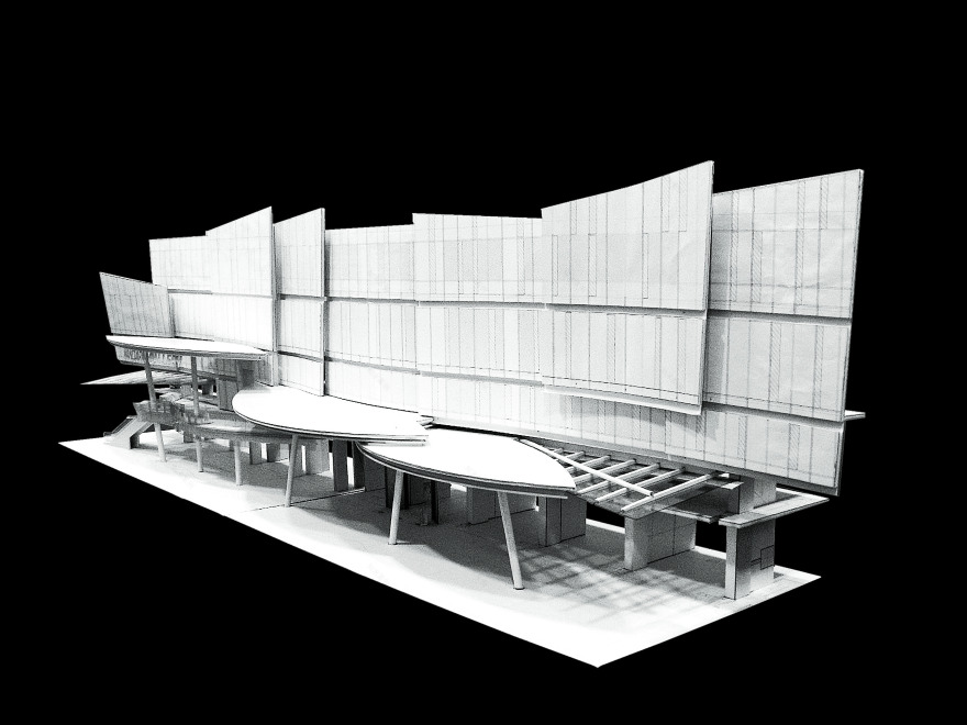
The proportion and mass of the new structures respond to the surrounding buildings. A 240m façade is organised in horizontal bands that wrap the new two-storey addition. The new layout allows easy access to Marina Square from Raffles Avenue, and also converts the under-utilised landscaped area along this avenue into a vibrant public space. New additions come together with existing buildings to create a permeable and inviting urban setting.
Mandarin Gallery on Orchard Road has also developed a clear circulation, engaging users at a fundamental level. The design of Mandarin Gallery exemplifies the extroversion of the conventional shopping mall. Consideration has been given to the enhancement of pedestrian accessibility. Ti emphasised the people-oriented functions by linking the inside and outside, creating an uninterrupted lively pedestrian experience.
The hotel’s vehicular drop-off lanes on Orchard Road have been relocated to the site’s western boundary. This opens a wide pedestrian-only promenade in front of the building. In addition, an escalator connects the promenade directly to the second floor of the shopping centre, extending street life to the upper levels of the mall directly.
Spatial Quality
There is often an intangible quality of place that differentiates Ti’s projects from other retail offerings. Defined, this sensory understanding is a culmination of many factors – scale, volume, light, finishes and tactility of surfaces. There is a spatial quality in his designs that transcends what exists in architectural drawings and shows his understanding that architecture is truly the creation of three-dimensional spaces and experiences.
The skylight, a recurring theme in Ti’s buildings, is further developed in later projects such as The Dubai Mall, the largest project DPA has undertaken to date. The clerestories above the mall’s atriums are turned into stunning architectural features. As the angle of the sun changes, different parts of the space are struck by its light to generate ever-changing patterns throughout the day.
The Dubai Mall is an exemplary project from the start. The key to designing a successful retail space is the understanding of how visitors move through spaces and experience them. Ti also develops a very clear circulation throughout this project. The colossal scale of the mall was translated into an identifiable human experience. With over one million square metres of covered area and 1,200 shops, The Dubai Mall is one of the largest shopping malls in the world. The strategies of spatial organisation that were once developed for city planning are now used for the mall.
The Dubai Mall is richly diverse. It is structured at the scale of a city, with internal pedestrian streets, nodes and landmarks. The mall has proven to be incredibly successful. Anticipating 100 million annual visitors, the popular Fashion Avenue will be expanded to offer more high-end retail options. A bridge above the extension will provide direct access to Boulevard Point, a luxury residential development also designed by DP Architects. In addition, a wide range of dining spaces will also be accommodated along Burj Lake, overlooking The Dubai Fountain. With its expansion, The Dubai Mall will become a new form of retail paradigm that invigorates the global retail scene.
A wide palette of forms, components and details are applied in countless variations in Ti’s designs. One Prime is an addition-and-alteration of an existing building located in a prime location in Hongkou District, Shanghai, China.
Inspired by the ‘treasure box’ of Qing Dynasty emperors, One Prime adopts a double-skin fritted-glass curtain wall to wrap the entire retail podium. To visually unify the podium, the curtain wall drapes over the podium roof without interruption, turning the rooftop M&E equipment area into an elevated garden. At night, 30,000 LED modules dramatically transform the retail podium into a highly animated feature, enriching street life in Shanghai.
Ti’s design sense is based on a deep understanding and concern for the user’s experience. Every project is different and the solutions are not stereotyped. The success of these projects lies in creating dynamic but sensitive elements, achieving welcoming light-filled retail spaces, charting clear and effective circulation, and communicating intimate human scale. These retail spaces have also been woven into the existing urban context as lively public spaces. As a consequence, Ti’s designs continue to be popular successes long after they were conceived.
客服
消息
收藏
下载
最近


