查看完整案例


收藏

下载

翻译
Firm: Architectural bureau G.Natkevicius and partners
Type: Commercial › Showroom
STATUS: Built
YEAR: 2020
SIZE: 5000 sqft - 10,000 sqft
Photos: Lukas Mykolaitis (20)
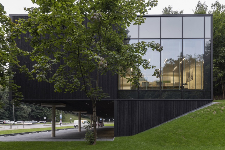
The slope of the plot, also the fact that the location of the plot is half-forest, half-street, while the commercial space requires parking places did not allow to design a standard building. Due to the location, size and relief of the plot, unusual solution of the architectural composition was chosen.
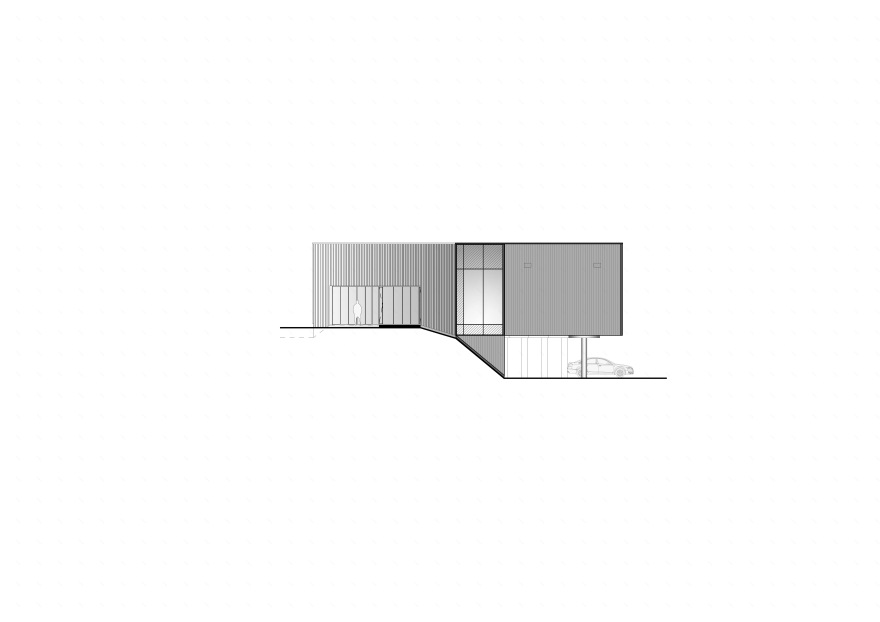
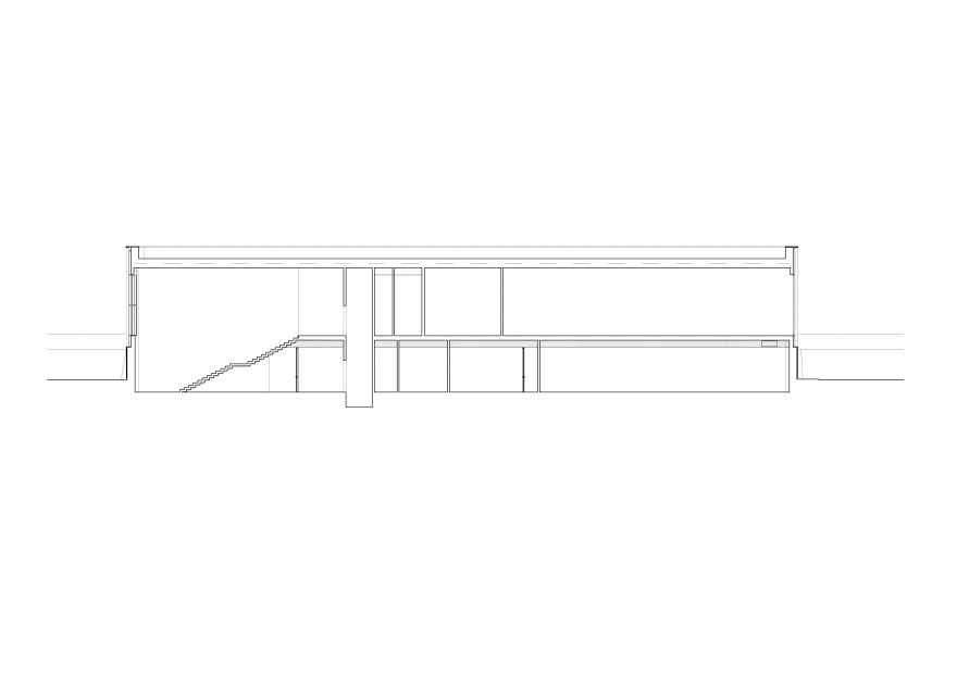
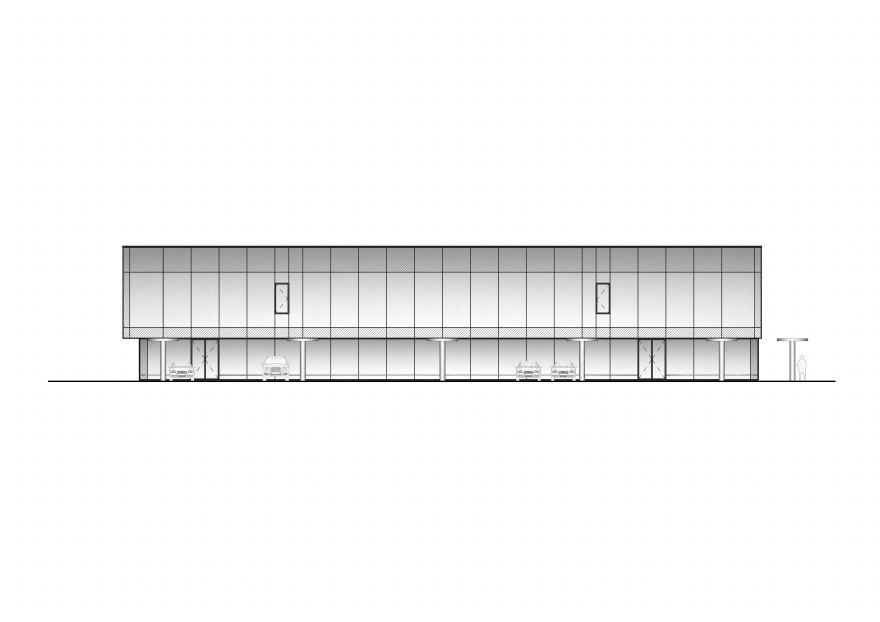
The building of modern minimalism is raised from the ground by one floor and looks as placed on thin columns. This allowed to install parking spaces on the ground floor level under the building along with storage facilities and a lobby. The architects managed to make purposeful use of the space without moving the building away from the street.
The architects turned the disadvantage that there are no commercial premises on the ground floor into a plus - the second floor of the exposition got as close as possible to the street, which arouses curiosity for passers-by. It seems like the second floor of the building "climbs" on the street and creates an emotion for the passerby and the future client - such an effective thing gets stuck in the memory.
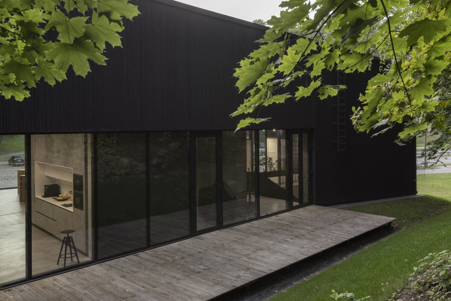
At a height of four meters, a terrace has been formed on the side of the slope, offering a contrast to the hustle and bustle of a busy street - a quiet shelter of nature for both "Wood Style" employees and guests.
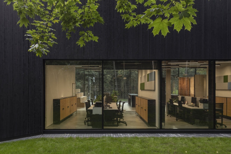
A combination of glass and wood composition is used for facades. The decoration of the wooden beams, combined with huge frameless glass elements, allow to see nature and the city from the exhibition hall while seeing the inside of the exhibition hall from the outside.
It was important the lighting of the building to be visible from the outside as well. This reinforces the original idea of the architects - as an exhibition space on the second floor would be located above the street and attracting the attention of passers-by. Large glass showcases and light, spreading from them to the street invite customers to visit.
In front of the building on the other side of the street there is an oak grove, which relief opens through a glass facade. The neighborhood of the oak grove helps to intertwine indoor and outdoor spaces - "Wood Style" uses oak wood for its products. The architectural solutions and glass facades chosen by architects reflect both the old oak grove and the bustling city.
The entire load-bearing structure is made of monolithic reinforced concrete - wall, floor, columns. Due to the unusual relief of the plot, the construction of the monolith was especially suitable here - its strength and ability to withstand heavy loads served to design the sloping part of the plot. Half of the building, buried in the slope serves as a retaining wall that retains the ground and allows to create an open ground floor level.
The entire building spaces - both work and clients’ - were designed to be as informal as possible. Professional photography with elements of Kaunas modernism also provides informality to common spaces.
It has been a considerable challenge to design and customize expositional furniture as the customer has a very wide range of products. The architectural idea was all the different products to have in a common aesthetic and the presentation to be in a possible unified style. Five large cabinets that divide the spaces and are the part of the exhibition were designed, which also act as lockers, an archive and a place for storing samples. The store was managed to create the impression of a showroom in the salon.
Minimalist subtlety is maintained by creating three clear interior areas: oak floors, doors, stairs. The dark grey color of the exposition furniture was chosen as its background reveals the exhibits at their best. The challenge was to make a light metal floor samples construction standing freely in the space, to ensure stability and at the same time the graceful look as one such sample weighs about 80 kg.
The exposition ends with a wooden amphitheater, which acts both as an example of "Wood-style" stairs production possibilities and as a conference and meeting area.
As with the architectural elements of the building, the interior is dominated by minimalism without unnecessary details. The colors were chosen to be neutral, due to its aesthetic structural properties, monumentality, texture. Due to the purpose of the building, the architects gave up provocative interior element - neutral tones don’t compete with the "Wood Style" production. Open concrete, bare glass, gray tones - all this creates a neutral space, a background for the products exhibited by "Wood Style".
客服
消息
收藏
下载
最近


