查看完整案例

收藏

下载

翻译
Firm: One Brick At A Time
Type: Commercial › Office Retail Showroom Industrial › Warehouse
STATUS: Built
YEAR: 2016
SIZE: 1000 sqft - 3000 sqft
BUDGET: $10M - 50M
"Kart & Kriss" a name derived from the names of two brothers, karthik and krishna, a second generation business house, who left their traditional line of business of dealing in spices and daily needs gourmet etc. and chose to break away to start this whole sale brand of clothing line about 25 years back.
This store was launched on the 25th anniversary of the business line, also marking a shift in roles, where the next generation, Karthik and Krishna were taking over from their father who had bravely fought all odds and brought the brand to the stage it is at.
When Karthik came to us, with his vision for the new store, we were shocked! As no one in a country like India spends any considerable amount in setting up a whole sale store! But Karthik wanted to, he wanted to reassure his existing and future clientele that the brand was here to stay no matter who ran the day to day show! We were impressed at his enthusiasm and commitment. We feel a lot of this enthusiasm rubbed off on us even, and the result is for all to see.
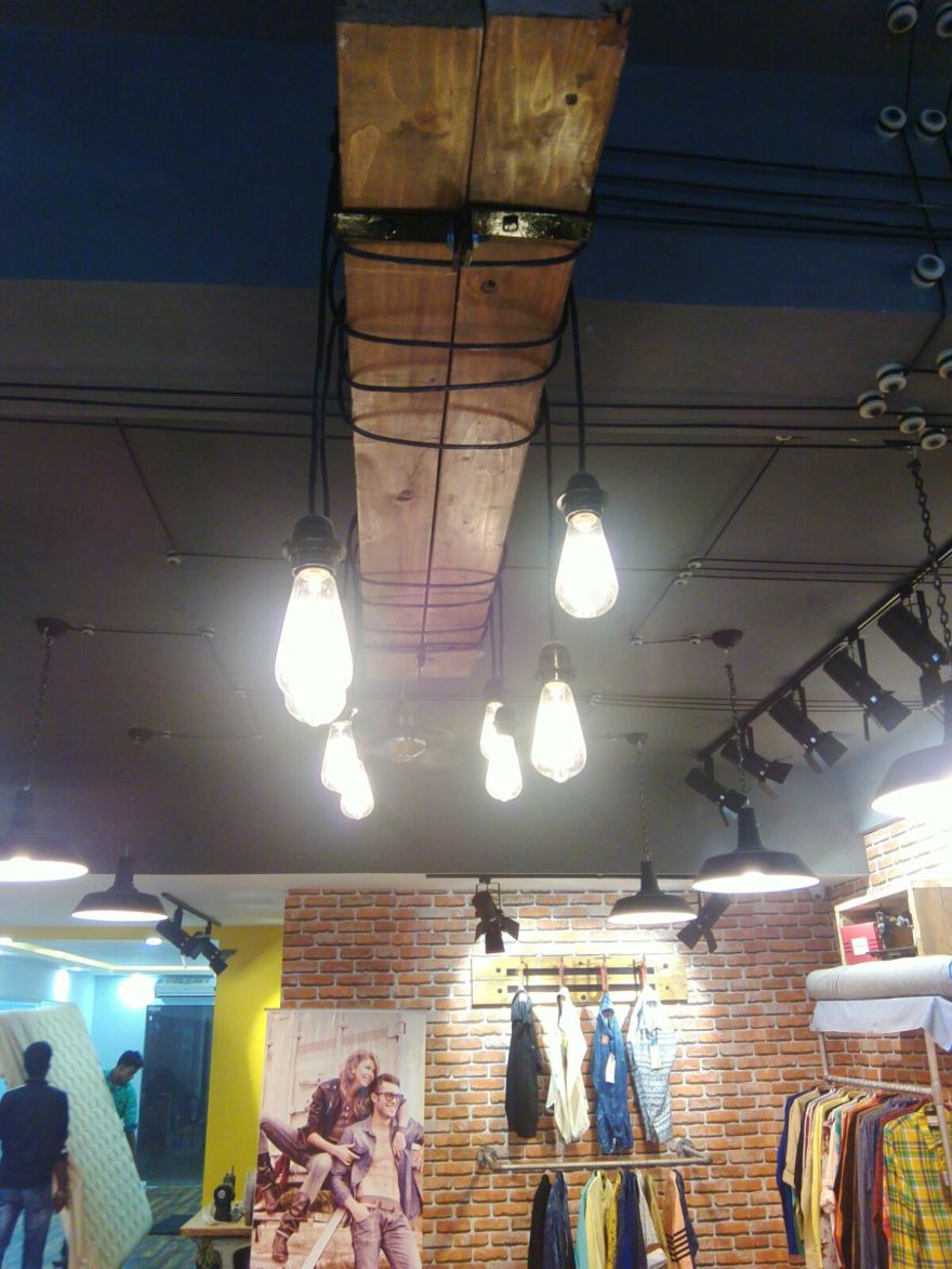
In discussion with the karthik, we had zeroed in on a theme/concept of Vintage - Rustic style, but yet elegant and classy! This was primarily because we were about to design a space which would be used by two generations with different aesthetic sense and appeals. But, we were determined to achieve the look and feel as we did not see it as an impossible task.
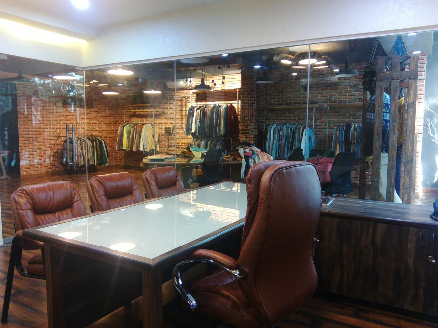
With the theme set, the idea and look and feel board presented, we set about to design the layout which was simple and cleverly zoned into three significant zones. ZONE One - shopping, ZONE Two - administrative, ZONE Three - store. Once we got done with the layout designing we went straight into execution due to lack of time. We were merely given 1 month and 15 days for design and implementation of a 3000 sq,feet space. We were up for a challenge with respect to the timelines.
We were given a stringent budget to execute the project, which laid the basis for our choices of materials. With limited budget and time, we were automatically drawn to materials such as plumbing pipes and hard unfinished wood as they would suite our theme and at the same time would be fast to execute our ideas.
We set about looking for references of DIY furniture's and quickly adapted the references and styles to the design in hand and on site conditions. We had to be cautious that while aesthetics are important for the theme to stand up, we could definitely not compromise on the functionality of the space and the usage of it.
The clients were expecting to display about 1200 different varieties of shirts, trousers and denims, and it was necessary that these needed to be hung up and not folded as they needed to be taken off the racks and displayed to their clients on a table. The size, gauge and strength of the G.I plumbing pipes needed to be carefully chosen to give a fine balance between aesthetics and the strength / function.
The table on which the clothes were to be laid out to check the various aspects of the fabric and design of the clothes was also a well thought about design. The unusual curved triangular shape was derived based on discussion with the client about how discussions happen and the ergonomics attached to the same. The design allows ample space for loading about 50 odd shorts at a time, giving sufficient place to still spread out a couple of shirts for further examination. The design allows the clients to be able to sit while the check the clothes in detail, a traditional way of how things are done in India, we just took a contemporary take on the same.
Since this was a clothing line and fabric plays a vital role, we tried to adopt this concept into our design as well. Upon closer look at all the tables designs in the project, one will notice that we have given a fabric top to all of these and topped it with a toughened glass. Concept being, one could see the texture of fabric but not feel the texture itself in a way creating a temptation to go about looking for the various textures on offer in the store.
The show window, towards the road side, was of no importance to the client as they do not ever have walk in clients! But we were persistent on having a good show window to showcase the mood of the season. At the same time, we took it upon as a challenge that if we were able to generate at least one client a month, with the help of the show window, we would have achieved what we had set out to do. And they had their first walk in client 2 day after the opening!
We were able to complete the project on time and leave the clients in awe.
INTERESTING FACTS
No formal drawings were made for the design and execution of the project. Hard to believe but we didn't! All of the execution drawings were hand sketched and done on site. The only formal drawing was the layout plan so that we could get the placements accurately.
All loose furniture like tables, display racks, main table etc. can be dismantled. Though they were all made by local carpenters, we designed it to be modular and in shape to be used more than once in more than one space.
Another interesting part about the project was, the principal architect and the entire team worked on site for the project. Not only did we work on the drawings, but on the execution as well. We have put in the bolts, cut wood, laid the flooring and painted the ceiling! As our principal architect says, "we can't design unless we know how difficult it is to make!"
We do strongly believe that a successful project can be executed only if the client and the architect work as partners and not merely as two entities who are having a business exchange.
客服
消息
收藏
下载
最近


