查看完整案例


收藏

下载

翻译
WWAA Architects have created a conceptual design for the Shanghai Expo 2010. With the exhibition housing pavilions from countries all over the world, each pavilion must provide a strong aesthetic message to attract visitors and then provide insight into the country. WWAA’s pavilion creates a distinct stylistic motif taken from the folk-art paper cut-out to create a “memorable cultural ideogram”. The intention was for “the structure décor to draw on and make reference to tradition, but ultimately to be that tradition’s contemporary reinterpretation, a creative extension into the present day by way of inspiration rather than replication,” by the architects. THE PROJECT CONCEPT:
In the contemporary world with its abundance of visual experience, with the pictorial language of communication reigning supreme, with the almost unconstrained and instant accessibility of iconographic material, an exposition piece of architecture will only be attractive insofar it can offer perceptual sensations attainable only through direct, unmediated exposure to out-of-the-ordinary, singular stimuli, insofar it can provide a quality of experience born out of the chemistry of inter-sensory stimulation.
Given the nature of the exposition, the exhibition facility has to denote, by its esthetic distinctiveness, the country of origin has to constitute, by the strength of its stylistic connotations, an evocative, recognizable, and memorable cultural ideogram. In our design, the cultural idiom is primarily conveyed through the theme, the motif of the folk-art paper cut-out. Or, more precisely, through a rendering of the motif, a transcription of an elementary esthetic code into the contemporary language of architectural décor. The transcription rationale was twofold. First of all, we did not wish the design to be literally folklorish, a mechanical multiplication of convention-approved set patterns. The intention was for the structure décor to draw on and make reference to tradition, but ultimately to be that tradition’s contemporary reinterpretation, a creative extension into the present day by way of inspiration rather than replication.
Secondly, we aspired to make the structure in its own right, in a purely architectural dimension, a significant landmark, a showcase of Polish design achievements. That it should be an attractive, eye-catching exterior both in daylight, against the panorama of other Expo facilities, as well as a mesmerizing experience at night with the edifice drawn by the multi-colored light seeping through the cut-out patterns. And reversely, that it should provide inside visitors with comparable experience by shaping the outer skin patterning in such a way that the sun rays shining through would chisel, by light and shade, the space under the vault. The structure’s overall shape, with many slanting planes, on the one hand, complements and rounds out, by the suggestion of a folded sheet of paper, the ‘cut-out’ narrative, on the other creates inside a geometrically intriguing and flexible space that can be creatively apportioned, by inner divisions, to the different exhibition, performance and utility functions and uses.
FUNCTIONAL ARRANGEMENTS AND EXHIBITION DESIGN:
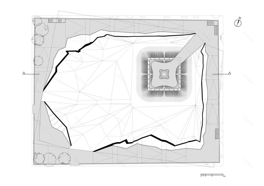
The outside structure of the pavilion and its reflection in the proposed arrangement of its inside functions impose on the visitors taking and following a route that is consistent with the logic of the building. The entranceway – an interlude between an inside and outside body of the construction, is accessible from the square marked out between the pavilions. The partial roof created by the fold in the building allows for providing a shelter for the queues of visitors. Next, the visitors proceed to the main, full-height exhibition area of the pavilion. Auxiliary functions, a shop, and a restaurant have been designed in the lowest part of the building while the higher part of the pavilion hosts the main exhibition area. The interior design is a continuation of the architectural idea of the form of the building and the details of the facade. The aesthetic concept of the pavilion is brought inside and the folk cut-outs lead the visitors through the entrance into the main hall and then, while transforming into other patterns, are continuously guiding them along with all the exhibition.
The usage of the cut-out patterns has not only aesthetic value but also an educational function associated with the main theme of the EXPO: „better cities-better life”. The cut-outs changing from the folk forms into organic ones and finally into a city-map and industrial patterns are a metaphor of migration of people from the countryside into cities. The story that the patterns are supposed to tell is the base for the presented images and films showing Poland through its history, culture, economy, and every-day life. The design of the cut-outs goes with the presented on its contents changing along the visitors’ route.
MATERIAL SOLUTIONS:
The outer layer of the elevation, with its characteristic design inspired by a traditional folk-art paper cut-out, is made of impregnated CNC plotter-cut plywood mounted on steel construction modules with a steel substructure. Panel wall elements PC are mounted on the outer side of the modules. Both the exterior, entranceway surface, and the interior of the pavilion will be covered with impregnated wooden flooring. The choice of materials and the character of construction were to a large extent dictated by the idea of possible future reclaiming and recycling of the pavilion structure or its parts, e.g. by reconstructing it in one of the Polish cities after the closing of EXPO. The colorist effects were determined by the choice of plywood panels in natural wood color. When the dusk falls the elevation will acquire different colors according to the changes of light penetrating the cut-out patterns.
LANDSCAPING:
The entrance yard constitutes an integral part of the ground floor of the pavilion. The pattern of the exterior flooring divisions as well as the material used are continued inside the building. The form of outdoor and indoor furniture has been inspired by the elevation patterns. There is a concept of using the elements cut out from the elevation plywood for producing the furniture, in the form and material which will directly refer to the pavilion architecture.
photography by © Daniele Mattioli
Project Info:
Architect: WWAA marcin mostafa + natalia paszkowska
Client: polish agency for enterprise development
Collaboration: wojciech kakowski, buro happold
Area: 2400 sqm
Year: design 2007 (competition first prize), construction 2010
Budget: ca 11 000 000 pln
project info for exhibition inside polish pavilion
Designed by: Boris kudlicka, Marcin Mostafa + Natalia Paczkowski (wwaa)
Client: polish agency for enterprise development
Area: ca 1500 sqm
Year: design 2009, construction 2010
Budget: ca 9 000 000 pln
photography by © Daniele Mattioli
photography by © Daniele Mattioli
photography by © Daniele Mattioli
photography by © Daniele Mattioli
photography by © Daniele Mattioli
photography by © Daniele Mattioli
客服
消息
收藏
下载
最近


