查看完整案例


收藏

下载
在我看来这就是艺术最大的力量,艺术并不是那么遥不可及,这些纯粹的美,仿佛点点的星光,点亮了我们对生活对美的渴望。MAY MIX 想成为这其中的一点星光,我们谈论美,谈论生活,简单的,真诚的。
In my opinion, this is the greatest power of art. Art is not so far away. These pure beauty, like a little starlight, light up our desire for beauty in life. MAY MIX wants to be a little star in this, we talk about beauty, we talk about life, simple and sincere.
MAY MIX 品牌委托 MOOTHAN.DESIGN 打造的运城形象店位于运城市万达广场。MAY MIX 作为美发行业的高端品牌,每个动作在行业中都被格外关注。延续之前连锁店的设计策略,此次打造具有差异性和适度的稀缺性的目的地型商业体验是设计探索的重点。
The Yuncheng image store commissioned by MAY MIX brand MOOTHAN. DESIGN is located in Yuncheng Wanda Plaza. As a high-end brand in the hairdressing industry, MAY MIX draws special attention to every action in the industry. Continuing the design strategy of the previous chain stores, this time, creating a destination-based commercial experience with differentiation and moderate scarcity is the focus of design exploration.
当下社会的消费很大一部分是由年轻一代的消费观念和消费偏好所驱动,针对年轻人需求而生的美发店已成为国内商业业态中一个不可或缺的体验内容。美发的可塑性和其蕴含的精神力量满足了这个时代崇尚个性化和多元化的消费需求,美发也成为构成和丰富时代精神生活的一部分。
A large part of consumption in the current society is driven by the consumption concepts and consumption preferences of the younger generation. Hairdressing salons designed for the needs of young people have become an indispensable experience in domestic commercial formats. The plasticity of hairdressing and the spiritual power it contains meet the needs of consumers who advocate individualization and diversification in this era. Hairdressing has also become a part of composing and enriching the spiritual life of the times.
01.好奇的窗口 Inquisitive opening
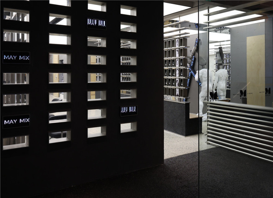
在这个界面上我们一共设计了两种抵达的路径:视野和身体。经过左侧矩形切割的墙面,迎面是自然石子所分割的地面,右转便是通往空间的主入口,既是建筑界面的展示又是进入内部的甬道。小洞的内壁精致的不锈钢,用于中和天然石子和水泥带给空间的粗旷,而嵌入的 led 屏幕,也增添了些许科技的味道。
On this interface, we have designed a total of two paths: vision and body. After passing the rectangular-cut wall on the left, facing the ground divided by natural stones, turning right is the main entrance to the space, which is both a display of the architectural interface and a corridor to enter the interior. It neutralizes the roughness of the space brought by natural stones and cement, and the embedded LED screen also adds a touch of technology.
设计师将原有入口的界线向室内做了引退,让空间多了一小喘息的过渡,同时与左右相邻的店铺在建筑体块上被区别出来。玻璃门可以完全打开并融入在周遭的环境中,让室内空间与外界完全共通。玻璃门打开后,空间无界限地将室内外空间的公共区域相融,路过的人也有机会与室内的客人产生一瞬间的视觉交流。
The designer retreated the boundary of the original entrance to the interior, allowing the space to have a little breathing transition, and at the same time, the adjacent shops on the left and right are distinguished from the building block. The glass doors can be fully opened and integrated into the surrounding environment, allowing the interior space to fully communicate with the outside world. After the glass door is opened, the space is boundless to integrate the public areas of the indoor and outdoor spaces, and passers-by also have the opportunity to have a momentary visual communication with the indoor guests.
空间艺术并不是高高在上的神秘面孔,我们特意设计了多个视窗,希望能消解室内外的边界,让顾客通过一种更轻松自然的方式去感受和接近空间。带着孩子般的好奇,从慢慢触碰,到渐渐参与,最终让空间走向日常和大众,像一个身边的朋友。
Space art is not a mysterious face above. We specially designed multiple windows, hoping to dissolve the boundary between indoor and outdoor, so that customers can feel and approach the space in a more relaxed and natural way. With childlike curiosity, from slowly touching, to gradually participating, and finally let the space go to the daily life and the public, like a friend around you.
02.手稿画廊 Manuscript Gallery
“我们并不是与世隔绝,我们活在思想和对话中,因此活在世界的中心。只不过是在另一块土地上,我们和大多数人之间并没有泾渭分明的区别,我们只是用另外一种目光看世界。我们的任务是在世界上建起一个岛屿,推出另一种生存的可能性。”
——赫尔曼·黑塞
“We are not isolated from the world, we live in thought and dialogue, and therefore in the center of the world. It’s just another land where there is no sharp difference between us and most people, we just use another Seeing the world in a different way. Our task is to build an island in the world and introduce another possibility of existence.”
——Hermann Hesse
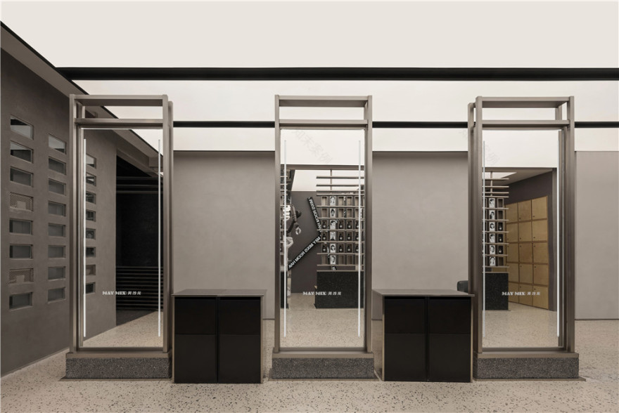
以较为通透和尽可能大的敞开面进行空间与空间之间的探索与对话。里与外,直线与曲线、光与影、游走与停留,在同一时间呈现。希望空间与空间之间,没有明显的分割界限。旨在创造一种具有极少墙壁和门的开放感,同时允许从一个空间到另一个空间的分离和隐私。
Exploration and dialogue between spaces are carried out with more transparent and open surfaces as large as possible. Inside and outside, straight lines and curves, light and shadow, wandering and staying, are presented at the same time. It is hoped that there is no clear dividing boundary between space and space. The aim was to create a sense of openness with minimal walls and doors, while allowing separation and privacy from one space to another.
我们想创造一种流动的、贯通的、隔而不离的整体空间效果。让顾客感受那种可以轻松的从一个空间到达另一个空间的自由感,让传统空间规划的封闭感得以消解,让不同空间之间界定模糊,过度自然。我们不把空间作为一种消极静止的存在,而是把它看做一种流动的力量。
We want to create an overall spatial effect that is fluid, connected, and isolated but not separated. Let customers feel the sense of freedom that they can easily go from one space to another space, so that the sense of closure in traditional space planning can be eliminated, and the boundaries between different spaces are blurred and overly natural. We do not regard space as a passive and static existence, but regard it as a flowing force.
03.开放的艺术 Open art
在经济发展和大量人口涌入城市的大背景下,人与人仿佛越来越分散的趋势难以阻挡,对于现在的商业空间的构建,更多的是创造具有强烈个人意志的空间理念,使空间回归自由意志和精神共鸣,可以引导顾客一步步探寻生活的踪迹。
Under the background of economic development and the influx of a large number of people into the city, it seems that the trend of people becoming more and more dispersed is unstoppable. For the construction of the current commercial space, more is to create a space concept with a strong personal will, so that the space Returning to free will and spiritual resonance can guide customers to explore the traces of life step by step.
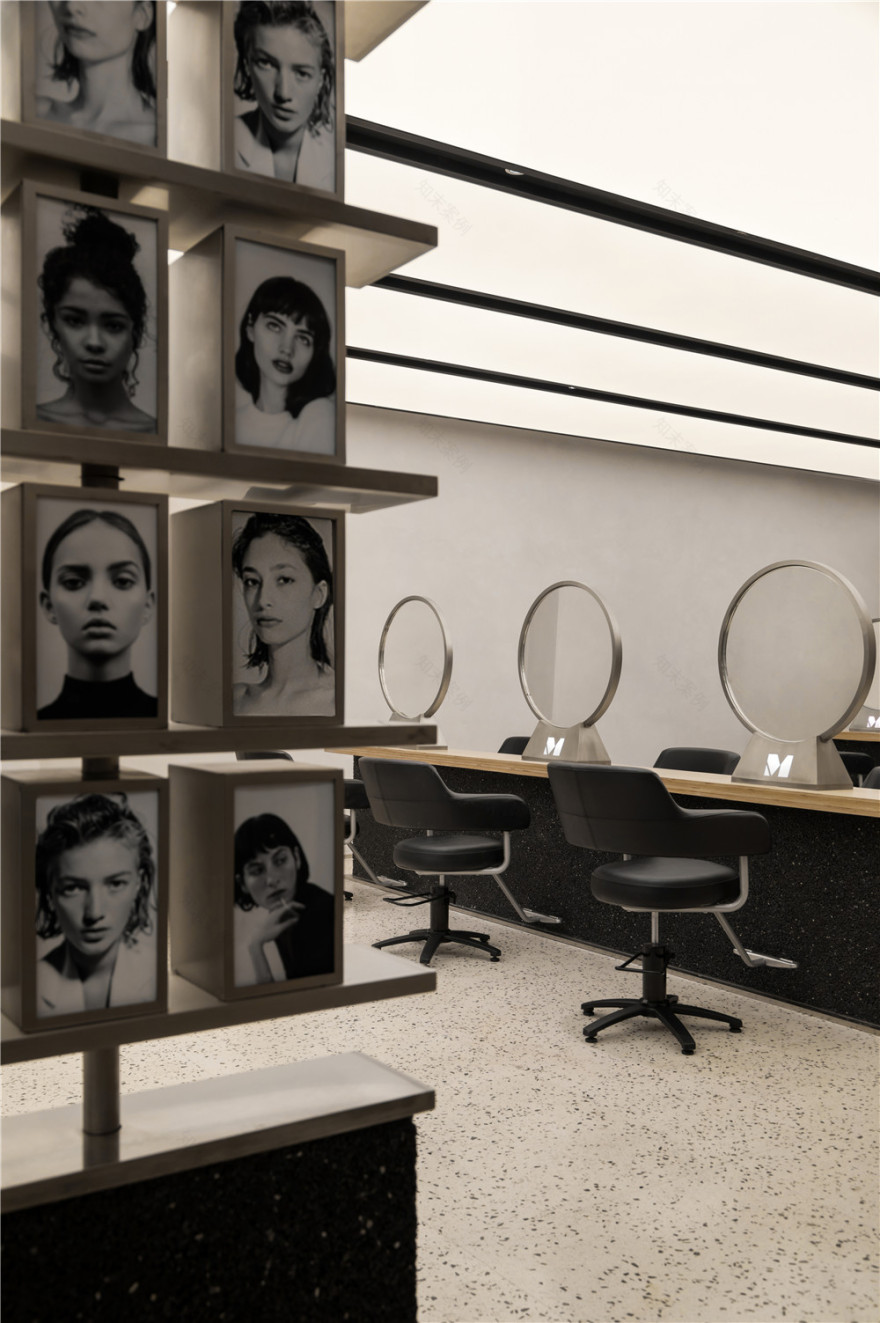
可旋转的手稿画廊展示了多位造型设计师的作品,它们以阵列的形式排列,进入的廊道,在动线中创造了更为丰富的路径,也尽可能地在有限的空间里创造更长的阅读路径。
The rotatable manuscript gallery displays the works of a number of stylists. They are arranged in an array. The corridors that enter create a richer path in the circulation, and also create as much as possible in a limited space long reading paths.
通过对大小不一的木纹的重新组合,形成了新的比例关系。不锈钢片的穿插带来冰冷材质与自然木的冲突性,同时它的出现也“缝合”了树木被切割后带来的伤痕。矗立其中,使之与空间形成新的对话,如同雕塑与自然的低语。
Through the recombination of wood grains of different sizes, a new proportional relationship is formed. The interspersed stainless steel sheet brings the conflict between the cold material and the natural wood, and its appearance also “stitches” the scars caused by the trees being cut. Standing in it, it forms a new dialogue with the space, like a whisper between sculpture and nature.
04.多维的“SPACE” Multidimensional “SPACE”
顶灯依次排开,光随四方渡入空间。溯源过去,亦通过材质的碰撞与组合赋予空间崭新的叙事视角,予以新解,开启序章。
The ceiling lights are arranged in sequence, and the light enters the space with the four directions. Going back to the past, it also gives the space a new narrative perspective through the collision and combination of materials. To give a new solution, open the prologue.
精致空间,也保留着原始与自然的一面,让这些建筑材料成为主角,自己去叙说空间的故事。这些建筑材料被调动,它们内敛却丰富,带有浓重的叙事感,在空间这个容器里诠释着原生态的纯粹之美。
The exquisite space also retains the original and natural side, let these building materials become the protagonists, and tell the story of the space by themselves. These building materials are mobilized, they are restrained but rich, with a strong sense of narrative, interpreting the pure beauty of the original ecology in the container of space.
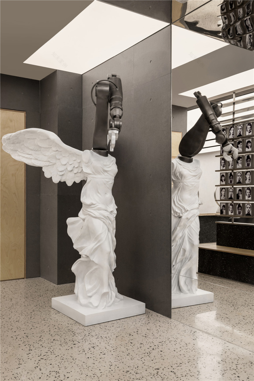
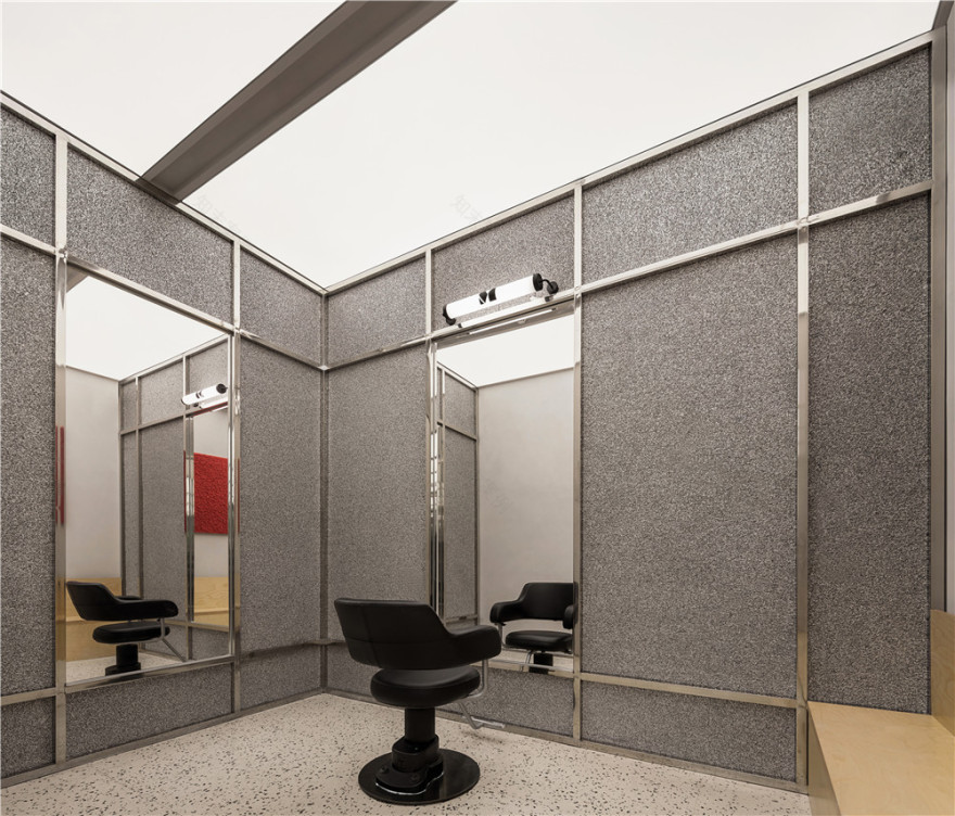
由不锈钢组成的结构抓人眼球,设计师同时将极具现代感的不锈钢材质置入空间,冰冷坚硬与粗粝、与柔软融合在一起,有反差也有呼应,极具工业感的同时又富有贴近生活的当代感,营造出一种无拘无束、前卫且时尚的空间氛围。
The structure composed of stainless steel is eye-catching. At the same time, the designer put a very modern stainless steel material into the space. It is cold, hard, rough, and soft. There are contrasts and echoes. It is very industrial and close at the same time. The contemporary feel of life creates an unrestrained, avant-garde and stylish space atmosphere.
05. 自然的融入 Natural Integration
如何实现自由而不失秩序的空间,开放而不失互动的体验,是这个空间设计的主基调。我们希望利用空间的层叠关系,将顾客的看、坐、接受服务这三个主要行为打散并串联,提升服务的便捷性和趣味。
How to realize a free and orderly space, an open and interactive experience, is the main tone of this space design. We hope to use the cascading relationship of space to break up and connect the three main behaviors of customers’ viewing, sitting and receiving services, so as to improve the convenience and interest of services.
木纹相对于空间中的材质来说,具有一定的视觉冲击力以及蕴含的对人内心积极能量的推动,在很多商业场景中被广泛使用。本次实践中建筑师尝试在空间内,进一步激发木纹的能量功能,给原本沉闷的商业空间营造全新的场域体验。
Compared with the material in the space, the wood grain has a certain visual impact and the promotion of positive energy in the human heart. It is widely used in many commercial scenes. In this practice, the architects try to further stimulate the energy function of wood grain in the space to create a new field experience for the originally dull commercial space.
一气呵成,溯游从之 Materials:in one go and travel back
聚焦光,光线同时增强空间;通过朴实无华的物理形态创作出静谧内敛的氛围,营造出未来感的宁静;融合了技术、空间和建筑。
Focusing on focused light, the light enhances the space at the same time; creating a quiet and restrained atmosphere through the creation of unpretentious physical forms, creating a sense of futuristic tranquility; integrating technology, space and architecture.
蜂窝铝板、海洋板等材料,构成了建筑的基础色调,MOOTHAN.关注空间带给人的视觉感受及情感体验,反对无思考无创见的材料堆砌式装修,强调创新精神及设计价值。
Materials such as honeycomb aluminum panels and marine panels constitute the basic color of the building. MOOTHAN pays attention to the visual and emotional experience brought by the space, and opposes the material stacking decoration without thinking and originality, emphasizing the spirit of innovation and design value.
▲平面图
项目信息——
项目名称:MAY MIX·运城万达
设计方:末染设计
项目设计:2021.11
完成年份:2022.02
主创及设计团队:孟飛
项目地址:山西省运城市
建筑面积:110
摄影版权:RICCI 空间摄影
客户:MAY MIX
装修主材:水洗石、水磨石、不锈钢
客服
消息
收藏
下载
最近


