查看完整案例


收藏

下载
DOP是一家坐落于广州的互联网金融公司。办公室位于广州高端国际商务大厦IMP,于2018年迁入至此并希望对内部空间做了改造。
DOP, located in Guangzhou City, is an Internet financial company. Its office is situated in IMP, which is a high-end international business building in Guangzhou. It moved here in 2018 and the internal space was renovated.
当我们谈论互联网的时候,我们想到的是大数据?云计算?还是……作为活跃在互联网金融行业的解决方案提供商,我们的客户DOP更关注高品质的用户体验,“我们希望客户能在这个环境以及我们的服务当中感受到DOP带来的品质感”DOP CEO如是说。
When it comes to Internet, what we think of is big data, cloud computing, or something else?As an active provider of solutions in the Internet financial industry, our customer DOP gives more attention to the user experience with high quality. “We hope that our customers can feel a sense of quality brought by DOP in such an environment and through our services”, said CEO of DOP.
每个团队的工作方式都具有一定的独特性,美好的设计不应仅局限于风格,而是将需求转化为其中的细节,才能真实贴近客户理想的模样。设计在这个项目中并没有生搬硬套各种科技元素,反而在结构与材质上作出许多考量,务求打造最适合DOP团队的工作空间。
Working approach of each team is distinctive to some extent. Good design shouldn‘t only be limited to the style; instead, the demands ought to be converted into some details so as to live up to the expectation of the customer. The design of this project doesn’t apply all kinds of technological elements mechanically; on the contrary, it is in pursuit of creating a workspace that is most suitable for the team of DOP by taking both structure and material into account.
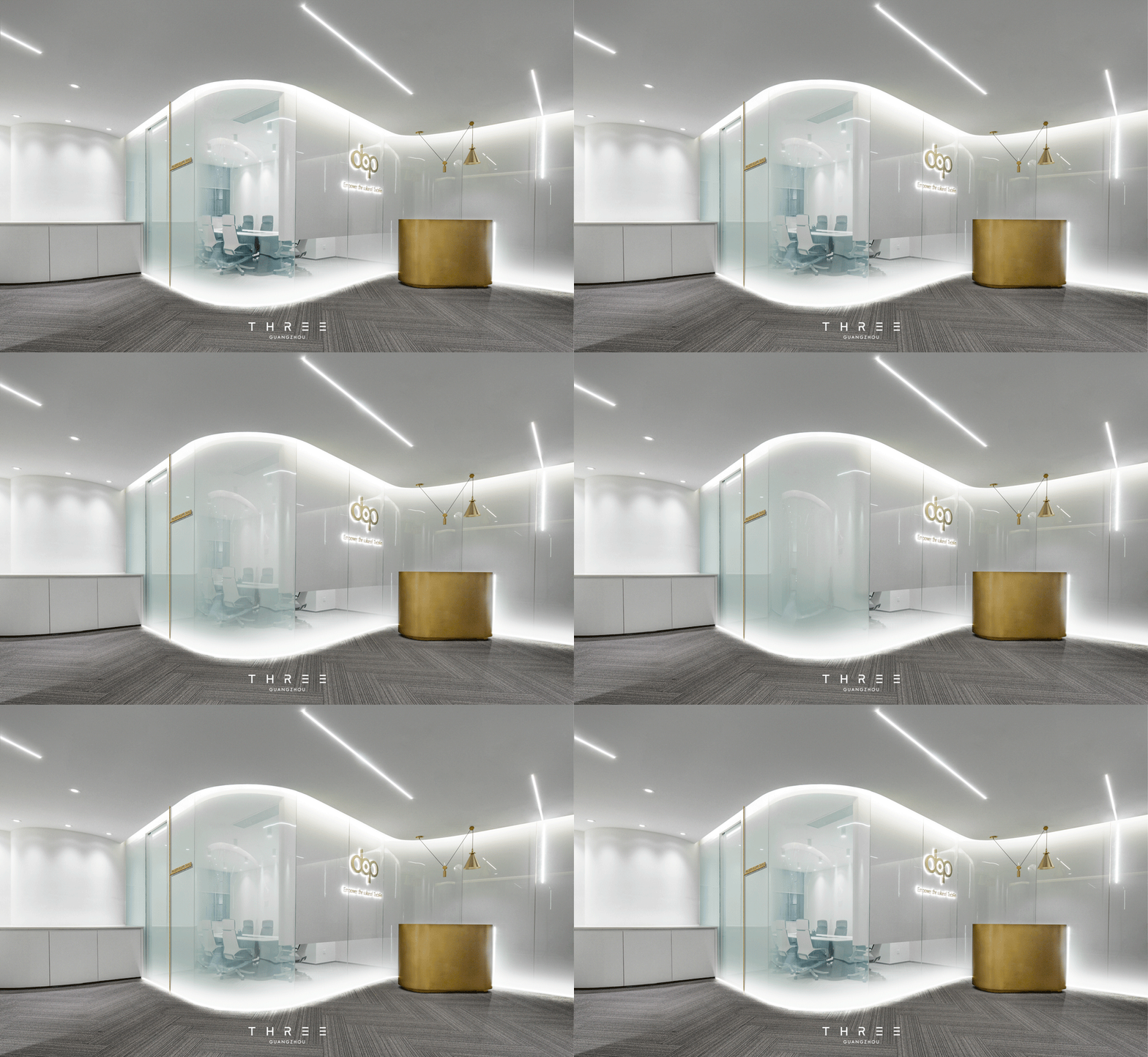
本案的设计概念元素,以弧形“穿过”空间,“遮挡”常规视线高度,在墙身底部设置引人入胜的“阻碍”;以及精巧的划分包括会议室在内的每个区域等,我们做的不是装饰,而是作为机能性的设计来构建整个空间。
The conceptional element of this design divides the space with a curve to block normal sight, an attracting obstacle is set at the bottom of the wall, and each part including the meeting room is divided exquisitely. We are not merely decorating the room; instead, we are constructing the entire space by regarding the decoration as the design with specific functions.
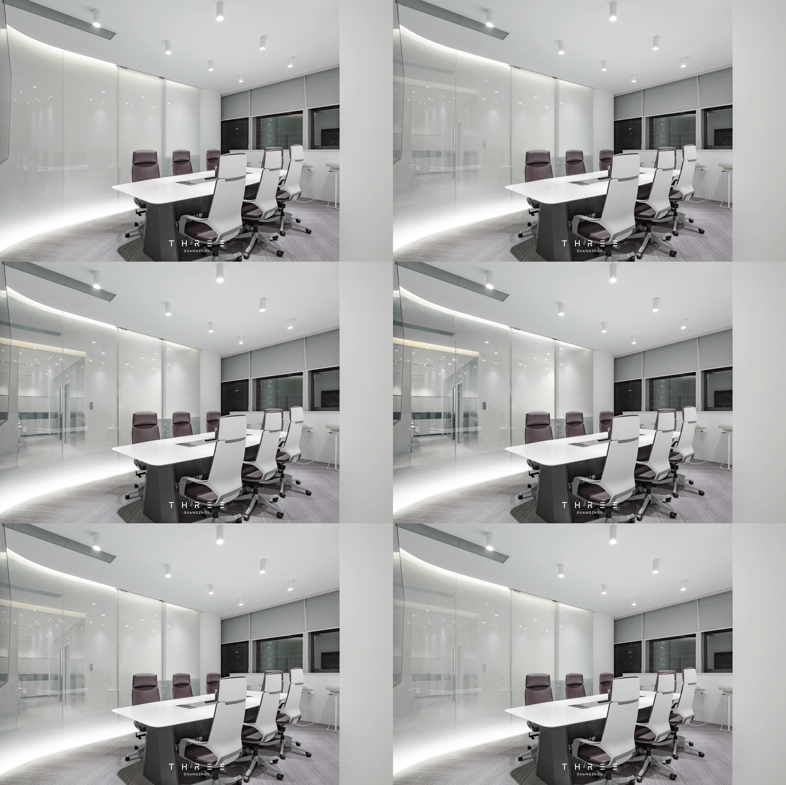
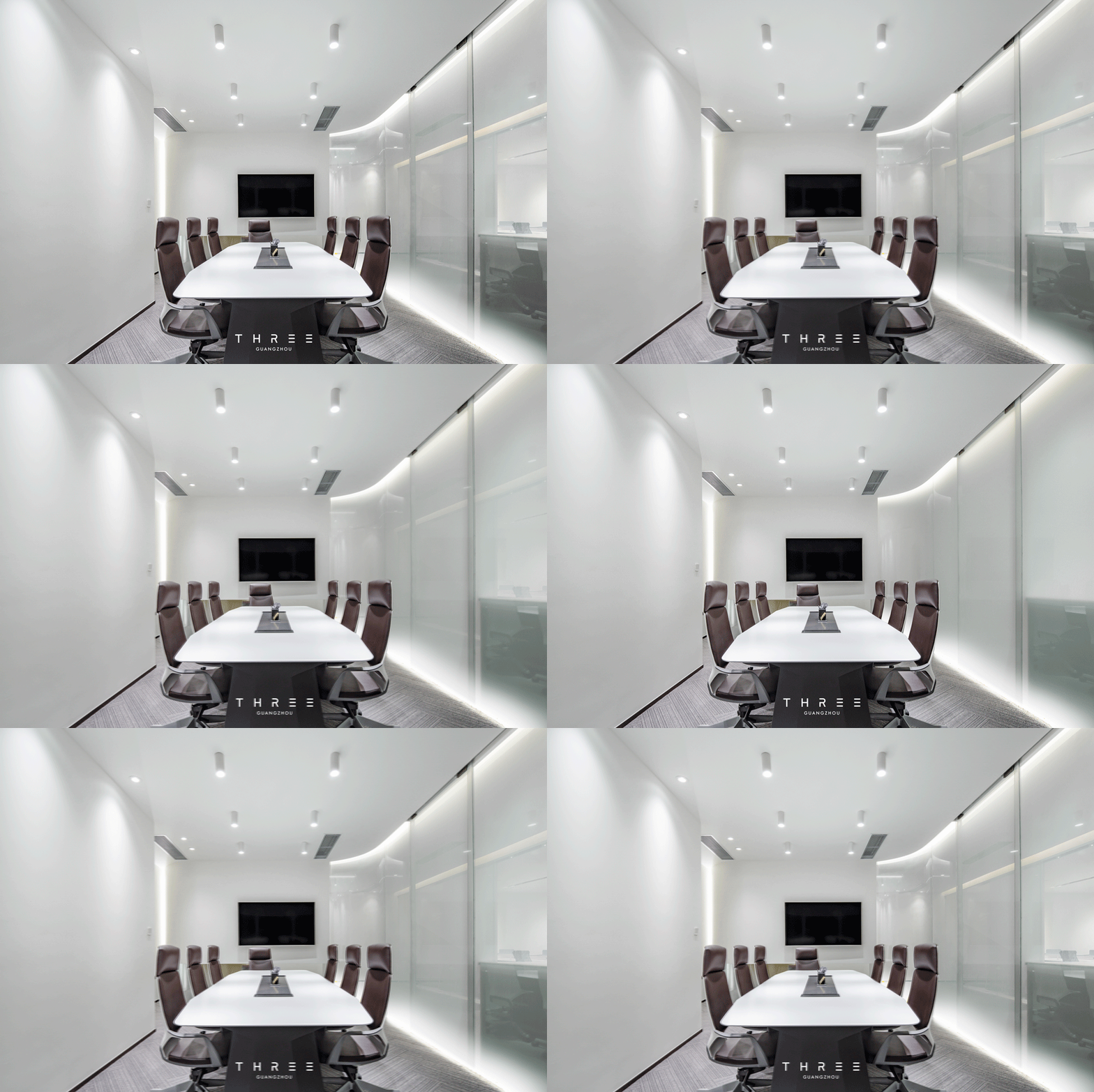
由于室内采光充沛,我们达成共识以白色为基调,辅以流畅弧线打破原本保守方正的布局。弧形雾透玻璃作为空间的视觉焦点,带来强烈的导向性,意在邀请客户前往一探究竟。会议室的玻璃外墙通过智能调光的特性,满足空间视觉及区间划分双重功能的实现。我们特意于玻璃间隔下方隐藏环伺灯带,提增整体深远明亮感,使暖黄光线洒落于各边角。再透过重点式的灯光布局,如顶部错落有致的条状灯带、前台现代几何灯具,给予空间丰富光影层次。使纯静基调中蕴含多变细节,完美诠释互联网技术的无限可能。
Due to excellent indoor lighting, we have reached a consensus that using white tone with a smooth curve to break original conservative square layout. Curved atomized glass is the visual focus of the space with strong orientation, which is designed to guide the customer to visit and make further exploration. The glass wall of the meeting room satisfies the needs of sight and division of the space by intelligent light-control system. We hide the lamp belt under the interval of the glass on purpose so as to make the yellow light light up every corner and lighten the entire space. The lighting layout such as well-arranged strips of light belts on the top and modern geometric lanterns at the front desk makes for enriched layers of light and shadows, which entails diversified details in simple tone and perfectly illustrates infinite possibilities of Internet technology.
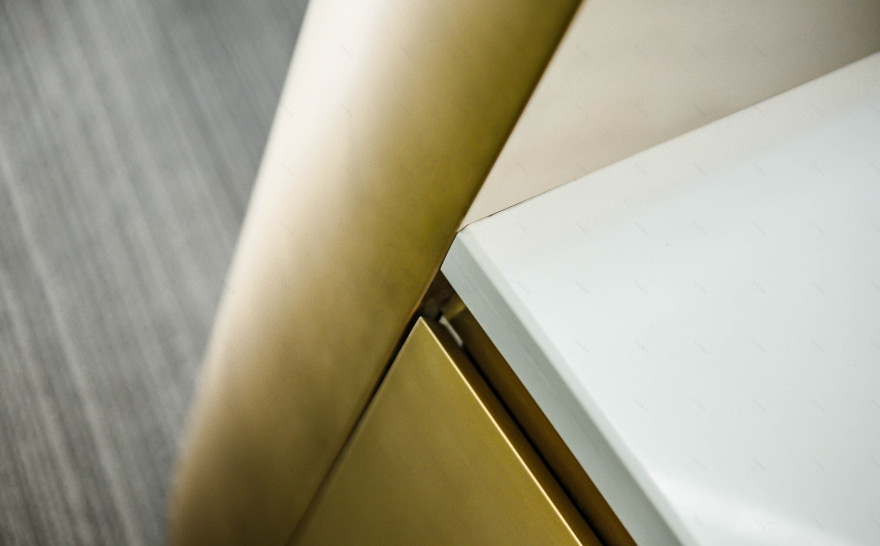
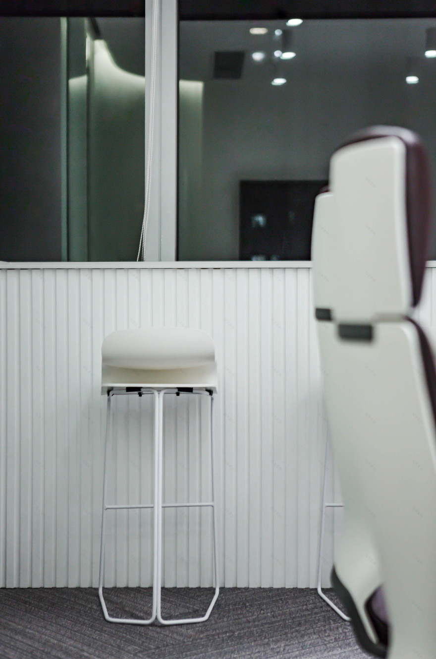
设计师对集聚情感的茶水间区域进行了弱划分,仅以功能界定:利用建筑原有的圆柱暗藏冰箱和迷你吧,开辟了一处休憩之地,平衡了办公空间的严肃与暇意。开阔的落地窗边被充分利用,设置了小而美的观景吧台,让繁华的城市景观尽收眼底。精挑细选的办公家具极具线条感,传递科技感的同时使视感流畅不紊乱。深暖色的会议椅延展温润气息,借此缓和全白空间带来的冷冽感。质感厚重的黄铜前台及吊灯与轻盈透亮的渐变玻璃,营造出一种虚实有致的空间张力。
The analyst divides the tea room in which people can express their feelings into several parts according to their functions: a rest area is designed by hiding a refrigerator and a mini bar behind cylinder that originally exists in the building to balance the solemnity and leisure of the office space. The capacious space beside the French window is in full use by setting up a small but beautiful view bar so as to have a panoramic view of the landscape of the prosperous city. The office furniture that is carefully selected has smooth lines, which doesn‘t block the sight at the same time of conveying a sense of technology. Chairs with warm color used for meeting create a warm atmosphere, which relieve the coldness that the all-white space brings about. Brassy front desk that gives decorous feeling to a person, the ceiling lamp, and light and bright gradient glass give tension to the space with a good combination of virtuality and reality.
项目信息——
项目名称:DOP办公室
设计方:再叁设计事务所
项目设计 & 完成年份:2018
主创及设计团队:TOE、ALLEN、zoe、kiki
项目地址:广州国际商务大厦
建筑面积:116㎡
摄影:再叁设计事务所
客服
消息
收藏
下载
最近


