查看完整案例


收藏

下载
珍妮之家
Jenny’s House
Copyright
© The GoDesign
/
时间赋予设计意义,一套从两人世界装修到三口之家的房子。
Time gives meaning to the design, a house renovated from a two-person world to a family of three.
本案业主是一对年轻夫妇,男业主是一位机长,做事严谨,追求极致。女业主是一位温柔贤惠,美丽大方的空姐。在设计委托前时他们的宝宝还没有出生,因为疫情案子落地完成时他们的女儿珍妮已经会走路了。时间赋予设计意义,从两人世界到三口之家,都应该被设计照顾到。
The owners of this case are a young couple, and the male owner is a captain who works rigorously and pursues the ultimate. The hostess is a gentle and virtuous, beautiful and generous flight attendant. Their baby had not yet been born before the design commission, because their daughter Jenny was already able to walk when the pandemic case was completed. Time gives meaning to design, from the world of two people to a family of three, it should be taken care of by design.
项目地址 / 南京 大名城紫金九号
Project Address /Daming Zijin Nine
主案设计 / 构设计事务所
Main Design / Go Design Office
设计面积 / 186 平米
(一层 111㎡+负一层 75㎡)
Design Area / 186m² (One floor 111㎡+B1 75㎡)
项目完工 / 2022 年 06 月
Project Completion / 2022.6
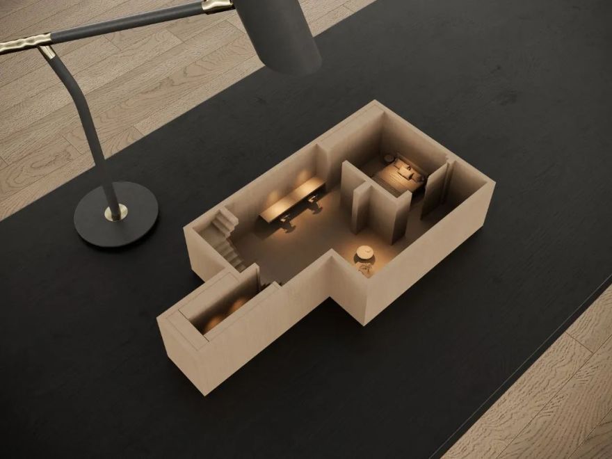
▼鸟瞰
模型
< 左右滑动查看更多 >
▼平面布置图
< 左右滑动查看更多 >
▼原始户型图
< 左右滑动查看更多 >
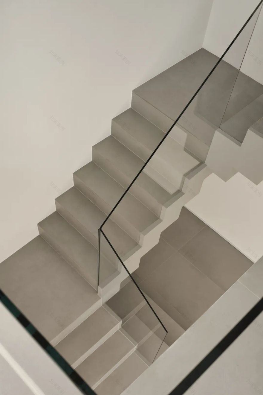
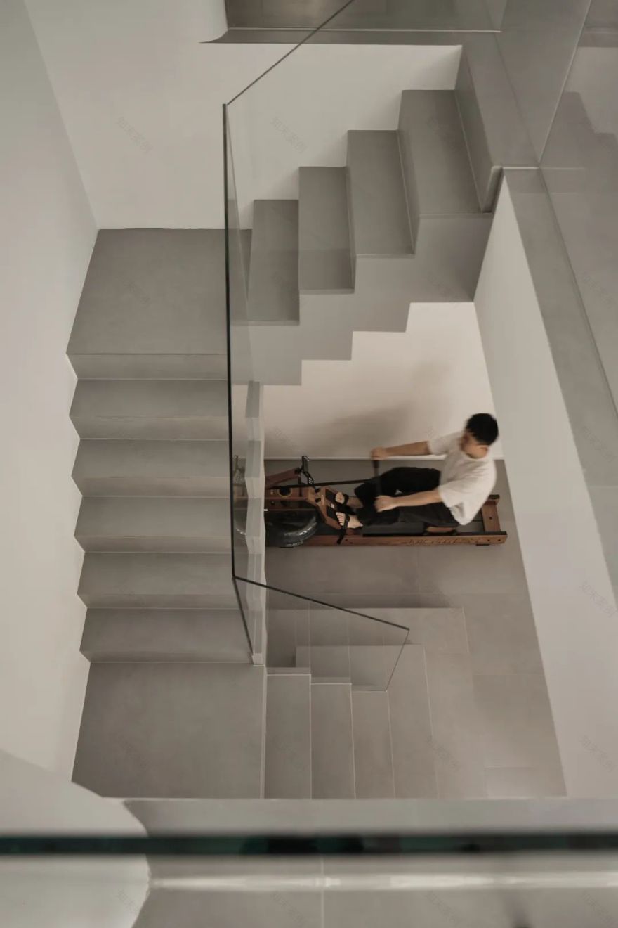
▼楼 梯
/
St
air
当我们拿到一个复式户型时,第一件事就是找到楼梯的最优位置,一旦上下楼层的连接点被锁定,其他的功能排布自然就水到渠成。一层和地下室重叠的部分只有南向的三个开间,北侧的厨房餐厅次卧下面就是车库,也就是说楼梯只能在南侧三个开间里选择一个合适的位置,在保证客餐厅空间的互动性和主卧独立性的前提下,楼梯很自然的被选择放在了入户的正对面。
When we get a duplex, the first thing we do is to find the optimal position of the stairs, once the connection points of the upper and lower floors are locked, the other functional arrangements will naturally come into being. The overlapping part of the first floor and the basement of this case is only three bays facing south, and the kitchen and dining room on the north side of the second bedroom is the garage, which means that the stairs can only choose a suitable position in the three bays on the south side, under the premise of ensuring the interaction of the living and dining space and the independence of the master bedroom, the stairs are naturally placed directly opposite the house.
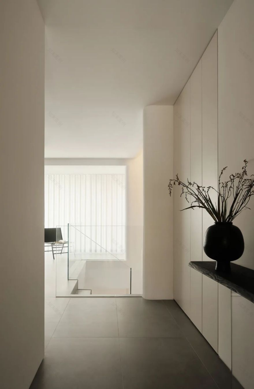
入户的视线得到了最好的释放,仅仅只有玻璃的护栏出现在视野里。且对客厅区域造成的挤压感可以做到最小,楼梯上面的空间从视觉和感受上也可以作为客厅的一部分的延伸空间。
The view of the house is best released, and only the glass guardrail appears in the field of view. And the squeeze on the living room area can be minimal, and the space above the stairs can also be used as an extension of the living room from the visual and sensory aspects.
▼入 口 / Entrance
▼客厅
Living room
楼梯一旦定位,客厅的空间也就自然形成了。
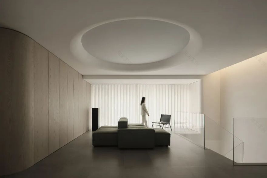
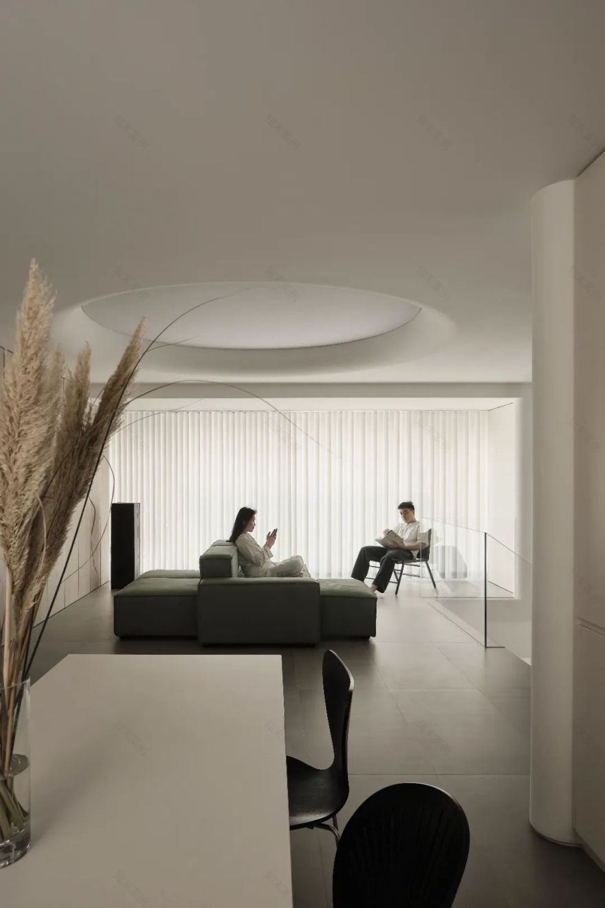
在这个案子里,我们摒弃了传统的客厅沙发电视面对面的做法,采用模块沙发居中放置。
模块化沙发的好处有很多,面对空间的四个面可以独立形成各自的功能用途。
Once the staircase is positioned, the space in the living room is naturally formed. In this case, we abandoned the traditional living room sofa TV face-to-face practice and adopted a modular sofa drama placement. The benefits of a modular sofa are numerous, as the four sides facing the space can independently form their own functional uses.
面对落地窗的部分我们在窗帘盒前面暗藏了幕布,沙发跟幕布之间形成了观影区。
In front of the floor-to-ceiling windows, we concealed the curtain in front of the curtain box, and formed a viewing area between the sofa and the curtain.
面对孩子玩具收纳柜那一侧交给孩子作为玩耍区。
The side facing the child’s toy storage cabinet is given to the child as a play area.
面对餐厅那一侧也可以成为就餐等候区。
The side facing the restaurant can also become a dining waiting area.
如果有必要它还可以被打散放置在空间的任意位置,后期业主孩子稍大需要在家放置爬爬垫的时候,我们就可以把沙发拆分到其他细部区域,把客厅完全交给孩子尽情的爬走。
This is the effect of the modular sofa combination, if necessary, it can also be scattered and placed anywhere in the space, and when the owner’s children are a little older and need to place climbing mats at home, we can split the sofa into other detailed areas and completely give the living room to the children to enjoy.
< 左右滑动查看顶灯开关对比图 >
< 左右滑动查看顶灯开关对比图 >
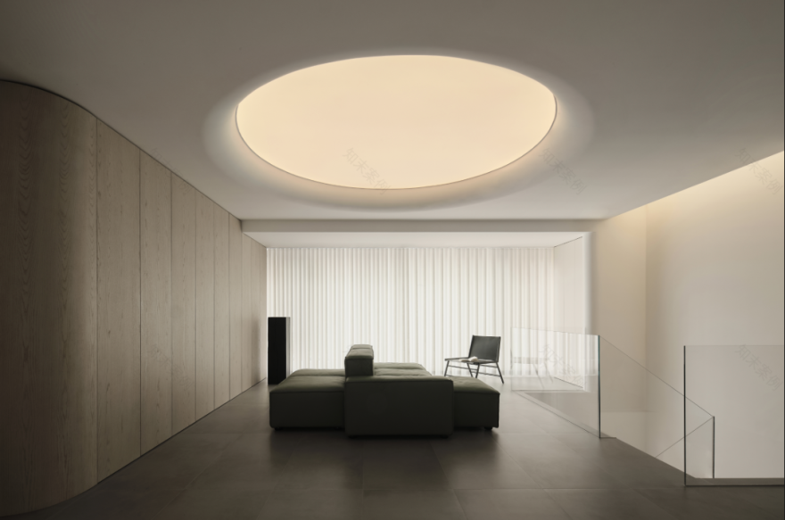
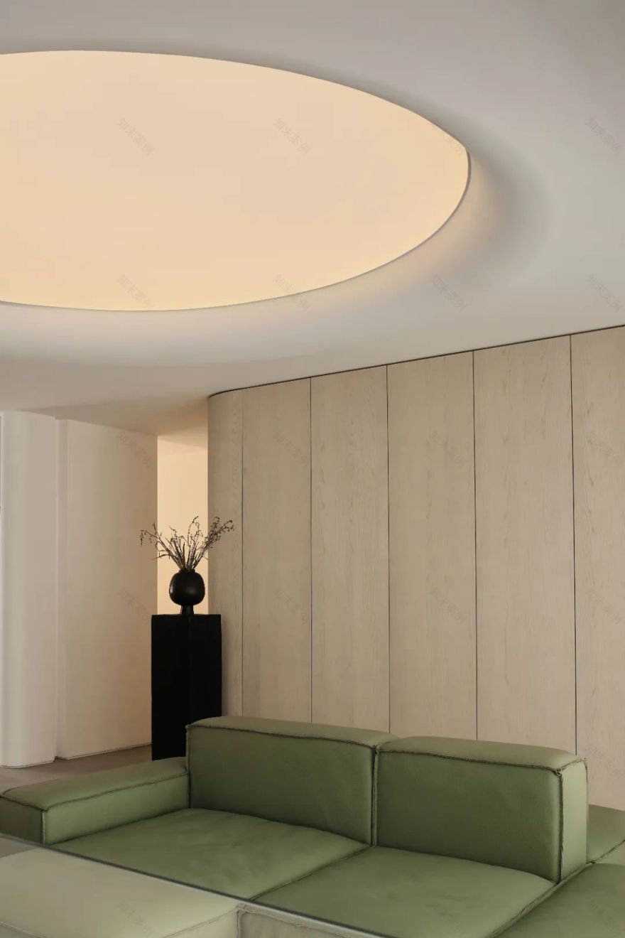
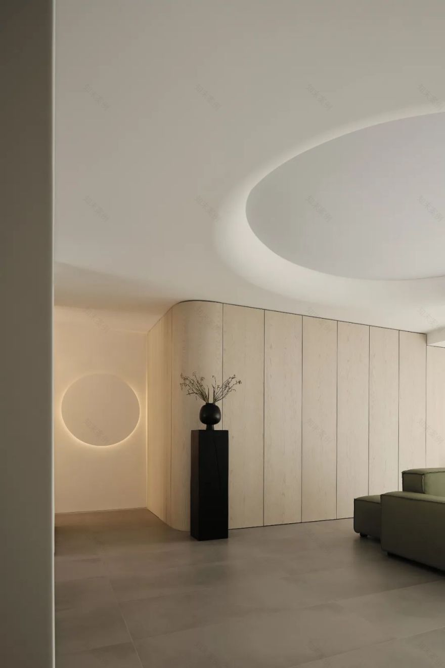
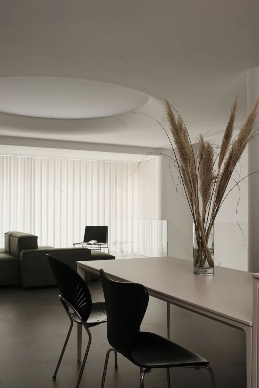
为了加强沙发在区域里的中心感,我们在顶部做了一大块圆形灯膜作为客厅的主照明,让照明像一片天光一样洒下来,并把灯膜和天花的分界处进行了圆弧处理,让两者之间的边界变得更加模糊,柔和。
In order to strengthen the central sense of the sofa in the area, we made a large circular lamp film at the top as the main lighting of the living room, so that the lighting spilled down like a piece of skylight, and arced the boundary between the lamp film and the ceiling to make the boundary between the two more blurred and soft.
< 左右滑动查看顶灯开关对比图 >
< 左右滑动查看顶灯开关对比图 >
< 左右滑动查看顶灯开关对比图 >
▼厨房 / Kitchen
每个功能被设计好时都会留出使用该功能的尺寸,比如冰箱前面要留好开冰箱门的位置,灶台前面要留好炒菜的操作空间,如果我们设计可以把这些灰色区域进行组合重叠,那么空间的利用率将会被极大的提升。
Each function is designed to set aside the size of the function, such as the front of the refrigerator to leave a position to open the refrigerator door, the front of the stove to leave a good stir-fry operation space. If we design can combine these gray areas to overlap, then the utilization of space will be greatly improved.
原始户型厨房是独立的一个区域,跟餐厅把北边分割成了两个独立功能区。这样分割会导致厨房闭塞、餐厅拥挤,两个空间都无法很好地排布。我们的解决方案是把餐厨之间的隔墙拿掉,两侧做上橱柜,将北侧的飘窗台拐弯延伸形成一个吧台,餐桌靠吧台使用。
The original kitchen is an independent area and the dining room divides the north side into two independent functional areas, which will cause the kitchen to be closed and the dining room is crowded, and the two spaces cannot be well arranged. Our solution was to remove the partition wall between the kitchens and make cabinets on both sides, and extend the bay window sill on the north side to form a bar counter, and the table was used against the bar.
左侧的橱柜跟吧台的水池形成了传统“中厨”的功能,右侧的橱柜可以在嵌入冰箱的同时完成一个“西厨”的功能,餐桌靠着吧台放在北侧空间中间,把餐桌两侧的过道和“中西厨”的操作区进行了重叠,让两个功能都借到了彼此的灰色区域,增加空间利用率。
The cabinet on the left and the pool of the bar form the function of traditional "Chinese kitchen", the cabinet on the right can complete a "western kitchen" function while embedding in the refrigerator, the dining table is placed in the middle of the north space against the bar, and the aisles on both sides of the dining table and the operation area of the "Chinese and Western kitchen" are overlapped, so that the two functions are borrowed to each other’s gray area to increase space utilization.
▼卧室 / Kitchen
GODESIGN
设计咨询 |项目预约|商业合作|交流分享
构设计事务所
c oogo d@m 16651118889 | 手机
南京市建邺区兴隆大街 50 号 7 栋 103|地址
客服
消息
收藏
下载
最近


