查看完整案例

收藏

下载
法兰克福Senckenberg Quartier一期工程共有四栋建筑:一栋商住两用高层、一栋办公高层、一栋独立写字楼、一座幼儿园。该工程由cyrus moser建筑事务所负责设计。这组建筑物将成为法兰克福腹地该中心的地标性建筑。本事务所接受委托,负责该中心整个室外区域、地下车库以及“One Forty West”楼中的导向系统设计。我们所用设计语言吸收建筑语言元素,与之相辅相成。
The Senckenberg Quartier Frankfurt is an ensemble of four
buildings: a hybrid high-rise, an office tower, a solitary office building and
a day-care centre. Designed by cyrus moser Architekten, the ensemble shapes the
identity of the centre of this quarter in the heart of Frankfurt. Our design
concept for the guidance and orientation system for the whole outdoor area, an
underground car park and the interior of the ›One Forty West‹ building derives
from the architectural idiom of the buildings themselves.
以外墙为导向,以纵向为视觉要素
Oriented around the façade: our vertical key visual
Senckenberg Quartier的外墙设计以动感线条和网格为主导。几栋建筑高度介于22米与140米之间,如此强烈的落差也构成了该中心的一个视觉特征。我们利用这一节奏,将其转化为设计语言,运动到导向设计当中。信息板和墙面文字以纵向叶片和横向网格线为基调。色彩与建筑外观相一致。香槟色字符和直线元素采取浮雕式安装,抑或丝网印刷在墙面上。
Dynamic lines and grids in the façade design and strikingly
different building heights, varying from 22 to 140 metres, characterise the
image of the Senckenberg Quartier. We adopt this rhythm and translate it into a
design language for the guidance system: The information carriers and wall
lettering are based on a system of vertical lamellae and a horizontal set of
lines. The colour scheme also derives from the building façades.
Champagne-coloured letters and line elements are either raised or
screen-printed.
地下车库的色彩向导
A trend-setting colour system for the underground car park
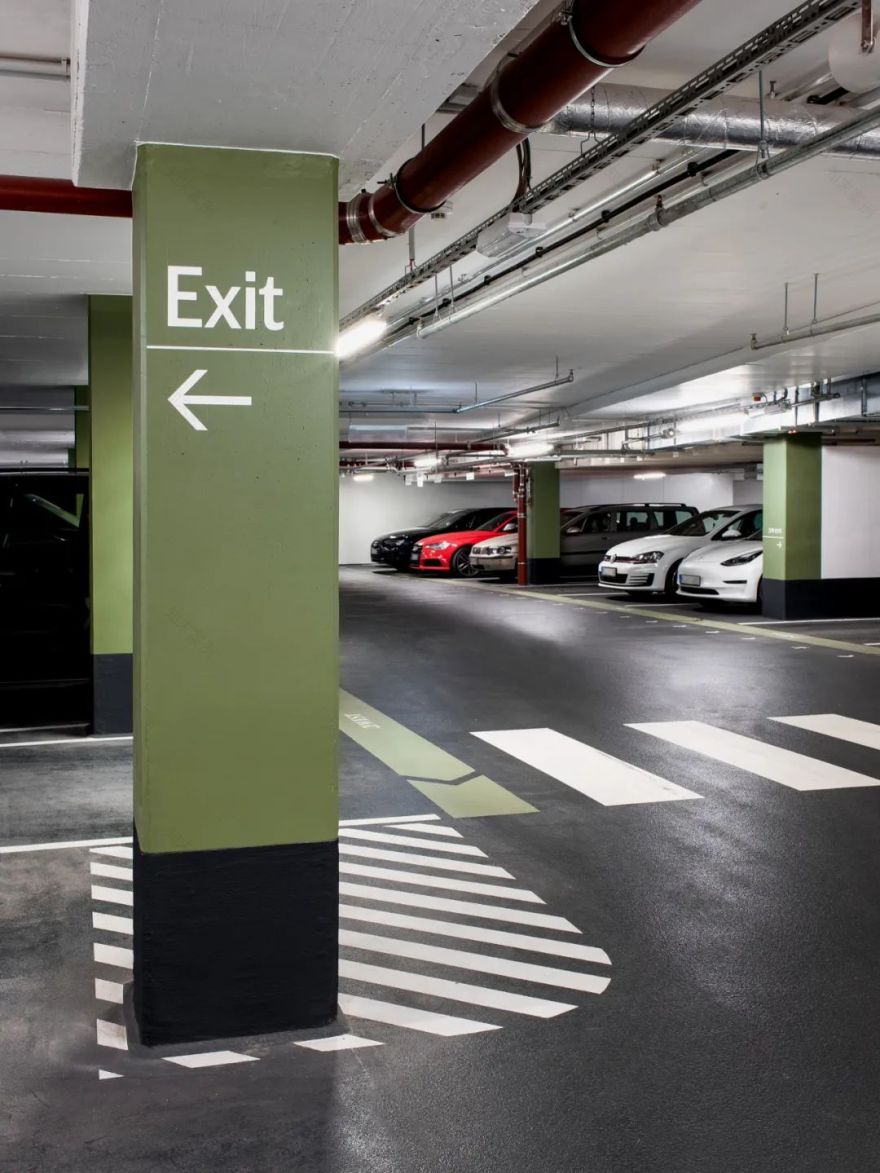
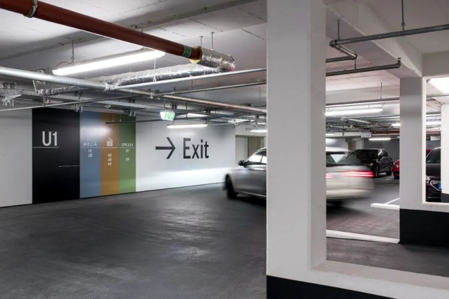
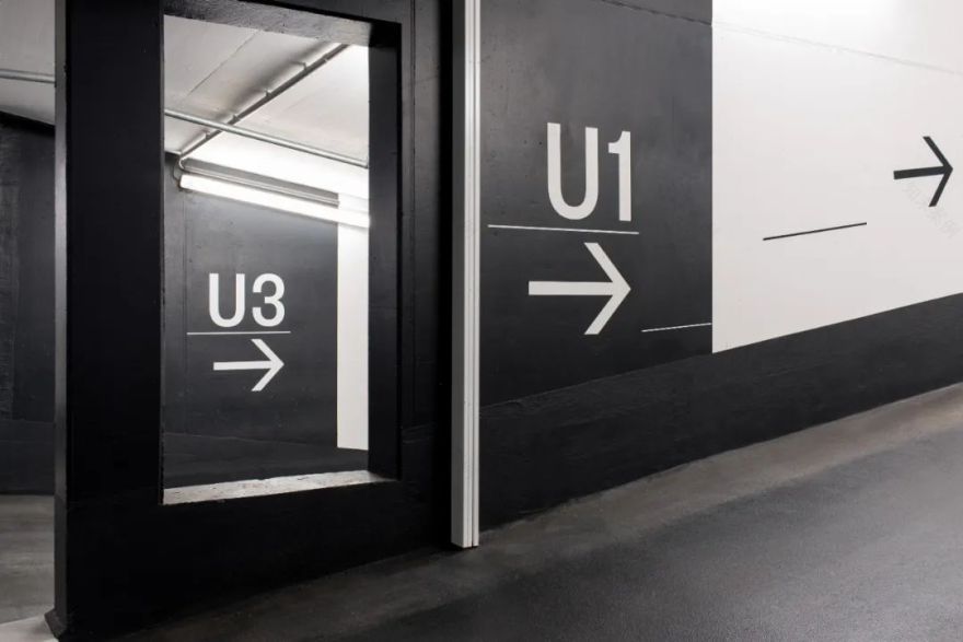
该中心的地下车库共分四层,总计350个车位。如何打造一个导向系统,为多种多样的用户群体提供清晰易懂、一目了然的方向指引,是本次设计的挑战之一。在商住两用楼中有许多私家住户;餐馆酒吧有许多临时停车的需求;酒店的顾客往往来自他乡,对本地地形陌生;写字楼的租户和访客又有其各自不同的使用习惯……一套导向系统要全天候且直观地满足上述各种需求。由于车库的天花板上装有各种通风制冷采暖等管线结构,因而让我们决定放弃采用垂吊式的信息指示牌。所有信息均安置在墙上或立柱上。为便于汽车驾驶者读取,信息的设定高度在层高的上三分之处;对行人而言,信息的高度则位于层高的下三分之一处,以及主入口的墙面上。车库的地面采用深色涂层,与天花板形成对比,使驾驶者的注意力更易集中,而且使地面上的白色标线和字迹等更易阅读。在深色地面上,彩色的区域标识显而易见,例如步行区分别涂以金黄、木犀草绿、葡萄蓝和蛋白石绿,以不同的色彩令不同的用户自然分辨去向。以高级质感兼顾功能性为目标,我们还设计了一套与整体字体相协调的象形符号。尤其是带充电桩的电动车位,其符号最具时效性。百闻不如一见:欢迎到法兰克福来探访我们的设计!不见不散。
The key challenge in designing a guidance system for an
underground car park with 350 parking spaces across four levels was to give the
different user groups a clear and quickly comprehensible means of orientation.
Whether private residents of the hybrid high-rise, short-stay restaurant
guests, hotel guests from out of town, or the tenants and visitors of the
office spaces: The guidance system should provide intuitive orientation right
around the clock. Due to the many technical installations on the ceiling, we
dispensed almost completely with installing any hanging signs. Instead, all
information is affixed to walls and pillars. Easily visible for motorists in
the upper third, and for pedestrians on the footpaths in the lower third, as
well as on the walls of the access cores. The dark floor draws the eye away
from the ceiling, and creates a strong contrast to the white markings and to
the coloured areas and footpaths in gold, reseda green, dove blue and opal
green – colour codes for the different user groups using the underground car
park.
In accordance with the demand for high quality and functionality, we designed a
set of individual pictograms that harmonise visually with the chosen font. A
particularly contemporary touch is offered by the pictogram for parking spaces
with e-charging stations.
Never seen one before? Why not come to Frankfurt? It will be easy to find!
That’s a promise.
摄影
Photography
Ippolito Fleitz Group
团队
Team
Min Jung Kang
Georg Kast
Axel Knapp
Anna Maier
Ismaël Sanou
Carolin Stusak
版权
Copyright
Ippolito Fleitz Group
Follow us on Xiaohongshu!
客服
消息
收藏
下载
最近


