查看完整案例

收藏

下载
简璞设计
Vintage
我一直认为,中古的状态,就似一场久别重逢的偶遇。
I always believe that vintage is a status, just like the reunite after a long separation.
时光荏苒后,那种安静而内敛的沉淀之美。褪去的是那股生人勿近的高傲姿态,剩下的则是岁月浸染的轻柔与平和。
After the passage of time, the quiet and introspective beauty of the sedimentation. The remaining is the softness and calmness impregnated by the years.
个性化商业 Personalized Commercial
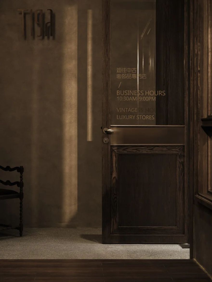
我认为,这像是属于迪、佳两姐妹的生活道场,是她们诠释中古与生活方式的一种态度。安静的,旧旧的,没有距离感的一家特立独行的小店。而它所呈现出来的印迹,则预示着它允许其自然生长的生命特性。
I think it looks like a dojo of life belonging to the two sisters Di and Jia, an attitude of their interpretation of Chinese antiquity and lifestyle. Quiet, old, a small maverick store without a sense of distance. And the imprint it presents foreshadows the character of life it allows to grow naturally.
建筑基础 Architecture Foundation
两百多平米的建筑面积,作为一家中古商店而言,并不算紧凑。加之较高的建筑层高关系,甚至可以算得上空间富裕。但因其 C 字型的建筑结构,以及居中的两根大立柱而产生的空间限制,让原本宽敞的物理空间,显得犹如被拆分开来的独立小方块。如果设计按照现有的建筑结构设定而展开,势必会大大减弱空间的体验感。
The floor area is more than 200m², as a vintage store is not compact. Combined with the high building height, it can even be regarded as space-rich. However, since the “C” shape building structure and the space limitation caused by the two large columns in the center, make the originally spacious physical space appear as if it were separated into independent small squares. If the design is developed according to the existing building structure settings, the experience of space would be significantly reduced.
同时,作为一家临街商铺,受限于山城独特的地形特征。原建筑空间关系与室外坡道形成了两种截然不同的空间关系。面向门头的右边建筑明显高于街道,而左边建筑则远远低于街道的完成面。
As well, as a street shop, limited by the unique topographical features of mountain cities, the original building space relationship and outdoor ramp form two completely different spatial relationships. The building on the right facing the door head is higher than the street, while the left side is far below the finished surface of the street.
设计探索 Design Exploration
综上所述,我们不仅仅是要搭建一个可供销售产品的商店,而是在保证基本诉求的前提下,更需要满足的是个性化的商业表达。这将与主理人的状态密切相关,但也不仅仅只是对她个人喜好的表达,同时还需满足她们在真实使用状态下的考虑。
Overall, we not only need to build a store for selling productions, but also a space on the premise of ensuring basic demands, it takes more to satisfy the personalized commercial expressions, these would be closely related to the state of the manager, but not just an expression of her personal preference, at the same time, it is necessary to satisfy their consideration in real use.
空间描述
Spacial Description
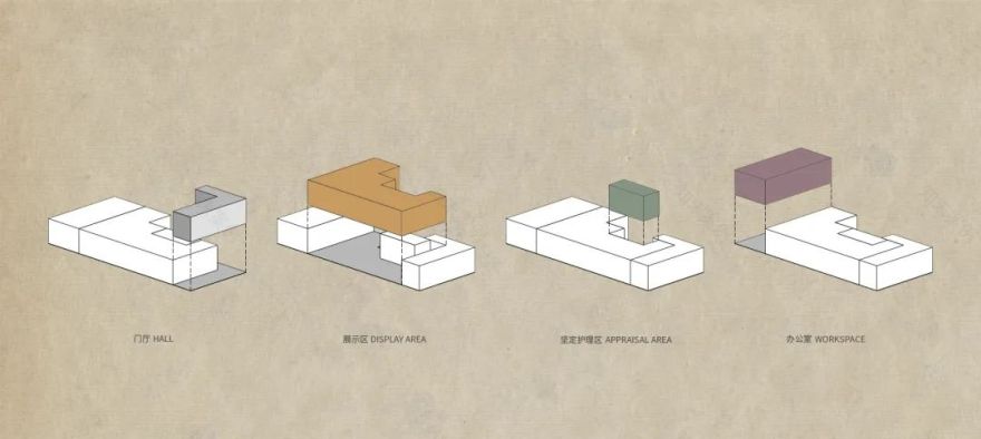
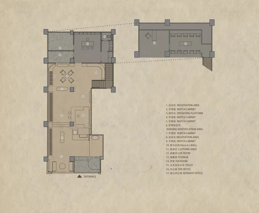
于是,我们将空间根据实际需求,拆分为了五个主要部分。
Consequently, we obey the practical needs of the space, split it into five major parts.
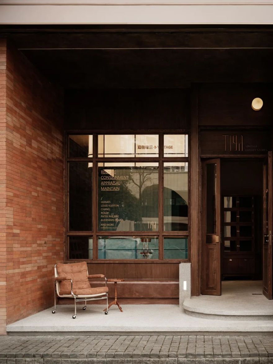
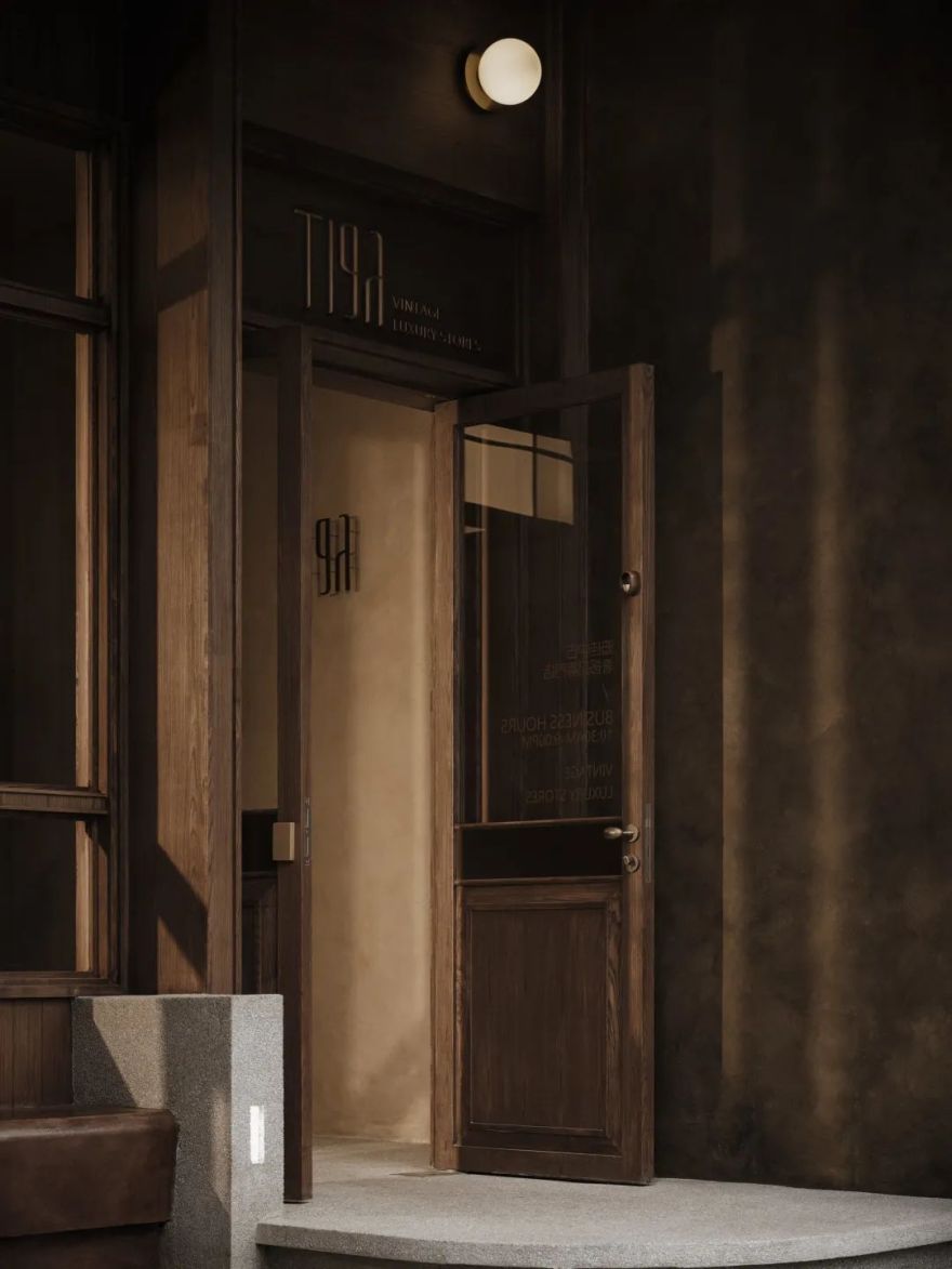
首先根据所处地形因素,我们将门头分成了两个空间,并实施了部分地面抬高的土建处理。
First of all, according to the terrain factors, we divide the door head into two spaces and partial ground elevated by the civil engineering treatment.
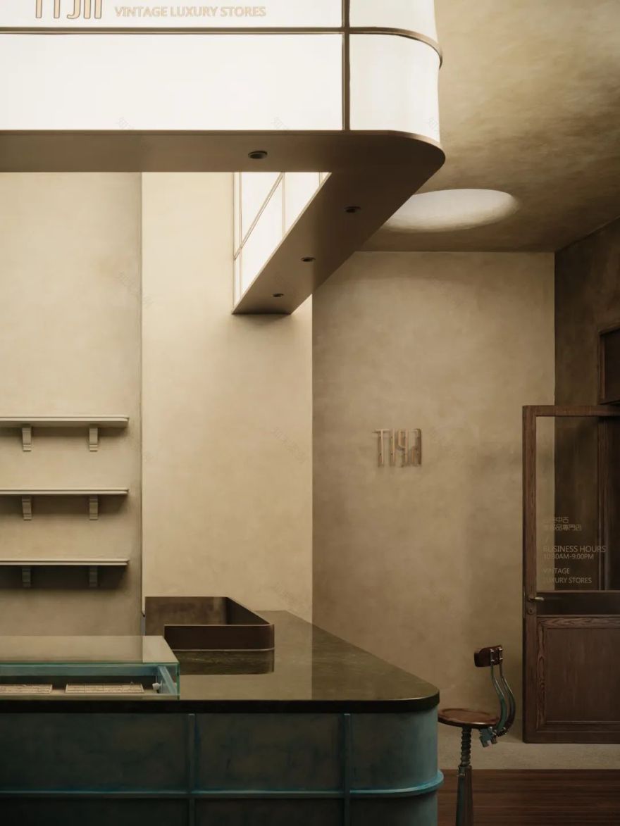
当进入到主体空间后,我们通过抬高地台的方式,以及结合柱体而形成的围合式综合服务空间,将室内主要展示空间又分为了两个主要部分。
After entering the main area, we apply the method of raise the platform, and the enclosed comprehensive service space formed by combining the columns, divide the inside main exhibition area into two major parts.
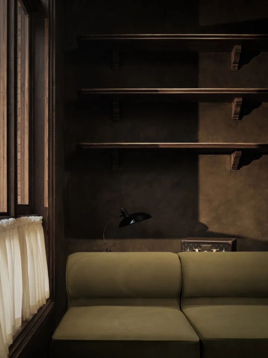
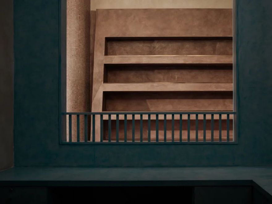
再往里走,则是我们可以营造的精神场域。原本可以搭建为两层空间的层高关系得以保留。在这里,高挑的结构柱与箱包陈列墙成为了视觉的主体,低趴的座位区与之形成鲜明的对比。
Walking further inside is the spiritual field that we can build. The story height relationship that could have been built as a two-story space has been preserved. Here, tall structural columns and luggage display walls have become the main body of vision. The low-lying seating area is in sharp contrast with it.
因其较为狭长的建筑结构关系,我们利用最末端的建筑部分进行了双层空间的搭建。这不仅是为了更好地营造空间情绪而产生的设计手段。
Because of the relatively narrow deep building structure relationship, we build the double-layer space by using the end of the architecture. This is not only a design method to create space mood better.
质感表达 Texture Expression
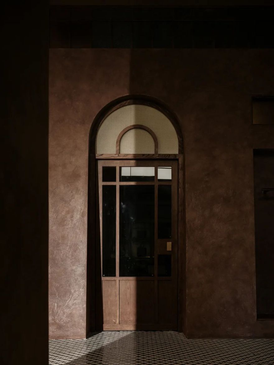
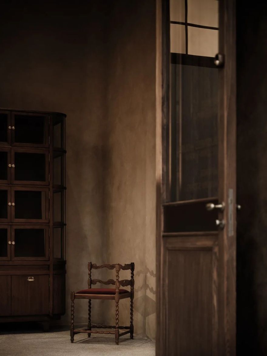
在质感的表达上,我一如既往地偏爱着最为基础的材质关系。原木、水洗石、涂料、红砖再次成为了空间的主角。这无疑是最为纯粹的表达形式。但在迪佳的价值输出方面,我们希望较之以往的同类作品,更具传统价值的认知感受。所以,在整体的设计中,我们融入了适度的石材、短绒、拼花、金属等材质。
On the texture expression, as always, I prefer the most basic material relationship. Log, washed stone, paint and red brick have once again become the key to space. No doubt, it is the purest expression formation. But in Dijia’s value output aspect, we hope to have more traditional cognitive feelings than previous similar works. So, in the overall design, we incorporate moderate stone, short pile, mosaic, metal, and other materials.
虽然这看似老旧的质感关系,并非光鲜亮丽。但这便是我所希望呈现出来的空间,可以安静地、平和地屹立在那里,伴随着时间、光影、人物的关系,而自在其中。每一刻,即是一帧,即是可以保存起来的当下。
Although the texture relationship seems old not glamorous. However, it should be the space I want to show. It can still in peaceful and clam. Among them, accompany with the relationship of time, light and shadow, character. Every moment is a frame, that is, the moment that can be saved.
项目信息
Information
━
项目名称:迪佳中古奢侈品商店
Project Name: Tiga Luxury Vintage Store
项目地点:中国重庆
Project Location: Chongqing, China
设计总监:文超
Design Director: Steven
设计团队:JSD - 简璞设计
Design Team: JSD
软装设计:JSD - 璞本文致
Soft Loading Design: JSD
装饰工程:JSD - 璞造建设
Decoration Engineering: JSD
建筑面积:240 平方米
Cover Area: 240 m²
空间摄影:言隅建筑摄影
Space Photography:Inspace Photography
客服
消息
收藏
下载
最近


