查看完整案例


收藏

下载
本项目对某大楼的一层进行了改造。建筑一层是特殊的,它与地面层级相连,室内和室外空间接壤。在城市中旅行的人们可以看到一层内部空间,甚至将其视为建筑外立面的一部分。正因为一层的开放性和公共性,它的规划就变得尤为重要。
The plan is to renovate the first floor of the building. The first floor is special in architecture. The floor is connected to the ground and the inside and outside of the building are close. People traveling around the city can see the floor and even think of it as a façade. The openness and its public nature of the first floor lies in its continuity with the ground. I thought it is important for renovation to plan the floor.
▼项目外观概览,overview of the project’s exterior
本项目是某房地产经纪人的店面和办公室。面向客户的商务区需要一个岛式会议空间、一个面对面的会议空间和一个儿童玩乐空间。此外,由于大楼位于车站前,因此周边环境非常繁忙,室内需要一种能让客人停留的氛围。因此,设计的目标是营造一种氛围,让店面和办公室像咖啡馆一样柔和地将不同人群分开,也让客人能像在公园一样自然地停留。
The program is a real estate agent’s store opening and office. The business area used by customers was required to have an island meeting space, a counter-face-to-face meeting space, and a toy space for children. In addition, the location is very busy in front of the station, and an atmosphere that makes it easy to stop by was required. Therefore, we aimed to create an atmosphere where people can be divided softly like a cafe and naturally stop by like a park.
▼由十字路口看向大楼,a view from the crossroads to the building
设计决定用土壤和混凝土建造一系列房间的门廊和地板。一般来说,房间内的地板材料是重复排列铺装的,通常没有设置固定尺寸和特殊的装饰性。另一方面,在外部空间中,人行道和斜坡使用的铺装材料则有固定尺寸并更注重其功能性。
Specifically, we decided to make the porch and the floor in the room continuously from soil and concrete. In general, flooring materials in a room are repeatedly arranged and often not given dimensions and treated decoratively. On the other hand, in the exterior plan, floor materials using by pavement and slopes are given dimensions and functions.
▼门店入口,the office’s entrance
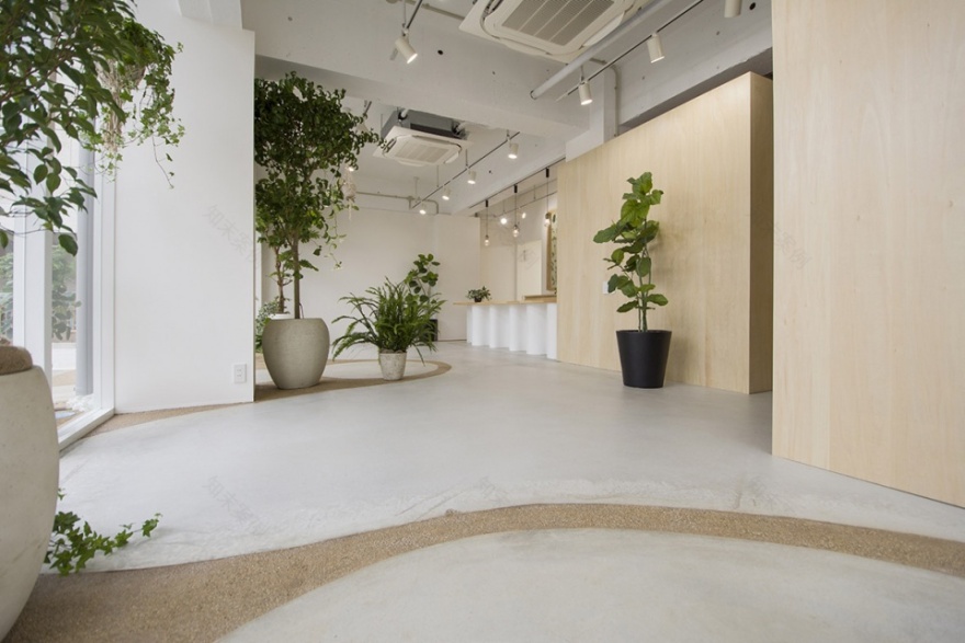
在这里,设计画出了土壤和混凝土之间的边界,就好像在画一个外部平面图一样。考虑到家具和玩具的尺寸、步幅和流线,地板材料的尺寸尽可能仔细规划。由于原始土壤已硬化处理并用混凝土找平,因此室内没有阶梯。
Here, I drew the boundary between soil and concrete as if I were drawing an exterior plan. Taking into consideration the dimensions of furniture and toys, stride length and flow line, the dimensions were given as carefully as possible to the floor material. However, there are no steps because the soil is hardened and finished flat with concrete.
▼门店入口近景,close shot of the office’s entrance
▼由室外看向室内空间,a view from the exterior to the interior
前台是用三种不同半径的模具滚压一块3.2mm的铁板而制成,波浪形底座支撑着装有带凹槽的台面。做成这样,就可以把面向员工一侧和面向客户一侧区分开,两边都可以把腿伸出来。
The counter table is made by rolling a 3.2 mm iron plate with three different radii to make it self-supporting, and a top plate with a groove is fitted in it. By making it like this, you can separate this side from the other side, and you can throw your legs out when you are seated.
▼地面铺装概览,overview of the flooring
▼前台近景,close shot of the front desk
▼前台,the front desk
就像一个分为草地和人行道的公园,即使整个地块都是平整的,我们也经常倾向于在人行道上行走。不过,根据心情,人们有时会在草地上行走。设计想在室内做出这样的氛围:桌子或玩具被自然放置在不同的位置,进而创造了一个柔软的区域,让人们更容易从外面停下脚步驻足观望。
Like a park divided into grass and pavement, we often walk on the pavement even if the floor is flat. Still, depending on my mood, I sometimes walk on the grass. I wanted to make such a difference at the interior. It feels like the table or toy is naturally placed in its place, creating a soft area that makes it easier to stop by from the outside.
▼顾客接待区,the reception area
▼座谈区,the seats and tables for conversations
▼儿童玩耍空间,playspace for children
更多关于他们:
葛島隆之建築設計事務所
客服
消息
收藏
下载
最近


