查看完整案例

收藏

下载
Often the Salone del Mobile furniture fair is not the place to find the most exciting, Instagram-worth moments – for that, you have to head into the centre of Milan. That was more true than ever this Milan Design Week, with companies transforming their flagship stores in ever more inventive and memorable ways. From a takeover by artist Joana Vasconcelos to collaborations with designers and several deep dives into archives, this was a year that simply stepping into your favourite shop could become a full-on lesson in design history or an inspirational assault on the senses. Here, we share some of our favourite transformations you may have missed…
Roche Bobois
Roche Bobois
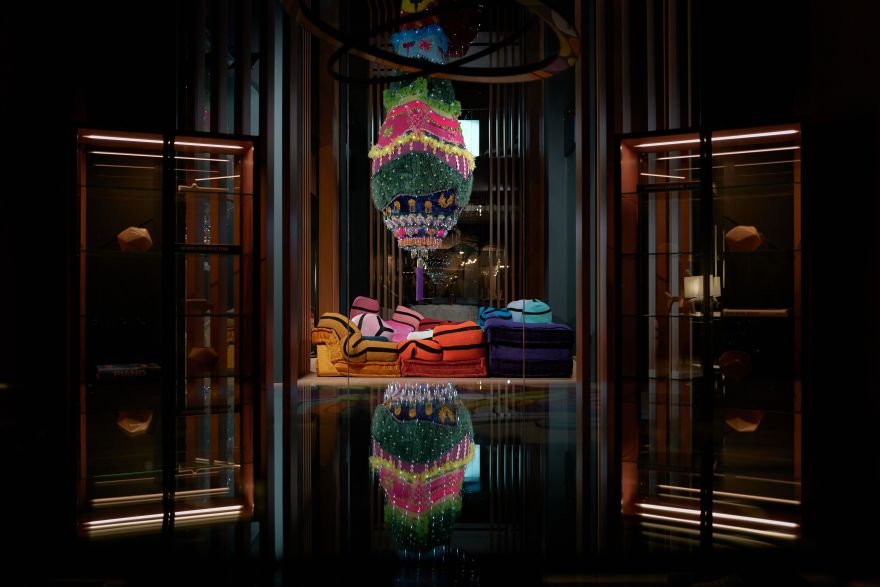
Fans of the French furniture house’s style may have previously seen design collaborations with Portuguese artist Joana Vasconcelos, from her fantastical reinterpretation of the brand’s iconic ‘Mah Jong’ sofa, complete with squidgy knitted appendages, to her Liquorice Allsort-like ‘BomBom’ sofas. To mark her new collection, candy-coloured outdoor versions of the ‘BomBom’, the decision was made to take a big step into the artist’s world.
Roche Bobois
Baptiste Le Quiniou
Flexform
Flexform
For this year’s Milan Design Week, Flexform chose to transform its flagship showroom into a minimal art gallery. The brand has a history of arresting advertising photography – by the likes of Gabriele Basilico, Giovanni Gastel, Maria Vittoria Backhaus, Mario Ciampi, Gianni Berengo Gardin and Fabrizio Ferri – and it's these images it turned to. By hanging the images above the pieces they were promoting, the exhibition, named ‘Portraying Design, Celebrating Tradition & Innovation’ became a retrospective of design and the home through the ages.
Flexform
We especially loved the black and white classic elegance of Max Basilico’s shots depicting the ‘Supermax’ by Antonio Citterio – relaunched this year. flexform.it
Courtesy ELLE Decor Italy
Cassina
What better time for a birthday celebration than during Milan Design Week – and Cassina’s 50th celebrations were the talk of the city. For the ‘Echoes 50 Years of I Maestri’ exhibition, located in the basement level of the brand’s flagship store, designer Patricia Urquiola compiled design sketches, photographs and cult pieces of the past half a century, including works by the likes of Vico Magistretti, Gio Ponti and Carlo Scarpa.
Courtesy ELLE Decor Italy
Courtesy of Ralph Lauren
Ralph Lauren
It may be a quintessentially American brand, but there is something undeniably chic about the way the Italians style Ralph Lauren’s garments. Now, the same can be said for its stores. The brand’s space in Milan’s ‘Quadrilatero della Moda’ was, for Design Week, transformed with a façade featuring a patchwork quilt of its fabrics – from faded florals to ticking stripes and antique blockprints. Plus, to greet passersby, there was also a charmingly styled gelato cart and even a lemonade stand.
Courtesy of Ralph Lauren
Courtesy of Ralph Lauren
Wander through the store and you may have discovered a real treat in its rear courtyard. The Bar at Ralph Lauren was similarly well-dressed for the occasion – think wicker chairs upholstered in the same mix of fabrics depicted on the walls. It was well worth staying to enjoy the aperitivo menu, which was served on tableware created by Ralph Lauren in collaboration with Burleigh. ralphlauren.co.uk
Cristina Bagnara
Wall & Decò
You expect to see wallpaper on walls, but for this installation at Wall & Decò’s store, Italian architecture studio 23Bassi did something a little different; creating cascading strips of wallpaper which fell, instead, from the ceiling. The effect was of walking into a colourful, kaleidoscopic grotto. Almost 1,000 square metres of designs were sliced up to create this wonder, which took almost three days to construct (and almost ten days before that to cut every piece out).
Cristina Bagnara
客服
消息
收藏
下载
最近


