查看完整案例


收藏

下载
“Homemade food to take away”快餐店位于西班牙西北城市蓬特韦德拉(Pontevedra),设计从零开始,将两个完全闲置的小空间结合在一起,以创造出一处精致便捷的备餐与售卖空间,同时也不放弃为顾客提供堂食的可能性。
“Homemade food to take away” is the starting premise of this new project in Pontevedra. Starting from scratch, uniting two small completely empty premises, the aim is to create a space for the preparation and sale of food, without giving up the possibility of tasting there on time as well.
▼项目概览,overall of the project
设计的第一步就是将快餐店内的不同功能区域整合在统一开放空间中,其中不设置任何分隔元素。厨房被规划在顾客的视线内,让人们参与到食物的准备过程中,营造出宾至如归的感觉。
The first decision made was to distribute the different areas in the same space, open, without compartmentalizing. Leaving the kitchen in sight to make the client participate in the food preparation process, make them feel at home.
▼顾客取餐区,custom area
▼由入口看吧台,
viewing the counter from the entrance
由于空间的限制,设计师将部分家具整合到了室内立面中。例如面向外部街道的窗框就形成了长凳,为那些喜欢边看街景边吃饭的人们提供了理想的座位区。
Due to the limited surface available to us, it is proposed to integrate part of the furniture into the façade. Thus, the windows that communicate visually with the outside are framed by a substructure, generating benches that will serve as a seat for those who prefer to eat on the premises.
▼由吧台看窗边座位区,
viewing the window side benches from the counter
▼窗口与街景,window frame and street view
单一空间中的植被造境成为了室内设计的灵感来源,引导设计师采用了不同的材质肌理对空间进行分区,并形成不同氛围之间的对比。因此,整个空间被划分为顾客区与工作区两个区域,吧台就坐落于两者之间的分界线上。
The distribution of the plant in a single space leads us to differentiate the uses with the use of different materials, which delimit the areas and contrast between them. Thus, a line is created, coinciding with the counter, which divides the premises into two zones: that of the client and that of the worker.
▼吧台坐落于两区域之间的分界线上,
the counter divides the premises into two zones
▼吧台细部,details of counter
一系列能够带来温暖质感的材料,为空间营造出亲切质朴的整体环境。家具和天花板中的木材肌理以及覆盖着墙壁和地板的陶瓷元素,赋予了空间传统厨房般的触感,体现出项目的餐饮空间性质。
For the first we use a series of materials that provide warmth and create a more rustic environment. The wood in the furniture and the ceiling together with the ceramic element that covers the walls and floor, give that touch of the traditional kitchen that is sought to be reflected in the project.
▼吧台与厨房,the bar counter and the kitchen
▼黑色瓷砖与家具电器中的金属元素,black tiles and metallic elements in furniture and appliances
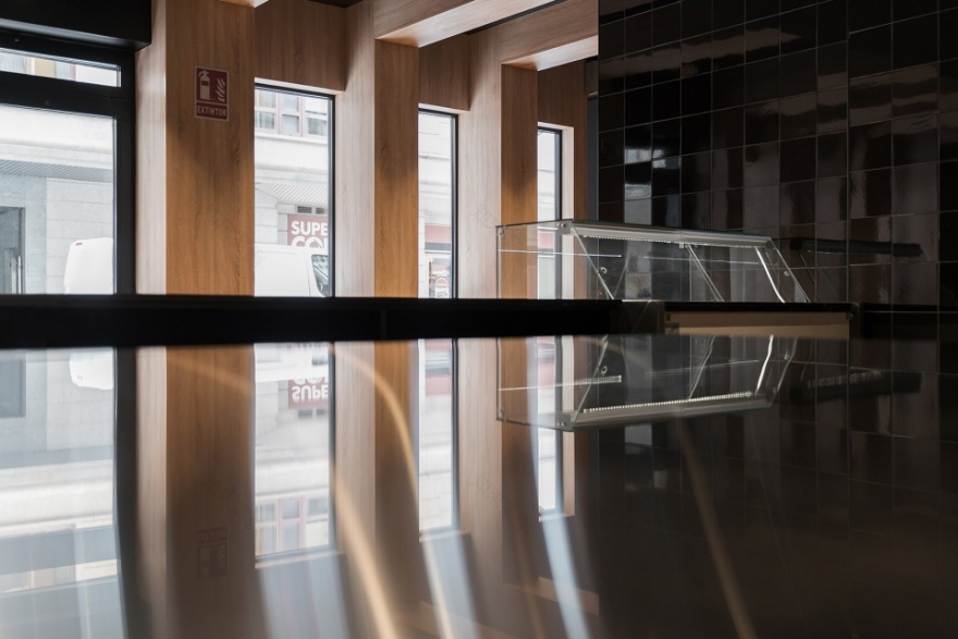
厨房的全黑色背景则与其他空间形成鲜明对比,精心布置的照明,电器,以及家具中的金属材料脱颖而出,成为空间中引人注目的焦点。此外,连续的地板和光滑的瓷砖也为厨房带来了清洁和秩序的感觉。
Contrasting with this, the kitchen is conceived as a completely black background, carefully illuminated, on which the metallic materials of the electrical appliances and furniture stand out to turn them into focal points. The continuous flooring and the glossy tiling in this area also give a feeling of cleanliness and order in the kitchen.
▼由吧台台面看街道,viewing outside from the counter top
客区与工作区,两者之间,除了主要由材料、颜色和纹理来区分外,还具有不同的天花板高度。客区作为与外部环境相连的交通区域,采用了高天花板,创造出更具活力的空间氛围,为人们带来了更加广阔的视野。另一方面,工作空间的天花板则相对较低,更具集中性。
These two areas, differentiated mainly by their materials, colors and textures, also have different heights. The first, as a transit area in relation to the exterior, is presented with a high ceiling, creating a more dynamic space, giving it greater breadth. The second, on the other hand, as a work space, is more collected with a lower ceiling.
▼结构细部,details of the timber structure
简而言之,本项目可谓是传统与当代设计的融合,它为传统的餐饮行业创造出新的可能。
In short, the proposal is a fusion between tradition and contemporary design. A new format for the usual recipes.
▼卫生间入口与结构细部,doorway of the toilets and details of structure
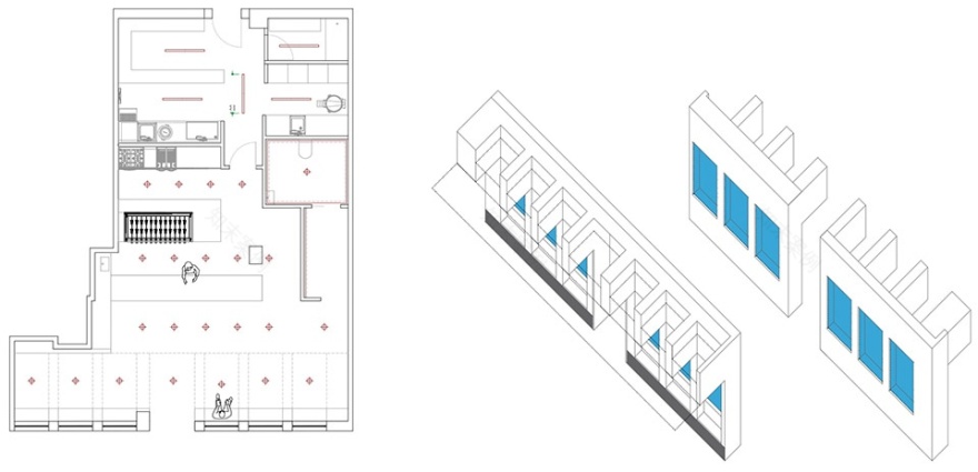
▼项目图纸,drawings
Project size: 98 m2
Site size: 98 m2
Project Budget: EUR 60,000.00
Completion date: 2022
Building levels: 1
Project team: Nan Arquitectos
更多关于他们:
NAN Arquitectos
客服
消息
收藏
下载
最近


