查看完整案例

收藏

下载
在消费大升级的当下环境,消费者的需求变化以更深度层次驱动零售品牌线下终端的变革与模式创新,至此,以“1+N”“N*N”多功能场景组合的复合型空间,成为品牌打造自身差异化的新形式之一。
Under the backdrop of nowadays large consumption upgrade, the change of consumer demand drives the transformation and mode innovation of retail brand offline terminal at a deeper level. So far, the compound space of "1+N" and "N*N" multifunctional scene combination has become one of the new forms for brands to create their own differentiation.
另奕可能为本土设计师服饰品牌MAO BY MAO塑造的复合型空间,在有限的空间内,集合办公室、概念店、茶室、样衣制作室等多功能需求,于“自然·非然”之间,传递品牌内在精神的原初映像。
In addition, ALTERNABILITY DESIGN creates a compound space for the local designer clothing brand MAO BY MAO. Within the limited space, it gathers multi-functional needs such as offices, concept stores, tea rooms, and sample clothing production rooms, which is between "natural and non-natural" to convey the original image of the brand's inner spirit.
01我源 · 自我
MAO BY MAO
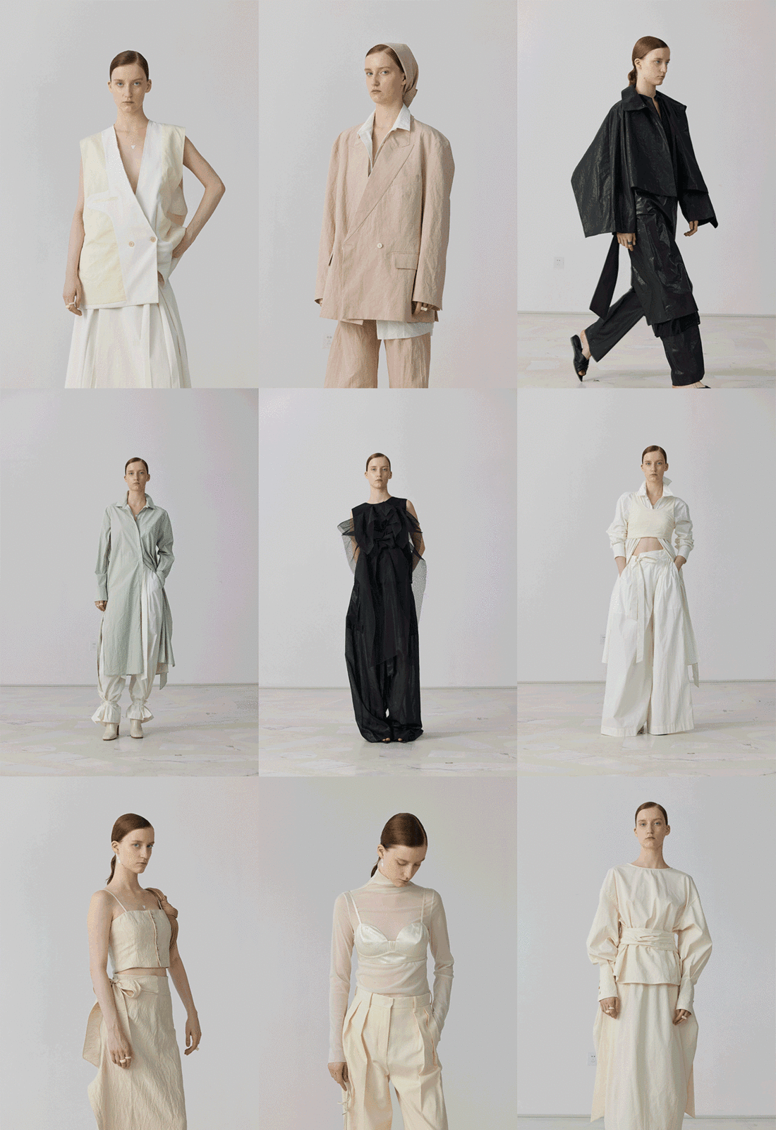
MAO BY MAO 23春夏/秋系列 LOOKBOOK © MAO BY MAO GIF
MAO BY MAO,一个根植于中国的新兴设计师服饰品牌,秉承“我源自我”的个性表达,守循“万物一体,自然之道”的内在信念,回归服装本真,探寻人与衣物、身体与尺度的本质关系,呈现穿衣者自然鲜活的生命力。
MAO BY MAO, an emerging designer clothing brand rooted in China, adheres to the individual expression of "I am, from myself”, which follows the inner belief of "All things are one, the law of nature", and returns to the authenticity of clothing. It aims to explore the essential relationship between people and clothing, human body and scale, presenting the natural and fresh vitality of wearers.
本案位于广州番禺创意园办公区一层,游离于城市中心之上,远处连绵成群的山林,近处荡漾着静谧的湖泊,四周环绕自然景观的视野,赋予项目本身连结外部自然的场所优势,亦与品牌调性相契合。
Located on the first floor of the office area of Panyu Creative Park in Guangzhou, this project, floats above the city center, with mountains and forests in the distance, quiet lakes rippling nearby, and a view of the surrounding natural landscape, giving the project itself the advantage of connecting with external nature, which is also in line with the brand's tonality.
MAO BY MAO 品牌精粹(DNA):自然、当代、人文
首行图三 © MAO BY MAO,其余图片来源于网络
另奕可能依循品牌内核,探寻肌理、质感与场域的存在关系,创造天然与人为的场景冲突感,结合不同功能单元的有序穿插,构建一个自然生长、当代审美、人文气息的纯粹空间。
In addition, ALTERNABILITY DESIGN follows the core of the brand, explores the existence of texture, quality and field, creates a sense of natural and artificial scene conflict, and combines the orderly interspersion of different functional units, to build a pure space with natural growth, contemporary aesthetics and humanistic atmosphere.
#02
自然 · 非然
Nature · Non-nature
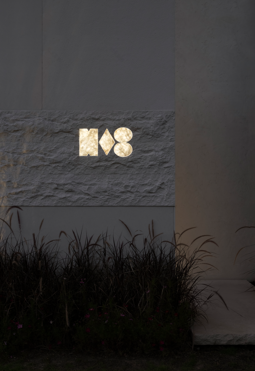
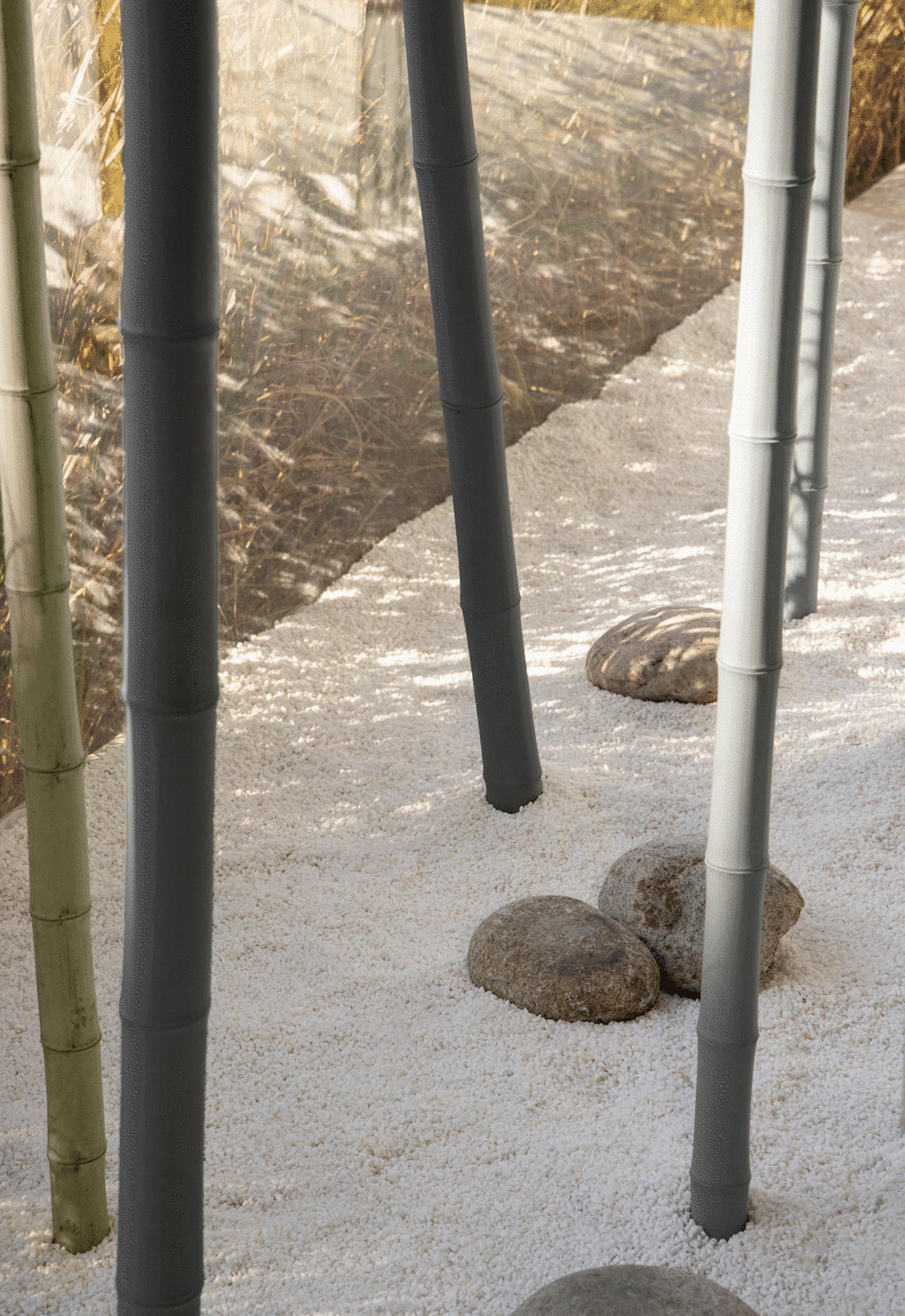
立于转折处向空间望去,立面分布纯白块面与全透明落地窗,窗内映射的竹林景观与室外吹动的芦苇、翠绿蜿蜒的远山,形成微妙的相连。或是日光照耀下,品牌标识在斑驳石面上显露出不张扬的内在属性;又或是深如夜色下,晕染出大理石肌理的自然微光。
Standing at the turning point and looking out into the space, the façade is distributed with pure white blocks and fully transparent floor-to-ceiling windows, and the bamboo forest landscape reflected in the window is subtly connected to the reeds blowing outdoors and the verdant winding mountains; or, under the sunlight, the brand logo reveals its unassuming intrinsic attributes on the mottled stone surface; or it's as dark as the night, blending the natural shimmer of the marble texture.
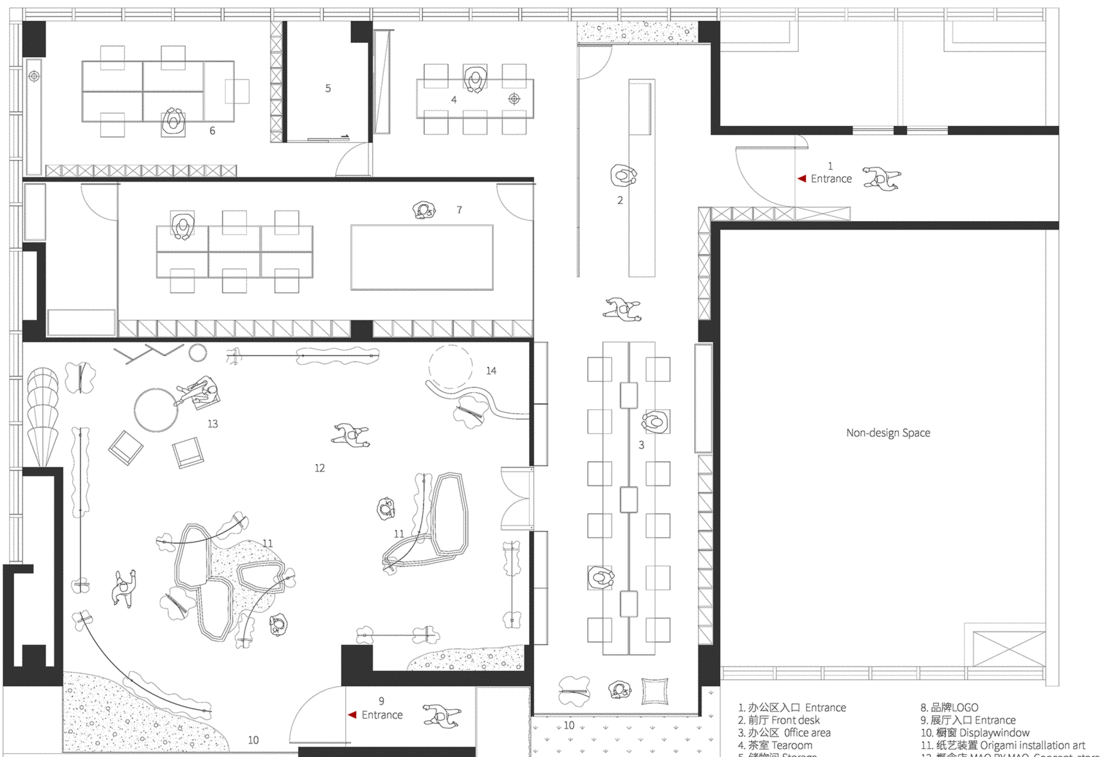
空间穿插两个入口,经由成片芦苇荡和大理石板的入口之一,以幽然转折的姿态,迎接来访者。此入口的设置,意在形成概念店空间独立性的同时,让整体空间布局趋于多元流畅,为来访者制造一场完整私密的沉浸式场景体验。
The space is interspersed with two entrances, passing through one of the entrances of reeds and marble slabs, which greets visitors in a subtle gesture. The setting of this entrance is intended to form the spatial independence of the concept store, while making the overall space layout tend to be diversified and smooth, creating a complete and private immersive scene experience for visitors.
行径至内,呈展的是MAO BY MAO当季主题概念下的空间。天然材料与人为设计碰撞下形成的衣物,是“自然·非然”的相遇,空间同样如此。
Walking to the inside, what is presented is the space under the theme concept of MAO BY MAO season. The collision of natural materials and artificial design is the encounter of "nature and non-nature", and the same is true of space.
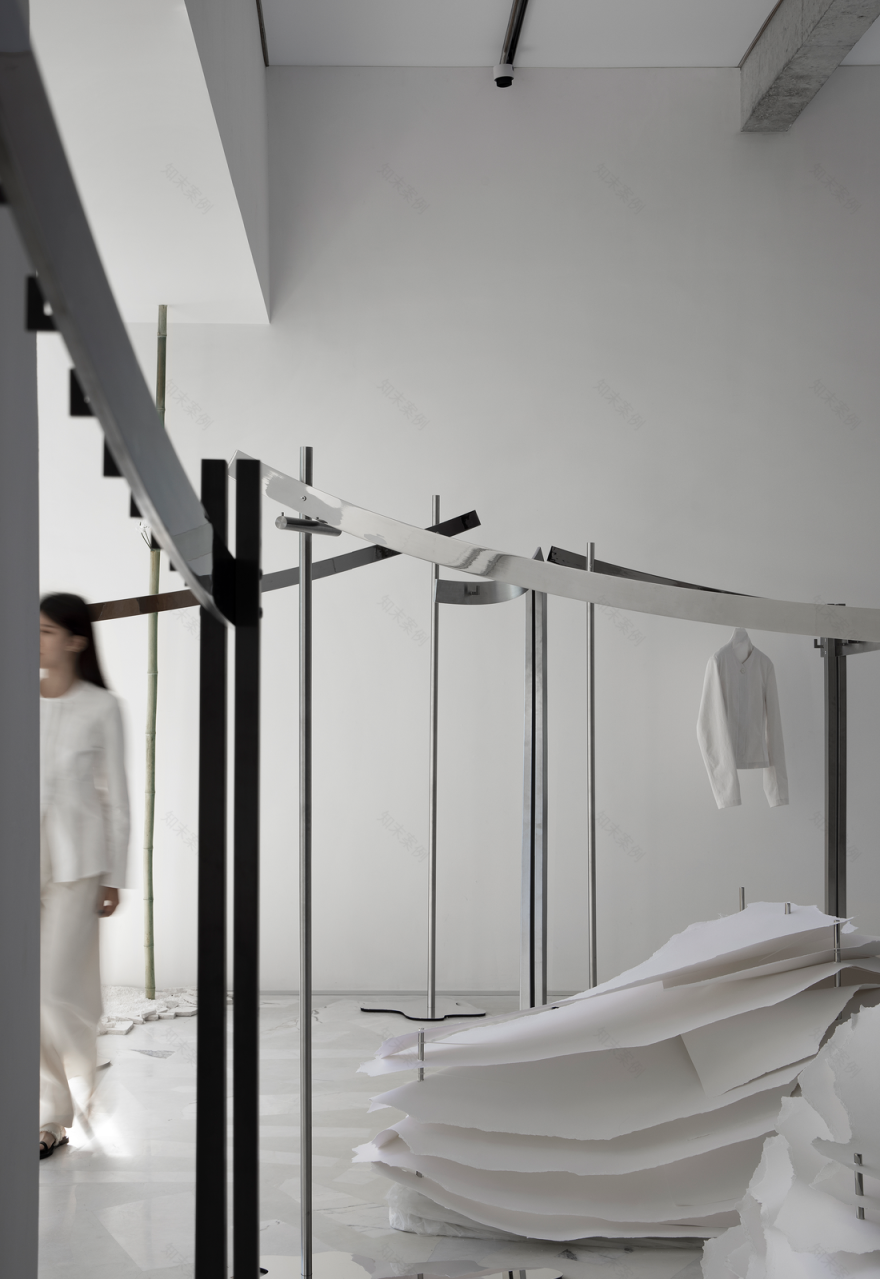
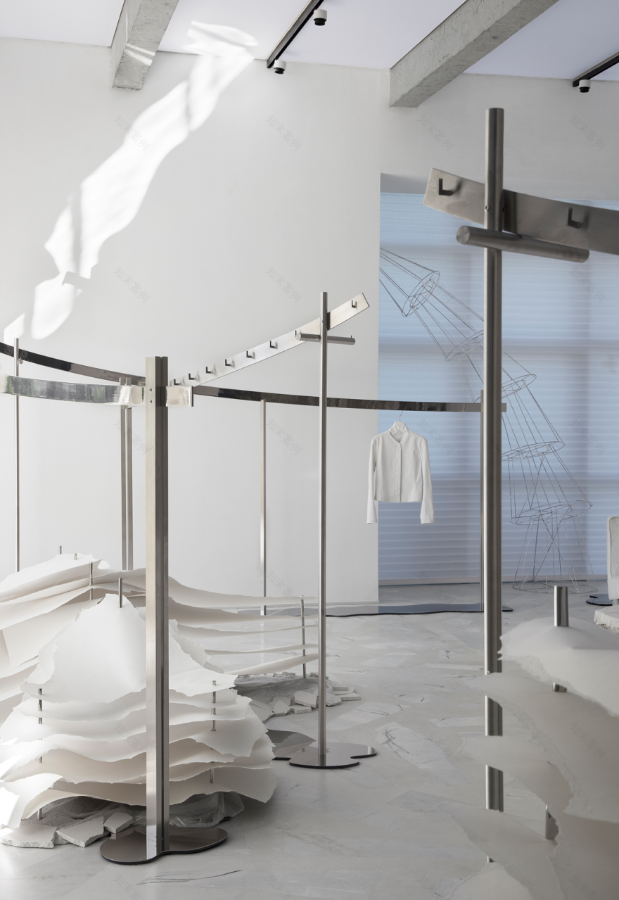
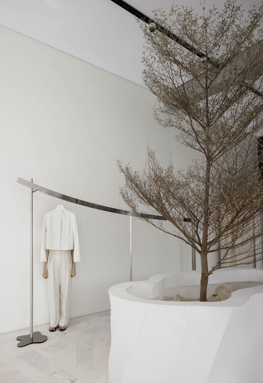
与此同时,概念店可根据每季服装主题,以策展性的设计思维形成灵活性的概念展示空间。拥有可自由移动的陈列货架、可根据不同主题变换的装置,并与之配合的可调节可变换的天花软膜灯光,给予了空间更多灵动的可能。
At the same time, concept stores can form flexible concept display spaces with curatorial design thinking based on the theme of clothing in every season. With freely movable display shelves, devices that can be changed according to different themes, and matches adjustable and changeable ceiling soft film lighting, it gives the space more possibilities in flexibility.
在地面的处理上,回收大理石荒料,用“园林置石”的方式嵌入地面,散落空间各处。看似随性却又似符合某种“自然规律”的审美细节,也隐喻品牌的自然性格,演绎空间的当代审美。
When comes to the management of the ground, marble blocks are recycled and embedded in the ground in the way of "garden stones", scattered throughout the space. The aesthetic details that seem casual but indeed seem to conform to a certain "natural law" are also metaphors for the natural character of the brand and interpret the contemporary aesthetics of the space.
自由生长-货架概念表达 © 另奕可能
立面的纯白基调延续至内部,捎带着外在的自然气息,造就纯粹柔和的空间。金属弧线起伏着,象征树植的自由生长。
The pure white tone of the facade continues to the interior, carrying a sense of natural atmosphere from the outside, and creating a pure and soft space. Metal arcs are undulating, indicating the free growth of trees.
自然间,沙砾碎石的粗粝、光滑镜面的流动、大理石地面的拼接,看似凌乱的陈置铺就出空间的层次分明,映射出湖泊的阵阵涟漪与泥土的活力绿意。
In the nature, the roughness of gravel, the flow of smooth mirrors, the splicing of marble floors, and the seemingly messy furnishings create distinct layers of space, reflecting the ripples of the lake and the vibrant greenery of the earth.
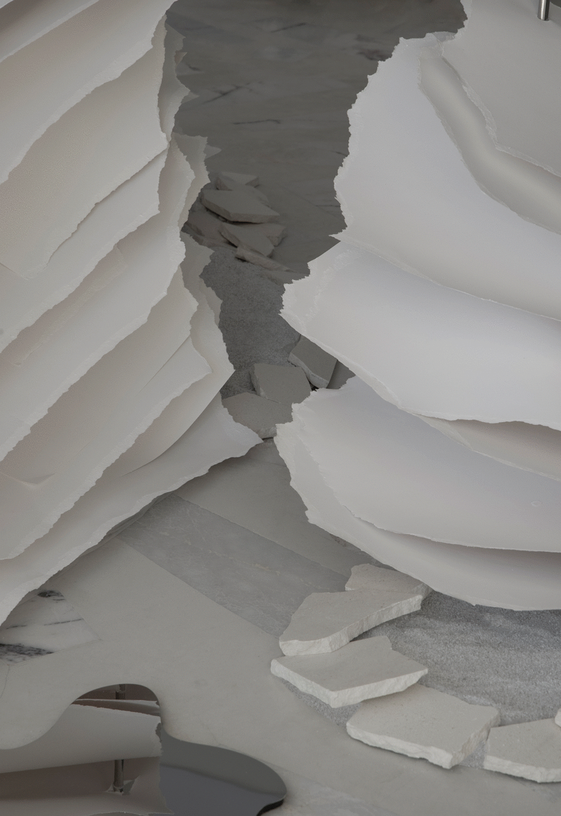
纸艺装置,是原陈列计划外的即兴表达,也是对艺术家Angela Glajcar作品《山火系列》作为灵感之源的致敬,携带未知的意境进入空间。随意撕扯的纸张边缘,恍若地壳运动的碰撞中向上而生的层层山川,轻盈而悬浮,肆意而鲜活。
The paper art installation is an impromptu expression outside the original display plan, and it is also a tribute to the artist Angela Glajcar's work "Mountain Fire Series" as a source of inspiration, bringing an unknown artistic conception into the space. The edges of the paper torn at will, like the layers of mountains and rivers rising upward in the collision of the crustal movement, are light and suspended, wanton and fresh.
#03
方角圆 · 转译
Square, triangle, circle
双动线入口-项目平面图 © 另奕可能
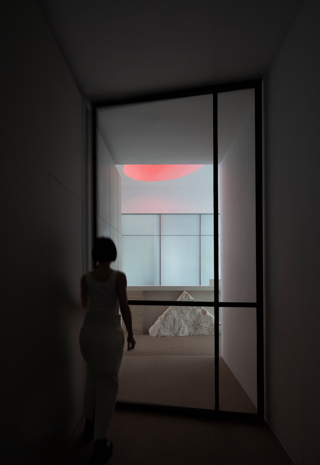
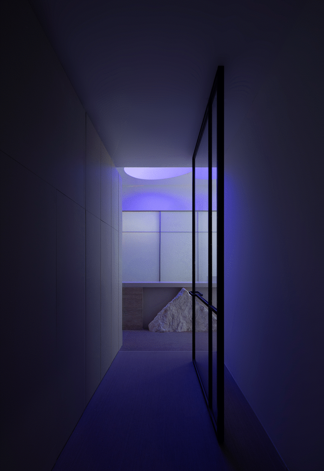
与前者连接内外自然的入口不同,通往办公区域的入口通道狭长而幽暗。另奕可能利用场地的4米层高,置入全透明转轴大门,致使室内外的视野共通,悄然划出外界与内部之间的过渡地带,激发来访者向里探索的好奇心。
Unlike the former, which connects the natural inside and outside, the entrance passage to the office area is narrow and dark. Additionally, ALTERNABILITY DESIGN uses the 4-meter height of the site to place a fully transparent hinge door, so that the indoor and outdoor views are common, quietly marking the transition zone between the outside as well as the interior, and stimulating the curiosity of visitors to explore the inward.
而更为内在的半透明玻璃,巧妙隔断外界对内部办公空间的窥探欲。虚实相间,是朦胧。
The more internal translucent glass cleverly cuts off the outside world's prying desire for the internal office space. Between the virtual and the real, it is hazy.
由黑暗至光亮,即见品牌标识的意象表达。
From darkness to lightness, the image of the brand logo is expressed.
品牌标识 © MAO BY MAO
MAO BY MAO来自最原始的图案——方形、三角形、圆形,这些简明、质朴与自然的视觉元素成为空间设计的发散点。
MAO BY MAO comes from the most original patterns - square, triangle, circle. These concise, rustic, and natural visual elements have become the divergence point of space design.
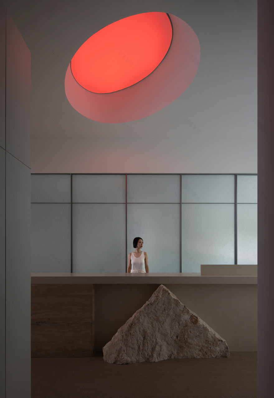
一反以往品牌标识直接露出的“开门见山”,另奕可能对品牌标识进行提取和转译,生成空间内在的一部分——前台。
Contrary to the "straight to the point" directly exposed by the brand logo in the past, ALTERNABILITY DESIGN extracts and translates the brand logo to generate an inner part of the space - the front desk.
天花圆灯如幻彩变化出不同光色,演绎日出至日落的时间维度;经回收加工的荒石裁切为三角形、方形,不经联想至日光照耀下的茫茫山色。
The ceiling round lamp changes different light colours like a mirage, interpreting the time dimension from the sunrise to the sunset. The recycled barren stones are cut into triangles and squares, which are not associated with the vast mountains under the sunlight.
前台,作为接待空间,是来访者对品牌和空间形态的初次认知,亦是功能的承载。跟随员工的使用需求,合理嵌入打印机、微波炉、饮水机等办公配件。
The front desk, as a reception space, is the visitors’ first perception of the brand and space form, and it is also the carrier of function. To satisfy the needs of employees, printers and microwave ovens, water dispensers and other office accessories are reasonably embedded.
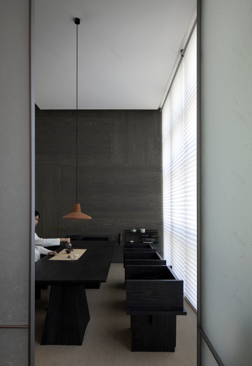
半透明玻璃后,是静谧安然的茶室。室外投射的自然光充足而柔和,无需过多的室内光源,仅在天花边缘置入氛围光。谈话品茶间,黑调的秩序与沉静由此营造。
Behind the translucent glass is a quiet and peaceful tearoom. The natural light projected from outdoors is abundant and soft, without excessive indoor light sources, with the ambient light being placed on the edge of the ceiling. During the period of conversation and tea tasting, the order and tranquillity of the black tone are thus created.
办公区域结合空间的自身条件和大面积落地玻璃采光,将室外的自然景观介入室内,为员工营造开放舒适的办公环境。
The office area combines its space and the large area of floor-to-ceiling glass lighting, and intervenes the outdoor natural landscape into the indoors, building an open and comfortable work environment for employees.
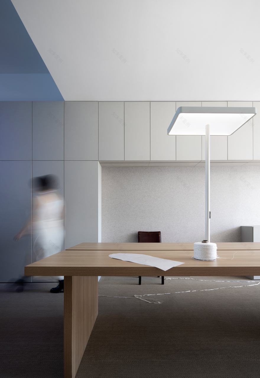
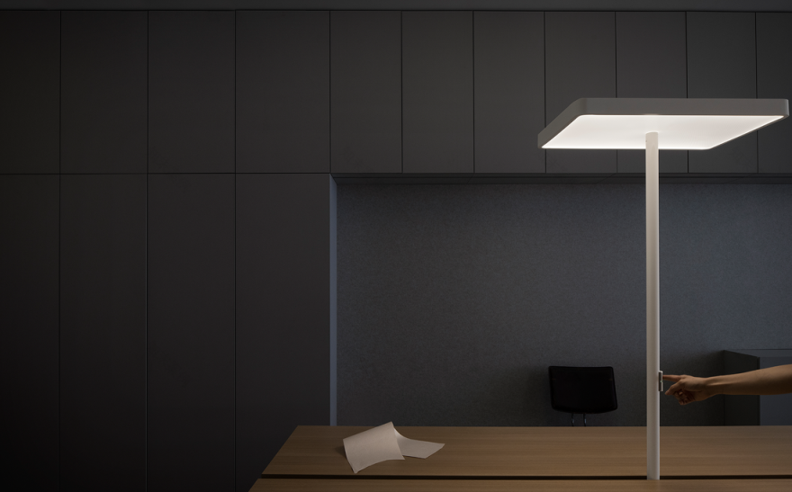
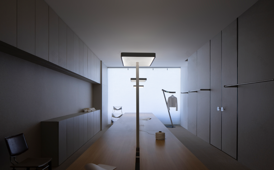
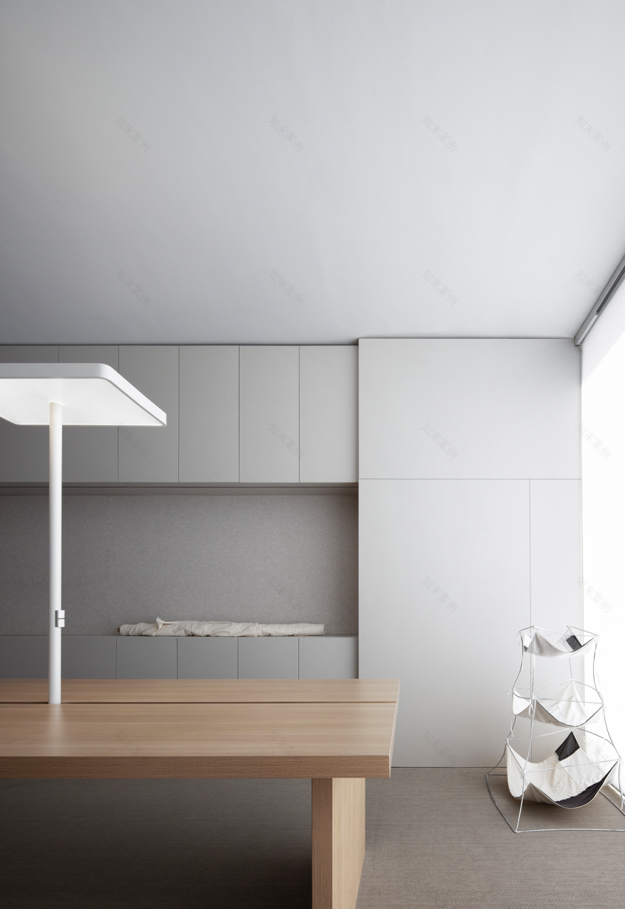
一张可容纳12人的定制长桌、合理的收纳柜、悬置的样衣衣架、可作灵感参考的毛毡墙板,没有明确的分割促进彼此交流。可调节光度的方形台灯自下而上出现,满足设计师对自有区块的掌控。
A custom-made long table that can accommodate 12 people, a reasonable storage cabinet, a hanging sample hanger, and a felt wall panel for inspiration, leaves no clear division to facilitate communication. Square table lamps with adjustable luminosity appear from the bottom up, satisfying the designer's control of its own zone.
通往概念店的双开门及其圆形门把手,昭示着空间与空间之间的相互衔接,呼应着品牌标识的解构概念。
The double doors leading to the concept store and their round door handles indicate the interconnection of the space, echoing the deconstruction concept of brand identity.
© 另奕可能
© 另奕可能、MAO BY MAO
项目信息
项目名称:MAO BY MAO办公空间+概念店
项目地址:中国 广州
项目面积:260㎡
项目业主:MAO BY MAO
设计单位:另奕可能 ALTERNABILITY DESIGN
主案设计:王晗文
设计团队:王晗文、禤锐涛等
项目摄影:ACT STUDIO
Project Information
Project Name: MAO BY MAO Office & Concept Store
Location: Guangzhou, China
Area: 260㎡
Client: MAO BY MAO
Design Organization: ALTERNABILITY DESIGN
Leading Designer: HARVEYWONG
Design Team Members: HARVEYWONG, Ruitao Xuan
Photographer: ACT STUDIO
客服
消息
收藏
下载
最近


