查看完整案例


收藏

下载
————
“日月不肯迟,四时相催迫”
The sun and moon will not be late, and the four seasons urge.
人人都是梦想的铸造者
"Everyone is the maker of dreams"
致每一个创业的你
To everyone who starts a business
设计并不是为了满足设计师的个人喜好,好的设计可以使建筑与主人发生共鸣。
The designer’s design can not resonate with the owner’s preferences.本次项目的设计中,我们认为这不仅仅是一个办公的区域,更像是一个舒适的、有调性的,夹杂着创始人情感的空间。我们弱化掉办公室的概念,而去强调整体的舒适性,为主人打造一个复合的办公空间。
In the design of this project, we believe that this is not only an office area, but more like a comfortable and tonal area mixed with the feelings of the founder. We weaken the concept of office and emphasize the overall comfort, so as to create a composite office space for the host.
Designaesthetics 设计美学
Suitable Space Design
宜空间 · 西安
/ 顶层
,钢筋
水泥下的绿洲
/
Top floor, oasis under reinforced concrete
钢筋水泥的躯壳内
In the body of reinforced concrete
往往承载着一个又一个不平凡的梦想
Often carrying one extraordinary dream after another.正如我们本次的设计,顶层整体犹如钢筋水泥下的绿洲。
身处钢筋水泥之中却能打造属于自身的灵动之美
Living in reinforced concrete, you can create your own smart beauty
▼效果图
本设计我们以简约作为内核
In this design, we take simplicity as the core
在设计中运用极简的线条,没有太多复杂的造型。
The use of minimalist lines in the design does not have too many complex shapes
各部分设计由环绕的水系串联起来
The design of each part is connected by the surrounding water system, making the whole space full of flexibility.
半室外设计的亭子满足了委托人喝茶聚餐会谈等诸多需求
The pavilion with semi outdoor design meets many needs of the client, such as tea, dinner and talks.
亭子外围采用了可电动磨砂的玻璃,保证了透光和私密性的双重选择
The pavilion is surrounded by electrically frosted glass, which ensures the dual choice of light transmission and privacy.
全露天的会客区,采用了温馨的室内家具
The open-air reception area adopts warm indoor furniture,
夏天傍晚三五好友又或是生意伙伴,在此区域喝茶赏景。
In the summer evening, friends or business partners drink tea and enjoy the scenery in this area.
上有满天繁星,下有曲水流觞,久处这里令人身心惬意。
There are many stars in the sky, and there are curved water cups under the sky. It’s pleasant to be here for a long time.
/
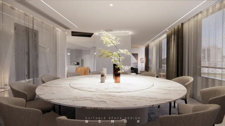
BOSS 层,办公与会客共生
/
Boss layer, office and reception symbiosis
BOSS 办公室应该是舒适的有调性的
The boss office should be comfortable and tonal
是夹杂着创始人的情感,和对于创业的热情
It is mixed with the feelings of the founder and the enthusiasm for entrepreneurship
▼效果图
所以在设计中,原本规则的平面我们做了不规则的造型。
So in the design of the original regular plane, we made an irregular shape
原本应该是昏暗的空间,我们用了大量的玻璃,让整个空间变得通透。It was supposed to be a dark space. We used a lot of glass to make the whole space transparent.
原本宴会茶休,喝茶聊天吃饭办公浑然在一体。
Originally, banquets, tea breaks, chatting, eating and working were integrated.
这是一个办公室吗,不,这更像是一个会客厅。
Is this an office? No, it’s more like a reception hall
这是一个会客的地方吗,不,它更像是一办公的地方
Is this a meeting place? No, it’s more like an office place
我们弱化掉办公室的概念,而去强调整个空间的舒适性,无论是从灯光材质还是线条出发。
We weaken the concept of the office and emphasize the comfort of the whole space, whether from the lighting material or line.
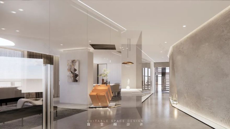
通常情况下看到的 LOGO 一定是挂在墙上,但是 logo 它是一个企业的灵魂。
Usually, the logo you see must be hung on the wall, but the logo is the soul of an enterprise.
所以我们把它变成一个装置放在一个空间最重要的地方
So we turn it into a device and put it in the most important place in space
用 logo 本身的色彩来点亮整个空间。它是一个精神的图腾,也是一个企业文化的展示。
Use the color of the logo itself to light up the whole space. It is not only a spiritual totem, but also a display of corporate culture.
/办公区,温情曲线的主战场/
方正的格子间难道才是办公区域的标准答案吗
Is the square lattice the standard answer to the office area
不,我们认为的办公室是具有温情的,并不是单调的直线和规则的平面所能表达的
No, we think our office is warm, not expressed by monotonous straight lines and regular planes.
在室内设计中曲线永远是温情的最好讲述者
In interior design, curve is always the best narrator of warmth.
因此我们在前台和会议室合照墙的设计过程中融入了翻页的设计元素
Therefore, we have incorporated page turning design elements into the design process of the front desk and conference room photo wall
原本规则的墙面,被翻起的书页造型完全打破,此时这里成为了曲线的主战场。
The original regular wall was completely broken by the shape of the turned up pages. At this time, it became the main battlefield of the curve.
将笔直的墙壁拉入到整个空间的氛围中来,使整个空间充满灵动。
Pull the straight wall into the atmosphere of the whole space to make the whole space full of flexibility
同时具有温情的办公室也体现在对于灯光的运用
At the same time, the warm office is also reflected in the use of lighting.
整个三楼办公室中间部分的采光较弱,采用大量光源,将自然光线无法透过的地方通过人造光让它更通透。
The lighting in the middle part of the office on the third floor is weak. A large number of light sources are used to make it more transparent through artificial light where natural light cannot pass through.
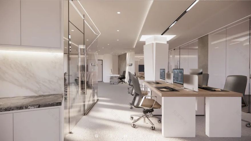
Second floor, minimalist office area.
节约成本难道就意味着要降低品质来妥协吗
Does cost saving mean compromising quality
二楼办公室设计遵循着低造价和节约成本的理念
The design of the office on the second floor follows the concept of low cost and cost saving.
The style is simple but not simple.
在设计上满足了办公室的所有功能需求,同时办公室的顶部采用裸顶的处理进一步降低造价。
The design meets all the functional requirements of the office. At the same time, the top of the office adopts the treatment of bare top to further reduce the cost.
这也同时展现了企业求真务实的品牌调性。
This also shows the enterprise’s pragmatic brand tone.
————
项目信息
平面布局丨Plane Layout:
项目名称丨Project name:三羊实业办公楼
项目地址| Project address:陕西·西安
建筑面积丨Square meters:1049㎡
项目类型丨Project type:商业建筑
设计团队丨Design team:宜空间设计
end
/ 关于宜空间 /
敖大 / 创始人
Jane Ao /
Founder
独创【复合商业空间思维】,以品牌加持启发差异化商业设计运营。提出【品牌】+【空间】+【IP】的设计新思路,一体化设计流程,让空间设计成为品牌形象的专属标签。
坚持以初心面对设计,立志以设计改变世界。
从业十几年间,有幸得到各行各业设计委托人的信任与认可,设计的商业空间作品多次荣获国际大奖。
/ 所获荣誉 /
意大利-A’设计大奖-银奖
中国-金堂奖-年度优秀零售空间设计
中国-中国设计星全国 12 强
日本-IDPA 国际先锋设计大奖-商业空间-金奖
法国-GPDPAWARD-Grand Award
意大利-A’设计大奖-金奖
韩国-K-DESIGN 大奖-金奖
亚洲-ASIA 设计大奖-Winner
荷兰-荷兰国际设计大奖-longlist
日本 JCD 国际商业设计大奖-longlist
/ 往期推荐 /
宜空间|不如我们上山一起吹吹风
宜空间 | 服装店设计的沉浸式体验
宜空间 | 云月相同,溪山各异
宜空间丨秦风茶楼,古城脚下,大秦风骨
生白丨 Raw White
【官宣】《无形之鳍》| 在“大音希声,大象希形”里感受味蕾刺激
《红与黑》丨一个重口味的健身房
coding life丨破壳计划
[官宣]度茶 一个有山有水的私人茶所
更多设计案例欢迎关注宜空间设计
原创设计 | 匠心铸造
- 设计咨询-
Add:陕西·西安·雁塔区·金地芙蓉世家
客服
消息
收藏
下载
最近


