

创作上传
VIP
收藏下载
登录 | 注册有礼
查看完整案例

收藏

下载

分享
翻译
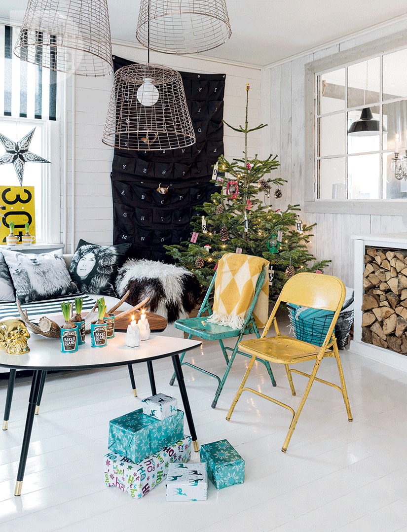
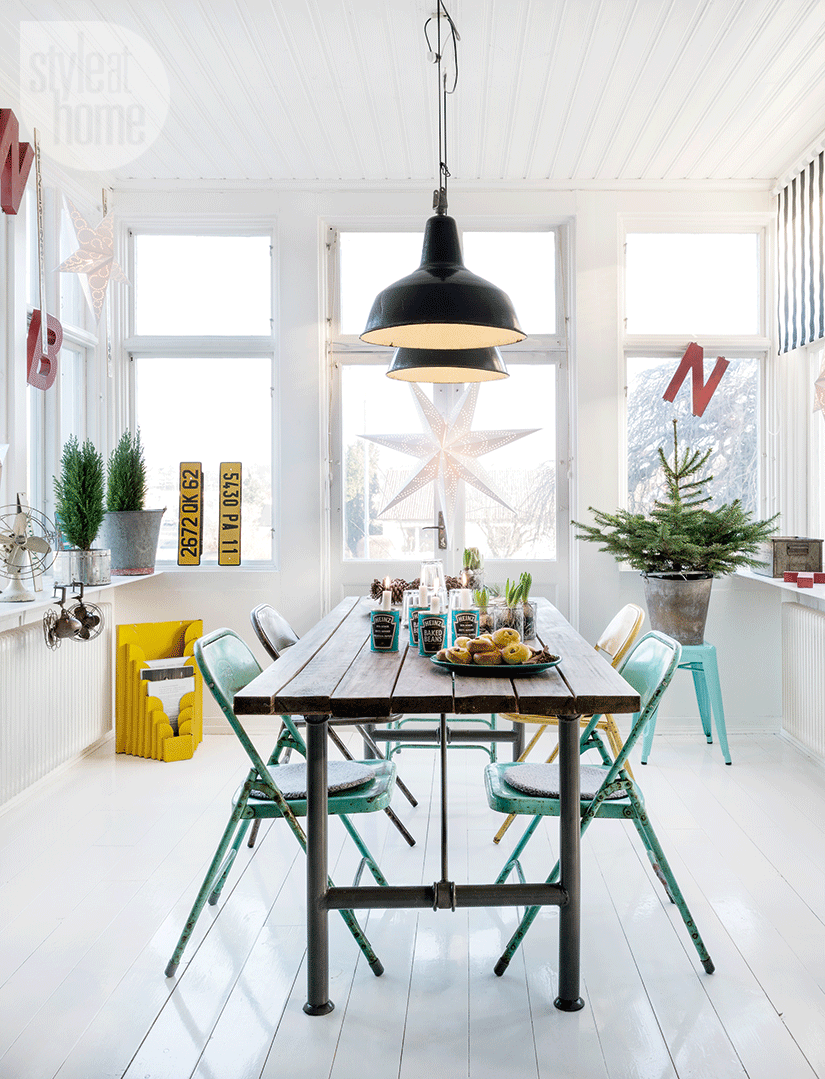
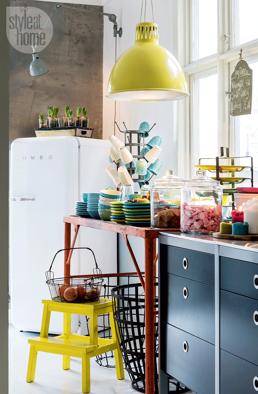
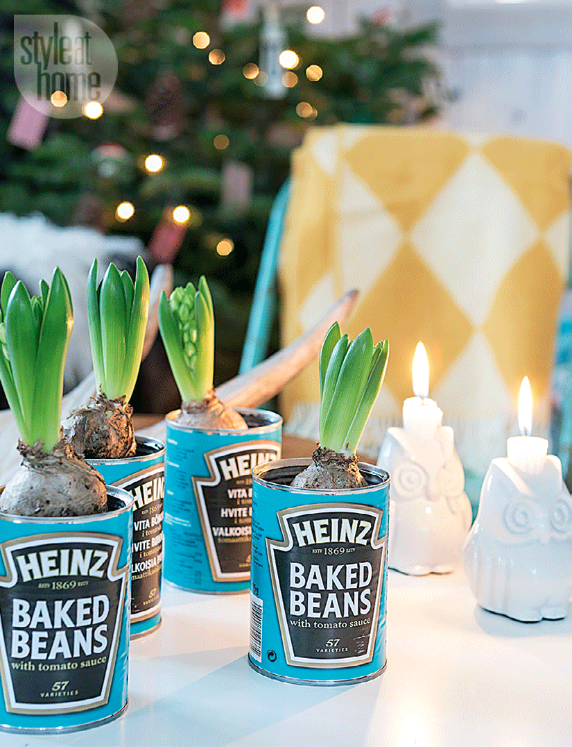
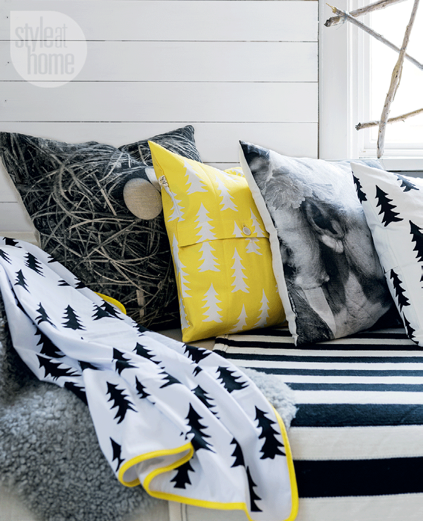
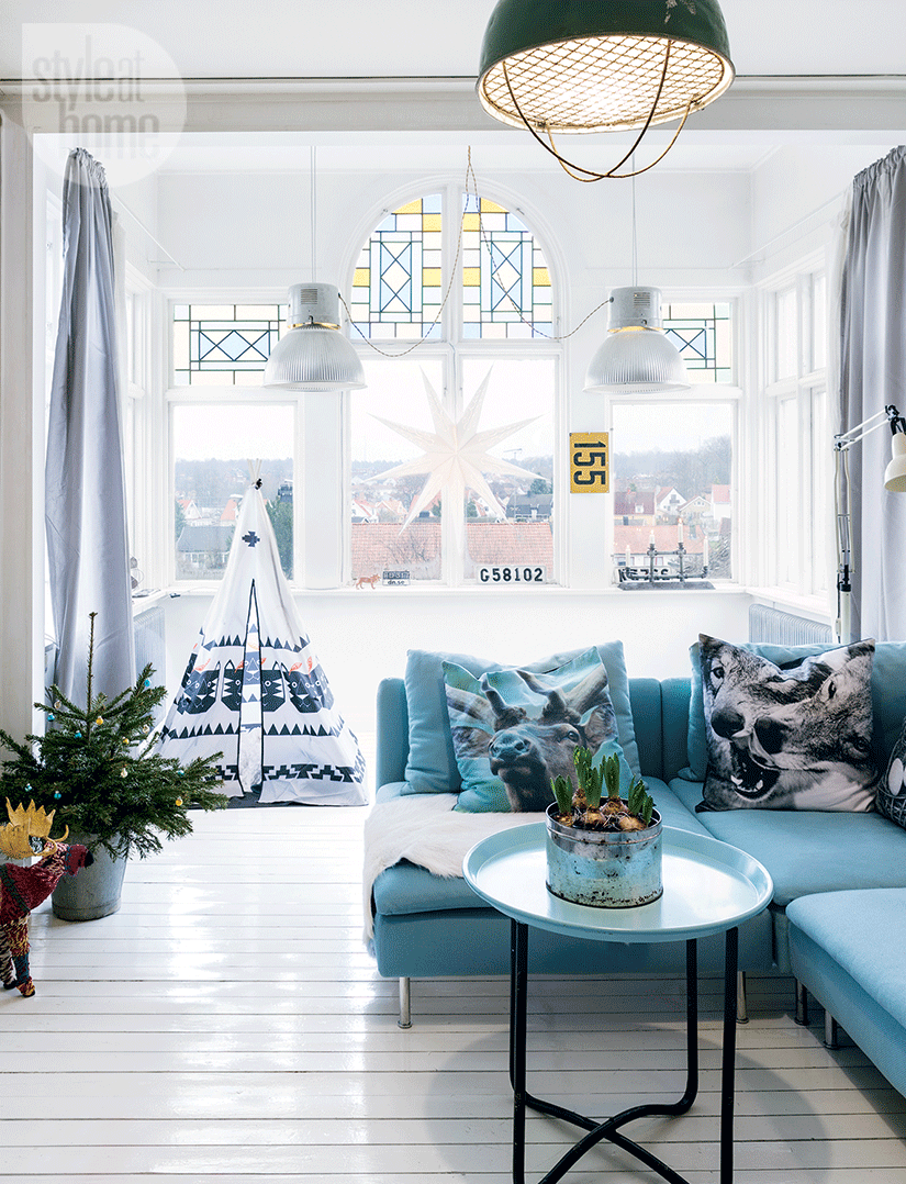
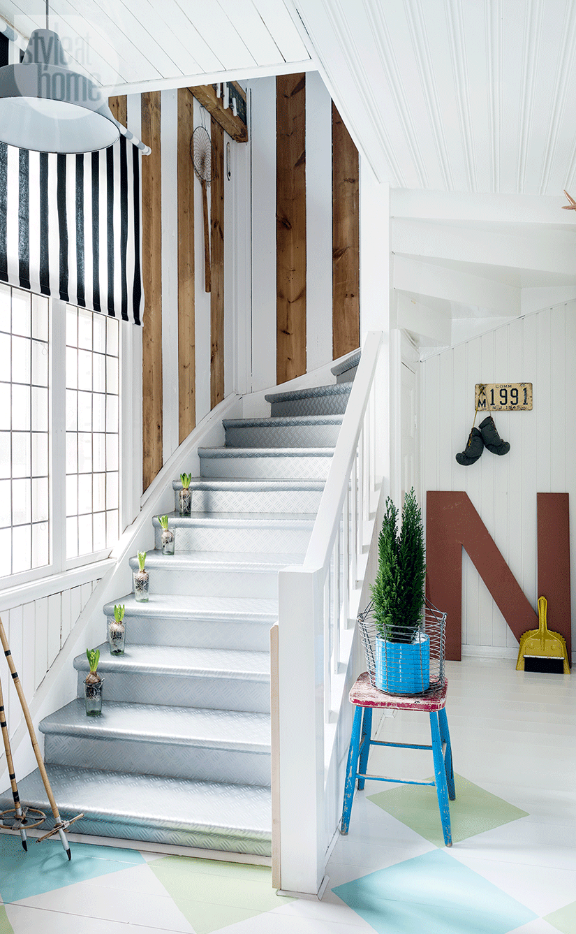
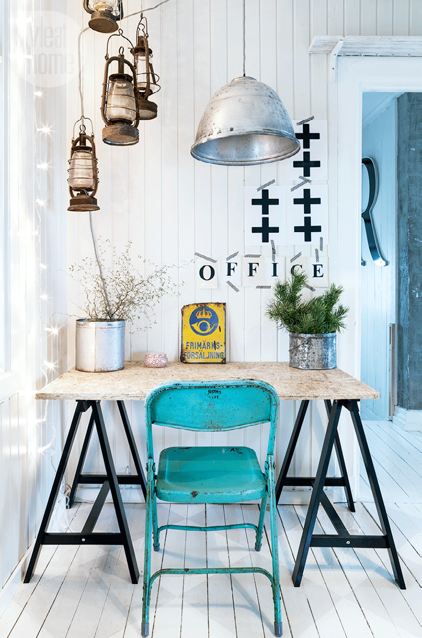
Le neutre est sage et efficace, mais parfois un peu ennuyeux. Intégrer la couleur à sa décoration est un art qu’il est difficile de maîtriser, et pourtant quelle satisfaction lorsque comme ici, c’est parfaitement réussi. La couleur doit s’apporter non pas forcément sur les murs, mais plutôt dans le mobilier léger et les accessoires qui sont faciles à changer si on se rend compte qu’on est dans le “too much”, ou qu’une couleur ne convient plus. Photo : Carina Olander | Styling: Carina Olander & Anna TruelsenHow to integrate colour into your decoration?Neutral is wise and efficient, but sometimes a little boring. Integrating colour into its decoration is an art that it4s difficult to master, and however, what a satisfaction when, as here, it’s perfectly successful. Colour should not necessarily be used on walls, but rather in light furniture and accessories that are easy to change if you realize that you are in the “too much”, or that a color is no longer suitable. Photo: Carina Olander | Styling: Carina Olander & Anna TruelsenSource :Style at Home
南京喵熊网络科技有限公司 苏ICP备18050492号-4知末 © 2018—2020 . All photos and trademark graphics are copyrighted by their owners.增值电信业务经营许可证(ICP)苏B2-20201444 苏公网安备 32011302321234号
苏公网安备 32011302321234号客服
消息
收藏
下载
最近