查看完整案例


收藏

下载
DAGAArchitects×SENSESPLUSCOFFEE
“Do not look at what I do, see what I saw.”
——
Luis Barragan
Syncretism
| 探知
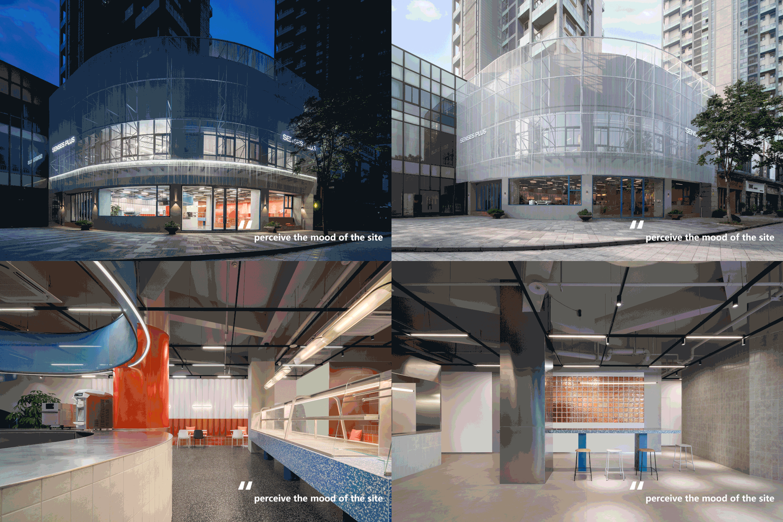
用强烈的色彩感知场所情绪
Use
ambitious
colors to perceive the mood of the site
在这个数据爆炸、信息过载的超数字化世界,我们借用数据的干扰和错乱感,用彩色编码来构建色彩。像素化的图形和相互交叠的图层,产生视觉引导和感知迷幻。充满生命力的高饱和度明亮色系激发对未知空间的探求欲。色彩通常在场域中起到填充空间的作用,而我们想探究的是:本案中,色彩是否可以作为一种视觉语言,充当动线导视。
In this hyper-digital world of data explosion and information overload. We borrow the sense of interference and confusion of the data and use color coding to construct colors. Pixelated graphics and overlapping layers produce visual guidance and perceptual psychedelia. Full of vitality and high saturation bright color system to stimulate the exploration of unknown space. Color usually plays a role in filling space in the field, and what we want to explore is: in this case, color can be used as a visual language, acting as a moving line guide.
▼建筑外观,
exterior view
©YCL
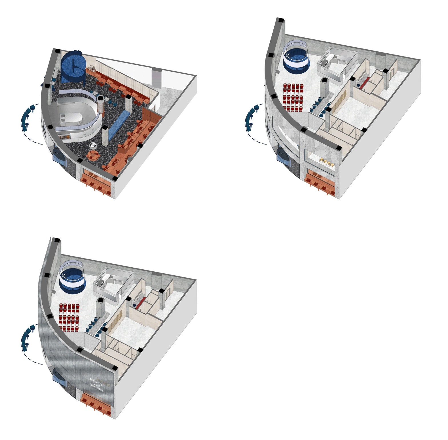
本案位于慈溪市新城大道北路,原生空间处于新城大道北路与北二环东路交叉处,形成独特的扇形结构空间。设计师用衍生结构(emergent grid)的概念作为切入点,借街角地理位置的优势,使两块实体空间在交叉中形成新的几何区域。借助这块扇形空间特有的几何结构和特性,在空间内部进行大规模环绕式设计。
The site is located in the North Road of Xincheng Road, Cixi City. The original space is at the intersection of the North Road of Xincheng Road and the East Road of North Second Ring Road, forming a unique fan-shaped space.
The designer uses the concept of Emergent Grid as the entry point, and takes advantage of the location of the corner to form a new geometric sector in the intersection of the two solid Spaces. With the help of the unique geometric structure and characteristics of this fan-shaped space, a large-scale surround design is carried out inside the space.
▼轴测结构分析图,
Diagram gif
©北京大观建筑
和谐的形式会对建筑中复杂的功能形成稳定性的影响,以一种共鸣性的特质在场域与行为个体之间传递。这类的行为诉求存在于建筑尺度与来访者之间。空间的记忆点在于外壳模糊化产生的虚焦感与内部空间映射的强烈色彩。在外层大面积使用弱肌理材料,通过形体穿插,虚化饰面,重点突出内部空间的存在感。氛围是烘托场景的关键,来访者的感官与场域交汇的过程,就完成了对环境的感知。
The harmonious form will have a functional impact on the complex functions in the building. It is transmitted between the field and the individual with a sympathetic character. Such behavioral demands exist in the architectural scale and the users themselves.
The memory point of the space lies in the virtual focus generated by the blurring of the shell and the strong color mapping of the interior space. A large area of texture material is used in the outer layer. Through the interspersion of forms, the surface is blurred, and the existence of the inner space is highlighted.
Here, atmosphere is the key to creating the scene. Atmosphere is the key to setting off the scene. The process of the interaction between the visitor’s senses and the field completes the perception of the environment.
▼轻质金属材料打造虚焦感的建筑表皮
The cladding of light metal materials is used to create a linear light and shadow facade.
©YCL
Architecture is a kind of social art form. 强调整体序列感,注重体块的秩序性。利用轻质金属材料的包被性打造线性光影外立面。不仅仅是静态的独立空间片段,而是连续的场域感知。对于在地性的研究在于考量到交叉路口的原生环境。造型感和立体感强烈的金属形成遮挡效果和视觉反差,同时也增强了抗风性。
Architecture is a kind of social art form. emphasizes the overall sense of sequence and focuses on the order of the block. The cladding of light metal materials is used to create a linear light and shadow facade. Not just static individual pieces of space, but continuous the sitesperception. The study of locality is to consider the native environment of intersections. The strong metal shape and three-dimensional sense form the occlusion effect and visual contrast, but also enhance the wind resistance.
▼外立面概念图,
Concept of exterior facade
©北京大观建筑
场域空间具有强烈的“表”、“里”情绪,无论是简单纯粹的光线,还是切换到丰富层次感营造出的空间阴影,亦或者是不同材质碰撞出的独特效果,繁复的层次感让单调的金属材质增加了不少细节,微妙的金属光泽加入其中更具有趣味性。
The site has strong "out", "in" the mood, both simple and pure light and switch to the rich administrative levels sense create the space shadow, or is the unique effect that the different material impact, the layering of the heavy and complicated metal material increase a lot of detail, subtle metallic luster to join is more interesting.
▼金属的层次感增添许多趣味性
Layers of metal add a lot of interest.
©YCL
Emotivism|沉浸
通过对空间的构筑和规划拥有一个更深层次的对话体验
Through the construction and planning of the space to have a deeper dialogue experience
我们用色彩引发的心理暗示和情绪效果界定场域内外。人为场所的特性绝大部分由感官反射带来的开放程度而定。边界的坚固性和外壳透明性使得空间变成孤立的或较广阔的整体中的一部分,而色彩带来的暗示则可以使来访者快速找到场域方向。在此,我们重新回到了内部和外部的关系,这种关系构成了建筑最主要的本质。
We define the inside and outside of a site by the psychological cues and emotional effects that color evokes. The character of an artificial place is overwhelmingly determined by the degree of openness brought about by sensory reflexes. The solidity of the boundaries and the transparency of the shell make the space into an isolated or part of a wider whole, while the cues brought by color allow the visitor to quickly find the direction of the site. Here we return to the relationship between interior and exterior, which constitutes the primary essence of the building.
▼灯光以线性结构穿插在室内,
Lighting is interspersed in a linear structure
©YCL
在体块交错的扇形空间中,形成一个既分隔又连通的场域,互相衔接、穿插,以引导人流,使来访者在行进中感受到丰富的空间变化。灯光以线性的形态穿梭在建筑表皮,在被建筑改变的同时,也用自身改变视觉焦点。
In the staggered fan-shaped space, a separate and connected site is formed, connecting and interspersing each other to guide the flow of people and make visitors feel the rich spatial changes during the movement. The light shuttles through the building skin in a linear form. While being changed by the building, it also changes the visual focus with itself.
▼一层结构分析,
1F analysis
©北京大观建筑
▼二层结构分析,
2F analysis
©北京大观建筑
▼冷调的蓝色与温暖的橘色形成强烈的对比,
The cool blue contrasts strongly with the warm orange.
©YCL
色彩是透过眼、脑和生活经验产生的对于光的视觉效应。橙色与蓝色基于冷暖对比,有一种“相映”或“相拒”的力量使之平衡,产生立体感和远近感。
本案中在旋转楼梯与吧台大面积使用蓝色,使环境中的目的物和细部造成轻微的流动感。而侧壁使用的橙,利用浅色对于自然光线的高反射率增加了墙面的视觉尺度。
Color is a visual effect of light produced through the eye, brain and life experience. Orange and blue are based on the contrast between warm and cold, and have the power of "reflection" or "rejection" to balance them, creating a sense of dimension and distance. In this case, the blue color is used on a large area of the revolving staircase and the bar to create a slight sense of flow in the objects and details of the environment. The orange used on the side walls increases the visual scale of the walls by using the high reflectivity of the light color to natural light.
▼塑料材质的客座采用色彩明快的亮橙色减轻空间沉闷感。
The plastic guest uses bright orange color to reduce the dullness of the space.
©YCL
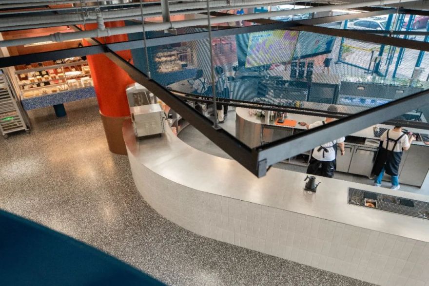
大尺寸 U 形操作台弥补了手冲吧台区域空间局促的遗憾,不需要走动太多,转身就能拿取。
The large U-shaped counter makes up for the cramped space in the bar area. You don’t need to move around too much, and you can just turn around and get it.
▼吧台上方环绕一圈照明灯带及蓝色网状装饰,
The bar is surrounded by a light belt and blue mesh decoration.
©YCL
▼大尺寸 U 形操作台弥补了手冲吧台区域空间局促的遗憾
The large U-shaped counter makes up for the cramped space in the bar area. © YCL
Form follows the function,This is a law正如沙利文所提出的那样,形式追随功能。沙发区融合了皮料、大理石和水泥三种材质。将座椅嵌入赭石色的外墙,金属光泽的立式吧台增加清爽感。
Form follows the function,This is a law", as Sullivan suggests, form follows function. The sofa area incorporates leather, marble and concrete. The seating is embedded in the ochre facade, and the metallic shine of the vertical bar adds a sense of refreshment.
▼沙发区由皮料、大理石和金属三种材料制作,
The sofa area is a combination of leather, marble and cement.
©YCL
▼金属光泽的立式吧台给空间增加清爽感,
The metallic standing bar adds a sense of freshness to the space.
©YCL
Eclecticism | 折衷 “非个体化” "non-independent" 关于二层,强调材质选取对于内部空间延展的重要性,它使建筑物“非个体化”,金属材质调和了明亮色彩带来的视觉过曝,释放沉静稳定的情绪,形成具有鲜明特性的场域。
It emphasizes the importance of material selection for the extension of the interior space, which makes the building "non-independent" and creates a relatively open and non-boring visiting experience. Metal material reconciles the visual overexposure brought by bright colors, releasing calm and stable emotions, and forming a sitewith distinct characteristics.
▼Metal material reconciles the visual overexposure brought by bright colors, releasing a calm and stable mood.
©YCL
▼二层洽谈区大面积使用金属材料,增加沉稳感
Large area of metal material is used in the second floor negotiation area to increase the sense of calmness.
©YCL
通向二层的旋转楼梯是本案的又一亮点,它以金属与大理石嵌合构成,其作用并不仅仅是提供垂直方向上的连接——在视觉上保持了楼层之间的连贯性,让色彩形成的张力带给室内空间更多的层次。可以俯瞰到中庭热闹的景象,也为社交互动创造了更多可能。
The rotating staircase leading to the second floor is another lightspot of this site, it is formed with metal and marble chimeric, its action is not just to provide the connection on the vertical direction -- the coherence between floors was maintained visually, the tension that lets colour form brings interior space more levels. The view overlooking the bustling atrium also creates more possibilities for social interaction.
▼以金属与大理石嵌合构成的旋转楼梯,
A revolving staircase made of metal and marble inlay © YCL
▼楼梯细节, details
© YCL
自然因其独有的折射光和连续性,影响着人们对于视觉色彩的习惯和审美经验。明暗、光影、色相等色彩的变化都有一定的规律。设计师将深度洽谈的空间作为共享空间使用,二层巨型落地窗引入自然光线并增加景观,给洽谈区的尽头制造丰富的空间变化。
Nature affects people’s habit and aesthetic experience of visual color because of its unique refraction light and continuity. The changes of light and shade, light and shadow, hue and other colors have certain rules. The designer uses the deep negotiation space as a shared space. The giant floor-to-ceiling Windows on the second floor introduce natural light and increase the landscape, creating rich spatial changes at the end of the negotiation area.
▼楼梯细节,
Staircase detailed view
©YCL
设计师通过色彩的调和,拉近场域与来访者之间的互动。我们希望通过对空间的构筑和规划,与客人拥有一个更深层次的对话体验。
The designer uses the color palette to bring the interaction between the site and the visitor closer. We hope to have a deeper dialogue experience with the guests through the construction and planning of the space.
项目名称:慈溪森加咖啡
设计公司:DAGA Architects 大观建筑设计
公司网站:
设计团队:申江海、Sara Peñas、王立枫、李静
项目类型:室内设计与改造
建筑面积:550m²
设计时间:2021 年 10 月-2021 年 11 月
建造时间:2021 年 11 月-2022 年 5 月
项目摄影:YCL
©YCL
媒体编辑:滕天怡
Project Information
Project name : SENSES PLUS COFFEE
Design company : DAGA Architects
Design Team : Shen Jianghai, Sara Peñas,Wang Lifeng, Li Jing
Project type : Interior Design,Renovation
Project area : 550m²
Design time : Oct 2021 - Dec 2021
Construction time : Dec 2021 - May 2022
Photographer : YCL
©YCL
media :Tengtianyi
客服
消息
收藏
下载
最近


