查看完整案例


收藏

下载
书店 Bookstore 卷宗书店位于秦皇岛阿那亚艺术中心,原本是一个咖啡厅,一高一低两个空间连在一起,总共约 100 平米。高空间有 6m,客人从二层进入,下楼梯走到吧台前,低空间只有 2.5m 高,向着一个室外下沉剧场打开。由于施工周期只有一个月,我们保留了所有墙面和地面,不做隐蔽工程,只是通过更换吊顶和家具来改变空间的氛围。
Juanzong Books is located at the Anaya Art Center in Qinhuangdao. It was originally a coffee shop with two spaces connected together, one high and one low, about 100 square meters in total. The clear height of the high space is 6m. Guests enter from the second floor of the Art Center and walk down the stairs to the concierge. The low space is only 2.5m high and opens towards an outdoor sunken theater. Due to the construction period being only one month, we have retained all walls and floors without any hidden construction work, and only changed the atmosphere of the space by replacing the suspended ceiling and furniture.
▼书店入口,Entrance of Juanzong Books
既然是一个建筑书店,就要有建筑书店的氛围,不能太时尚,也不要太精致。空间中的物品要简单、直接,是一种“工作空间”的感觉,灯光也一改通常温馨的氛围,用了适合工作的色温。我们设计了所有的吊灯和书架,是它们塑造了这个书店的个性,而桌凳我们则选择了历史上绘图桌凳的经典样式,一种匿名的形式。我们设想这是一个放满画册、图纸和模型的空间,并且能经得起一定的凌乱。
Since it is an architectural bookstore, it should have a corresponding atmosphere, not too fashionable or too exquisite. The items in the space should be simple and direct, creating a sense of ‘workspace’. The lighting should also use a suitable color temperature for work, instead of usual warm feeling. We designed all the pendant lamps and bookshelves that shaped the bookstore’s personality, and chose a classic form — also an anonymous form — with a long history for drawing tables and stools. We envisioned the space filled with picture albums, drawings, and models that could withstand some messiness.
▼家具和灯具塑造了简单直接的“工作空间”氛围,Furniture and lamps create a simple and straightforward ‘workspace’ atmosphere
▼书店矮空间中心绘图桌上方有最柔和的光源,是这个小小舞台的中心,The softest light above the drawing table in the centre of the low space is the centrepiece of this small stage
▼每个书架都探出自己的小灯,只把自己照亮
Each bookshelf peaks out its own light, illuminating only itself
不同的空间形状对应不同的功能。高空间有一定的自然光,我们继续保留其咖啡厅的功能。它有大面积的白墙适合图像的陈列,再加上可以替换的吊挂模型和海报,咖啡厅的上空就变成了一个可以不断更新的展厅。低矮的空间比较方正,我们减少了对外的开洞,让它被书架包围。空间的基调是很暗的,在黑色背景下,每个书架都探出自己的小灯,只把自己照亮。而中心绘图桌的上方,有最柔和的光源,是这个小小舞台的中心。书是这个空间的主角。
Different spaces correspond to different usages. The high space has a certain amount of natural light, and we keep its cafe function in use. The upper part of the cafe, with large white walls suitable for exhibiting images and hanging models and posters, becomes a space with frequently-changing looks. We reduced the number of openings in the lower space, and surrounded it with bookshelves, thus achieving a more solid volume. In a dim light against the black background, each bookshelf projects its lampshade and illuminates itself alone. The central drawing table, with the softest light from above, becomes the center of this small stage, on which books are the protagonists.
▼从二层下楼梯后进入书店
Enter the bookstore by going down the stairs from The first Floor
▼上空可用作展示功能的书店高空间,The bookstore high space can be used for display function
▼阿那亚卷宗书店,Juanzong Books at Aranya
▼从书店的高空间望向矮空间,
View from the high space of the bookstore to the low space
展厅 Book Fair Rooms 阿那亚艺术中心的展厅空间形式多样,但是彼此分离,只通过中间的螺旋坡道串连在一起。为了维持住书展的整体感,我们首先沿着中心坡道放置了很多书展的海报,让整个展览的气息不至于中断。
The rooms at the Aranya Art Center are diverse but separated from each other and only linked together by a spiral ramp in the middle. In order to maintain the overall sense of the book fair, we first placed many posters along the ramp to ensure that the atmosphere of the entire fair was not interrupted.
▼3 号展厅,Exhibition hall 3
▼3 号展厅的吊灯与展桌,Pendant lamp and exhibition table in exhibition hall 3
▼3 号展厅细部,Details of Exhibition hall 3
展厅的形状差异很大,加上布展周期紧迫,不可能对展厅本身有大的调整。我们唯一的动作就是给所有窗口加上了一层纱帘,不论窗洞的形式是怎样的,纱帘都要覆盖洞口所在的整个墙面,有的两三米高,有的则有七八米。纱帘挡住了纷乱的室外景象,也让自然光变得柔和,通高的帘幕让室内变得更加简单,成为书展的单纯背景。
The shape of the rooms varied greatly, and due to the book fair’s tight schedule, it was impossible to make significant adjustments to the rooms themselves. The only action we took was to add a layer of gauze curtains to all the windows. Regardless of the form of the window openings, the curtains had to cover the entire wall where the openings were located, some two or three meters high, some seven or eight meters. The gauze curtains blocked the chaotic outdoor scenery and softened the natural light. The high curtain makes the interior simpler, serving as a mere background for the book fair.
▼4 号展厅,Exhibition hall 4
▼4 号展厅细部,Details of Exhibition hall 4
家具
Furniture
我们为此次书展设计了灯具和展桌,作为一个建筑书展,我们希望展具也有着相应的性格——构造简单,制作方便,并且要有建筑式的稳定和安宁。
We designed the lamps and exhibition tables especially for the architectural book exhibition, hoping they acquire corresponding characteristics – simply structured, conveniently produced, and with architectural stability and tranquility.
▼6 号展厅,Exhibition hall 6
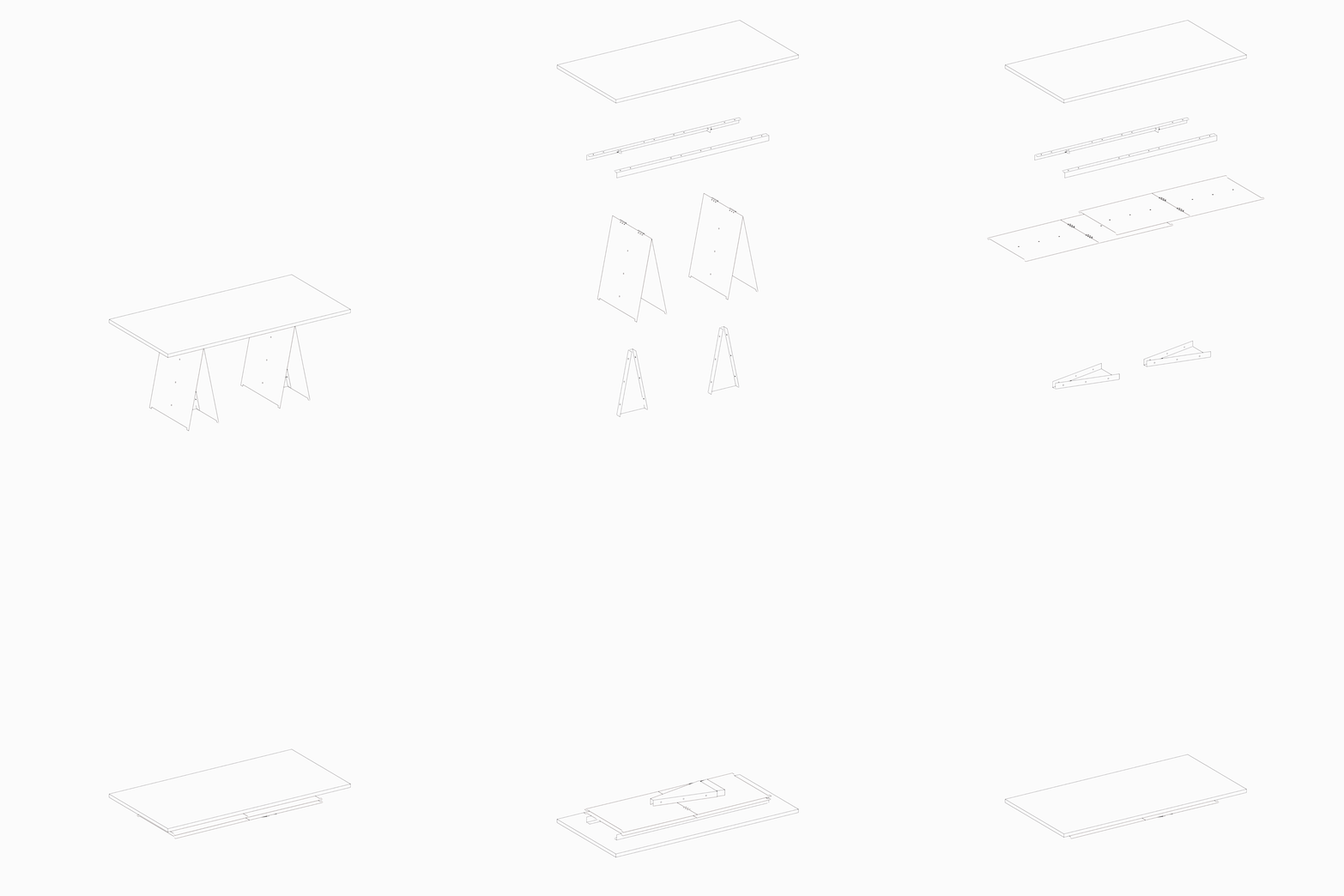
通常的桌子,排在一起时,由于桌腿大小间距变化,会有一种纷乱感。只有桌腿在桌面的四分位时,长长的一排桌子才会形成一个统一的整体。但四分位并不是一个常见的支撑位置,我们重新思考桌子的逻辑,让桌腿本身成为一个自立的结构,桌面只是一块放在上面的平板。展桌都比较大,我们的构造也考虑了方便拆卸,平板运输等等问题。展桌最后的形式,是对这些需求的回应。
▼展桌的平板运输与组装示意,Flatbed transport and assembly of table
▼展桌组装过程,Table Assembly
A long row of tables would form a unified entity only if their legs are at the quartile position of the whole length. However, this is not a normal position for legs to support the table, so we reconsidered the design logic and made the legs themselves self-supporting structures. As a result, the desktops become flat plates sitting on top. Due to the oversize of the tables, we also considered their disassembling and flat packaging for easier transportation. The final form of the exhibition table responds to all these needs.
▼2 号展厅,Exhibition hall 2
▼2 号展厅的长桌,Long table in exhibition hall 2
吊灯是由一张镀锌钢板折出来的,如果你把它平面展开,就正好是个半圆形。至于为何每个折痕下方都剪掉了一个小小的豁口呢?我们可以解释说,这样的小豁口让灯看着更加轻巧了。但实际上,是折纸这个动作,让我们想起了小时候的手工作业,在需要抹胶水的地方,总有这样那样的小切角。
▼吊灯的平板运输与组装示意,Flatbed transport and assembly of metal origami lamp
▼吊灯组装过程,Metal Origami Lamp assembly
The pendant lamp is folded out of a galvanized steel plate. If you unfold it, it is exactly a semicircle. As for why a small notch is cut off below each crease, we can explain that such a small opening would make the lamp look more lightweight. But in fact, it is the action of origami that brings back our childhood memory for handicraft. We always find such small corners where fold and glue are applied.
▼3 号展厅的吊灯与展桌
Pendant lamp and exhibition table in exhibition hall 3
▼书店和书展平面图,Floorplan of bookstore and book fair
▼书店和书展剖面图,Section of bookstore and book fair
项目名称:阿那亚卷宗书店与友谊书展
项目地点:河北秦皇岛阿那亚社区
设计者:亘建筑事务所
主持建筑师:范蓓蕾、薛喆、孔锐
项目负责人:杨新越
设计团队:薛君、赵芮澜
结构顾问:张准
机电顾问与合作设计:梁明、潘珅
道具制作:上海迈昌建设工程有限公司
业主:栩栩华生、阿那亚
施工总包:北京中恒春景建筑装饰工程有限公司、特禹展览服务有限公司
类型:室内设计
功能:文化、商业
建设面积:648 平方米
设计时间:2020.06-2020.08
建设时间:2020.07-2020.09
项目状态:建成
摄影:陈颢
客服
消息
收藏
下载
最近


