查看完整案例

收藏

下载
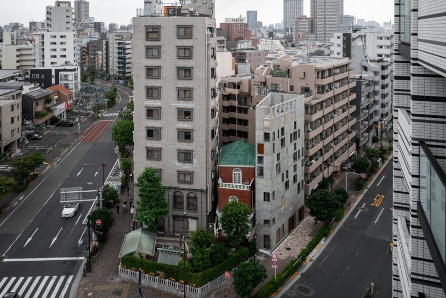
严岛神社坐落于通往东京核弁天的斜坡顶部,人们从其朴实无华的外观很难看出它的历史。在1086年,源氏家族跨越关东平原前往陆奥,选择将这里作为军队的临时驻地。这里是该地区地势最高的地方,很容易察觉到任何靠近的危险,并且从这里能够看到富士山的美景。一年后,源氏家族凯旋归来,为这座神社打造了地基,这个地基至今仍然存在。本项目选址于神社旁边的一个48平方米的梯形地块上。
At the top of the slope leading towards Tokyo’s Nukebenten, the unpretentious appearance of Itsukushima shrine suggests little of its history. In 1086, traversing the Kanto plains on the way to Mutsu, Minamoto no Yoshiie chose this location as temporary camp for his army. The highest in the area, it was easy to spot any approaching danger — and had great views of Mt. Fuji. A year later, returning victoriously, Yoshiie laid the foundation for the shrine which still exists today. The actual site for this project is a 48 m² small trapezoid next to the shrine.
▼项目概览,Overall view © Vincent Hecht
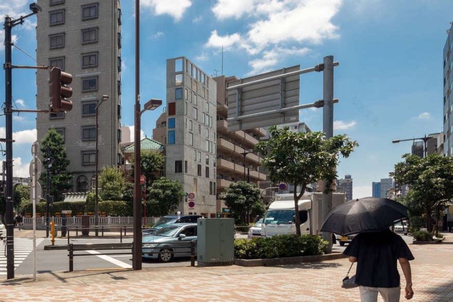
▼周边环境,Surrounding context © Vincent Hecht, Florian Busch Architects
延伸 EXTRUSION
当建筑的最大占地面积为用地48平方米的80%,并且希望能够打造一家餐厅和几间公寓时,设计策略反而变得很简单:将最大占地面积尽可能远地延伸,并在垂直方向上探索方案的可能性。
▼选址历史与现今对比图纸,site selection history and present comparative drawings © Florian Busch Architects
When your maximum footprint is 80% of 48 m² and an ambitious brief calls for a restaurant and several apartments above, the strategy tends to be straightforward: extrude this maximum footprint as far up as possible. Any freedom to explore what is possible must be found in vertical generosity.
▼用地鸟瞰,Bird’s eye view © Vincent Hecht
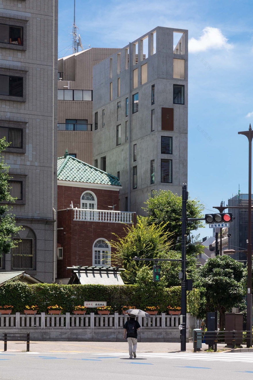
▼从附近街巷看向建筑,Looking at the building from the nearby streets and alleys © Vincent Hecht
向上攀登 CLIMB
业主好像事先预料到设计者的策略,Nobori——在确定用地之前就给这个项目取好了名字,这个词意味着向上、攀登。设计者随后面临的着非常现实的问题——如何实现这一策略。传统的设计手法是将紧凑的核心区域设计为交通核,但是设计者提出了一个与传统方案相反的设计:疏散核心区,将楼梯置于外围。当人们从街道进入这栋建筑就好像走入了东京无数的后巷之一,这些后巷实际上是介于城市尺度之间的大厅。
▼交通流线分析图,Traffic flow analysis diagram © Florian Busch Architects
▼剖面功能分析图,section function analysis diagram © Florian Busch Architects
As if the client had anticipated the challenges, Nobori, the name given to the project long before there even was a site, means to rise, to climb. The question is —pleasantly pragmatic— how? Where convention would suggest a compact core for circulation, we propose a counter-intuitive move: Dissolve the core to let the stairs climb up and down around the periphery. Entering the building from the street is like turning into one of Tokyo’s myriad back alleys, which are de facto residential lobbies mediating between the scales of the city.
▼入口处,Entrance © Vincent Hecht
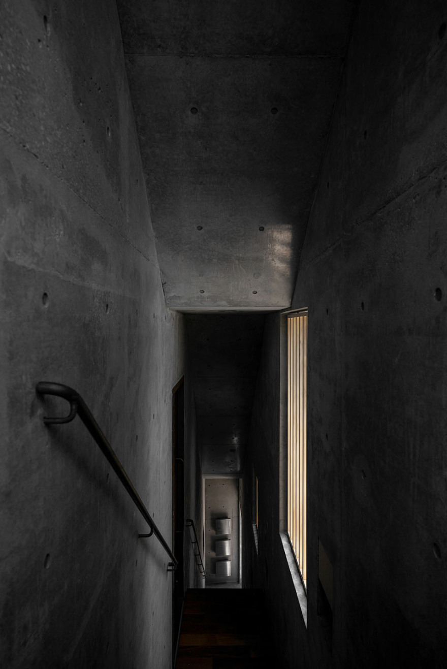
▼围绕外侧布置的楼梯,Stairs arranged around the outside © Florian Busch Architects
▼较低楼层的餐厅,Restaurant © Vincent Hecht
探索与发现 DISCOVERIES
建筑从外观上看起来是一个很简单的体量,但其内部却很复杂。由于楼梯的路径贯穿不同的楼层,所以地板的铺设不尽相同。设计者在垂直方向上的设计形成了一系列意想不到的效果:楼梯间处有足够的楼层高度——因此增强了楼梯间的功能性。建筑内部的复杂性堪比茶室,其中设计者经过对细节的深思熟虑将有限的小空间扩展为可探索的广阔空间。
What looks a simple volume from the outside is complex inside. As the stair-path pierces the levels at different points, no floor is alike. The vertical generosity pays off: There is enough height for interstices (between stair-volume and slabs) to afford unexpected usages — and thus augment the usual. The complexity is akin to that of the tearoom, where deliberate details open up the confines of a spatial minimum to a cosmos of discoveries.
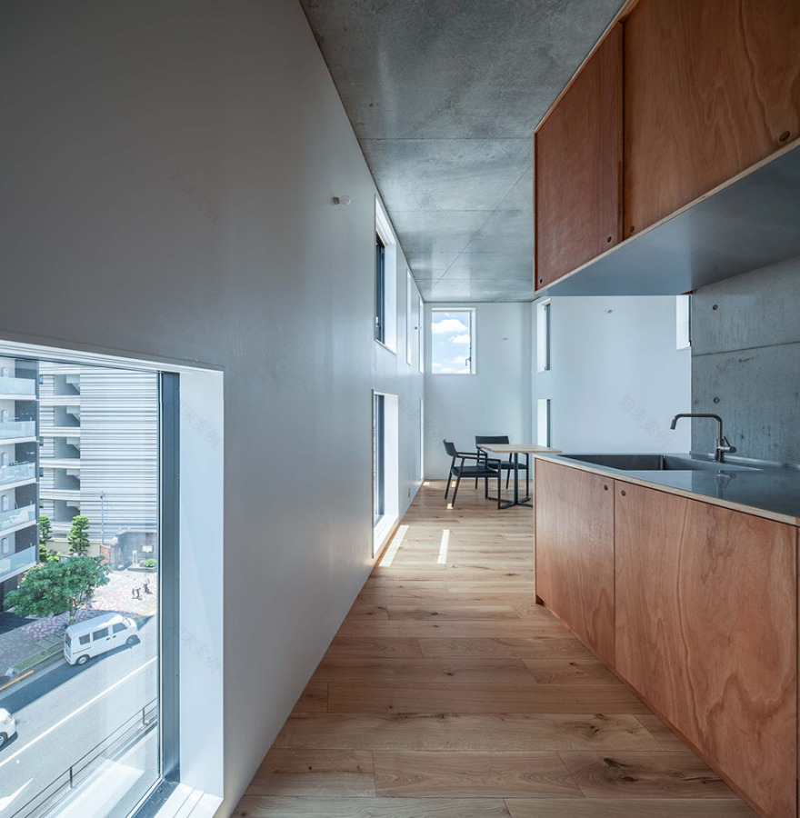
▼公寓层,Apartment © Vincent Hecht
▼屋顶花园,Roof garden © Vincent Hecht, Florian Busch Architects
表皮 SKIN
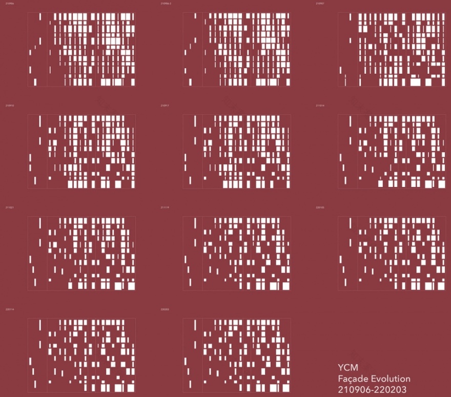
空间中的模糊性和多功能性在立面上显示出来。建筑的规模使外表皮能够承受结构带来的荷载。从最大的开口处开始,孔隙率随着时间的推移而变化,能够灵活地应对设计过程中的各种要求。立面最终呈现为一个多种限制因素(结构、外观、光线、通风、预算等等)相互制约的最佳协商方案。
▼不同空隙率的立面分析,different porosity of the elevation © Florian Busch Architects
This spatial ambiguity and polyvalence is revealed on the façade. The scale of the building makes it feasible, even advantageous to let the external skin carry the structural loads. Starting with the maximum potential openings, the degree of porosity evolves over time, responding flexibly to requirements and desires during the design process. The façade is the playing field where multiple constraints (structure, views, light, ventilation, budget…) compete with each other, negotiating an optimum compromise.
▼从建筑内部看向开窗,Looking at the holes and fenestrations from interior space © Vincent Hecht
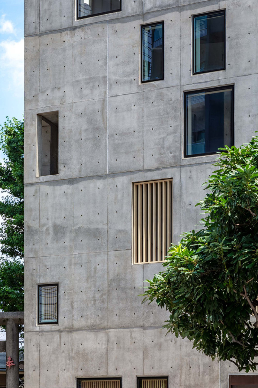
▼立面不同大小的孔洞和开窗,Holes and fenestrations of different sizes in the façade © Vincent Hecht, Florian Busch Architects
▼立面细部,Facade details © Vincent Hecht
视野 VIEWS
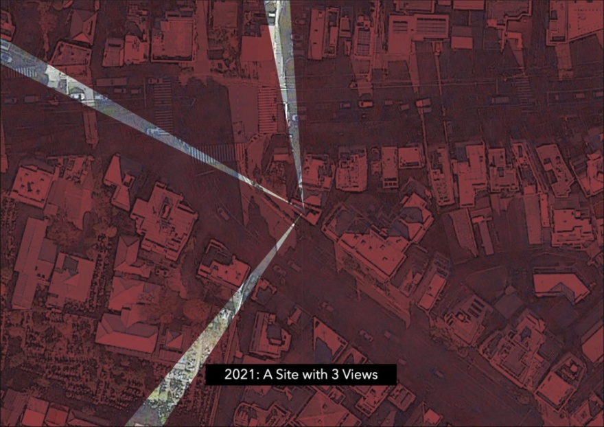
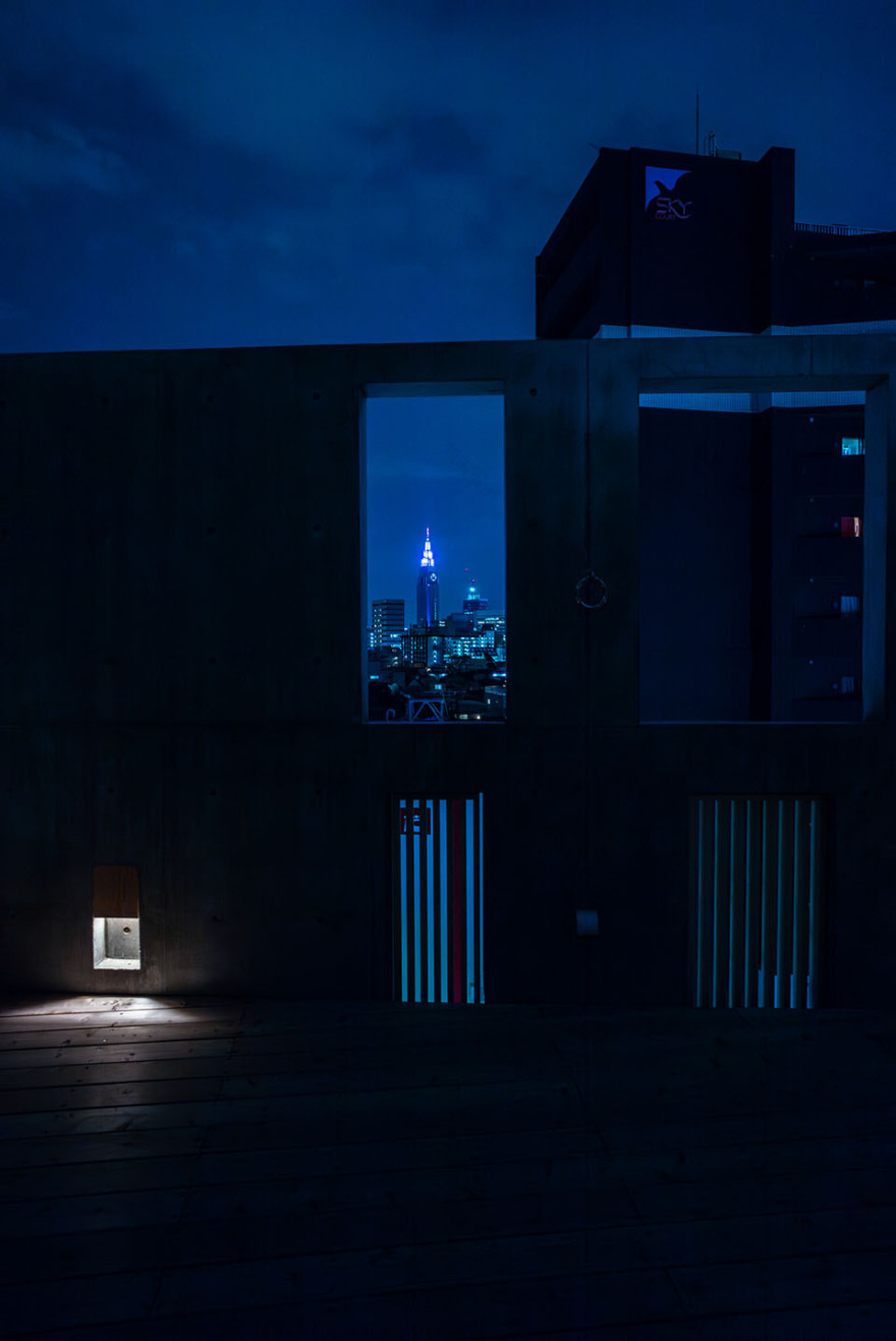
1086年时的自然景观现如今已经成为东京的市中心。长期以来,富士山的景观一直不断地被逐渐扩张的城市所遮挡。但是一条穿过人群的笔直道路作为景观走廊呈现了东京的广阔。源氏家族在历经九个世纪后,这里已不再是原来的样子了。但当人们从建筑中俯瞰城市景色时,仍然能够感受到这里地形在战略上的优势。
What was then, in 1086, in the middle of nature is now in the middle of Tokyo. Views of Mt. Fuji have been long been blocked by ever-growing urban masses. But where roads cut straight through these masses, view corridors reveal Tokyo’s vastness. Nine centuries after Yoshiie’s eyes scanned the surroundings, nothing here is the same anymore. Yet as we climb the building and collect frames of the city, the strategic advantage of the topography can still be felt today.
▼夜览,Night view © Vincent Hecht
▼区位,site plan © Florian Busch Architects
▼楼层平面图,floor plans © Florian Busch Architects
▼立面图,elevation © Florian Busch Architects
▼剖面图,section © Florian Busch Architects
客服
消息
收藏
下载
最近


