查看完整案例


收藏

下载

翻译
Both nostalgic and futuristic, KODA, a blazingly bold hair salon perched on the upper mezzanine level of Sydney’s heritage-listed Queen Victoria Building, is a majestic work of sculpted fiction. Designed by Arent&Pyke, the interior embraces primary colours and nuanced tones layered with mid-century Italian design pieces.
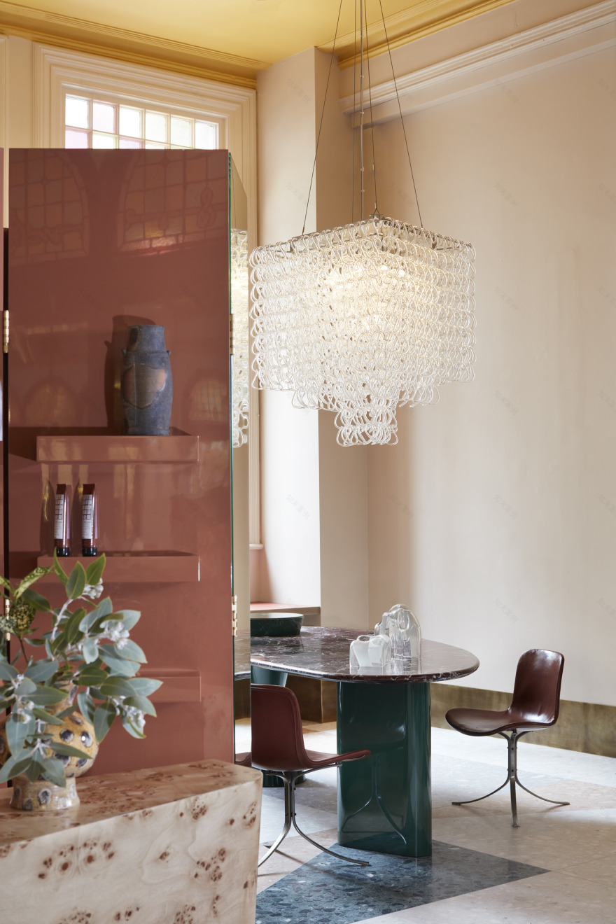
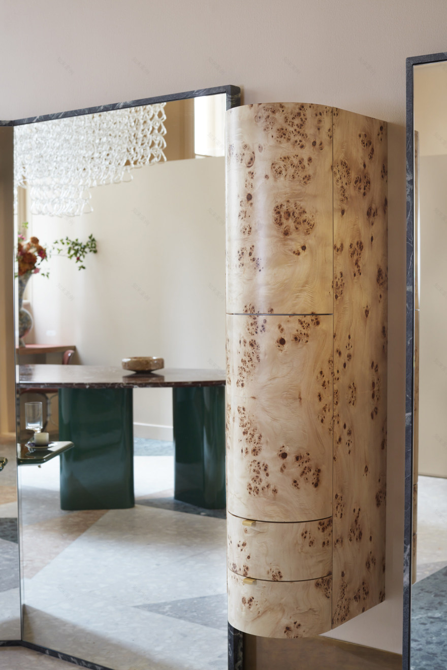
The Sydney design studio paired natural timbers with striking counterparts including terrazzo and high gloss polyurethane. “We wanted the salon to have a modern sensibility whilst honouring the formality of the QVBs historical architecture. Cut stone flooring brings a sense of nostalgia and burl timber and vintage furniture and lighting reference the heritage of the QVB,” explains Arent & Pryke’s co-principal, Juliette Arent.
As one of Sydney’s leading salons with a founding establishment in beachside Bondi, owner and Creative Director, Di Gorgievski, was keen to expand her offering in an iconic central CBD location. The space combines a myriad of shades and glossy tints, plus layered volume in contrast to the Bondi salon’s minimalistic setting featuring oversized Philippe Starck Caadre mirrors leaning upon white walls. “We avoided overloading the senses by creating a push-pull tension of honed and polished, reflective and matte, plus soft and strong elements,” Juliette continues.
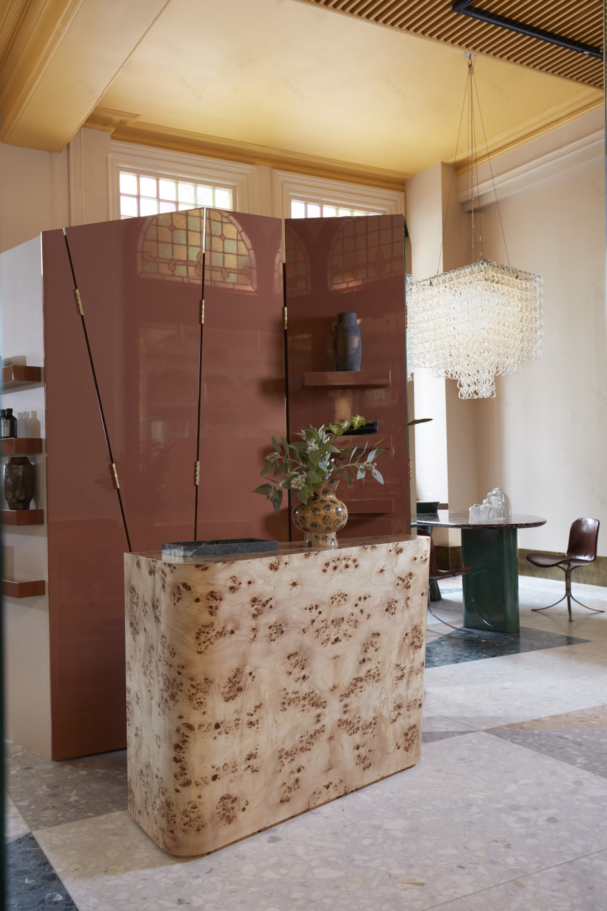
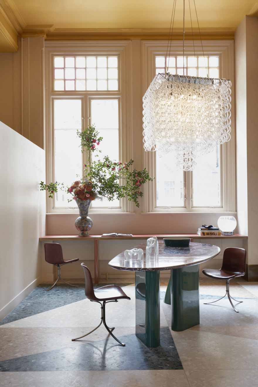
Responding to the building’s heritage constraints, the studio took a light-touch approach to the original fabric, but one thing they didn’t skip was the floor. Defined by richly hued oversized triangular tessellations—inspired by Gio Ponti’s Villa Planchart—the studio custom-cut terrazzo slabs in golden honey and fresh forest greens, tempered with light and dark greys. Given the salon’s relatively compact footprint, the oversized terrazzo pieces expand the space, aided by reflections from floor-set mirrors.
Designed to be appreciated from a seated height, the studio considered the space from all angles. “Drama occurs overhead with the ceiling painted in an unexpected Aztec gold, noting the often-forgotten experience of looking up in a salon,” Juliette elaborates. “At eye level, the palette is deliberately quiet to create a sense of calm allowing the focus to be on clients.”
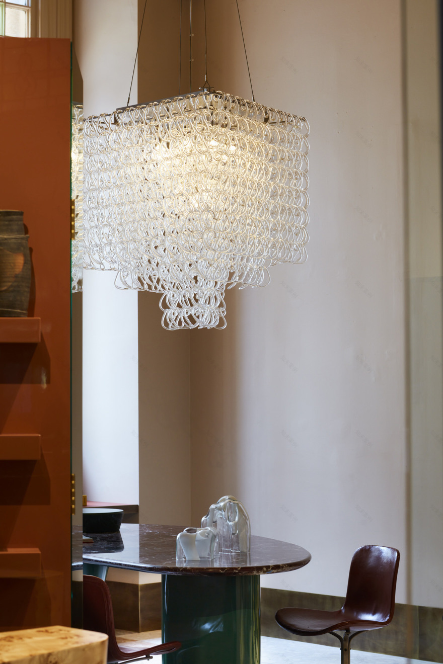
“Custom joinery elements in gloss lacquer add a modern reference point,” Juliette continues. “An elegant 1970 Angelo Mangiarotti chandelier is grounded by a custom colour table with Rosso Lavanto stone top and gloss green hourglass leg.”
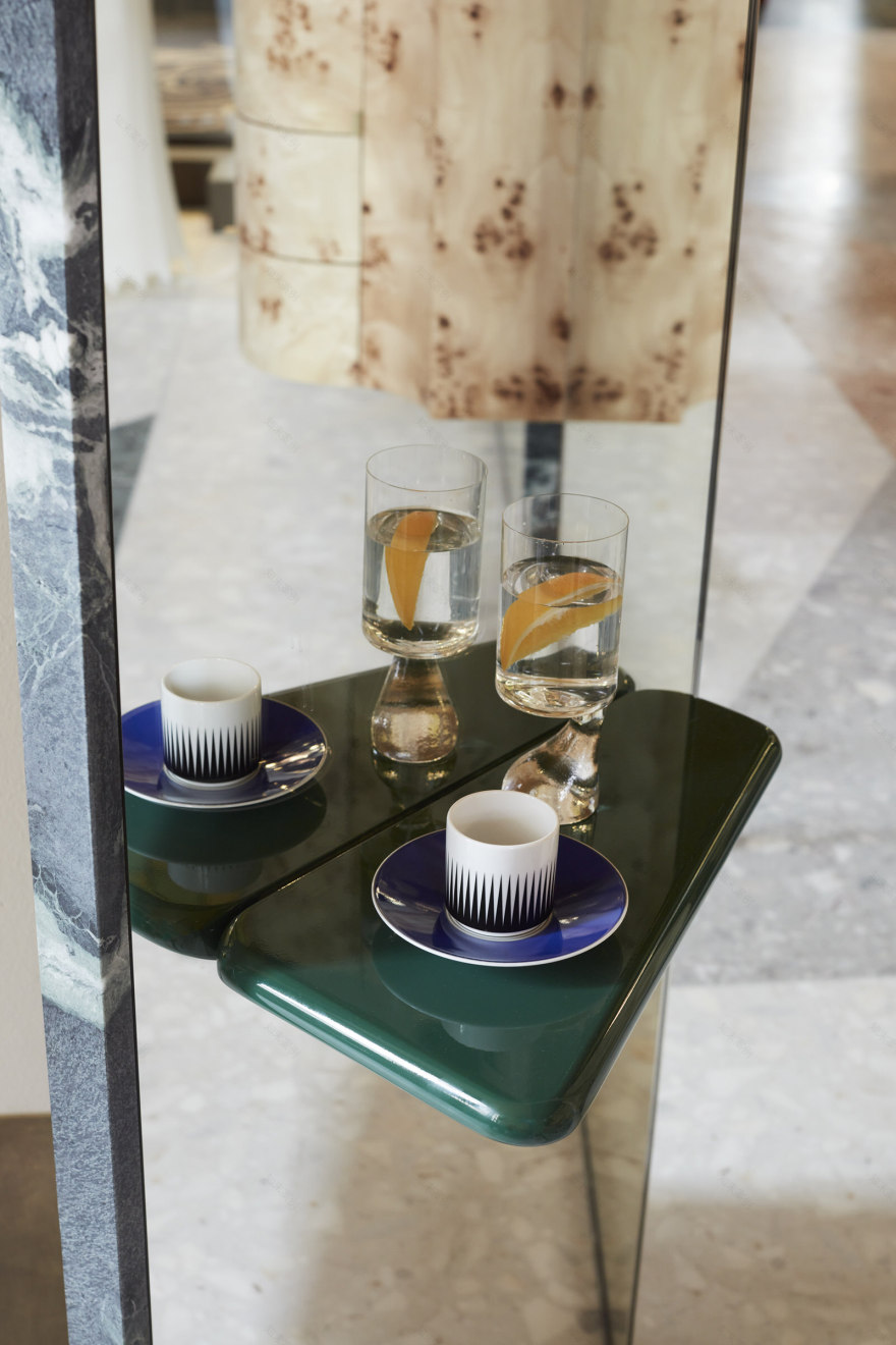
Vintage and bespoke furniture were carefully chosen for more than just their good looks. Trolleys cluttered with tools were banished, and swapped for custom burl cupboards matched with a triangular point-of-sale featuring rounded edges with an inset green quartzite trim for retail display.
Custom stands paired with stations comprise Tuscan yellow Marblo with aged brass armatures from which tongs and hair dryers artfully hang. Shielding the wash bay, a translucent pink curtain hangs from a rod, demarcating privacy.
“The resulting space is an alchemy of styles, past and present, both inspired and welcoming that generates a sense of comfort and vibrancy,” Juliette concludes.
[Images courtesy of Arent&Pyke. Photography by Prue Ruscoe.]
▼项目更多图片
客服
消息
收藏
下载
最近


