查看完整案例


收藏

下载

翻译
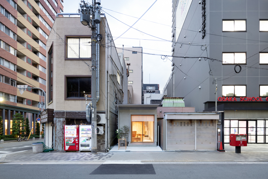
A hair and eyelash salon - The clients had a long, narrow, wood frame 1-story building, similar to an old-style Japanese nagaya row house. To capitalize on the inherent characteristics, we created a passageway with a long line of sight. As customer move further into the space, tiers help define each area. A noren curtain at the entrance disrupts the line of sight – people outside cannot see through to the back of the space. Clients duck under the curtain and enter, feeling psychologically drawn down the passageway, further into the space, to the other side of the koshi lattice panels. By blocking the line of sight, the façade entices people outside to imagine what the space holds.
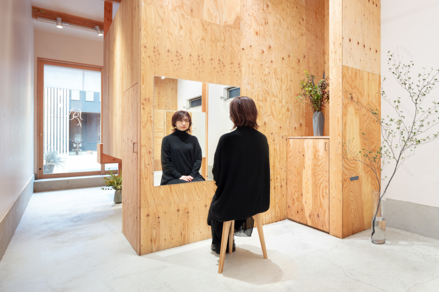
A married couple runs LAND. A hair salon and eyelash salon are synergistic, but due to the different nature of the services, we created two separate lines of movement from the entrance. Clients enter the eyelash room (box) directly from reception. Its raised floor is 900mm higher than the salon. The wall dividing it from reception area is an additional 1250mm -- high enough to make the elevated eyelash space private, but low enough that it still feels open. Areas under the raised floor are used for storage/closets.
The adjacent reception space is incorporated into the box’s height difference. Together they are reminiscent of a tansu step chest, falling somewhere between furniture and architectural feature. Stacked, L-shaped wooden supports that function as part of both areas catch the eye, while seeming to float near the façade. The tiered counter serves as a display space for select products sold in the shop.
The eyelash space (box) prevents people on the street from seeing the hair salon area. Panels partition the cutting area front to back. Four cutting chairs are separated from each other so customers can relax in a private space. The shampoo area, which is also where head spa treatments are done, is located further back, past the back room/hand-washing area (box). Kōshi lattice panels subtly define the shampoo area, making it a quiet and calm space.
LAND is more than just a hair and eyelash salon. It also sells the salon’s original products, and the owners aim to host a variety of art, music, and other events. LAND’s logo reflects that idea, and was created by illustrator Yu Nagaba. The owners have been a fan of his for many years and were thrilled to have Nagaba design the logo. Framed by the façade’s sliding glass doors, it seems to float in LAND’s passageway space, welcoming visitors in – the literal face of the salon.
客服
消息
收藏
下载
最近


