查看完整案例


收藏

下载
△ 实景展示 Realistic image
规划
Planning
项目位于上海市浦东新区“金色中环发展带”金桥副中心辐射区域的浦东足球场板块,整个片区集合体育、公园、办公、商业、酒店、住宅等多种业态,产城一体,明月华庭是片区首开项目。
The project is situated within the Pudong Football Stadium zone, a key part of the Jinqiao sub center radiation area in the ’Golden Central Development Belt’ of Pudong New Area, Shanghai. This expansive area seamlessly blends diverse elements such as sports facilities, parks, office complexes, commercial hubs, hotels, and residential spaces, effectively merging industry with urban life. Mingyue Huating stands as the first pioneering initiative in this dynamic locale.
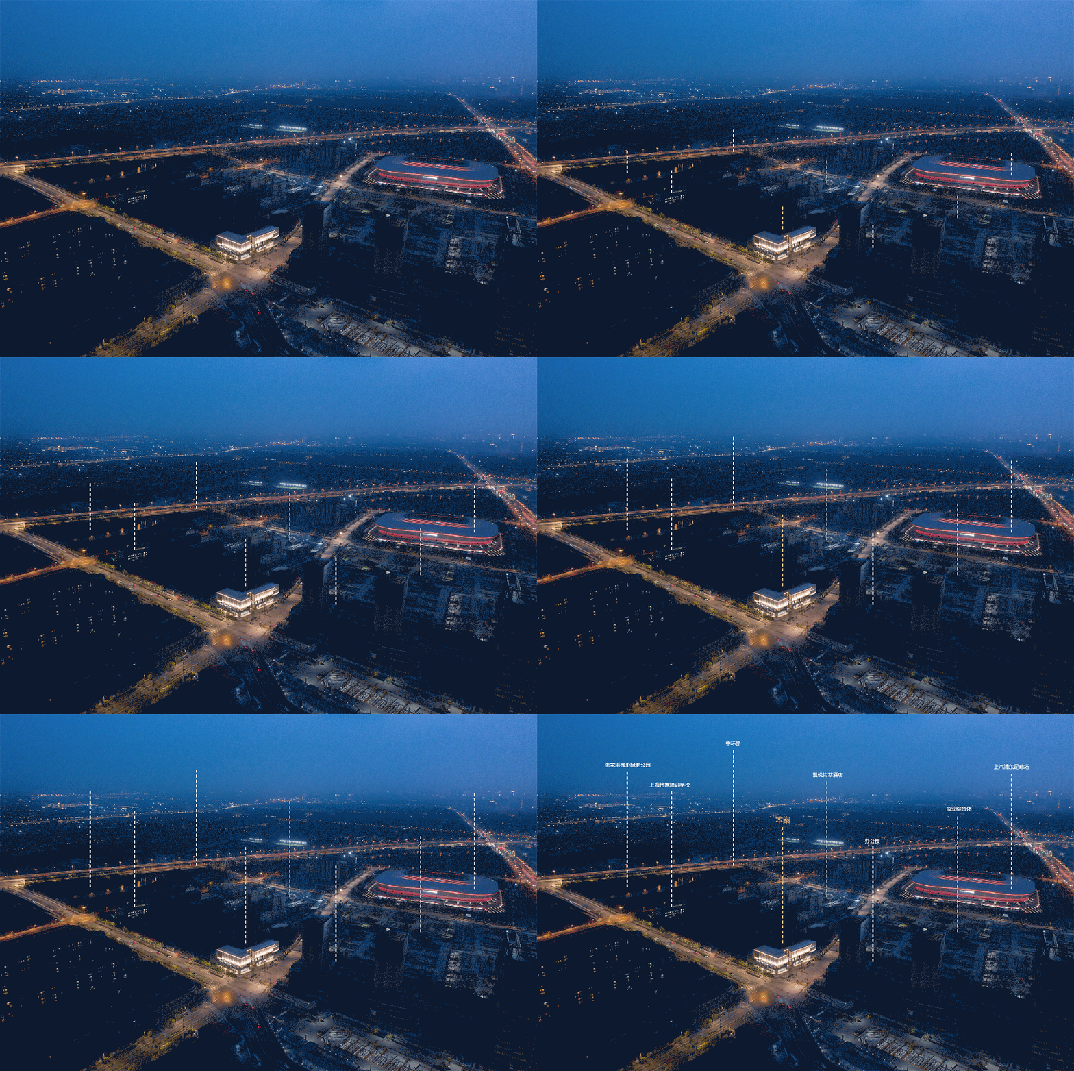
△ 实景瞰图 Realistic aerial view
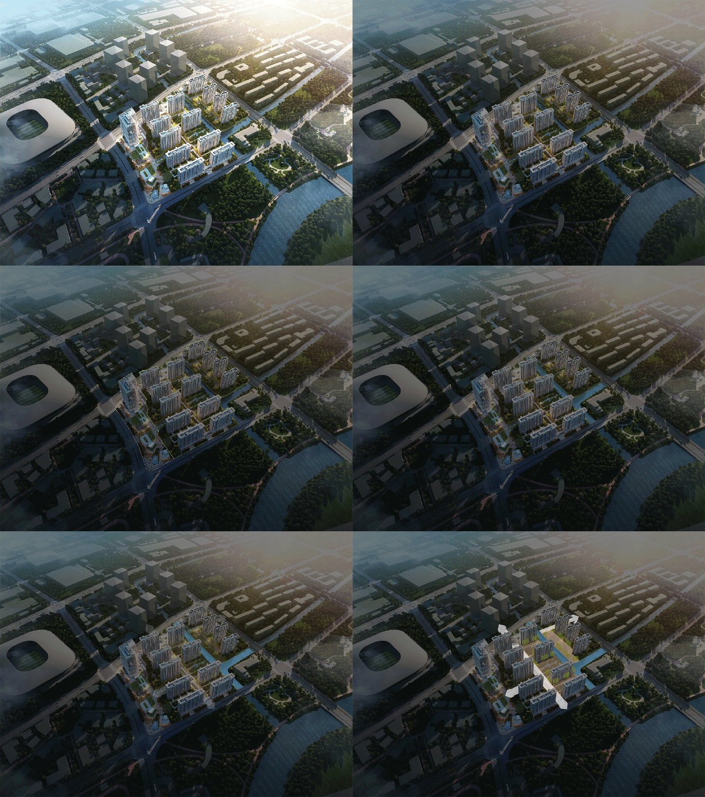
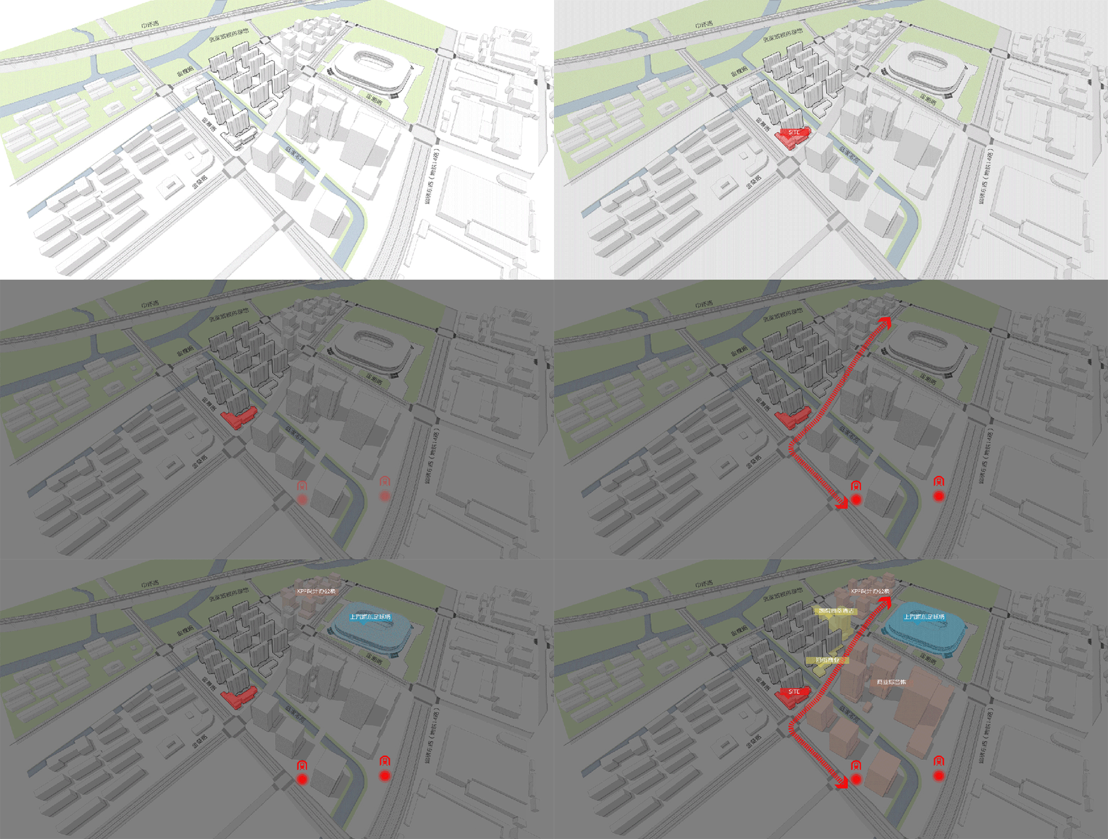
项目紧邻浦东足球场,南侧碧云绿地(张家浜楔形绿地),地块内部水系穿过。如何在当时当下“建筑语言体系”中寻找适合片区身份的项目自身价值定位;如何与片区 IP 浦东足球场协调呼应、功能衔接;如何回应地块优越自然环境是设计思考的三个主要切入点。
The project is situated adjacent to the Pudong Football Stadium, bordered by the Biyun Green Space (Zhangjiabang Wedge Green Space) to the south, with an internal water system passing through. The primary design considerations revolve around finding the project’s unique value proposition that aligns with the district’s identity within the current architectural language system. Additionally, it seeks to establish a harmonious connection with the Pudong Football Stadium in the vicinity and effectively respond to the exceptional natural environment of the plot. These are the key focal points for our design approach.
△ 项目周边 Surroundings of the project (本图片来自网络 版权归原作者所有)
△ 规划生成 Planning generation
△ 立面局部 Facade parts
精细化立面设计,研究材料“现代式”表达,挖掘材料,特别是铝板、玻璃时代审美趋势背景下的价值感体现。
Refining the façade design involves a meticulous examination of the contemporary interpretation of materials, with a deep exploration into the intrinsic value of materials, notably aluminum panels and glass, within the framework of prevailing aesthetic trends in the era of aesthetics.
邻里中心-示范区
Neighborhood Center - Demonstration Area
示范区前期为展示中心,后期作为邻里中心,建筑面积 4723 平米,一层二层为商业、三层以及四层则为社区服务配套用房。规划于东北侧街角处,向西沿街设置商业以及小区出入口,与北侧办公商业一起以开放公共界面形象连通地铁与足球场。
The demonstration area initially functions as a exhibition center and later transforms into a neighborhood center, covering a substantial building area of 4723.00 square meters. The design entails one to two commercial floors and four community service-supporting structures on the northeast corner. Commercial and community entrances and exits are strategically positioned along the western street. Together with the office and commercial buildings on the north side, it establishes an open, public interface connecting the subway and football stadium.
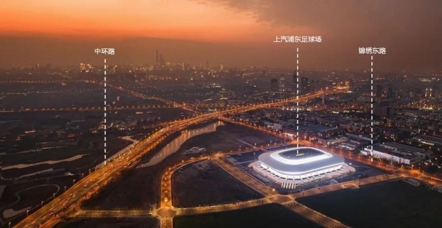
邻里中心作为街角重要节点,功能上作为社区商业,体量小,形象要与足球场以及北侧办公商业和而不同,体现街角形象的标识性。
Serving as a pivotal landmark at the street corner, the neighborhood center acts as a compact community commercial space. Its visual identity aligns with both the football stadium and the adjacent northern office and commercial area, reflecting the iconic essence of this street corner.
△ 区位分析 Location analysis
△ 实景图 Reality images
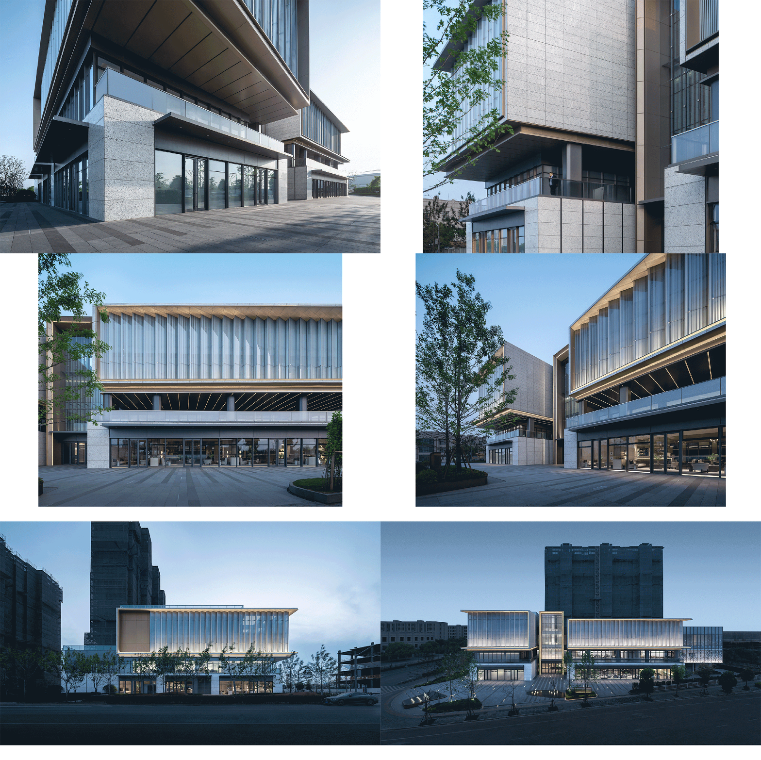
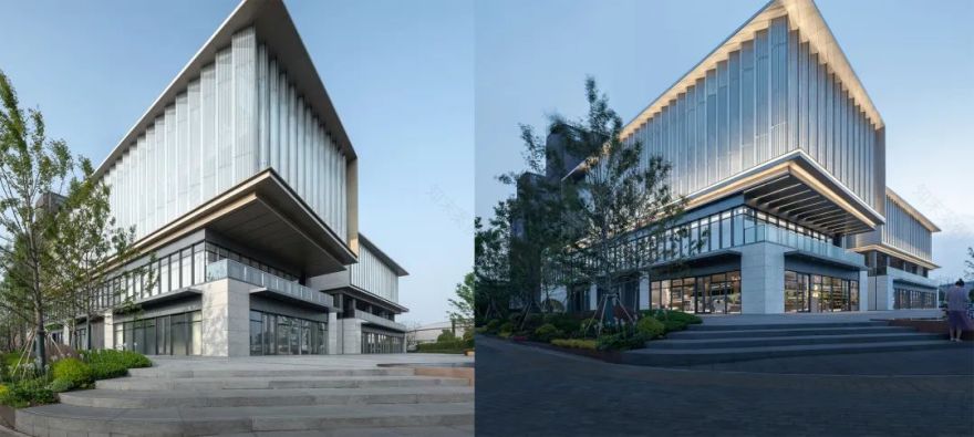
硬朗的方正几何体与柔美曲线“瓷碗”足球场相映成趣,材料上选用灰白色白玫瑰石材,与足球场白色铝板相统一,香槟色铝板调色,和而不同,表达街区型商业温馨的邻里感受。
The robust square geometry of the structure harmoniously coexists with the graceful curved design reminiscent of a ’porcelain bowl’ in the football stadium, creating a captivating blend. The choice of materials, gray-white rose stone, seamlessly integrates with the white aluminum panels of the football stadium. The addition of champagne-colored aluminum plates, while maintaining harmony, introduces a subtle distinction, conveying the inviting and neighborly ambiance of the commercial district.
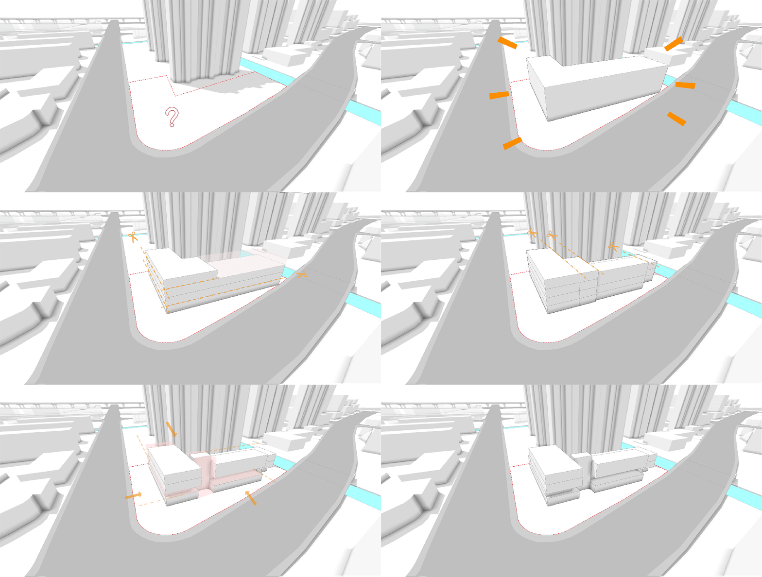
△ 体块生成 Block generation
建筑体量打碎重组,盒子相互“咬合”:一层商铺价值最高,结合橱窗预留广告位,通透性的落地玻璃增强室内外视线互动性,提高商业曝光度,同时大尺寸石材墙面,增强整体建筑的基础依托感。
二层盒子回收退让,留出室外露台外摆灰空间,视觉上与街道和足球场形成互动联系,采用灰色铝板和落地玻璃结合,灰色铝板预留广告点位,玻璃模数化阵列,整体简洁统一作为整体形象上“脖子”过渡。
三层四层一体,加强体块尺度感,整体悬挑,提高其标识度,采用点式丝网折线玻璃幕墙,白天温润如玉,夜晚波光粼粼,加之香槟色铝板铝板型材包边,以期增加其精致度。
The architectural volume undergoes a dynamic reconfiguration as the building boxes interlock and overlap. On the ground floor, retail spaces take precedence, featuring a combination of display windows and reserved advertising areas. Transparent floor-to-ceiling glass fosters a seamless connection between indoor and outdoor spaces, enhancing commercial visibility. Additionally, a prominent large-sized stone wall provides essential structural support to the entire building.
The second-floor box is repurposed and opens up, creating an outdoor patio that engages with the surrounding environment, visually connecting with the street and football stadium. This level utilizes a combination of gray aluminum panels and floor-to-ceiling glass, with advertising areas integrated into the gray aluminum panels. This design choice simplifies and unifies the overall aesthetic.
The third and fourth floors are harmoniously integrated to augment the overall scale of the structure, featuring an extended overhang for enhanced visibility. A distinctive point-type wire mesh folded glass curtain wall lends warmth and elegance during the day, while it radiates brilliance at night. The curtain wall is enveloped in champagne-colored aluminum plates and profiles, adding a touch of refinement to the composition.
Final overall demonstration area presentation
△ 实景图 Reality images
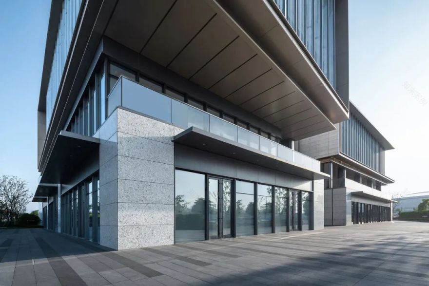
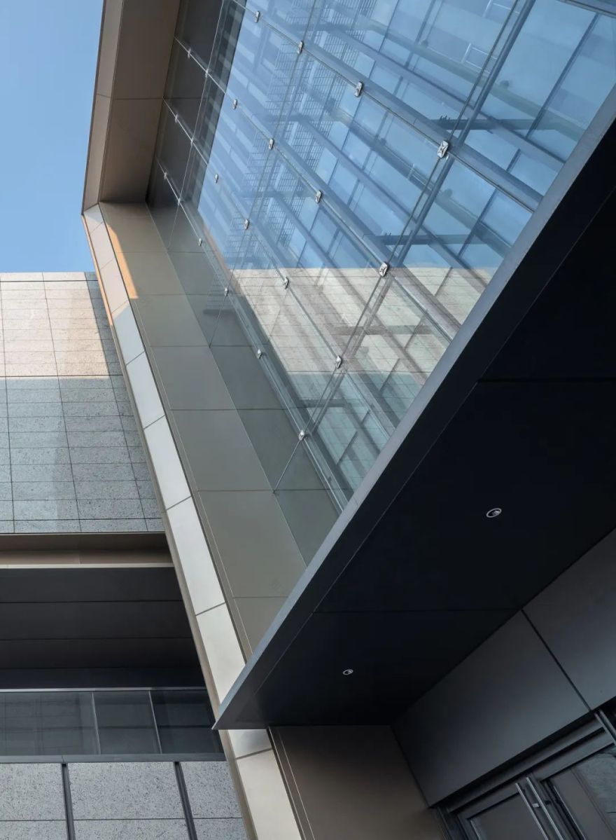
大尺度悬挑加之实虚对比增强其标识度和记忆感,檐下铝板分割槽缝结合埋灯设计,避免分隔缝打胶对效果的破坏,外侧型材收边,体现铝板材料轻、薄、挺之特性。
The substantial overhang, along with the juxtaposition of reality and virtual elements, heightens its recognizability and leaves a lasting impression. The aluminum panel beneath the eaves is meticulously divided into slots and incorporates concealed lighting to preserve the visual impact while eliminating any disruption caused by gap closure. The exterior profile is precisely contoured to accentuate the sleek, slender, and upright attributes of the aluminum panel material.
△ 实景图 Reality images
“秀技式”细节堆叠在一眼看不出来的时候便变成了自身的价值感提升。
The layering of intricate’showmanship style’ details elevates one’s perception of value, particularly when these details are not immediately apparent at first glance.
△ 实景图 Reality images
檐下空间增加了建筑的透气性,未来作为商业外摆休憩空间,为沿街效果增加舞台戏剧性。
The area beneath the eaves enhances the building’s ventilation, and in the future, serving as a commercial outdoor resting space, it will contribute a theatrical dimension to the street’s overall ambiance.
△ 实景图 Reality images
△ 二层外摆空间实景图 Realistic view of the outer swing space on the second floor
△二层外摆空间实景图 Realistic view of the outer swing space on the second floor
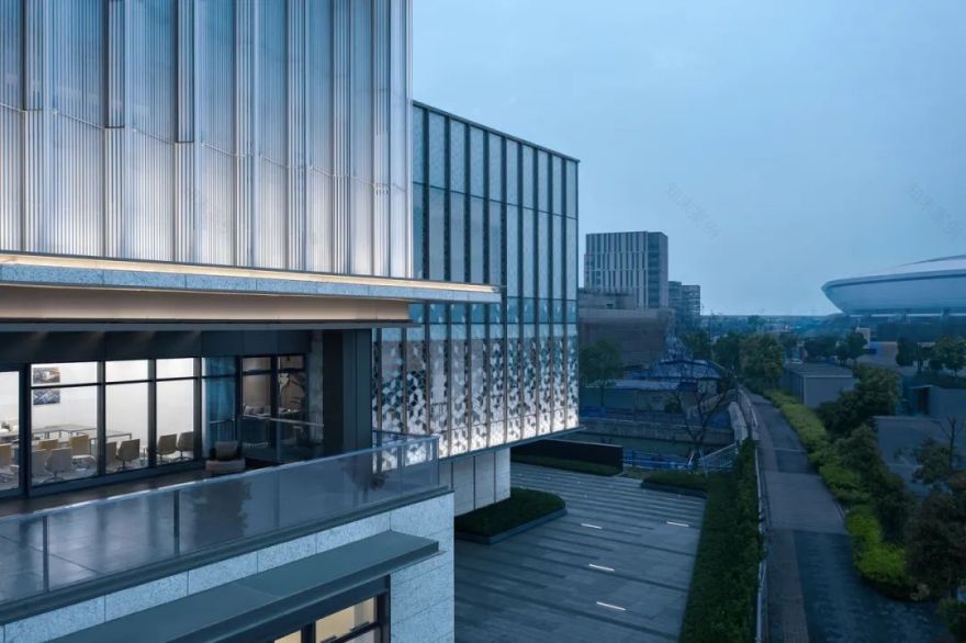
建筑二层退让出露台外摆空间,透过树冠,与街道以及足球场形成互动和联系。
The second floor of the building opens up to an outdoor terrace,fostering interaction and a seamless connection with the street and football stadium beneath a canopy of trees.
△ 沿街实景图 Realistic view of the street
△ 沿街实景图 Realistic view of the street
至臻细节·品质体现
To the details, the quality is reflected
外立面现代简约,几何体穿插变化,玻璃、石材、金属铝板结合,各体块运用不同色彩质感变化,营造层次丰富、界面清晰、记忆强烈的气质形象。
The façade boasts a modern and minimalist design characterized by alternating geometric shapes and a blend of glass, stone, and aluminum panels. Each section employs varying colors and textures to craft a diverse yet coherent interface, leaving a distinct and memorable impression of character and image.
△ 材料演示 Material demonstration
材质选择上,一层以米白色石材搭配超白玻,建筑基座稳定感同时兼顾商业橱窗展示效果,二层深灰色铝板和玻璃幕墙,结合体块退让,形成过渡,三层以上大尺度彩釉玻璃和香槟色铝板,晶莹剔透,形成视觉标识感。
In terms of material selection, the first layer incorporates off-white stone paired with ultra-white glass, ensuring structural stability while enhancing the display aspect of commercial windows. The second layer features dark gray aluminum panels and a glass curtain wall, complemented by block segmentation, creating a striking contrast. From the third floor and upwards, large-scale colored glazed glass and champagne-colored aluminum plates provide a crystalline clarity, establishing a distinctive visual identity.
双层表皮幕墙、折线玻璃幕墙、数码印刷立方体渐变幕墙,多种幕墙系统组合,形成建筑不同表情变化。
Double skin curtain wall, folded glass curtain wall, digital printed cubic gradient curtain wall, and various curtain wall systems combine to form different facial expressions of the building.
△ 入口双层玻璃表皮 Entrance double glazed skin
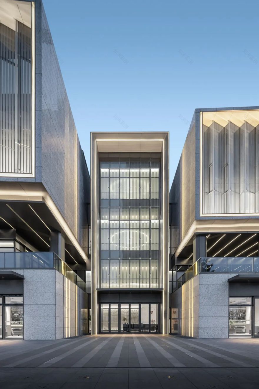
入口设计双层玻璃表皮,外侧超白玻点式玻璃幕墙,模数化分割,干净纯粹;内侧彩釉玻璃,预留广告张贴更换操作空间。
The entrance features a double-layer glass façade, with the outer layer adorned in super-white glass utilizing a point-type curtain wall system, employing modular divisions for a sleek and pristine appearance. The inner layer consists of glazed glass panels, designed with allocated space for advertising and ease of replacement.
△ 墙身节点 Architectural detail drawing
△ 丝网印刷折线玻璃 Screen printed folded glass
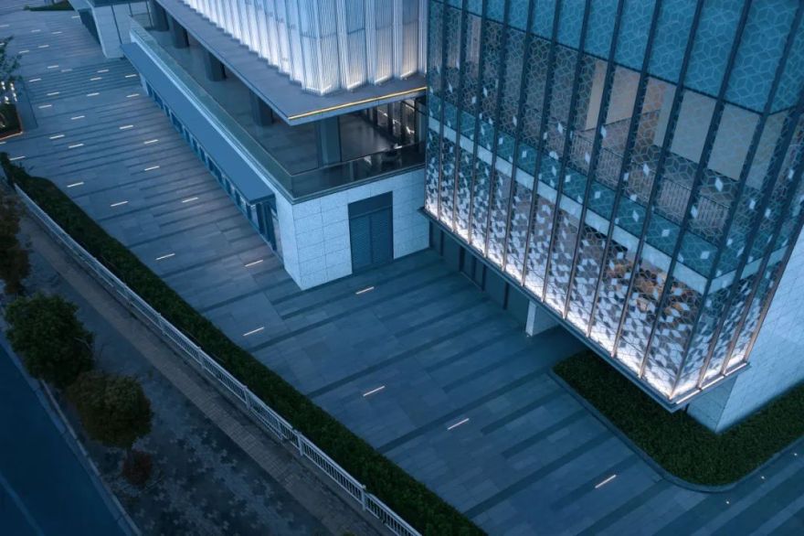
折线玻璃飞边设计,隐藏龙骨框料,外观晶莹纯粹,采用丝网印刷,丰富肌理,反射夜晚灯光,形成波光粼粼的表情变化。
The design incorporates a folded glass flash technique with a concealed keel frame structure, resulting in a crystal-clear and pristine appearance. Screen printing is employed to introduce a textured richness, which, in the evening, interacts with ambient lighting to create a captivating and sparkling visual transformation.
△ 墙身节点 Architectural detail drawing
△ 细部实景图 Detailed realistic view
采用数码打印玻璃,精密排版,形成跌落渐变肌理。
Utilizing digitally printed glass with precise layout to create a gradient texture resembling droplets.
△ 墙身节点 Architectural Detail Drawing
△ 不同肌理印刷玻璃 Printed glass with different textures
泛光照明
Flood lighting design
△ 日景夜景对比 Comparison of day and night scenes
△ 日景夜景对比 Comparison of day and night scenes
△ 细部节点 Architectural detail drawing
从方案到落地对灯光进行全程精细控制,避免灯具对立面破坏,使灯具与建筑巧妙的结合,白天不见灯,实现对型材线条和缝宽毫米级控制,灯光成为建筑表达一部分。
Exquisite control of lighting, meticulously integrated from the planning stage down to the ground level, ensuring no harm to the facade caused by lighting fixtures. This clever integration seamlessly blends the lighting elements with the building structure. By concealing the lighting during daylight hours, precise control down to the millimeter of profile lines and seam widths is achieved, seamlessly incorporating lighting into the architectural expression.
△ 灯光效果 Light effect
△ 灯光效果 Light effect
转角悬挑天花线性灯阵列,简洁而富有视觉冲击力,折线彩釉玻璃阵列,白天晶莹剔透,夜晚波光粼粼。
The linear light array along the corner overhanging ceiling is elegantly simple yet visually striking. It pairs with a folded colored glazed glass array that radiates clarity by day and dazzles with sparkling allure at night.
△ 灯光效果 Light effect
△ 灯光效果 Light effect
建成效果对比
Comparison of construction effects
△ 效果图 Rendering
△ 实景图 Realistic image
△ 施工过程 Construction process
项目距离公司不远,现场巡检带来很大方便,从前期 vmu 到后期现场幕墙上墙,各专业密切地配合,加之“串门式”的现场巡检把控,前期方案构思以及细节设计得以良好落地。
The project’s proximity to our company provides significant convenience for on-site inspections. Beginning with the early stages of VMU (Virtual Mock-Up) to the later stages of on-site curtain wall installation, close collaboration among various professions, combined with thorough on-site inspection, has ensured the successful implementation of both the initial conceptual plan and detailed design.
建筑的目的是提升生活,而不仅仅是空间中被欣赏的物体而已,建筑必须融入人类活动,并提升这种活动的品质。——贝聿铭
The essence of architecture is to enrich life itself, transcending the mere objects occupying space. Architecture should seamlessly integrate with human activities and elevate the quality of those activities. ——Leoh Ming Pei
项目档案
开发企业:浦开集团
建筑设计:PTA 上海柏涛
设计团队:设计五部
设计主创:邵鑫,师占奎
团队成员:林声尊,蒋若彧,王园圆,刘涵,李胜毅,邓文钦,陈宇昂,刘大蔚,李润,杨光宇,陈鸿创 ,王碧芸、黄涛
室内设计:HWCD
景观设计:上海日清景观设计有限公司
幕墙设计:SCHMIDLIN
施工图:上海筑景建筑设计有限公司
用地面积:3170㎡
建筑面积:4723㎡
设计时间:2019 年 12 月-2023 年 6 月
建筑摄影:山兮建筑空间摄影
客服
消息
收藏
下载
最近


